
How To: Use iStat menus to add versatility to your menu bar
A downloaded application that allows you to change your menu bar look to open up some more stats you can check up on.


A downloaded application that allows you to change your menu bar look to open up some more stats you can check up on.

This tutorial demonstrates how to quickly and easily create graphical navigation bars with DHTML menus for your website, using Xara Menu Maker.

A quick demo of how easy it is to create graphical website button bars with DHMTL menus using Xara Webstyle.

This video series shows you how to use the interface (UI) in 3D Studio Max. Topics covered are viewports, menu bar, main tool bar, status bar, command panel, and animation controls respectively.

This video explains how to use the status bar in 3D Studio Max.

Did you know the iPod bar graph in iTunes display has hidden view modes? It's true and Veronica uncovers them in this video.

Train for arm wrestling with this weight routine. Watch this video and learn how you can workout your forearms with this simple Hercules bar exercise.

This video goes over the stopper ball on the bar and how to use it when kiteboarding.
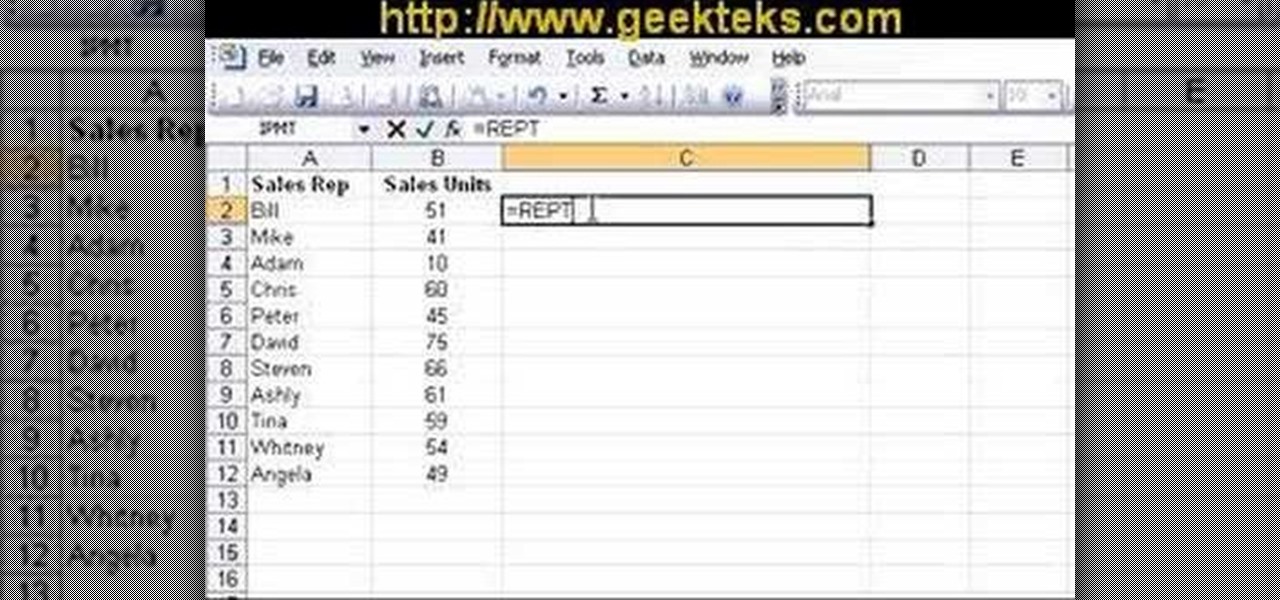
Learn how to compare numerical figures and create a simple bar chart in Microsoft Excel.

Getting different styles of bikes on a bike rack can sometimes be a real challenge. You need a lot of patience and a geometry degree to get women's frame, alternative frame, or kids bike to set on the rack properly. Well rather than banging your head on the wall trying to get all the bikes to fit, now you can add a simple adapter bar to help arrange the bikes on the rack, neat and easy. This video demonstrates the Thule Adapter Bar, and shows just how quick and simple it is to use.

Bobby Crispy introduces you in this video to bar chords.

This film is about gold. Gold diving. Use of the hookah rig to find gold. Gold flakes, nuggets, and platinum nuggets are shown. Gold and platinum are 15-19 times heavier than other streambed materials and concentrate in low pressure areas and cracks that run across rivers and streams. You look for a crack on the bank, and follow it out until you meet the "gold line" and there you suck it out with your dredge. Gold will be on the outside edge of a river gravel bar, at the head of the bar (larg...
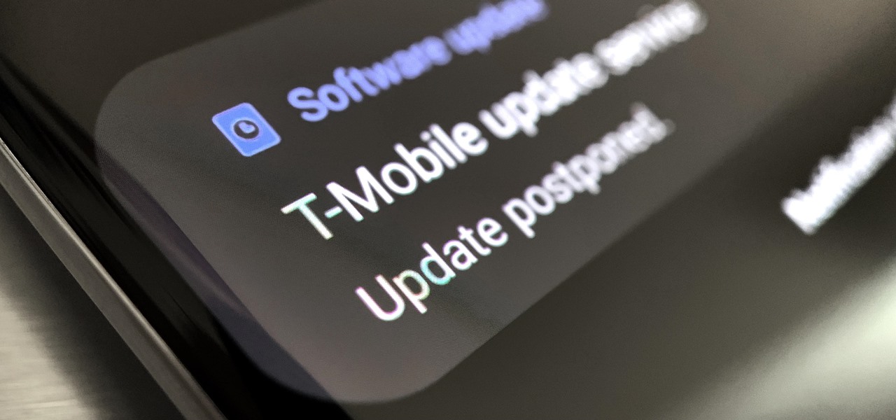
Updating your Galaxy to the latest software version is optional, but you wouldn't know that from the persistent notification and status bar icon that are constantly reminding you to. Thankfully, you're just an app away from hiding these eyesores without the need to update your phone.
Samsung's popular Good Lock app has been updated to work on One UI and now lets you take full advantage of its awesome add-ons to customize your S10 in a few simple taps. One add-on in particular lets you get rid of mostly redundant indicators like the NFC "N" for a cleaner status bar.
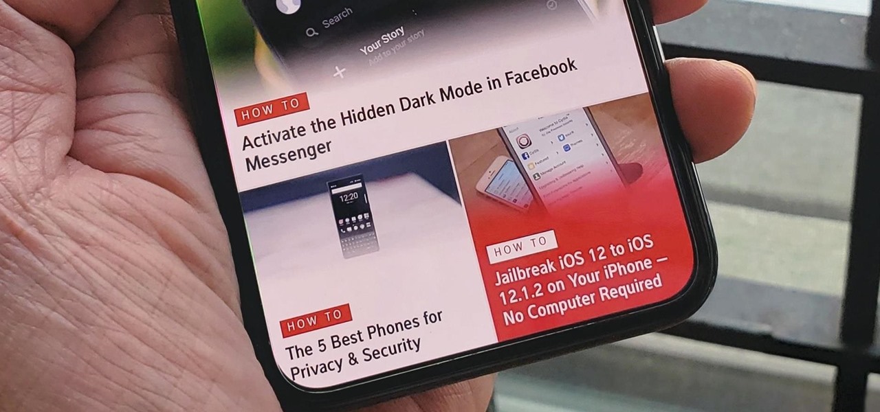
The home bar, that tiny sliver of color at the bottom of the screen on Home button-less iPhone models, is helpful when first getting used to an iPhone X or newer's gestures. It helps you learn how to swipe up to unlock, go to the home screen, view the app switcher, and so on. But after a few weeks, it just becomes an annoying eyesore you can't get rid of — unless you have a jailbroken iPhone X.
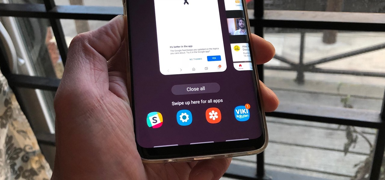
To give you a truly immersive experience on Infinity Display phones like the Galaxy Note 9, S9, and S8, Samsung added the option to hide the navigation bar when not in use, then easily reveal it with a swipe up gesture for quick access. If you've always found this process a little too cumbersome, Samsung has introduced a nifty feature in One UI that'll make it a lot more intuitive.
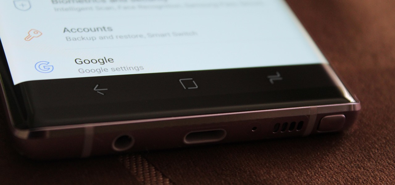
One option you won't find buried in the Galaxy Note 9's Settings is the ability to return the navigation bar to black. Samsung changed the default color to white with the Note 8, removing any ability to bring the black color back. But thanks to a neat app, Note 9 users can do it themselves.
For the first time since its inception, the famously hidden System UI Tuner has to be unlocked in a new way. No longer can you long-press the gear icon (found in Quick Settings) until it spins and reveals the hidden settings option. With Android 9.0 Pie, there's a new workaround to reveal the menu.

Native screen recording, one of the hottest features that Apple included in iOS 11 and later, is easily started from the optional Control Center toggle on your iPhone. From there, you can stop recording from the same place or from the red status bar or bubble. It's a very convenient addition to iOS, but there's one obvious downside — that red indicator, which can appear in your recordings.

Apple released iOS 11.2 beta 3 on Monday to developers, with only a handful of changes over Beta 2. Still, it's always recommended you upgrade to the newest version of iOS, so if you are running any of the previous 11.2 betas, make sure to update.
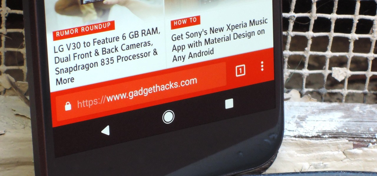
Update Feb. 2020: Google has removed the feature flag to move the address bar to the bottom of the screen. We've out to see if they have plans to bring it back, but received no comment. In the meantime, you can use the new Chrome Duet bottom bar instead.
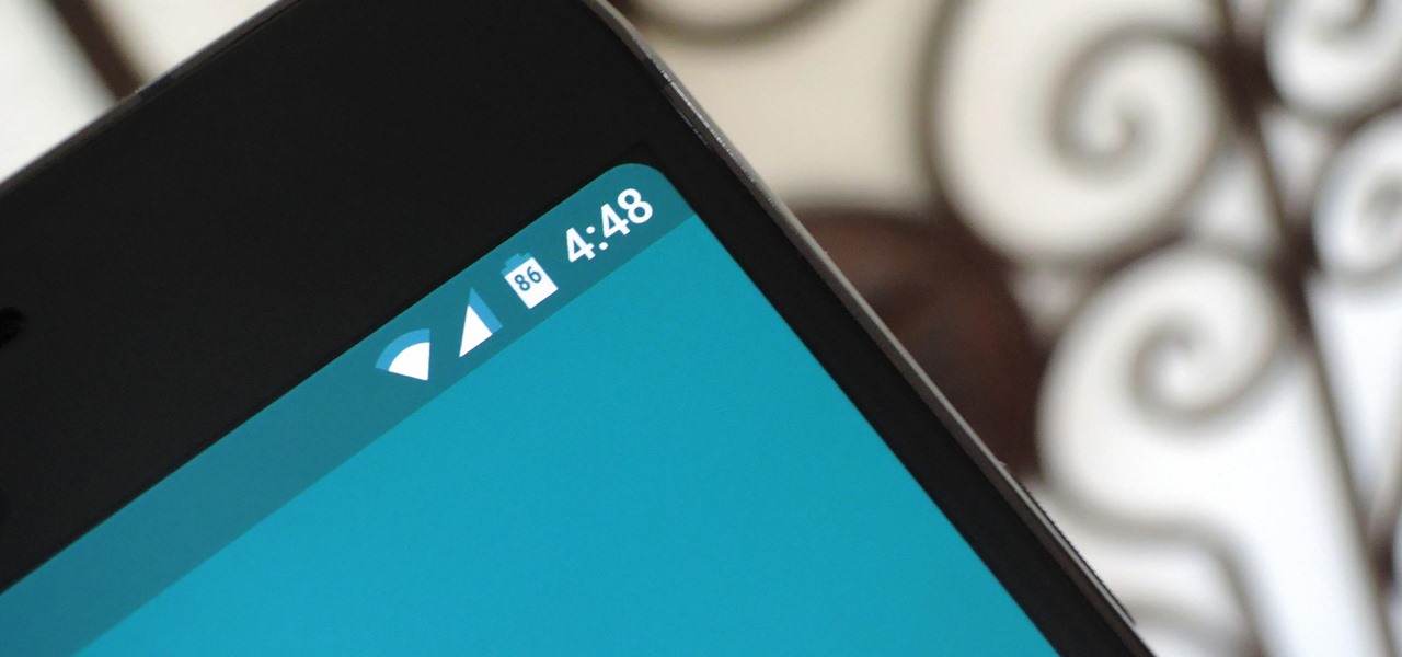
For years now, Xiaomi's smartphones, as well as any phone running Xiaomi's MIUI ROM, have had a subtle feature that makes the interface look all the more refined: Rounded display corners. But now, other manufacturers are getting in on the rounded corners craze, as the new LG G6 is using them, as well as the Samsung Galaxy S8 and S8+ models, whose curve is more subtle.

When we were kids, snacks on-the-go or in our lunch box were often Kellogg's Nutri-Grain cereal bars. There were flavors like strawberry, blueberry, and our beloved apple-cinnamon.

Video: . This video will show you how to secure your kayak to a J bar roof rack carrier.
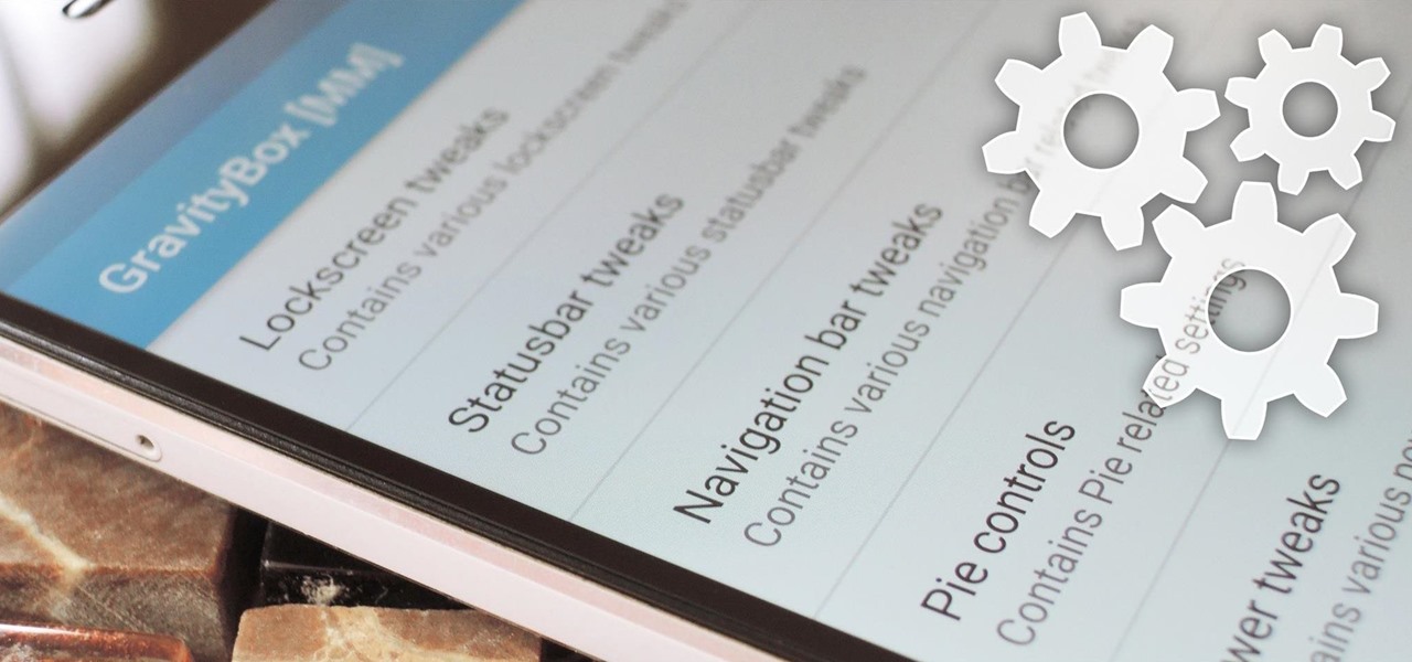
With certain apps and games, it's all about the settings. In order to get your money's worth with one of these, you simply have to take the time to tweak and adjust various options, which is something a lot of users don't necessarily want to do.
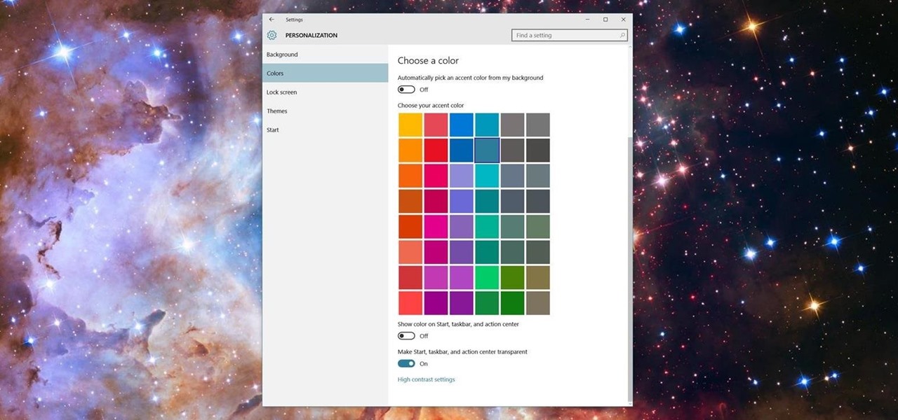
Microsoft has been listening to user feedback, and they've finally done something about one of the most common minor gripes with Windows 10. As of build 10525, there's now an option for changing the title bar color in apps, so you won't have to use this old workaround to personalize your window coloring anymore.
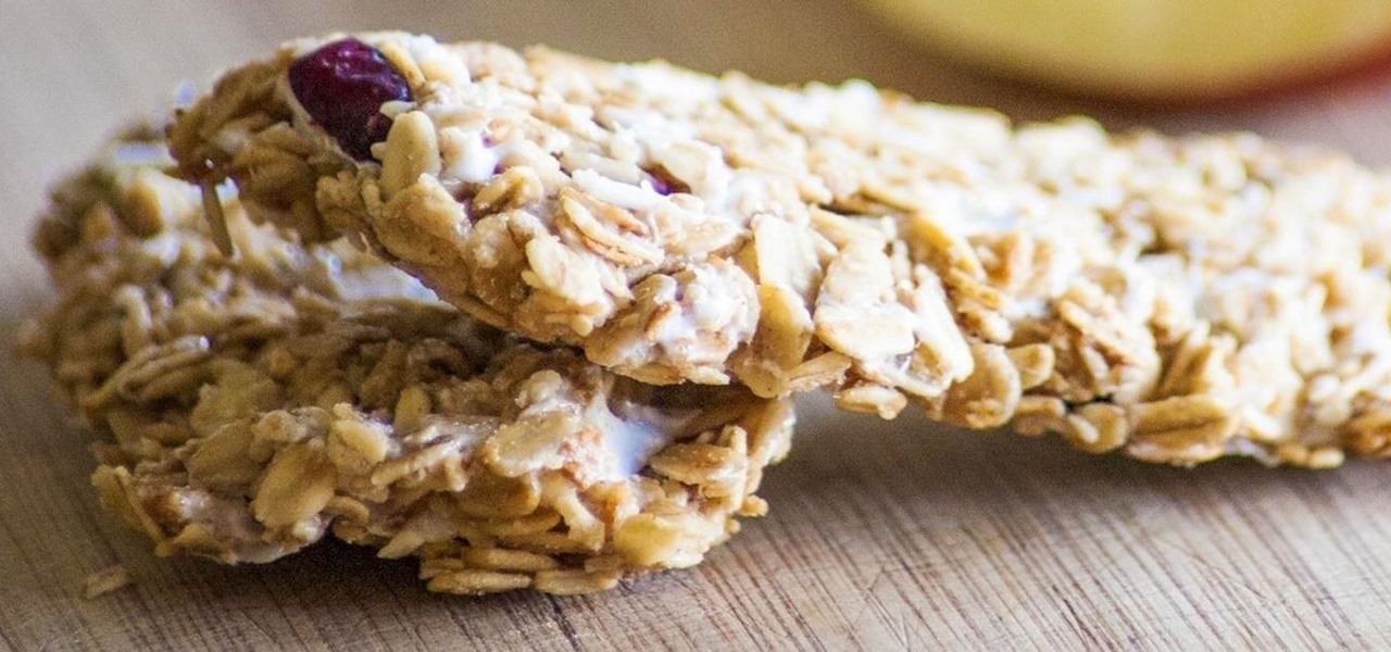
Granola bars are the perfect snack to have around: they're tasty, not messy, have nutritional value, are filling, and don't go stale quickly.
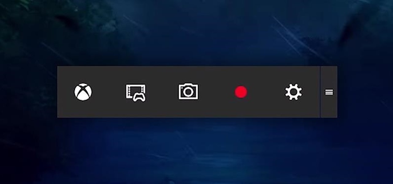
Up until now, if you wanted to record videos of the apps on your screen, you had to rely on a third-party option. However, Windows 10 changes this thanks in part to the new Xbox app. One of the new features of the Xbox app is the Game bar, which allows you to record footage of your gameplay.
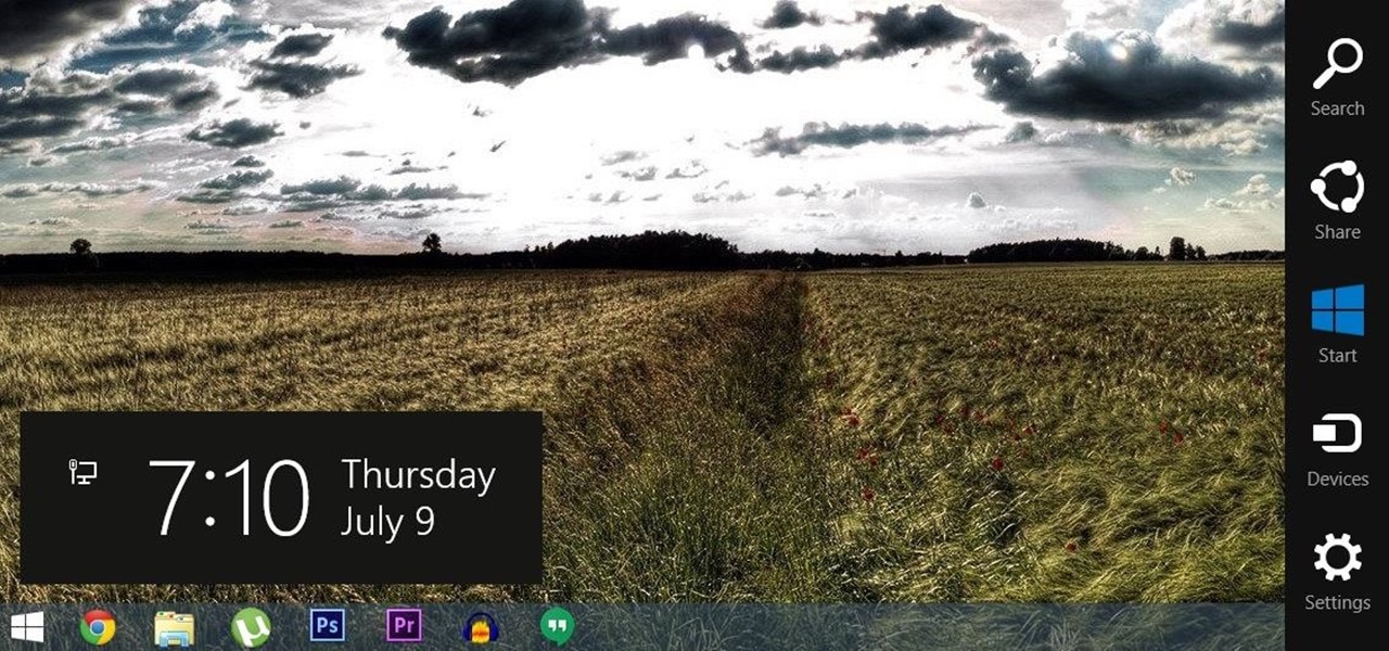
For all of the flak that Windows 8 received from desktop users, it certainly had some interesting and unique features. For instance, the "Charms" bar allowed you to easily access several key menus by simply hovering your mouse pointer in the top- or bottom-right corner of the screen.
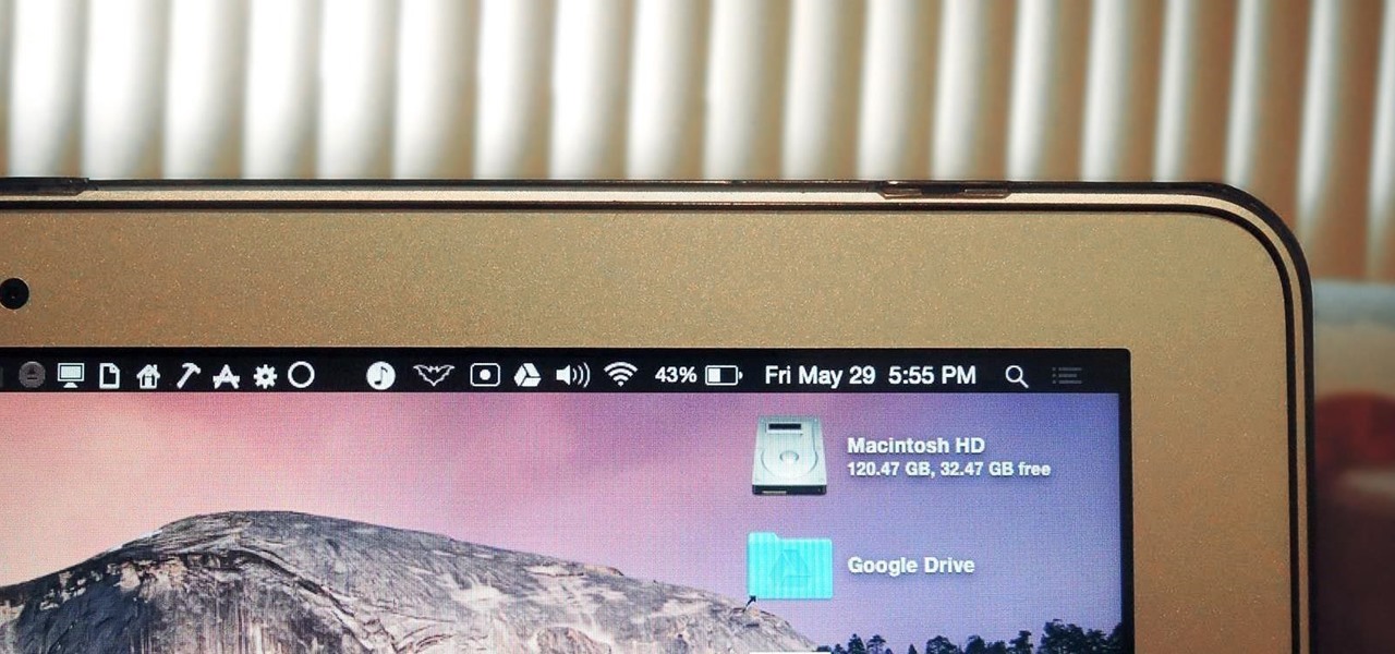
The menu bar is a great place to perform quick searches, track battery life, and switch Wi-Fi networks on your Mac, but it can do way more than that if you let it. I've rounded up some menu apps below that not only have features that will boost your productivity, but are lightweight enough to run entirely from the menu bar.
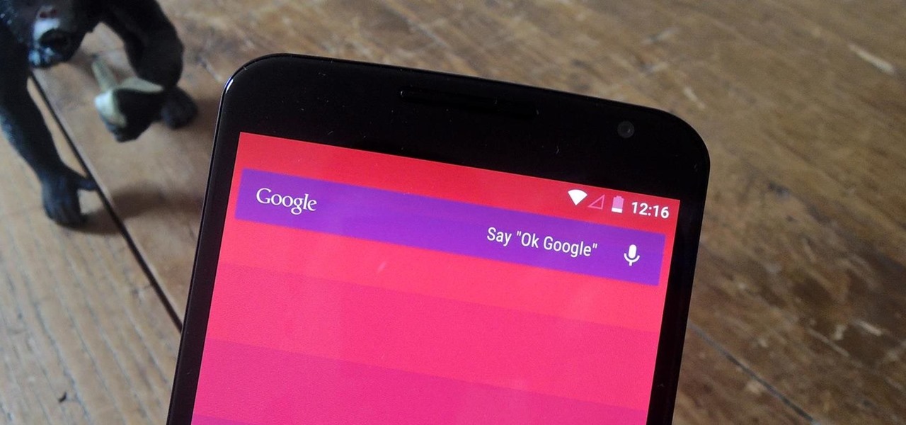
With the release of the Nexus 5 back in 2013 came the Google Now Launcher, which has become the go-to choice for many Android users, especially those who prefer the Nexus line. With its integration of the Google Now page and the always-listening hotword detection, you'd be hard-pressed to find a more complete and useful launcher.
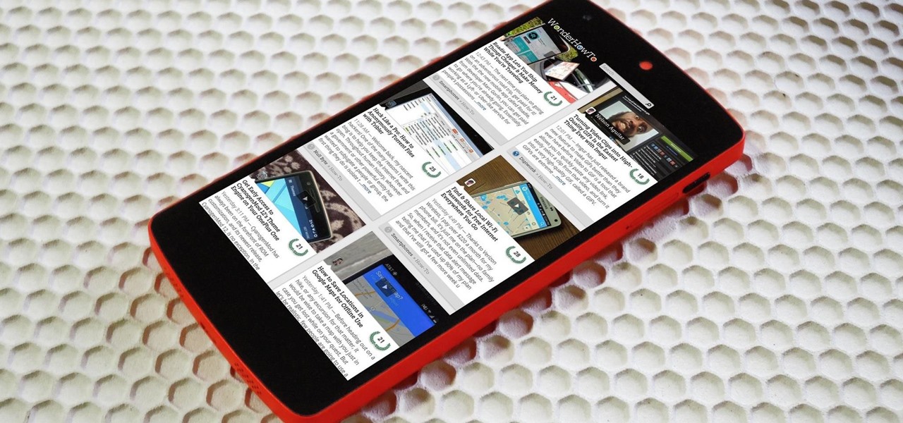
Many manufacturers add a custom skin on top of their Android builds, but none are more widely praised than HTC's Sense UI. The general consensus among Android users says that HTC's visual tweaks are done in good taste, and the features they add are both functional and warranted.
I'm all about customizing my iPhone and making it as different as possible from everyone else's. While it's easy to change the wallpaper, swap keyboards, and hide apps on your home screen, there's not much else you can do aesthetically without jailbreaking, especially when it comes to the status bar and app icons.
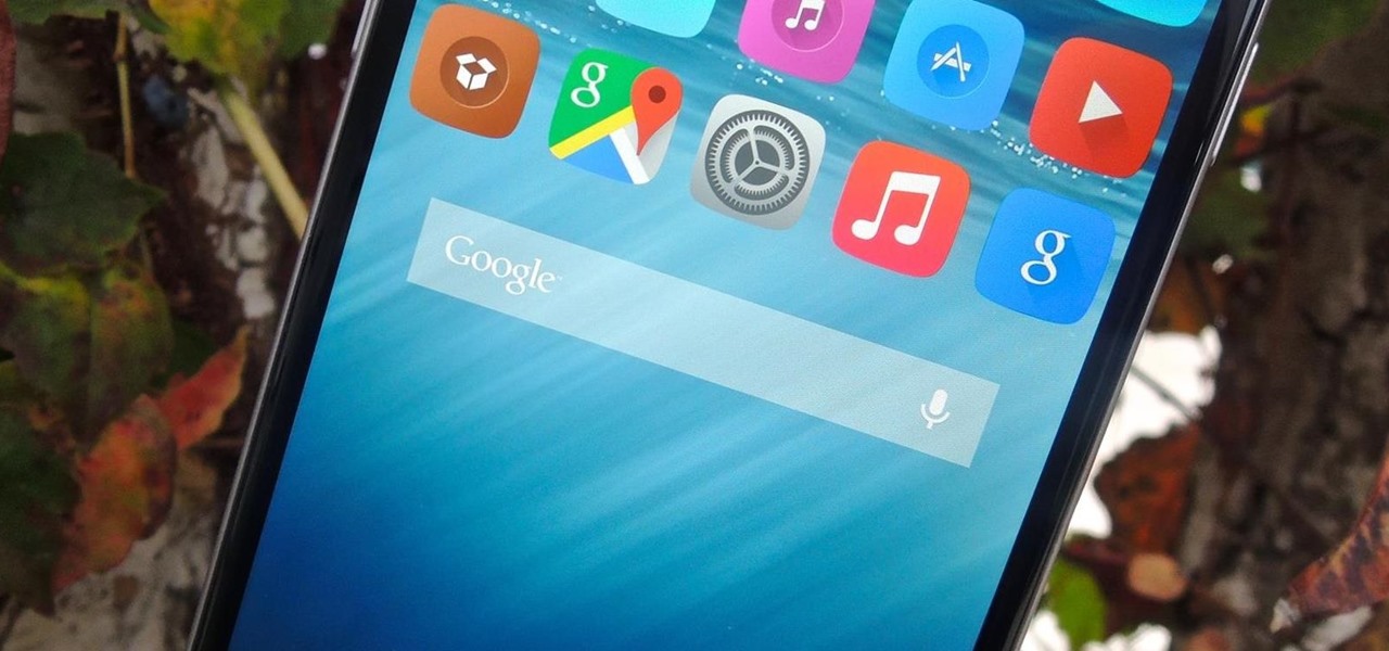
Aside from identifying songs with Shazam and using the "Hey Siri" feature while driving, Apple's personal assistant isn't something I regularly use on my iPhone.
Welcome to the first chapter of Excel is Simple, a place where we will burst all myths around excel and try to make it simpler and fun to use.

This is how I upgraded my 2002 Monte Carlo End Link and Sway Bar Bushing to Polyurethane ones from MOOG. My factory hollow sway bar broke and it was replaced with a 33mm solid one from Dorman.
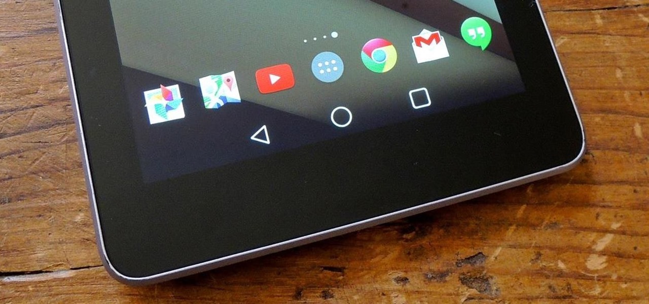
If you want to try out some of the new features in Android L, but can't run the developer preview on your Nexus—or simply don't want to—there's still hope. You don't actually need to be running Android L to try out some of the new improvements.
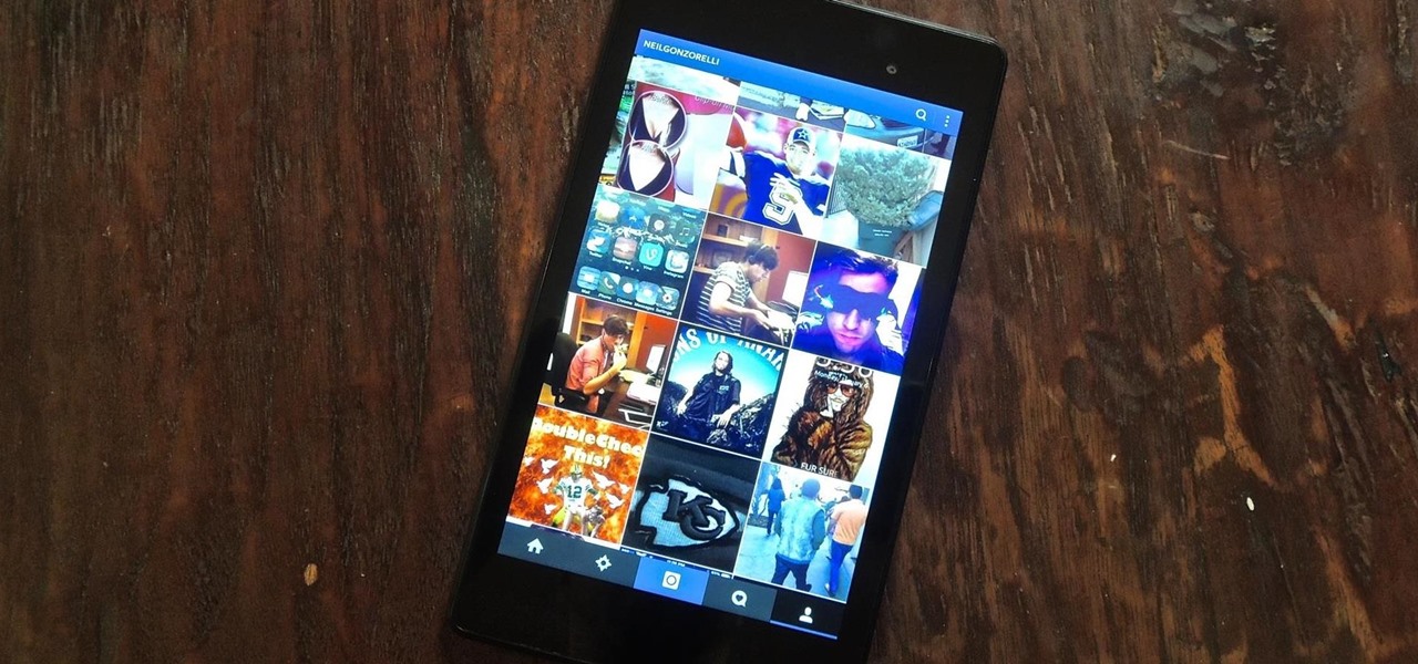
If you've followed our guide on unlocking KitKat's real full screen capability using the immersive mode mod, then your status and navigation bars will be hidden when not in use, giving you a more expansive full screen experience.

When the Nexus 5 was released, a new version of Android came along with it called KitKat. In the 4.4 update were some fancy new UI elements, one of the most noticeable being the translucent decor. By that, I mean the status and navigation bars being semi-transparent.
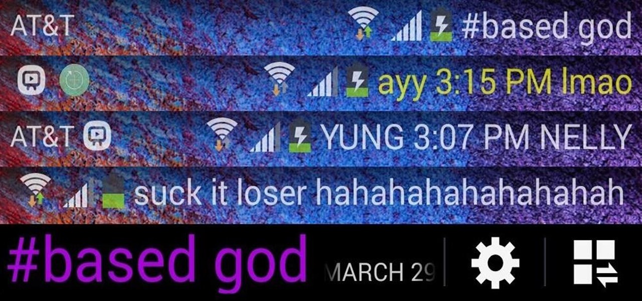
I love my status bar. Not only does it tell what time it is and how much battery juice is left, but it gives me cellular connection info, text alerts, and app update notifications. However, one thing is does not give me is customization. Since you're looking at it all the damn time, why not personalize it?