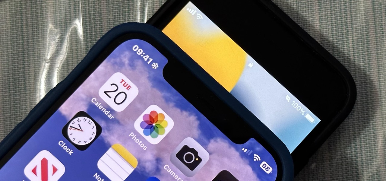
Apple just made its most significant update ever to the iOS lock screen, with a lot of features to be excited about. The theme of this upgrade is customization, giving you complete control over the look and functionality of your iPhone's lock screen.

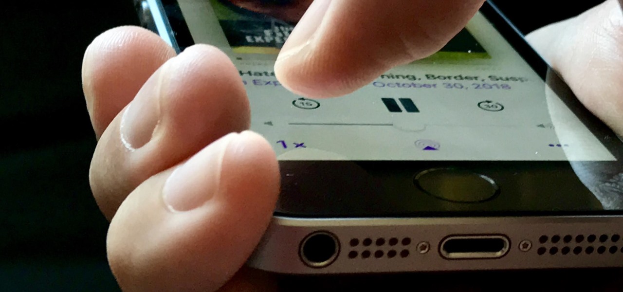
Apple's stock Podcasts app in iOS remains my go-to for all of my podcast-listening needs, but skipping around during an episode can be frustrating. Scrubbing audio along the timeline is often an imprecise maneuver, which is why the skip buttons can be so useful and efficient. Without customizing skip lengths, however, you may find yourself tapping far more than you need to.

The most significant customization aspect of the iPhone is most definitely the home screen. Before iOS 14, Apple only threw in a feature here and there to appease those who like a more personal touch on the most visible part of the operating system. Now, there are great customizability options to give you a real personalized touch, and that includes app icons.

The beauty of Android is that nearly everything can be customized. But sometimes, we get so caught up in tweaking functionality and other minutiae that one of the most important interfaces gets neglected—the home screen wallpaper.

The notification light on phones and tablets is slowly disappearing. The once staple feature is now only found on a few devices, and a bevy of other notification systems have sought to fill the gap. The most popular of these systems is Ambient Display, which has grown in popularity with OEMs over the last couple of years; even Google's own Nexus line of phones have made the plunge.

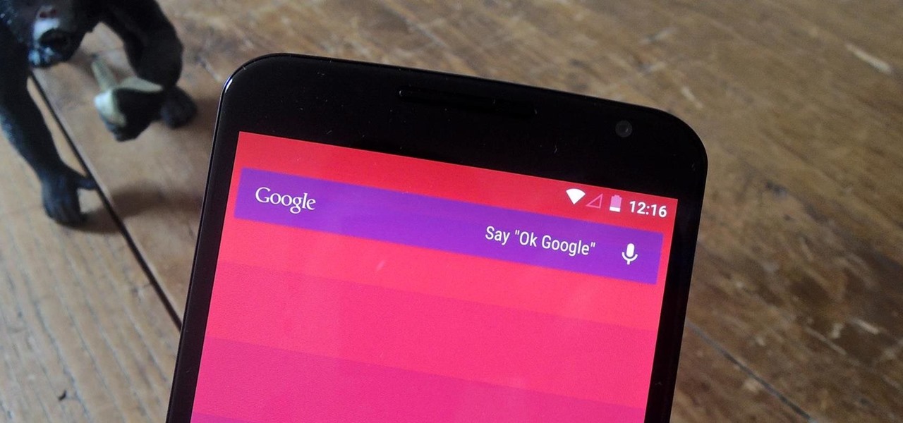
With the release of the Nexus 5 back in 2013 came the Google Now Launcher, which has become the go-to choice for many Android users, especially those who prefer the Nexus line. With its integration of the Google Now page and the always-listening hotword detection, you'd be hard-pressed to find a more complete and useful launcher.

One of the best things about iOS 7 is the Control Center, which gives you quick access from anywhere on your iPhone to turning on or off Airplane Mode, Wi-Fi, Bluetooth, and more. It also makes it very easy to adjust the brightness of your display, and gives app shortcuts for your Flashlight, Calculator, Timer, and Camera.

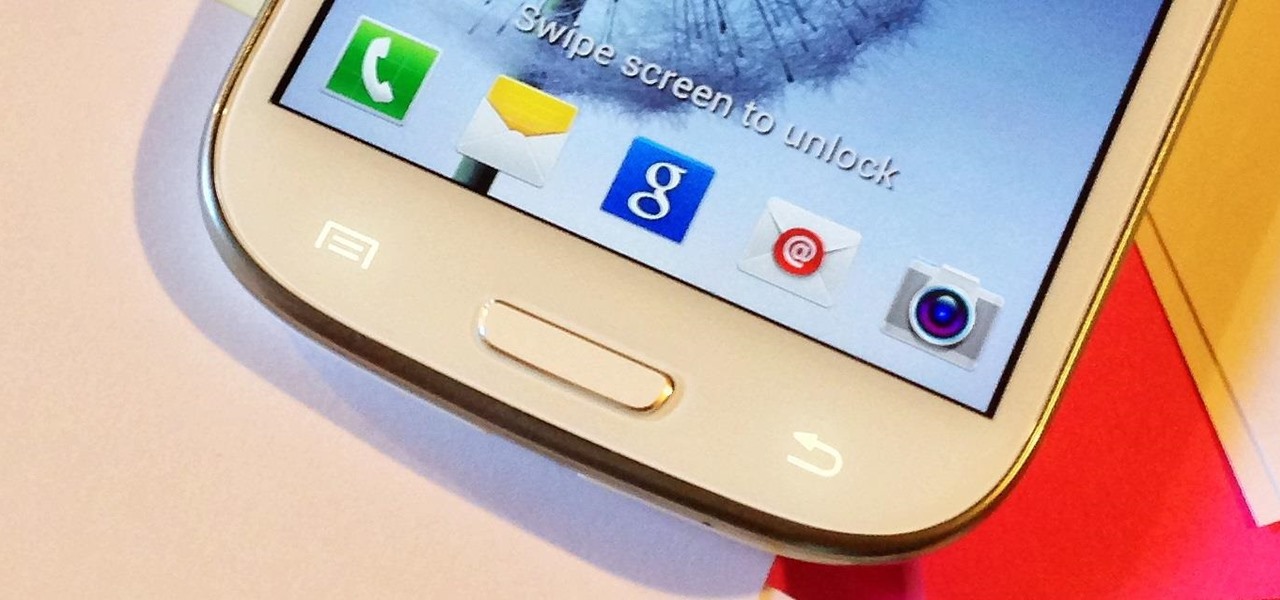
Android gets a lot of love for its immeasurable amount of customization, and for the most part, you don't even have to do any heinous hacking to swag out your Samsung Galaxy S3 or other Android device.

You see the status bar nearly everywhere on your iPhone, and it almost always looks the same. But you can use a few tricks to spice things up a bit — without jailbreaking your iPhone.

Google is making its Phone app, the default dialer for Pixel and Android One devices, available to many other smartphones via the Play Store. If you're enticed to replace your factory-installed dialer to take advantage of the spam-filtering capabilities, you don't want to miss out on other features like the ability to customize canned responses for declining calls.

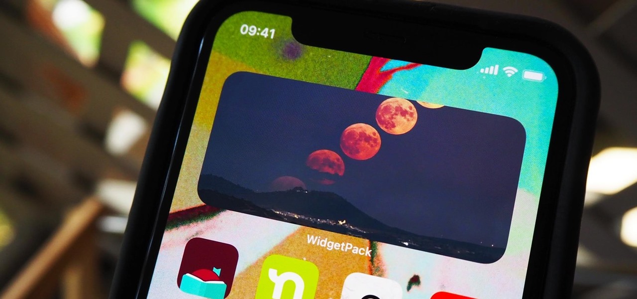
Possibly the most popular feature in iOS 14, home screen widgets are here to stay. Apple created a ton for its own apps, and third-party developers keep building ones for their own apps. But home screen widgets go beyond that since you can make a widget for practically anything you want, from a custom news feed to an inspirational picture of the day — and this is how you do it.

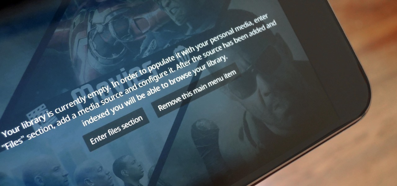
The default look for Kodi is a menu that shows all of the possible media playback options available to the media player. From movies to radio, Kodi's main menu has an option to meet your needs. But everyone's needs are different, and sometimes we don't want all of these options.

We use subtitles when we can't understand what's being spoken on screen, but most of the time it seems like those subtitles are out of our control. Maybe we find them too small, or even too large. Maybe the color is too faint, or the background too distracting. If only we could change the subtitles to reflect our own needs and styles ...

When you buy a Mac, you accept that you're giving up the customization found on Windows or Linux systems for a more fluid and secure machine. This is great for most consumers, but for those of us who'd rather opt for a tailor-made experience, there are always developers that can combine functionality with stability.

Out of the box, your Android device can be customized in many different ways, and a ton more with root access, but adjusting the actual interface of the system is a little bit more challenging. Changing the status bar size, icon width/length, and positioning of toast notifications are things that require a little bit more know-how—until now.

As fellow softModders, I'm sure you strive to find any and every way to make your phone unique. Wallpapers and icon packs are great to get started, but to really stand out from the rest, try changing your HTC One's boot animation.

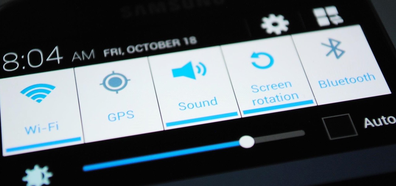
Samsung's quick settings toggles are insanely useful for accessing settings that you would normally need to dig into menus for. Definitely a case of function over form, though. TouchWiz's bright green on dark blue has to be one of the fugliest color combinations I have ever seen.

As mentioned before, the Home button is one of the most important keys on your Samsung Galaxy S3, and pretty much all Android devices for that matter. However, when it comes to customization, it's rather tame.

Typography is an important aspect of the video editing process. You deal with it when adding captions to news clips, giving on-screen recipes in food videos, creating burned-in subtitles for short films, making no-sound-needed videos for social media, and so much more. Enlight Videoleap for iOS makes this all easy.

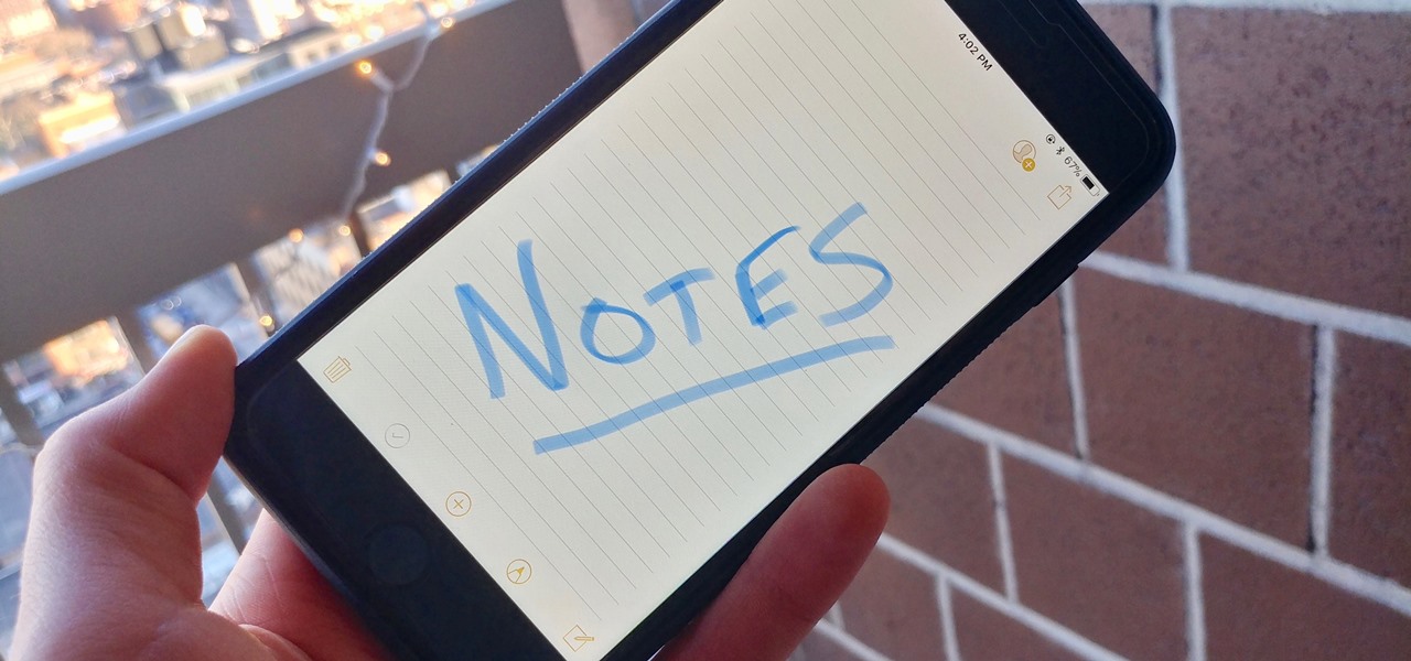
When you have an idea you want to jot down or a quick list to make, the Notes app on your iPhone is a great place to do it. However, by default, Notes use a blank canvas, which doesn't match the physical lined notebooks we're used to. If you've always use unlined or gridless sheets of paper, a blank canvas is probably fine, but you can actually customize your digital stationary with lines or grids.

While iOS offers a plentiful mix of excellent and exclusive features, what you see is what you get. Apple doesn't leave much room for customizability, meaning most people's iPhones look relatively the same. You can make yours stand out, however, by giving your apps unique and personal icons.

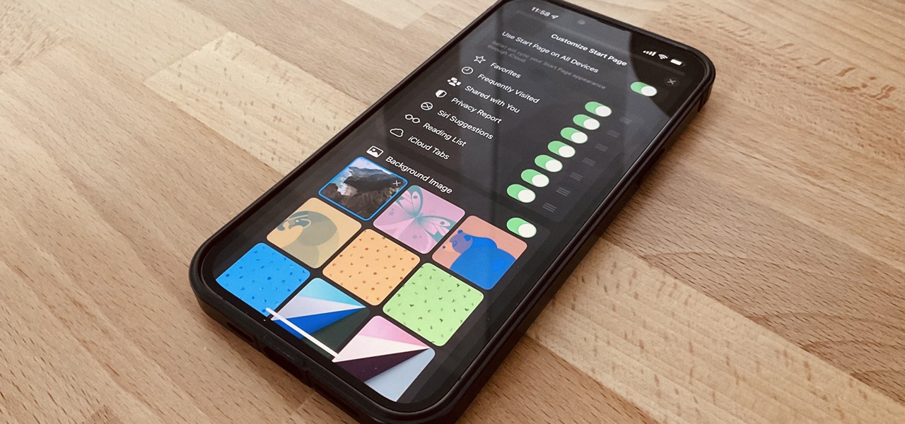
One of the biggest grievances with Safari on iPhone was always its lack of customization, and iOS 15's browser upgrades tackle that problem head-on. Apple added many great features, including Safari extensions, Tab Bar, and Tab Groups, but the most prominent feature caters to those obsessed with finding the perfect Home and Lock Screen look.

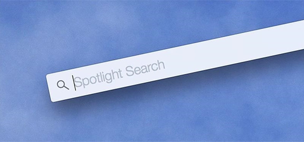
Spotlight, Apple's selection-based search system, received a major facelift on Mac OS X Yosemite. Packed with dozens of new features, such as a central search window and increased app suggestions, the reworked Spotlight was a breath of fresh air.

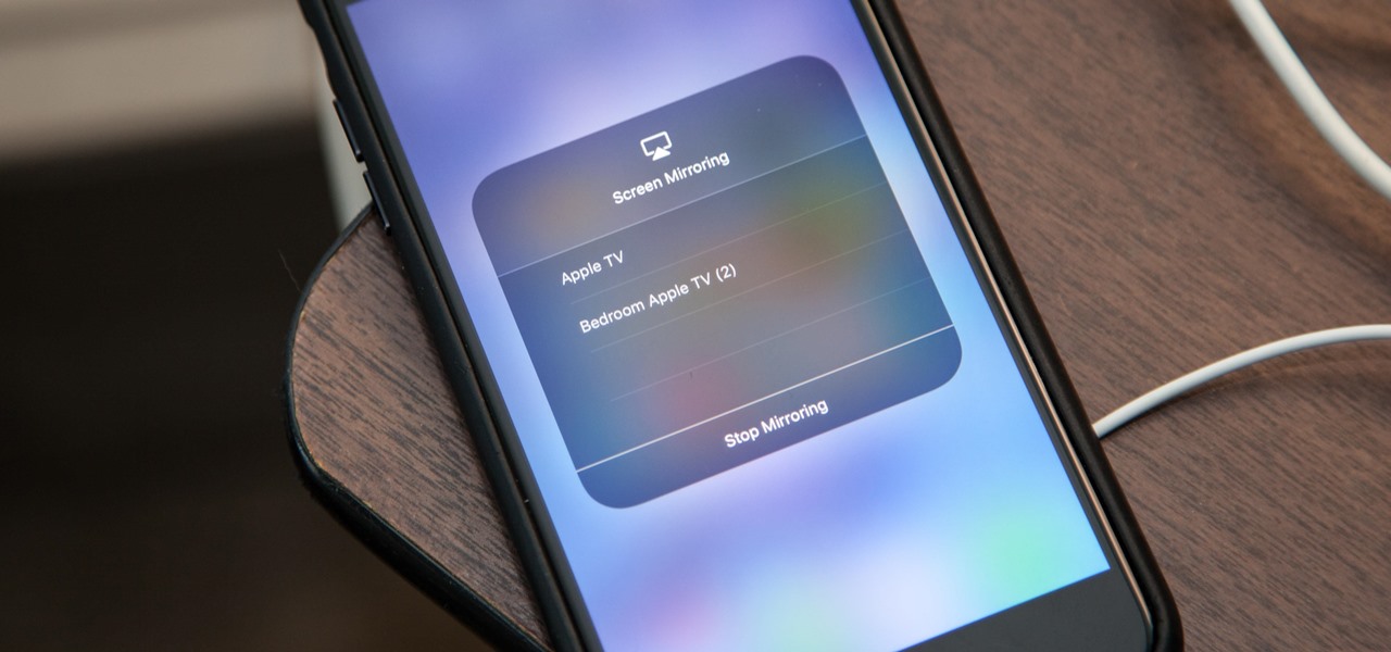
Your Apple TV is just that — your Apple TV, which means you probably want to personalize it a bit, to make yours stand out from everybody else's. And the easiest way to do this is by renaming it. If you live in an apartment building, this will help differentiate your Apple TV from your neighbors' when trying to use AirPlay.

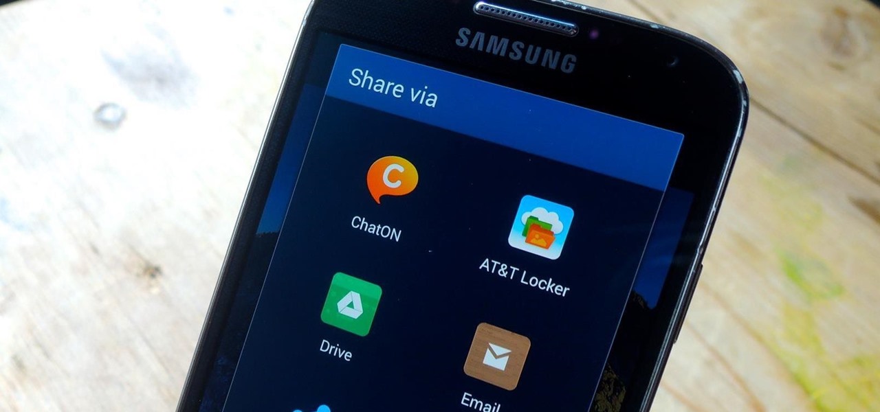
When opening a link or sharing a photo, your Android device will bring up a list of possible applications that you can complete the action with. However, some of the apps included you never use or didn't even know existed, and this leads to unnecessary clutter. Fortunately, if you're rooted, there's an easy way to remove apps from the "Open with" and "Share via" lists.

Some elements of iOS's design, like its minimal color palette, are what make Apple products unique, helping to produce a clean, sleek user experience. But after you jailbreak, that all goes out the window. Once you've tried things like theming your status bar, changing your icons, or applying a new lock screen, you'll never see your iOS device in the same way again.

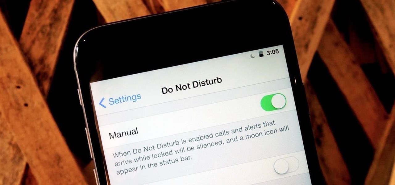
At certain times of the day, like when I finally get home after sitting through aggravating traffic, the last thing I need is the sound of my phone irritating me any further. So, I toggle on the "Do Not Disturb" feature (introduced in iOS 6) on my iPhone and get to enjoy a little peace of mind.

I'm all about customizing my iPhone and making it as different as possible from everyone else's. While it's easy to change the wallpaper, swap keyboards, and hide apps on your home screen, there's not much else you can do aesthetically without jailbreaking, especially when it comes to the status bar and app icons.

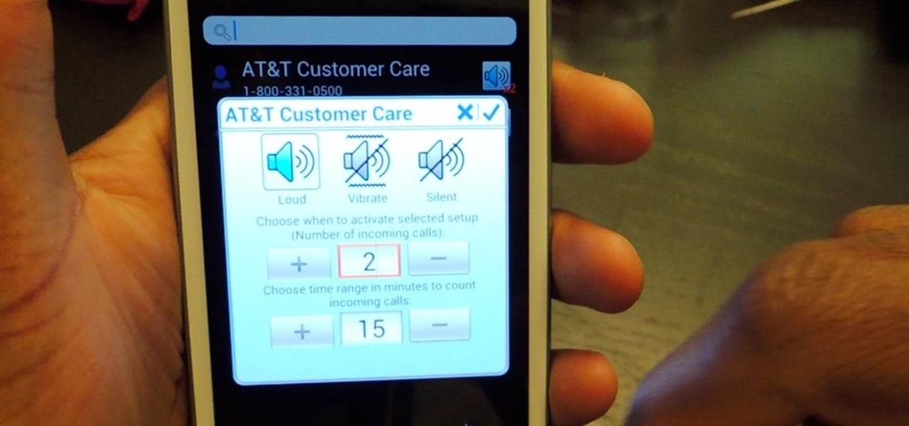
There are two scenarios that absolutely suck when someone calls you. The first is when you accidentally pick up a call you seriously didn't want to take. Debt collectors (thanks college), crazy exes, or that one guy from work. And the other is when you miss a super important call and can't get a hold of them afterwards.

Here we go again, softModders, it's time for another awesome tweak for your iPod, iPhone, or iPod running iOS 7. Have you ever felt like changing your lock screen with a custom text instead of it saying "slide to unlock"? Why shouldn't we be able to edit this? We're not given much freedom as it stands with our Apple devices.

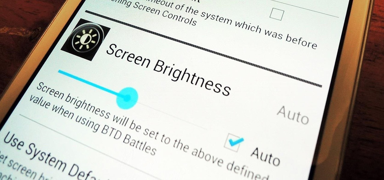
Adjusting the brightness on your Samsung Galaxy S3 can be a real pain sometimes. Each app you open may need a different amount of light to better optimize its use of the screen, and then you have to worry about it potentially eating up your battery life if it's too bright.

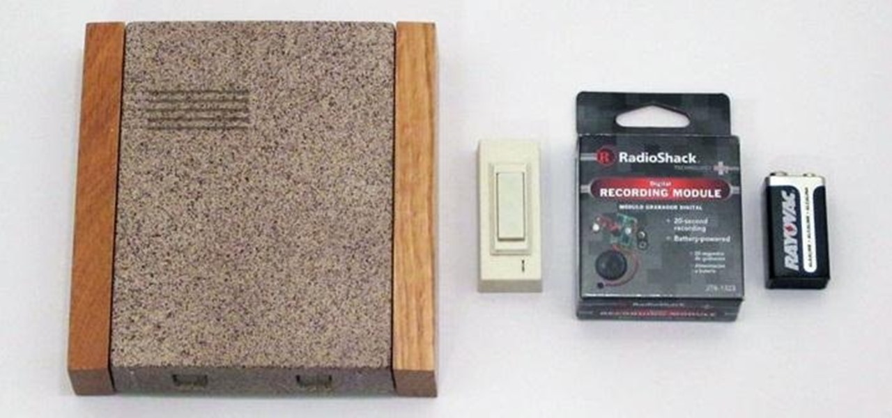
Doorbells are useful and all, but most of them are boring as hell. They use the same old generic sounds to let you know when guests have arrived, as demonstrated below.

I've never really liked to type on a flat or low keyboard. Even the small flip-up stands underneath most keyboards were not good enough for me, as those little legs aren't usually more than 2 or 3 centimeters high. I'd like a minimum of 5 cm, so I decided to make this keyboard base for myself. Aside from giving me the right height and angle, this DIY keyboard base also features LEDs that light up my monitor, the table, and gives a nice background to my desktop. It's even got a built-in stand ...

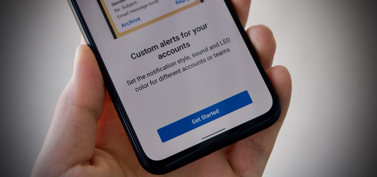
Android is all about customization. That's why it's entirely appropriate that Spark for Android's newest update adds a ton of customization options for your out-of-control email alerts. Now, you can add lights, sounds, and vibrations to notifications, and you can even set specific settings for all of your email accounts.

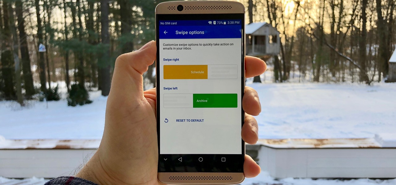
Swipe actions are an integral multitasking feature of any good email client, and Outlook is no exception. The application allows for two swipe actions at a time, but offers seven total options for those actions. We'll show you how to choose which actions go with which swipes to best tailor the app to your needs.

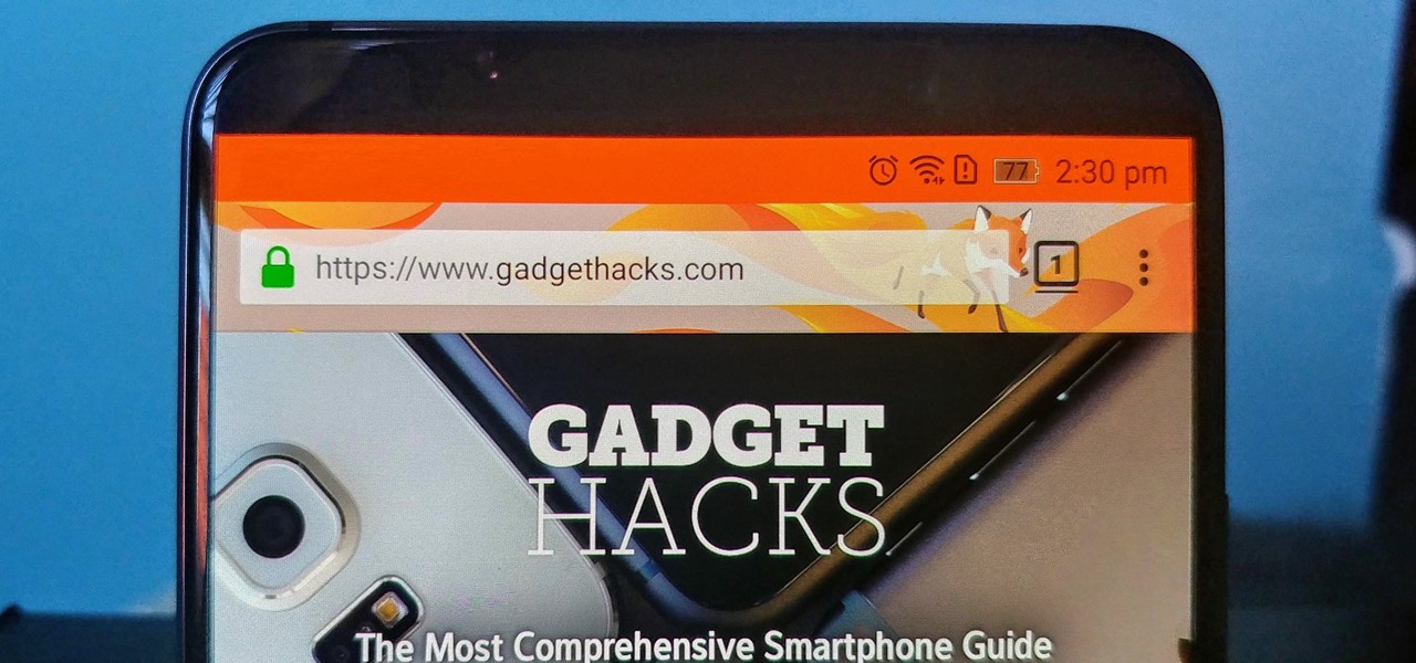
Android is a highly customizable operating system, but that doesn't always apply to the apps you find on the Play Store. Most of the time, when you install an app, you're stuck with the default look and feel — but luckily, this isn't the case with Firefox. Unlike most other browsers, you can actually install themes to change the look of the top browser for Android.

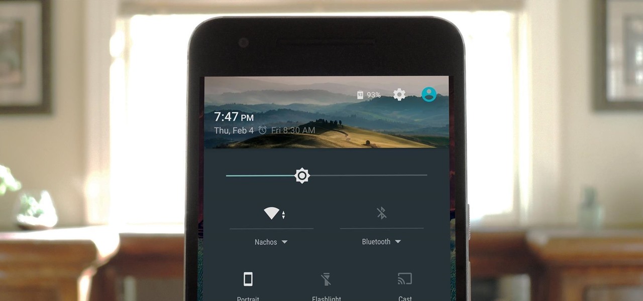
Android's main UI is looking so good these days that you hardly ever see developers spend time creating themes anymore. But even with the beauty of Material Design working in our favor now, there's always room for improvement, right?

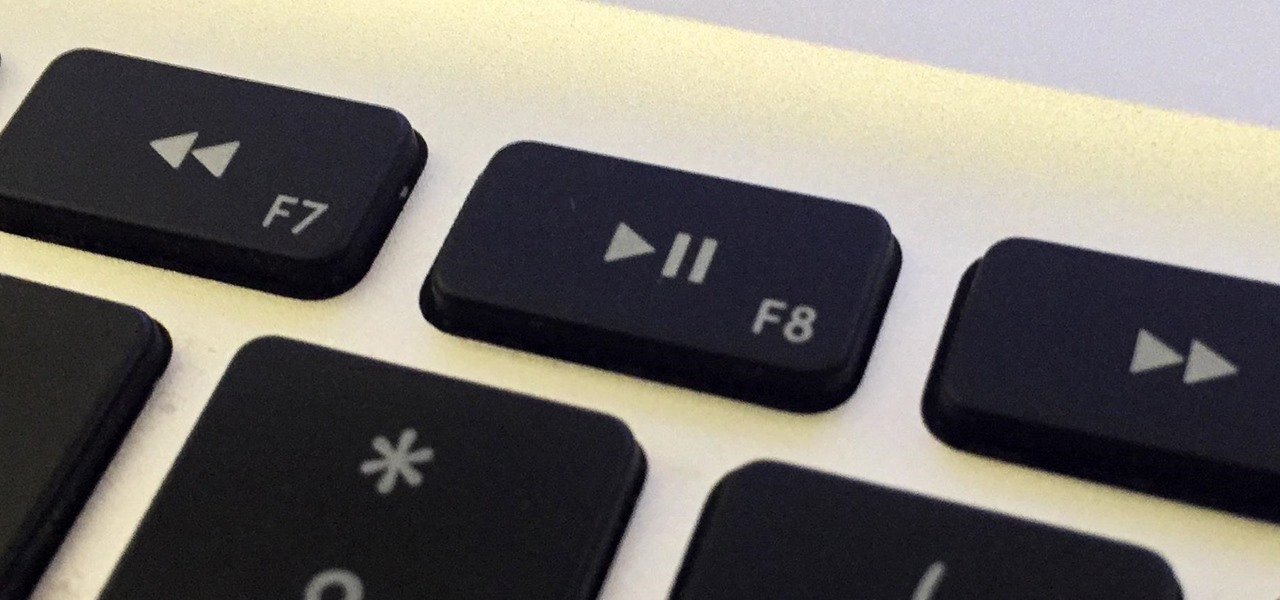
Mac keyboards are great when listening to music or watching a movie, since you can control what's playing without going back into iTunes or QuickTime Player. However, when you're using an app like Photoshop that uses the F7, F8, and F9 as shortcuts, it gets pretty annoying to have to hold down the Fn key. Why can't you just hit the back, play/pause, and skip buttons alone?

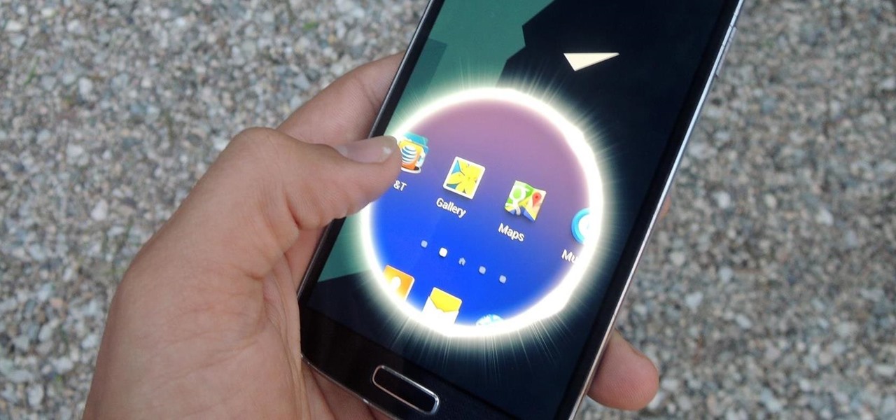
Aside from being able to change the wallpaper and add shortcuts, the Galaxy S4's lock screen doesn't offer much in the department of personalization. The lock screen is efficient and practical, but it's also a little bland.

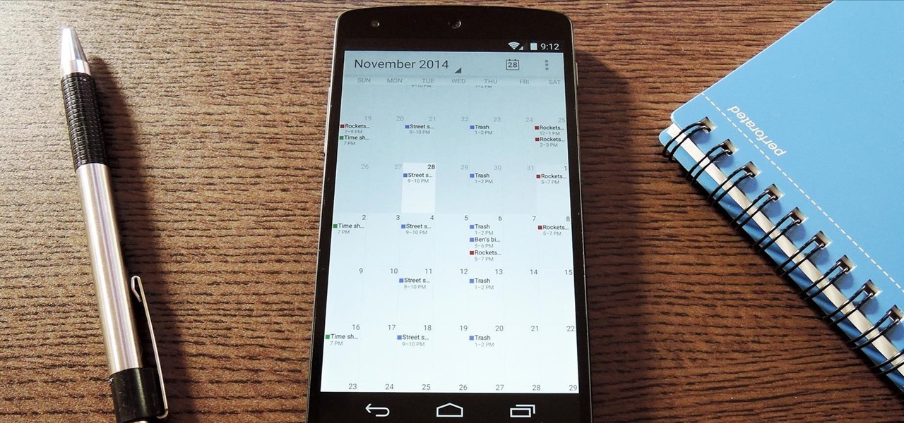
The Google Calendar app hasn't really changed much over the years. As a pre-installed staple on most Android devices, the interface is definitely lacking in some areas. Google knows this, and has plans in the pipeline to completely revamp Calendar's UI alongside Android 5.0's official release.


