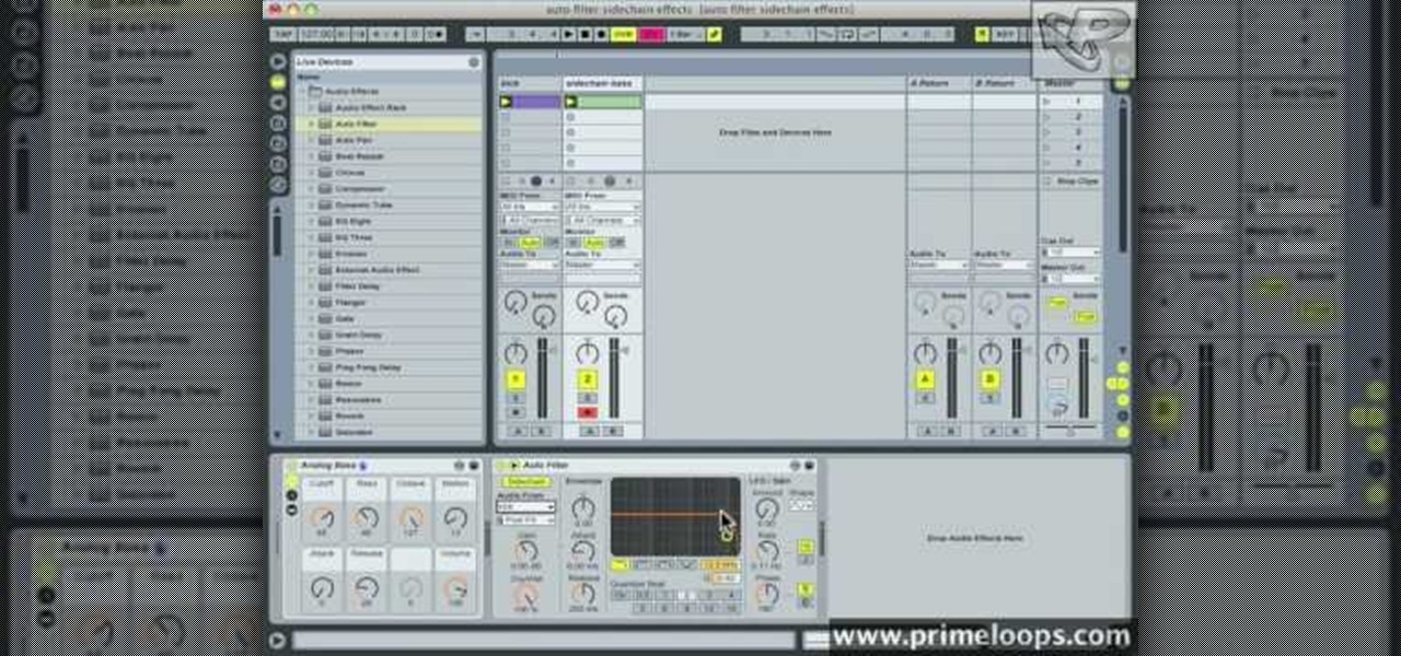
Open your program to a new live set. By using three keys (in Ableton Live), Command (Ctrl), Shift and t, you can create a short cut. Create two new midi tracks making one for (side chain) bass and one for (side chain) kick. To rename a track choose the two keys Command (Ctrl) and r. Next, you can load up the presets, located on the side bar list, one a bass, and, then a basic kick drum by opening up impulse, electronics and Tremor 1994. Now create a couple of patterns. To do this go an empty ...

There are few sounds that actually make me cringe whenever I hear them: silverware scraping on a plate, nails scratching on a chalkboard, and piercing high-frequency tones. While the former two terrors require some physical hardware, sending out high-frequency sounds is as easy as downloading an app.
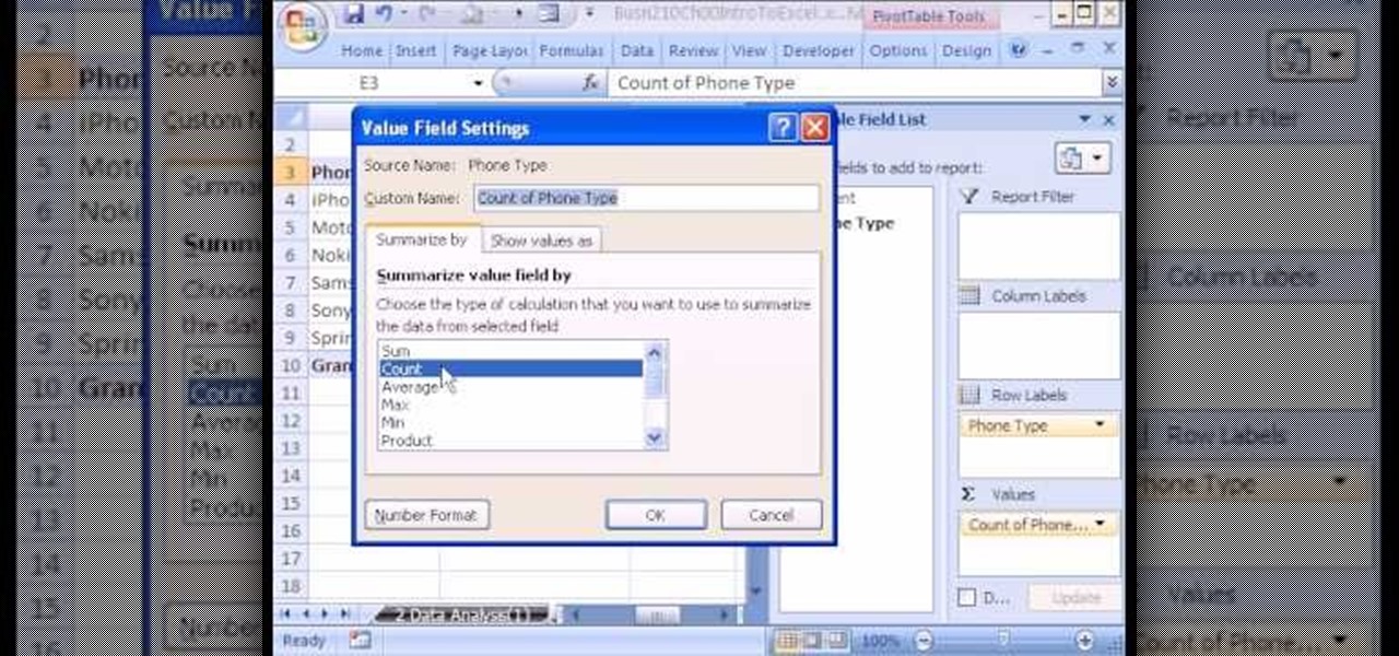
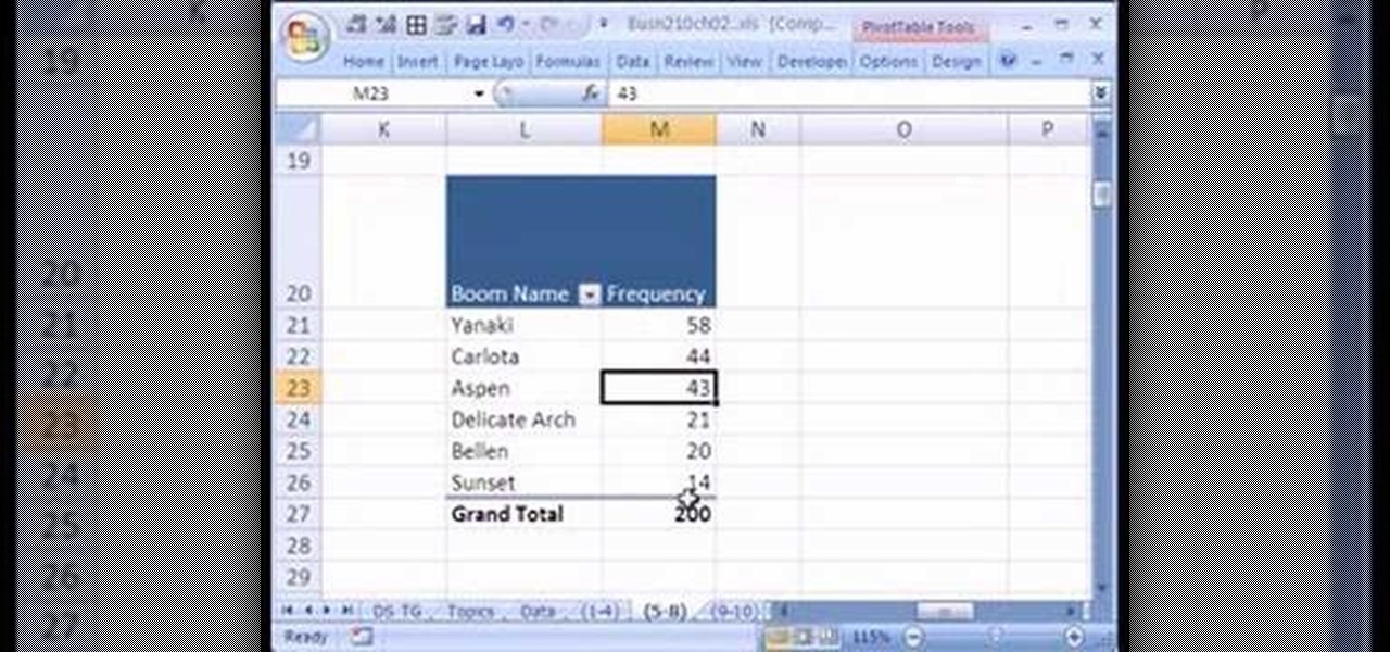
If you use Microsoft Excel on a regular basis, odds are you work with numbers. Put those numbers to work. Statistical analysis allows you to find patterns, trends and probabilities within your data. In this MS Excel tutorial from everyone's favorite Excel guru, YouTube's ExcelsFun, the 4th installment in his "Excel Statistics" series of free video lessons, you'll learn how to create a frequency table and percentage frequency table using a Pivot Table (PivotTable).

There will never be as many ways to quiet the vuvuzela sounds that buzz out of your TV constantly while you watch this World Cup as there are people bothered by the noise, but there are still quite a few. This video will show you how to use a hardware equalizer to cut out certain frequency ranges, largely muting the sound of the reviled horns. If you have a hardware EQ or are willing to buy one just for this, try it!
If you use Microsoft Excel on a regular basis, odds are you work with numbers. Put those numbers to work. Statistical analysis allows you to find patterns, trends and probabilities within your data. In this MS Excel tutorial from everyone's favorite Excel guru, YouTube's ExcelsFun, the 15th installment in his "Excel Statistics" series of free video lessons, you'll learn how to use create a frequency distribution, relative frequency distribution, percent frequency distribution and pie chart wi...
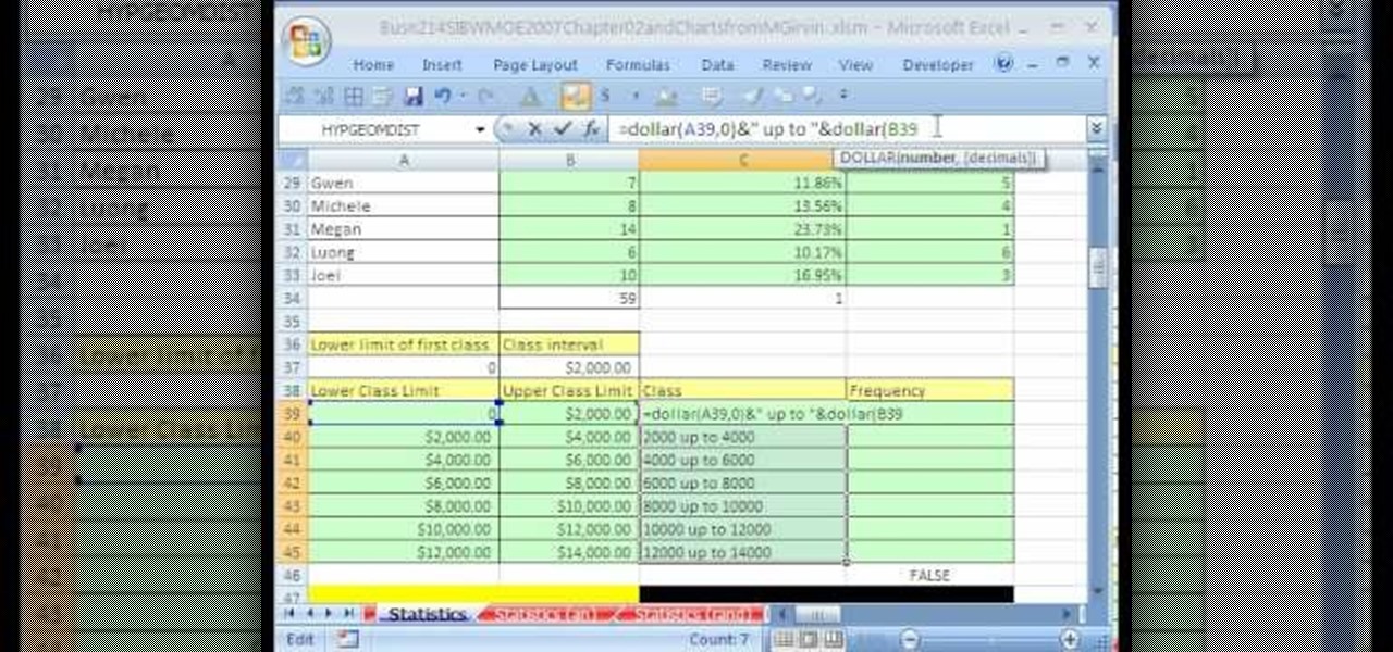
Whether you're interested in learning Microsoft Excel from the bottom up or just looking to pick up a few tips and tricks, you've come to the right place. In this tutorial from everyone's favorite digital spreadsheet guru, ExcelIsFun, the 31st installment in his "Highline Excel Class" series of free video Excel lessons, you'll learn how to build frequency tables and simple histogram charts in Microsoft Excel. Specifically, this video addresses the following subjects:

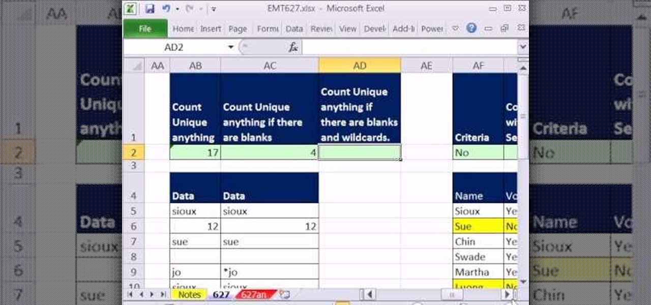
New to Microsoft Excel? Looking for a tip? How about a tip so mind-blowingly useful as to qualify as a magic trick? You're in luck. In this MS Excel tutorial from ExcelIsFun and Mr. Excel, the 627th installment in their joint series of digital spreadsheet magic tricks, you'll learn how to create, edit and otherwise work with FREQUENCY array functions.
Want to mix and scratch like a professional DJ? To be a good DJ you need to understand the concepts of mixing tracks, adding cool effects, and of course you need a good sense of rhythm to line up the beats. This how to video explains the crossover frequency dial. This demonstration shows you the crossover frequency dial on the Peavey VSX active cross over. Watch this DJ tutorial and you can learn how to use the crossover frequency dial so you can separate the bass sounds from the mid and top ...
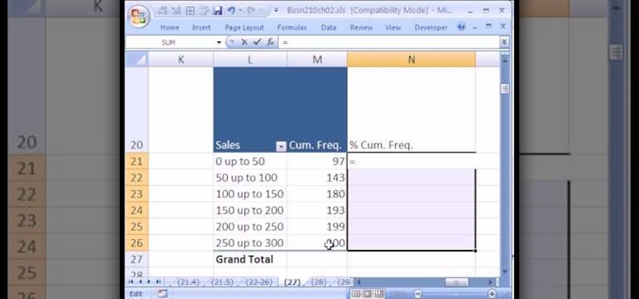
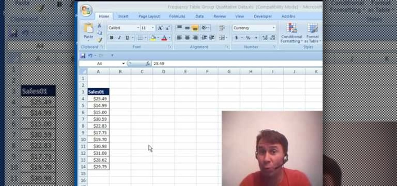
If you use Microsoft Excel on a regular basis, odds are you work with numbers. Put those numbers to work. Statistical analysis allows you to find patterns, trends and probabilities within your data. In this MS Excel tutorial from everyone's favorite Excel guru, YouTube's ExcelsFun, the 26th installment in his "Excel Statistics" series of free video lessons, you'll learn how to create quantitative data cumulative frequency distributions with pivot tables.
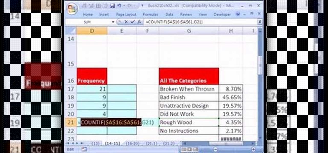
If you use Microsoft Excel on a regular basis, odds are you work with numbers. Put those numbers to work. Statistical analysis allows you to find patterns, trends and probabilities within your data. In this MS Excel tutorial from everyone's favorite Excel guru, YouTube's ExcelsFun, the 19th installment in his "Excel Statistics" series of free video lessons, you'll learn how to group categories in a frequency distribution with a formula (2 COUNTIF) and the pivot table (PivotTable) grouping fea...
This music production software tutorial is on the use of the BV512 vocoder as a frequency specific effects gate in Reason. This way, it is quite easy to draw a frequency curve to delay only your treble, distort your midrange, and reverb your bass, or any configuration imaginable. See how to use vocoders as effect control units in this video.
In this video, Rick show us how to cut monitor feedback with StudioLive 16.4.2. First, assign your microphone to ox 1. Then turn it up and go to the master output of Ox 1 and turn it up until you hear feedback happening. Then, hit the select button on Ox 1 and you can change the compression for any channel. Take out low rumble by putting the low band on and putting it in shelf mode. This will create a high pass filter. Take out frequencies below 130 hertz and then go back to ox 1 master and t...
hether you're interested in learning Microsoft Excel from the bottom up or just looking to pick up a few tips and tricks, you've come to the right place. In this tutorial from everyone's favorite digital spreadsheet guru, ExcelIsFun, the 38th installment in his "Highline Excel Class" series of free video Excel lessons, you'll learn how to use the TRANSPOSE & FREQUENCY functions.
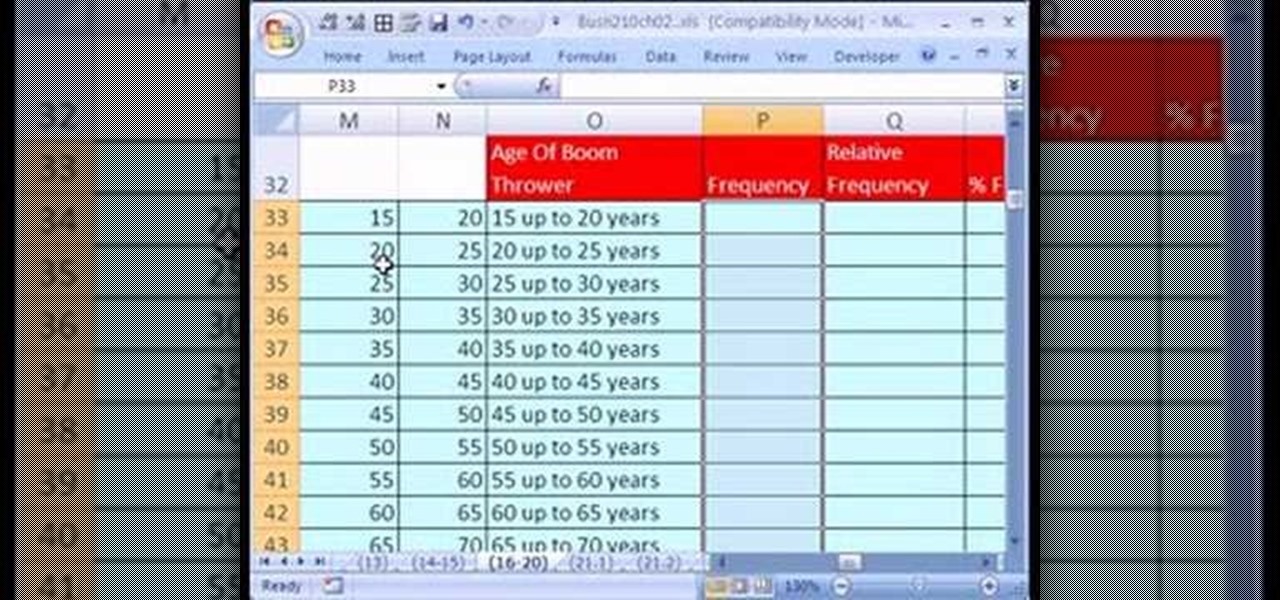
If you use Microsoft Excel on a regular basis, odds are you work with numbers. Put those numbers to work. Statistical analysis allows you to find patterns, trends and probabilities within your data. In this MS Excel tutorial from everyone's favorite Excel guru, YouTube's ExcelsFun, the 21st installment in his "Excel Statistics" series of free video lessons, you'll learn how to build labels and counting formulas for a frequency distribution.
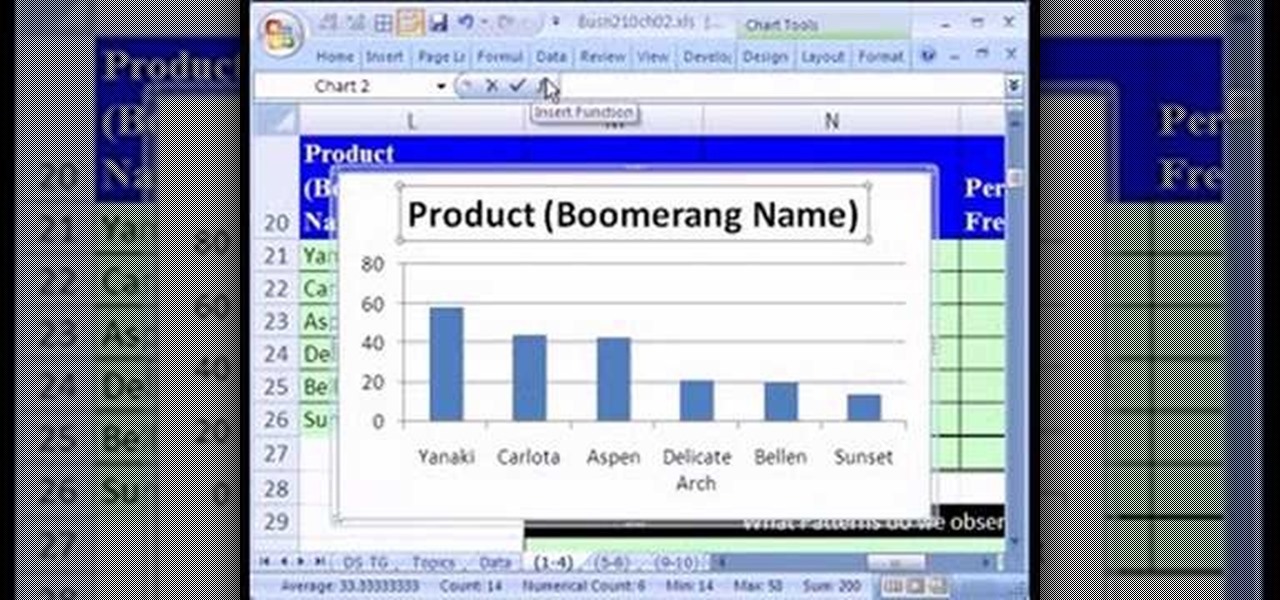
If you use Microsoft Excel on a regular basis, odds are you work with numbers. Put those numbers to work. Statistical analysis allows you to find patterns, trends and probabilities within your data. In this MS Excel tutorial from everyone's favorite Excel guru, YouTube's ExcelsFun, the 13th installment in his "Excel Statistics" series of free video lessons, you'll learn how to create a column chart from a frequency distribution for categorical data.
If you're in the market for a new smartphone, you'll likely scan spec sheets and read reviews of the top phones, compare display size and technology, RAM amount, and processors. But one factor that is often overlooked is cell reception — and for T-Mobile subscribers, there's only one device that has flagship specs and an exclusive antenna that will actually improve your signal.
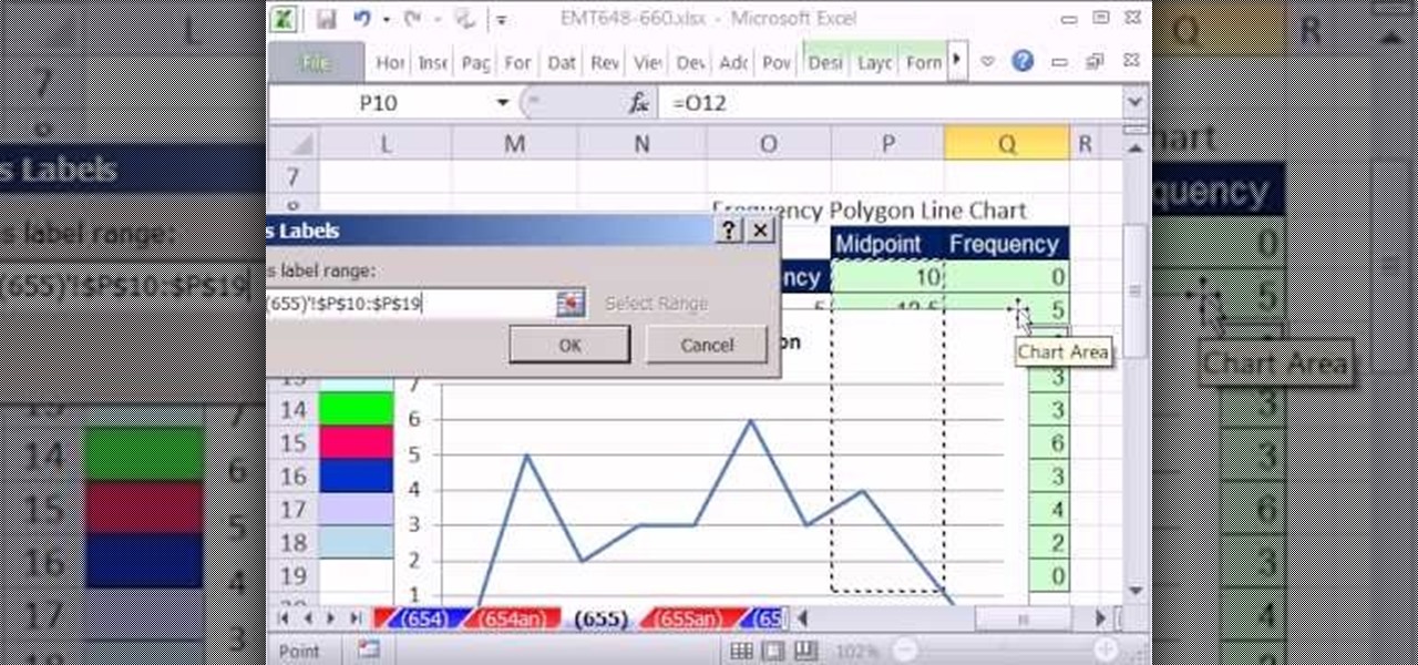
New to Excel? Looking for a tip? How about a tip so mind-blowingly useful as to qualify as a magic trick? You're in luck. With this video tutorial from ExcelIsFun, the 329th installment in their series of digital spreadsheet video tutorials, you'll learn how to create a frequency table. Then see how to calculate the midpoint of each category and make a frequency polygon with two or more lines (two or more data sets).
Learn to make your own super effective bass traps and acoustic panels with materials from your local hardware store, just by watching this home audio video tutorial.
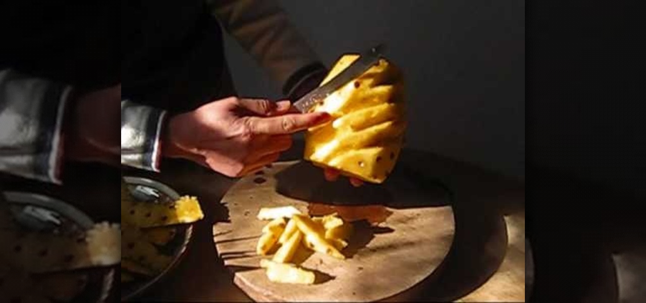
Brian demonstrates a simple method of cutting a pineapple in this entertaining video. He starts reviewing some pineapple research. Pineapples are named after pinecones! Brian also discusses the concerns of eating pineapple for people with certain health conditions. First twist and pull off the flower top of the pineapple. Then cut off the top and bottom of the pineapple so that they are both flat surfaces. Then cut off the skin of the pineapple, retaining as much of the flesh as possible. Use...
New to Microsoft Excel? Looking for a tip? How about a tip so mind-blowingly useful as to qualify as a magic trick? You're in luck. In this MS Excel tutorial from ExcelIsFun and Mr. Excel, the 15th installment in their joint series of digital spreadsheet magic tricks, you'll learn how to use a pivot table with grouping and a count function to create a frequency distribution.
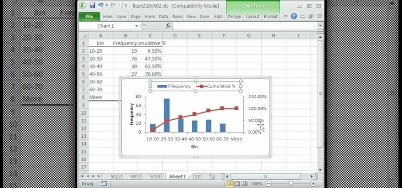
A histogram is a summary graph showing a count of data points that fall in various ranges. Histograms are used in statistics and other forms of mathematics. In this video, learn how to create your own histogram using data analysis on the computer. This tutorial will show you how to create a frequency distribution, a cumulative frequency distribution, a histogram chart and an ogive chart with the data analysis add-in.
This instructional turntable video shares some techniques for the aspiring DJ. EQing is an important aspect of mixing on the turntable. EQing filters out certain frequencies in your music. The idea is to have control over the bass, treble, high and middle frequencies, to create your own remix. Watch this tutorial to help you build a tune on the turntable.
A CDJ player has a filter button and slider which allows you to isolate the bass, mid, or top frequencies in the music. You can use the bass, mid, and treble dials on a mixer to emulate this effect.
We've all been there — using Google Maps for navigation and waiting for the app to find our location. As we drive around, we keep hoping it will get a lock in time to make the next turn. Well in the US, we finally have a solution to this problem, and it's the OnePlus 7 Pro.
As a parent, navigating smartphone usage with your children can be a perilous journey as you hand them that new device they've always wanted, or even your older hand-me-down phone or tablet.
In order to cut into a fresh pineapple, you will need a sharp knife and a cutting board.
In this video tutorial the instructor demonstrates resonant frequency. In this video the instructor shows the sound of resonance and how to generate it. Resonance is a forced vibration of energy into molecules of an object that makes those molecules vibrate at their resonant frequency. When these molecules vibrate naturally they produce a kind of noise that can be annoying some times. In this video the author makes a small object using a rubber band and a net that produces vibrations when rot...
How to prepare bok choy for Chinese food
In this video from kandeejohnson we learn how to cut a sports jersey or sweats into trendy summer tops. On a football jersey, she cut the shoulders off, right above the seam. And where there was too much fabric, she folded it and pinned it so it wouldn't hang too low. With a sweatshirt on, look in the mirror and see where you want to cut it. Make snips which will be your mark so you know where to cut. Make a rough cut of it while you are still wearing it. Now take it off and straighten all th...
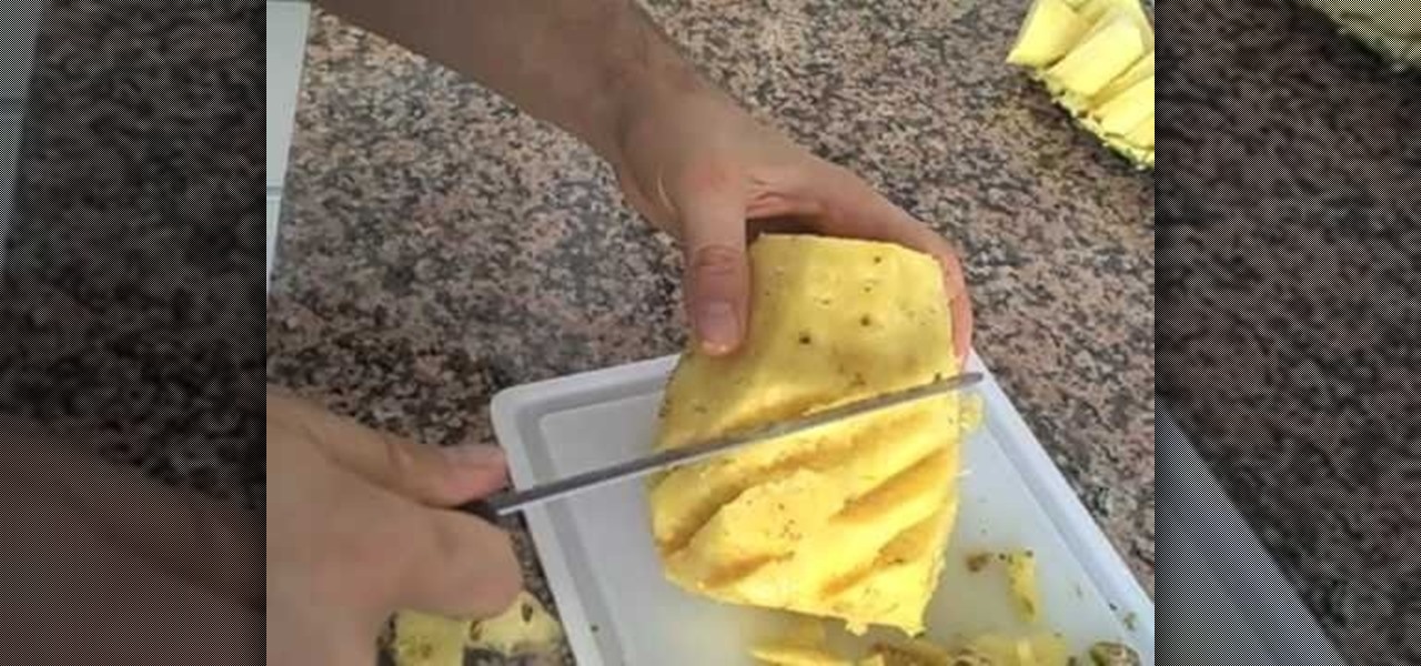
This video showcases the skills of the demonstrator in cutting a pineapple in an artistic manner. He begins by removing transverse sections, one each from top and bottom with a sharp knife. He then cuts off the remaining skin vertically in eight thin sections to keep wastage to a minimum. He marks off oblique lines one above the other all along the periphery. He cuts off very thin and small oblique slices along the marked lines, rotating the pineapple slowly. The resulting shape is now like a...
In this tutorial, we learn how to prepare a cantaloupe. First, cut the top and the bottom off of the cantaloupe. After you have these cut off, take a sharp knife and cut from the top to the bottom of the fruit. Cut just the skin off, making sure you get the least amount of orange left on the skin when it's cut off. Continue to cut all the way around the cantaloupe until there is no more green or skin left on the fruit. After this, cut the fruit in half and then scoop out all the seeds. From h...
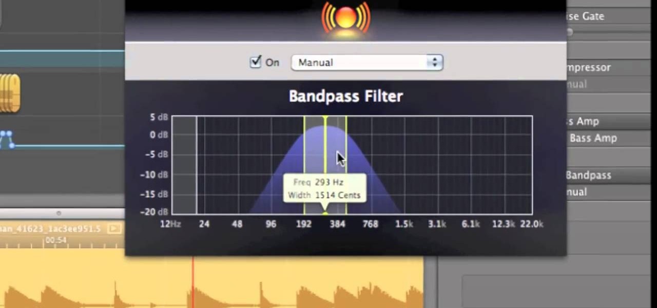
GarageBand is a great tool for composing your own beats and jingles, but when it comes to filters, it's not so easy to understand exactly what they do, as in the case of the AUBandpass filter. This video explains exactly what the AUBandpass feature does in GarageBand and how it can be used to make quality-sounding instrumentals for you beat projects.
New to Microsoft Excel? Looking for a tip? How about a tip so mind-blowingly useful as to qualify as a magic trick? You're in luck. In this MS Excel tutorial from ExcelIsFun, the 655th installment in their series of digital spreadsheet magic tricks, you'll learn see how to create a statistical frequency polygon using a line chart. Also see how Excel mistakenly interprets number category label data as Number Series data.
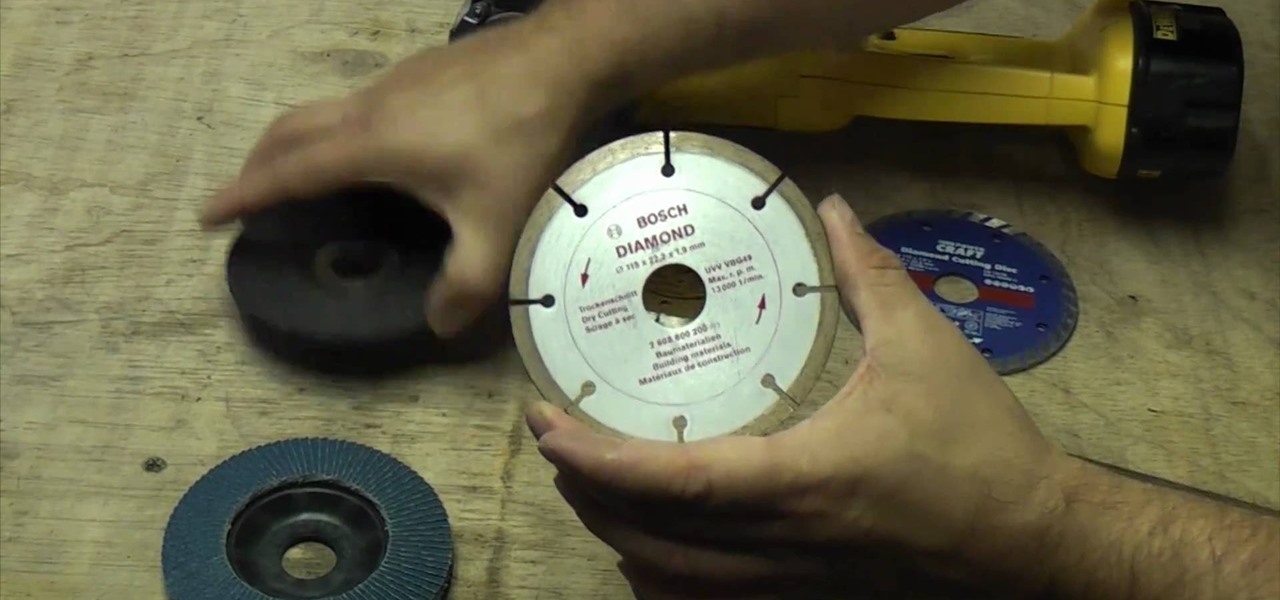
Angle grinders (or cut-off tools) are great for all sorts of major construction and repair projects. One of the reasons for this is that you can put all types of discs on them for different jobs. This video tell you all about the different types of discs and which ones you should use for different kinds of jobs.
Sarah Dussault gives us instructions on how to appropriately cut her favorite fruit, the mango. -There is a huge seed where the pit is, so first you want to cut off the sides. -Take one side and cut into a grid pattern. -Now you can simply pop the cubes of mango off and eat them. -Be careful, the skin of mangoes contain similar oils to those found in poison ivy. -Take the other side of the mango and cut into slices and then peel the skin off. This is another technique for cutting mangoes. Jus...
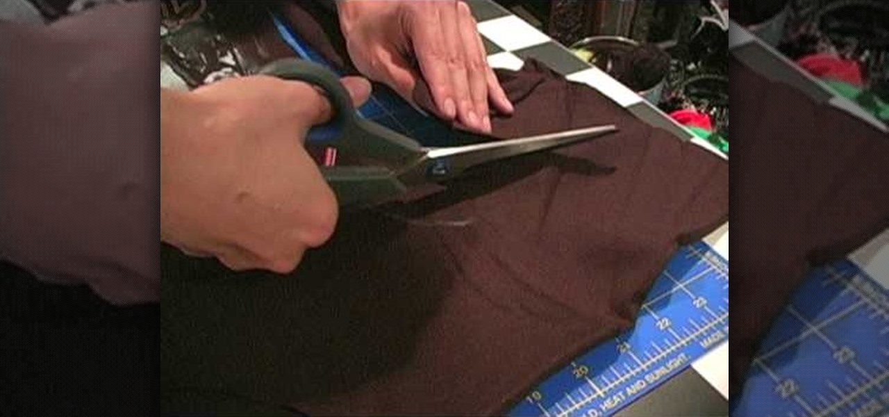
In this tutorial, we learn how to make an off the shoulder t-shirt dress. You will need: t-shirt, scissors, pins, and needle/thread. First, cut a wide scoop and cut off the bottom hem. Next, cut the sides and turn it inside out. After this, measure your bust, waist, and hips and then mark them on the shirt. Now, trim away the excess fabric according to your markings, then stitch up the sides. Once finished, cut off the sleeves making sure the angles follow the arm holes. Now, stitch those hol...
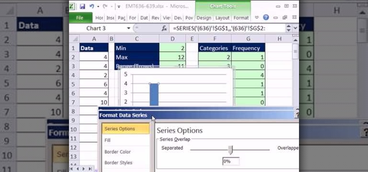
New to Microsoft Excel? Looking for a tip? How about a tip so mind-blowingly useful as to qualify as a magic trick? You're in luck. In this MS Excel tutorial from ExcelIsFun, the 636th installment in their series of digital spreadsheet magic tricks, you'll learn how to create a dynamic frequency table and histogram chart using defined name formulas for dynamic ranges that use the INDEX function. See other formulas that use the COUNTIF, IF and ROWS functions that help to make it fully dynamic....
Frederic Patenaude demonstrates selecting and cutting a fresh pineapple. To select a fresh pineapple, he discusses that the color is not a great indicator. Instead he suggests looking at the bottom of the pineapple to make sure the base is yellow, indicating ripeness. He also smells the pineapple to make sure it smells ripe. he also checks for bad spots, softness or leakage around the whole fruit. He communicates that any tests with leaves are also not indicators. One way to cut a pineapple i...
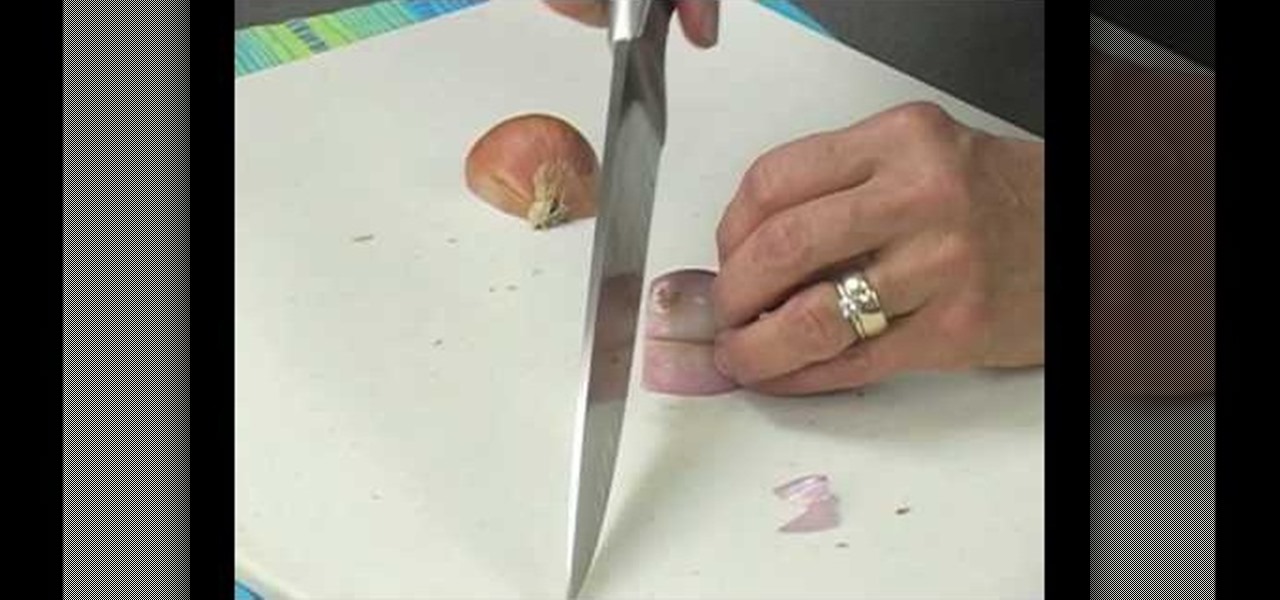
How to buy, store, and chop shallots
5G is undoubtedly the future of mobile networks, and there's a good chance your next phone will have it. But just like with 4G, as carriers race to get the best 5G coverage, the ones running behind are abusing marketing terms to make themselves seem further ahead than they actually are.