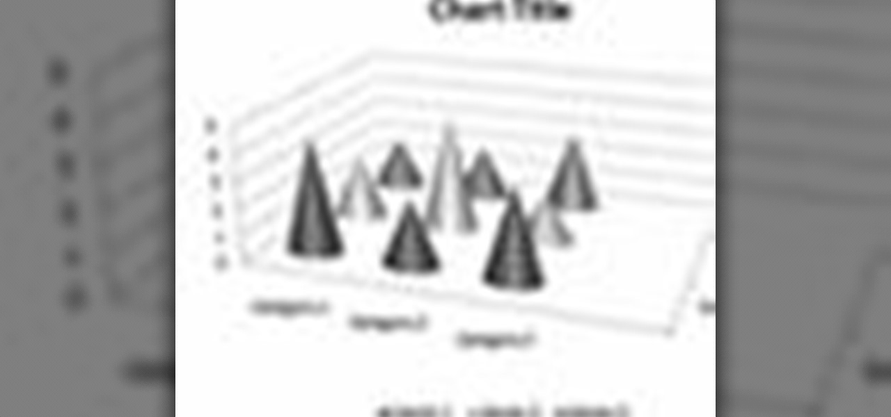
In order to format graphs and charts using Microsoft Word 2007, click on Chart Tools. The tabs at the top of the screen provides you with your options. You can change the type of chart or graph by clicking on Change Chart Type. If there is a particular type of chart that you would like to use again and again, then you can save it as a template via the Save As a Template icon. You can edit the data in your chart of graph by clicking on Edit Data. You can modify the chart layout by clicking on ...

New to Microsoft Excel? Looking for a tip? How about a tip so mind-blowingly useful as to qualify as a magic trick? You're in luck. In this MS Excel tutorial from ExcelIsFun, the 637th installment in their series of digital spreadsheet magic tricks, you'll learn how to create a dynamic two data series line chart for blood pressures — how to look up a chart using defined names, a data validation list, and a formula using the INDIRECT function inside a picture of a chart.

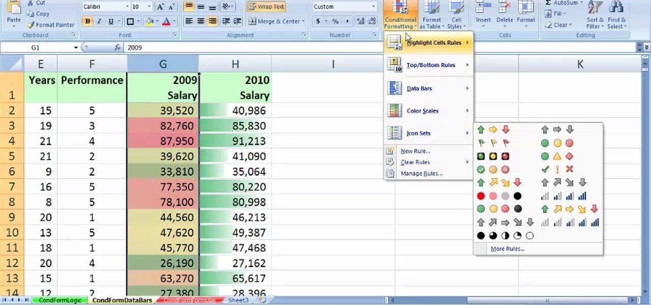
See how to create value-based formatting using data bars and color scales in Excel 2007. See how to use the Format Cells dialog box and the pop-up mini-toolbar in Microsoft Excel 2007. Whether you're new to Microsoft's popular digital spreadsheet application or a seasoned business professional just looking to better acquaint yourself with this particular iteration of the program, you're sure to be well served by this video tutorial. For more information, including step-by-step instructions, w...

New to Microsoft Excel? Looking for a tip? How about a tip so mind-blowingly useful as to qualify as a magic trick? You're in luck. In this MS Excel tutorial from ExcelIsFun and Mr. Excel, the 20th installment in their joint series of digital spreadsheet magic tricks, you'll learn how to summarize survey data with a pivot table (grouping & report filter), COUNTIFS function (4 criteria), SUMPRODUCTS formula, SUMPRODUCTS & TEXT functions and DCOUNT database function.

New to Microsoft Excel? Looking for a tip? How about a tip so mind-blowingly useful as to qualify as a magic trick? You're in luck. In this MS Excel tutorial from ExcelIsFun and Mr. Excel, the 5th installment in their joint series of digital spreadsheet magic tricks, you'll learn how to create horizontal subtotals for a data set using the IF, SUM and SUMIF functions. Also see conditional formatting for non-contiguous cell ranges using a TRUE/FALSE logical formula with the NOT symbols.

Whether you're interested in learning Microsoft Excel from the bottom up or just looking to pick up a few tips and tricks, you're in the right place. In this tutorial from everyone's favorite digital spreadsheet guru, ExcelIsFun, the 21st installment in his "Highline Excel Class" series of free video Excel lessons, you'll learn how to add conditional formatting to data bars and icons to show relative size, icons to show relative size, to highlight values within 1 standard deviation, to highli...

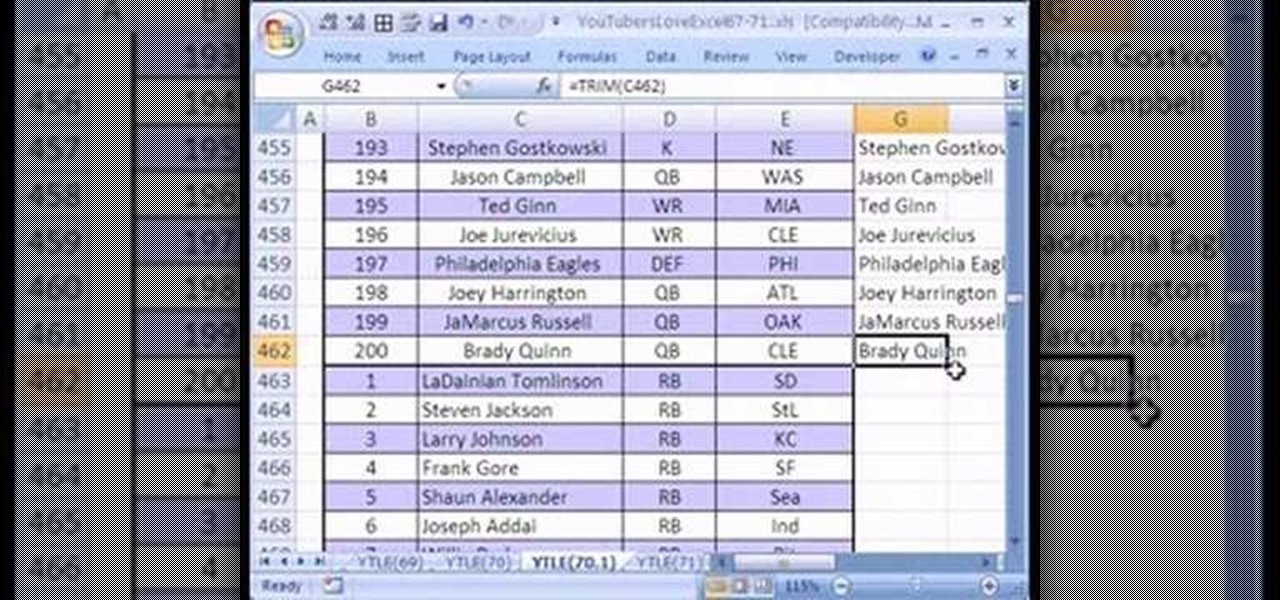
Love Microsoft Excel? This clip contains a tip that just might induce you to. With this free video tutorial from ExcelIsFun, the 70th installment of his "YouTubers Love Excel" or YTLE series of free video MS Excel lessons, you'll learn how to clean up a bad data set with the TRIM function before building a pivot table (PivotTable) to calculate an average. Learn to love digital spreadsheets more perfectly with the tricks outlined in this free Microsoft Office how-to.

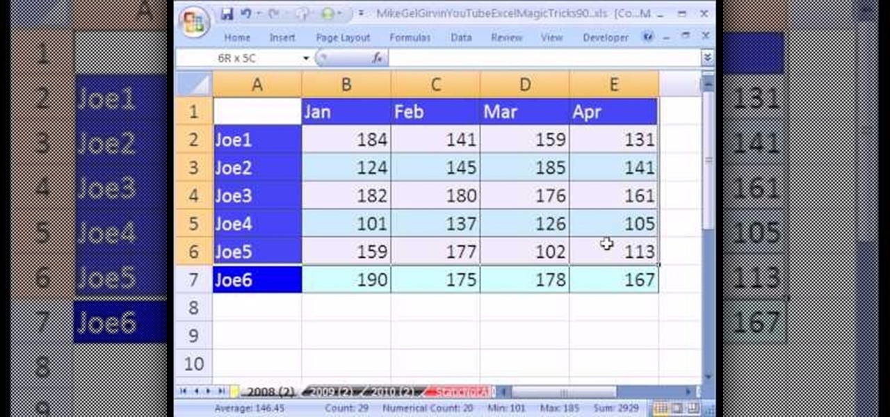
New to Microsoft Excel? Looking for a tip? How about a tip so mind-blowingly useful as to qualify as a magic trick? You're in luck. In this MS Excel tutorial from ExcelIsFun, the 90th installment in their series of digital spreadsheet magic tricks, you'll learn how to use the consolidation feature in Excel. Summarize data from a number of different tables quickly using consolidation.

New to Microsoft Excel? Looking for a tip? How about a tip so mind-blowingly useful as to qualify as a magic trick? You're in luck. In this MS Excel tutorial from ExcelIsFun, the 5th installment in their series of digital spreadsheet magic tricks, you'll learn how to name a cell range, use data validation to add a drop-down list, and how to use the VLOOKUP function to look up values.

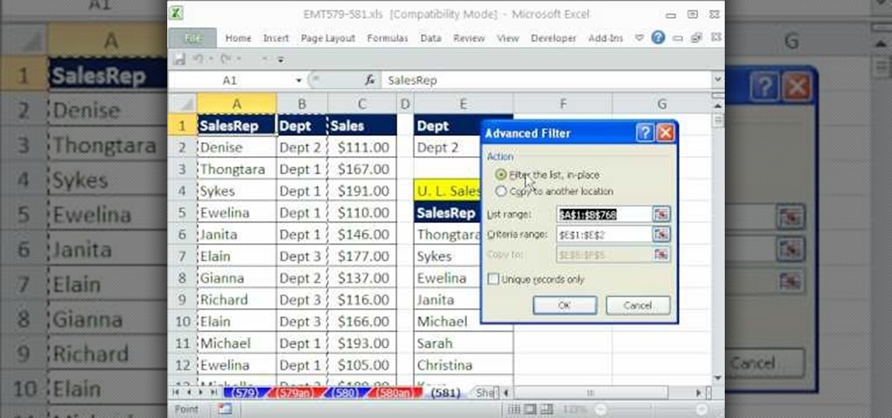
New to Microsoft Excel? Looking for a tip? How about a tip so mind-blowingly useful as to qualify as a magic trick? You're in luck. In this MS Excel tutorial from ExcelIsFun, the 581st installment in their series of digital spreadsheet magic tricks, you'll learn how to use the advanced filter tool with criteria to extract a unique list of employees for each department from a huge data set with transactional records.

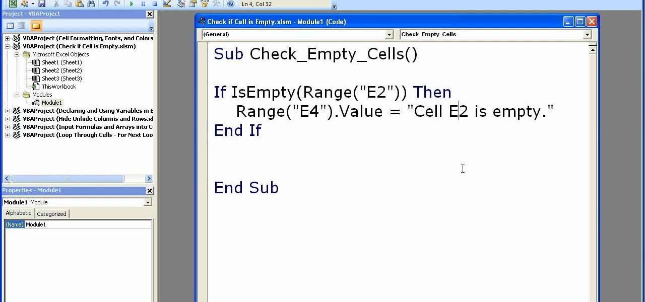
Microsoft Excel is used to store and work on data by storing them in rows and columns in tables. You can use a macros to check if a cell is empty. To do this you have to know two short cuts. The first is the VBA Window short cut which is Alt + F11 and the other one is View Macros short cut which is Alt + F8. So open an Excel spread sheet and insert some data into a small table. Now create a macro for this tutorial. You can use and IsEmpty() functions to check if a cell is empty. Use this func...

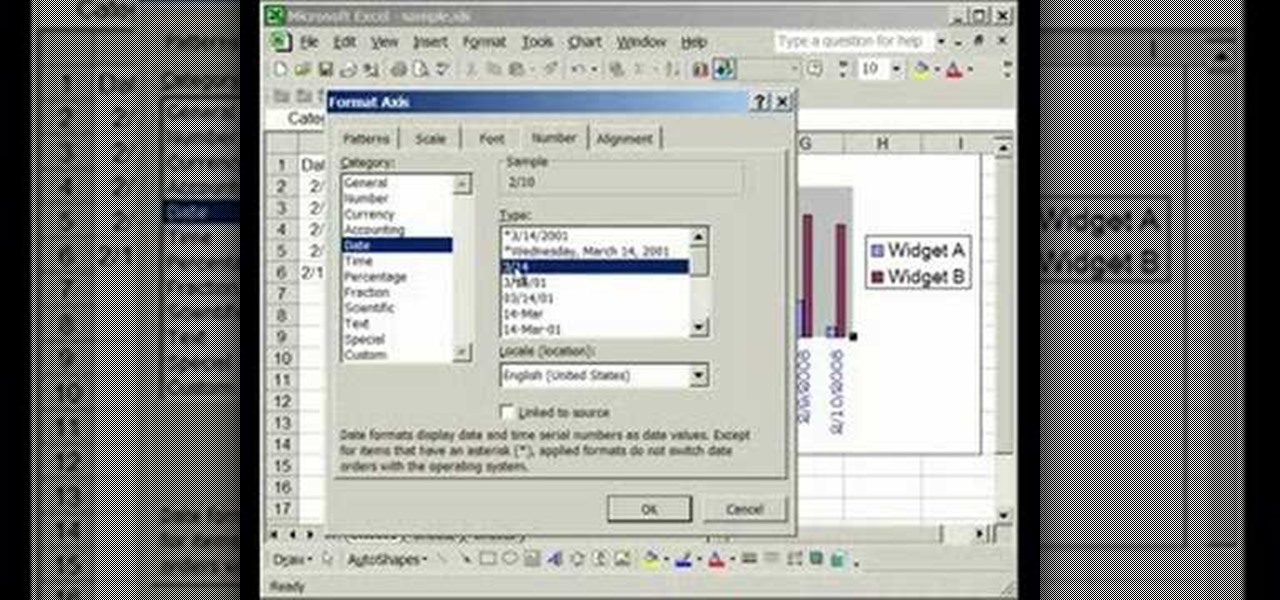
This video is about formatting the charts in Excel especially the x and y axes. The video begins by selecting a chart and right clicking the dates at the bottom of the data points. The format axis window pops up and by making changes to the style, color and the weight of lines given in the patterns tab, you can change the way the x-axis looks like. You can also change appearance of characters appearing close to the x-axis by selecting options in the font menu. You can also change the format o...

RAID, or Redundant Array of Independent Disks, lets you divide and replicate data among multiple hard disk drives for information storage security. This video tutorial demonstrates how to install Ubuntu in a RAID 0 array. Before starting, you'll need at least 2 hard drives and an Ubuntu alternate installation CD. RAID 0, or striped disks, let's you install an operating system, such as Ubuntu, on a partition, while using others for data storage, as illustrated in this instructional segment.

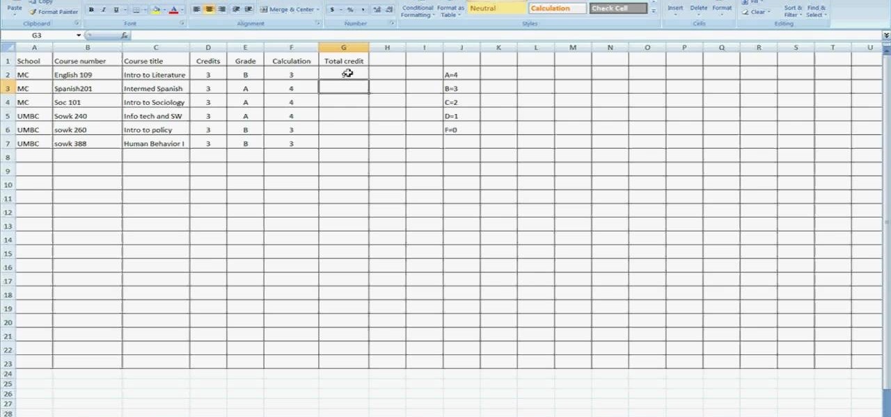
Open Microsoft Office Excel. Across the top notice letters (columns), along the sides are numbers (rows). The columns and rows can be extended by highlighting sections and right clicking and choosing the high of the row. You can also select to add a border, and change the orientation of your cells.

In this Computers and Programming video tutorial you will learn how to delete temporary internet files in Internet Explorer 8. The video is from FreeComputerRepair. Click on Start -> control panel ->network and internet connections -> internet options. Now the internet properties dialog box opens up. Here you go down to browsing history and click ‘Delete’ button. This will open up the Delete Browsing History window. Here you check all the data that you want to delete. If you don’t want to del...

In this video the instructor shows how to create charts and graphs in Microsoft Word. First, open the Word document and select an area to insert the charts. Now go to the Insert tab in the ribbon and select the Chart icon. The Insert Chart window opens up with various chart templates. There are various categories of charts like Line, Pie, Bar in the left hand side. In the right hand side you can see the sample charts available and you can select any of them that you want. Now it transfers you...

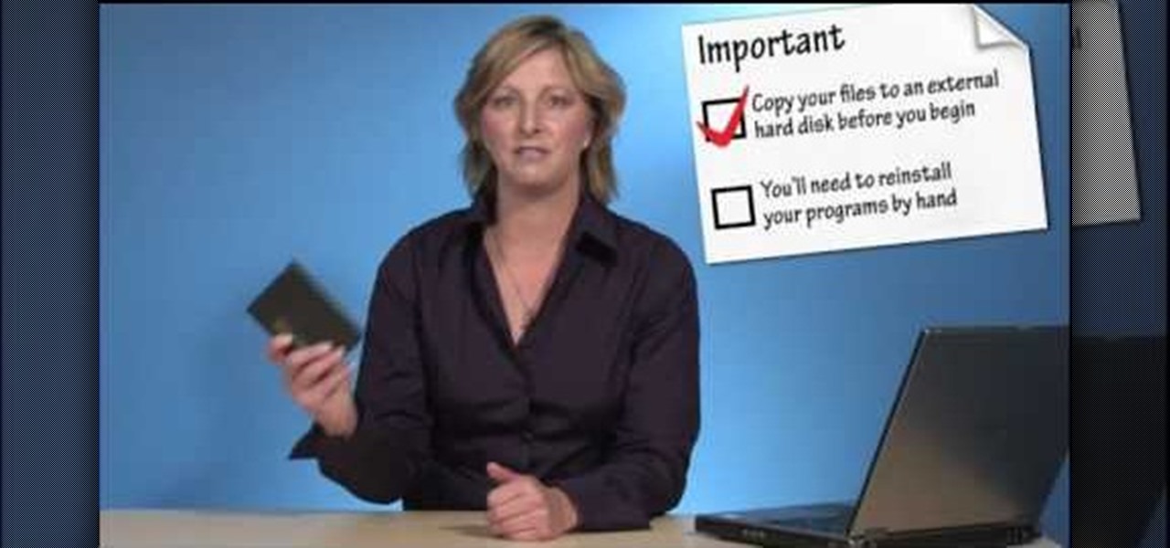
Custom optioned installation includes the following: Copy the files to an external hard disk before starting your installation, then you will reinstall your programs by hand by using the windows easy transfer and transfer the data into the hard disk.

In this tutorial, Mike Lively of Northern Kentucky University gets you started in getting the Adobe Air Content Management System up and going.

For Infinity Exists Full Disclosure's first Website Hacking episode, we demonstrate how to exploit a security vulnerability occurring in a website's database to extract password hashes. Sql (Structured Query Language) is a computer language designed for the retrieval and management of data in a system's database. The Attack, known as Sql Injection, manipulates Sql statements before they are sent to the Sql Server, allowing the Attacker to create, change, or retrieve data stored in the database.

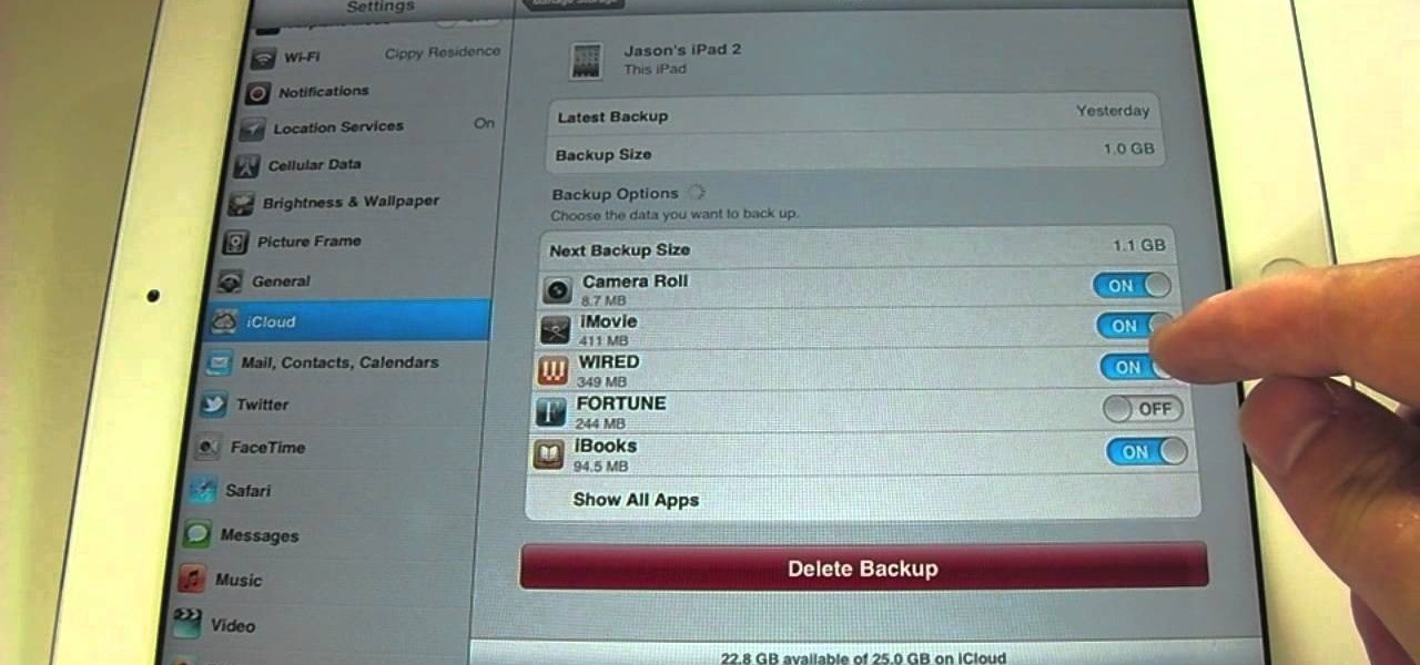
If you want to clear up some extra space in iCloud with iOS 5, take a look at this guide to learn how to manage your data on an iPad or iPhone running the service. You will need to access the iCloud panel under "Settings" to do so.

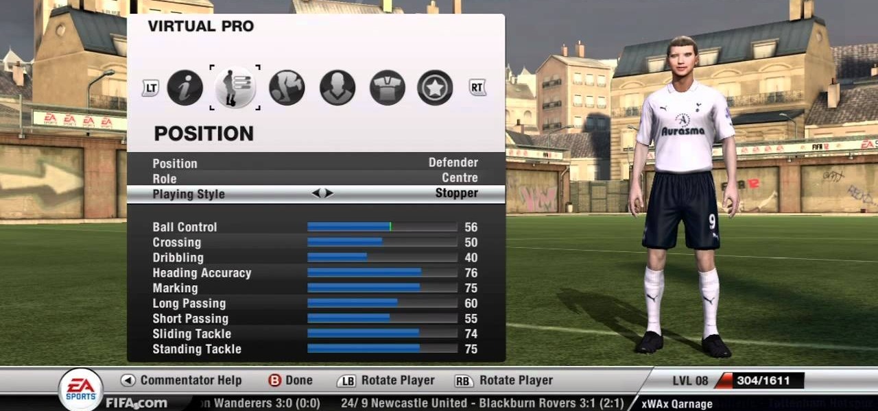
There are several methods in this guide that will help you earn the Boost Defense and Goalkeeper accomplishments in Fifa 12. Be sure not to change the formation of the BYA boosting team during step 3, otherwise the team data will become corrupt. This may be resolved in the future.

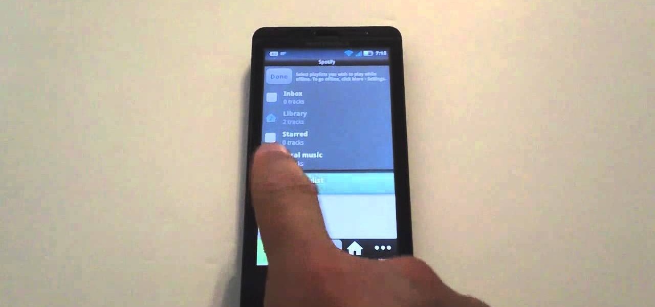
If you want to keep listening to music on your Android smartphone or tablet using the Spotify app, take a look at this video guide from Cnet on how to use Spotify in offline mode. This will let you keep listening to music while in an elevator or when you lose a data connection.

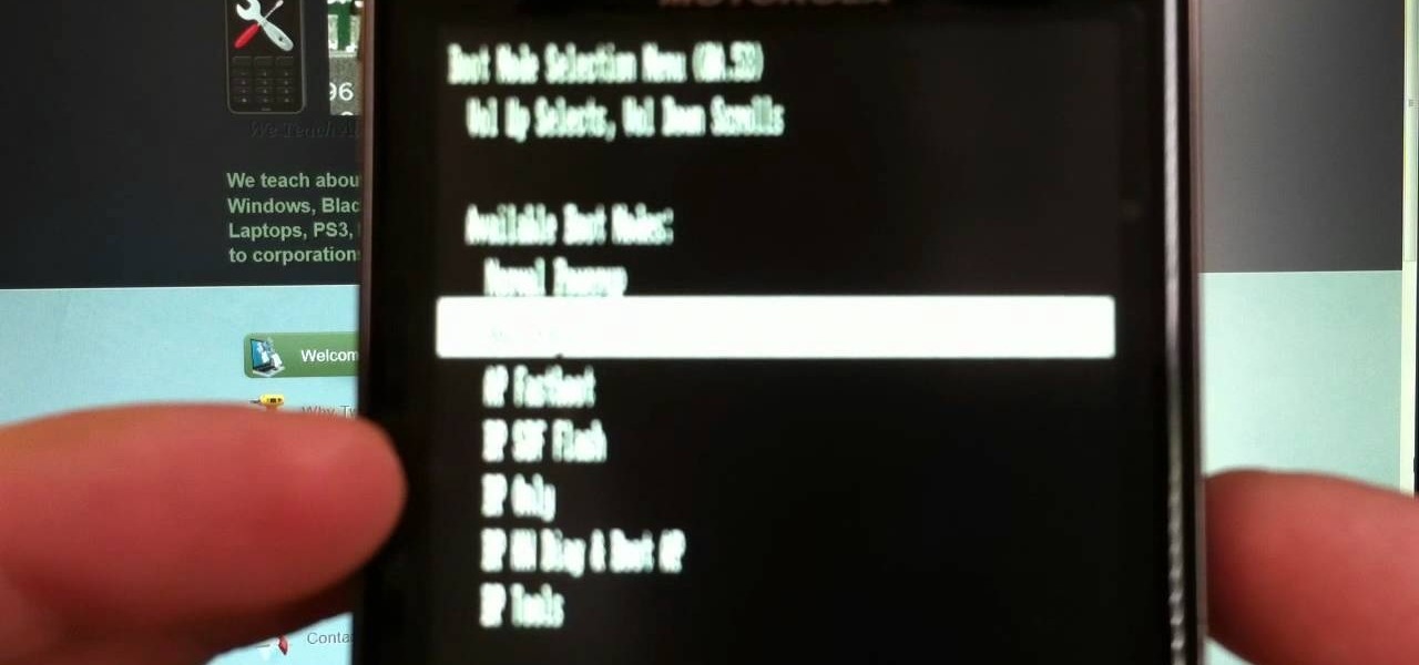
If your phone won't boot or you need to dig deeper into the Android operating system on your Motorola Droid Bionic, this tutorial on booting the Bionic into recovery mode should help you out. Just be careful, because a factory reset on the Verizon Wireless smartphone will cause you to lose all of your data.

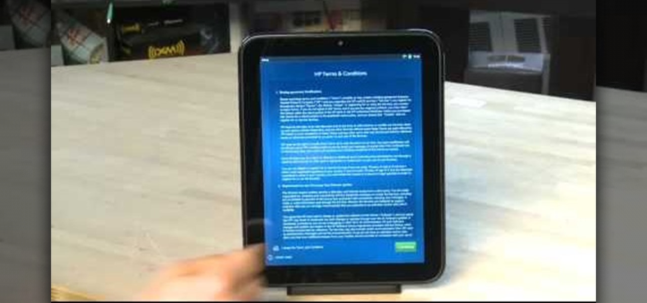
If you were one of the lucky individuals to score a TouchPad before HP discountinued them, you will need to proceed through the initial setup wizard when you turn on the device for the first time, or after performing a data wipe and reset on the tablet. This guide will walk you through everything from accepting the terms & conditions, connecting to a Wi-Fi network, and creating a webOS account for the first time.

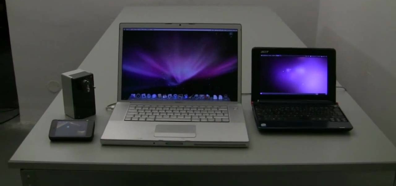
The Newstweek might be the coolest new device of 2011 that no one is talking about. It's a pocket-sized device that allows you to access the data streaming through a wireless internet access point and change the news being read by fellow users at the hotspot, from any site, however you want. It allows you to do some amazingly inspiring and sinister things, like any really progressive technology, and this video will show you how to use it.

This half-hour episode of Hak5 covers several topics: Using a DSLR camera to create HD footage, building your own Google TV, unlocking & copying locked files with Lock Hunter, using PicPick for screen capture, using WinDirStat for analyzing & cleaning your hard drive, setting up a secure FTP server with Ubuntu Server, and secretly copying data from USB drives with USB Dumper.

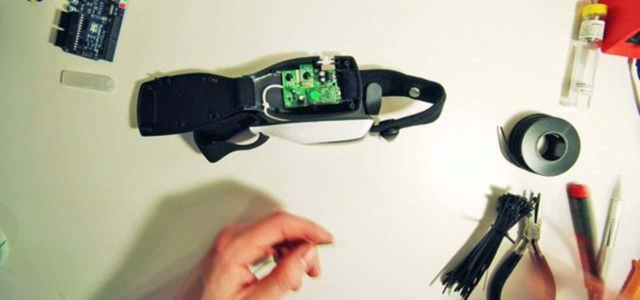
In this clip, you'll learn how to extract serial data from the $80 Mattel Mindflex or Star Wars Force Trainer. For more information, including detailed, step-by-step instructions, and to get started creating your own working EEG/BCI, watch this very-neat hacker's how-to.

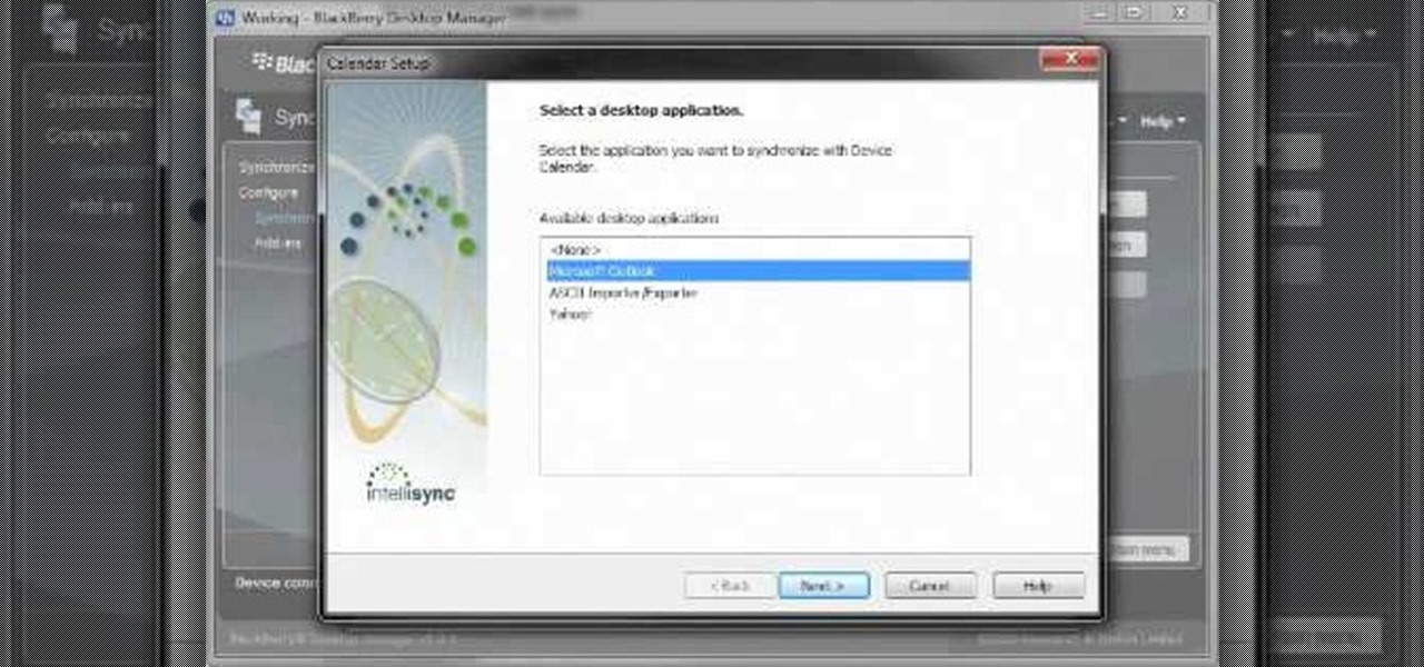
Want to know how to synch information between your BlackBerry smartphone and your computer? Connect your BlackBerry to your computer with a USB cable and launch BlackBerry Desktop Manager. Configure to taste, then click Next. For a complete video overview of the process, watch this BlackBerry owner's guide.

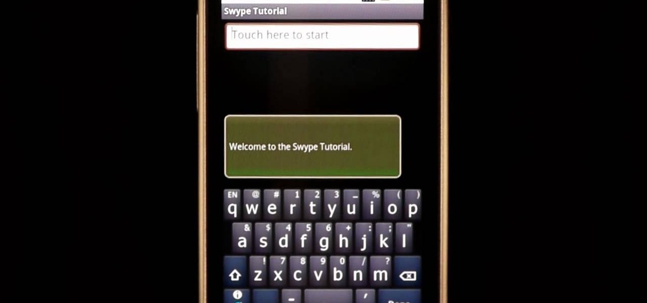
In this clip, learn how to use the Swype Key while texting with Swype on your cell phone. The Swype key is where all of your options are like dictionaries, tips and tricks, help menus and everything else you may need.

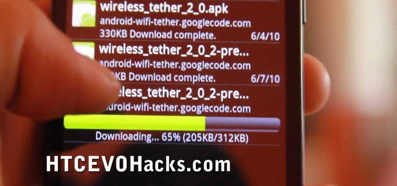
In this tutorial, learn how to access your phone's data network to enable free tethering on your new HTC EVO 4G. By tethering with your EVO you can connect up to eight other devices to your phone and use it as a wireless modem. This hack works with any EVO and will allow you to connect regardless of whether your city offers 3G or 4G signals.

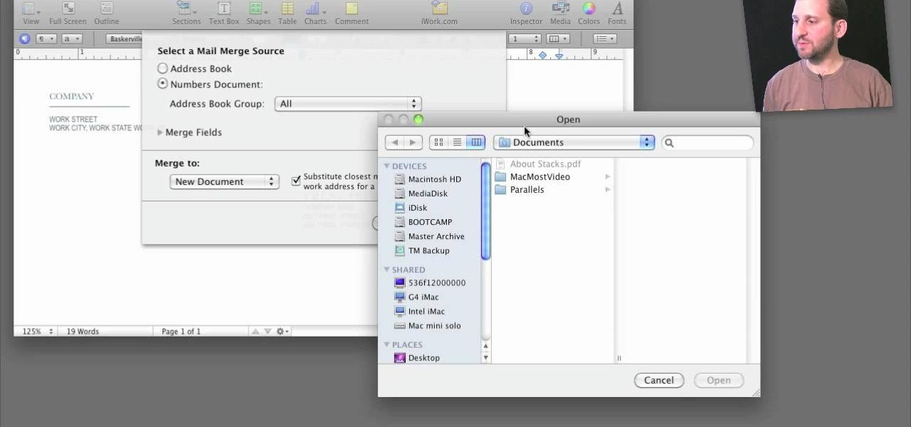
A step-by-step guide that will walk you through Mail Merge on a Mac computer. You will gain how to prep and print envelopes, letters or any document that you need to send to different names and addresses on each item. You can pull the data from your address book or from a Numbers Spreadsheet and will see how to modify and merge the information you will need to successfully set up your documents.

If you have a circular or semicircular protractor like the one used in this video, making a pie chart is as easy as – well — pie. This will teach you how to use your protractor to measure out each individual slice in your pie chart. Learn how to visualize statistical data through hand-drawn pie charts with this free video math lesson.

Whether you're new to Adobe Photoshop or a seasoned graphic design professional after a general overview of CS5's most vital new features, you're sure to be well served by this official video tutorial from the folks at Adobe TV. In it, you'll learn how to automatically correct lens distortions and fix chromatic aberration and vignetting with Photoshop CS5 and Photoshop CS5 Extended, which use an image file’s EXIF data to make precise adjustments based on the type of camera and lens you used.

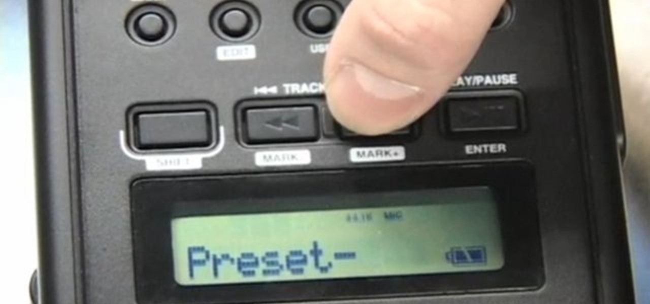
Check out this video tutorial to show you how to use a Marantz digital audio recorder. This video was made by the equipment room at CUNY Journalism School in New York.

We're living in the age of Big Data. As the primary force behind everything from targeted marketing campaigns and online search algorithms to self-driving cars and even space exploration, massive sets of complex data stand at the heart of today's most exciting and important innovations.

If you have a limited mobile data plan on your iPhone, you know how tricky it can be to stay within your given allotment. Large app installs and updates, 4K resolution videos, and photo backups can waste precious data resources in no time. And apps like Apple News, Facebook, Mail, and Netflix eat data like it's candy. But you can nip the problem in the bud by restricting data hogs from your cellular network.

Your Google history is mostly a binary choice — either you enable it fully, taking advantage of all its features while letting Google record your activity, or you disable it, staying incognito but also missing out on some fun stuff. But now, Google will let you auto-delete your history, allowing you to utilize all the perks that come with recording your history while maintaining some level of privacy.

The YouTube app will default to 480p playback when you first open a video. It's supposed to switch to your screen resolution a few seconds in, but this isn't always the case. The regular YouTube app doesn't let you change this behavior, but like most things with Android, there is still a way.

Project Fi, Google's MVNO, is running a new promotion on the latest and greatest from LG. From July 16 until the 29th, whenever you order and activate the LG G7 ThinQ or LG V35 ThinQ, you will receive a $300 service credit. When you do the numbers, that equals a minimum of three free months of service.

The addition of a new research mode for Microsoft HoloLens will enable researchers and developers to tap into a wider range of data collected by the device's sensors.
