Ruby is a dynamic, general-purpose programming language created by Yukihiro "Matz" Matsumoto in Japan around the mid-90's. It has many uses but with it's flexibility, it makes a great language to write exploits in. In fact, the entire Metasploit Framework is written in Ruby! The sole purpose of this series is to teach hackers the basics of Ruby, along with some more advanced concepts that are important in hacking.

Hello again, reader! In this post, we are going to cover some data types and how to declare variables. It shouldn't be too hard so just sit back, relax, grab some popcorn and enjoy the ride (while you still can!).

Welcome back my friends !! Today we'll go through the second part of this C# series

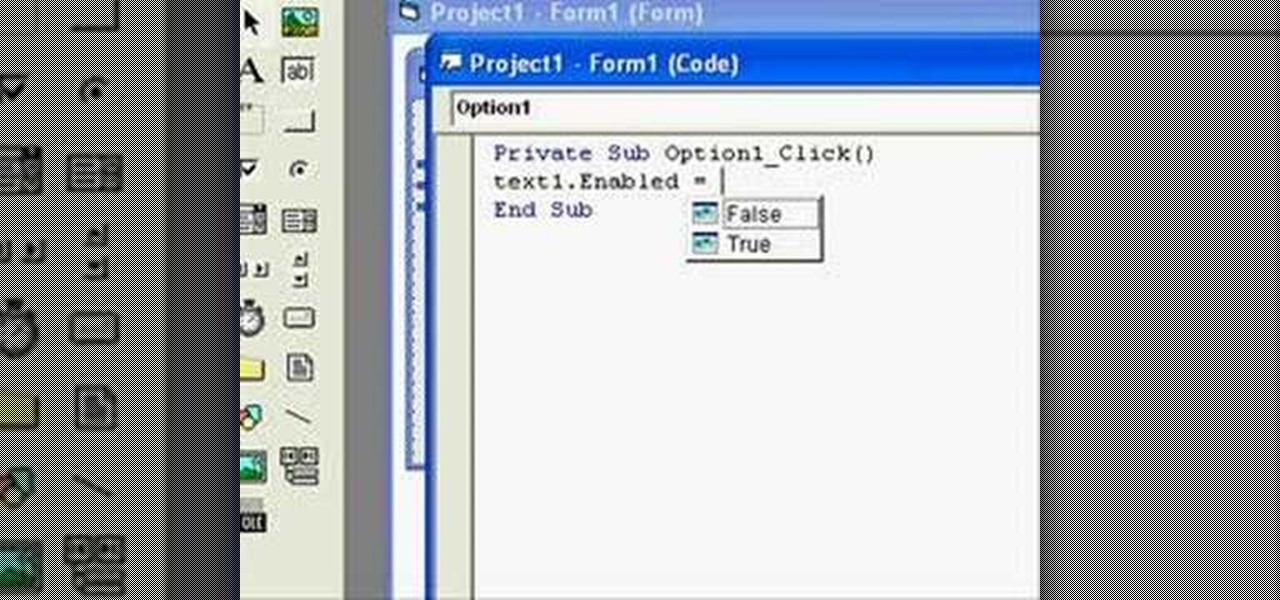
In this clip, you'll learn how to use "True" and "False" statements in your VB code. Whether you're new to Microsoft's popular event-driven program language & IDE or a seasoned developer merely looking to improve your chops, you're sure to find benefit in this free Visual Basic programming lesson. For more information, including a complete demonstration and detailed, step-by-step instructions, take a look.

Welcome back Java programmers! In this tutorial we'll being going over Variables/DataTypes and Type-casting

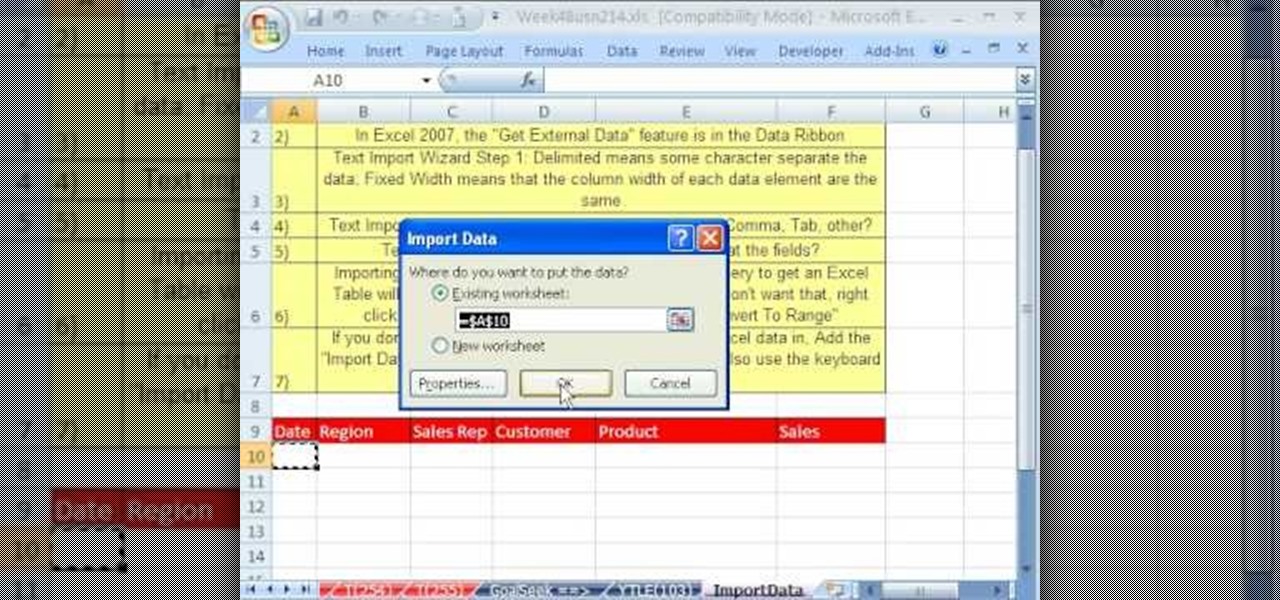
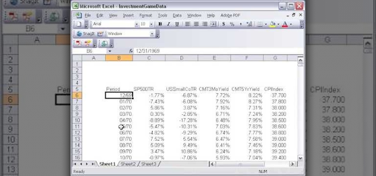
Whether you're interested in learning Microsoft Excel from the bottom up or just looking to pick up a few tips and tricks, you're in the right place. In this tutorial from everyone's favorite digital spreadsheet guru, ExcelIsFun, the 23rd installment in his "Highline Excel Class" series of free video Excel lessons, you'll learn how to import data into Excel from text files, web sites, Excel files and Microsoft Office Access files. Also see how to import currency rates and major indicies from ...

As smartphones become increasingly integral parts of our lives, so does data throttling. Personally, I try to save data any way that I can, so to stave off unnecessary usage, I use the GoogleOfflineVoice to limit the amount of data consumed by voice typing.

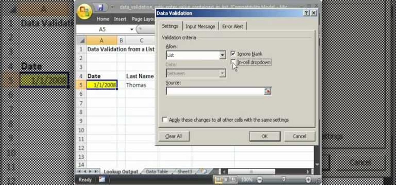
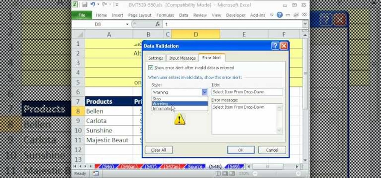
This video shows you how to idiot-proof a data set in Excel pretty much. It demonstrates how to enable data validation in a cell, so that when you type something in it must be in a predetermined list or will not work. Start by typing in your data table in a second tab. His example is a date, then information about certain employees based on that day. To enter the data validation menu, click the cell you want to use and then hit ALT+D+L to bring it up. Go to settings, then under the Allow menu...

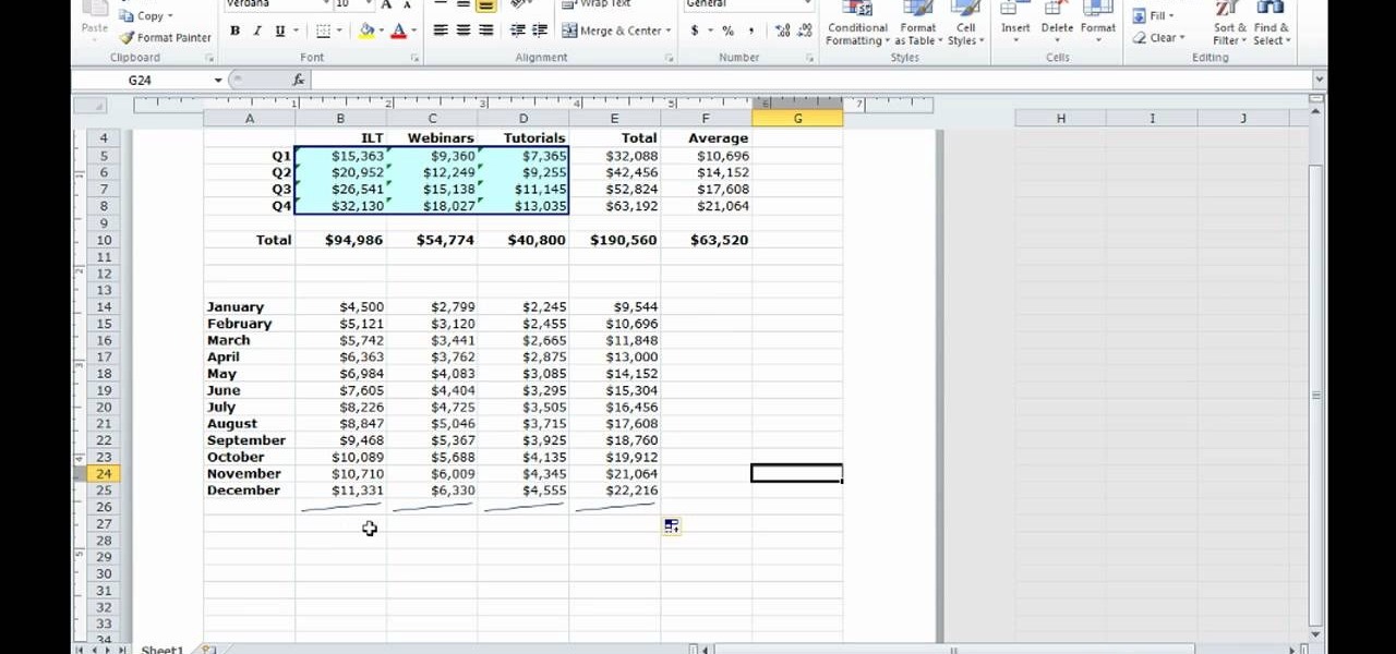
There is a new function in MS Excel 2010 called ‘Sparkline’ which helps you quickly find trends associated with a set of data. To create Sparkline, you can go to ‘Insert’ tab and then select ‘Sparkline’ section and then select the graph type. After you enter the data range and location range, the Sparkline will show up indicating the trend based on the data range you identified earlier. You can change the types and styles of your Sparkline easily. As the video demonstrates, whenever you use E...

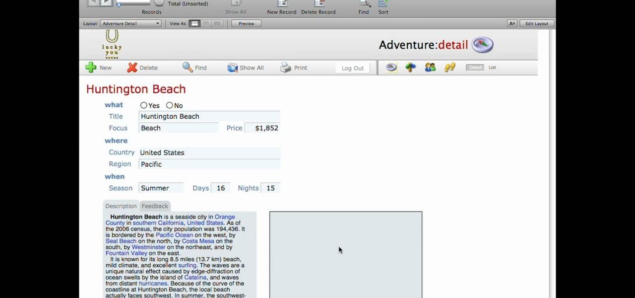
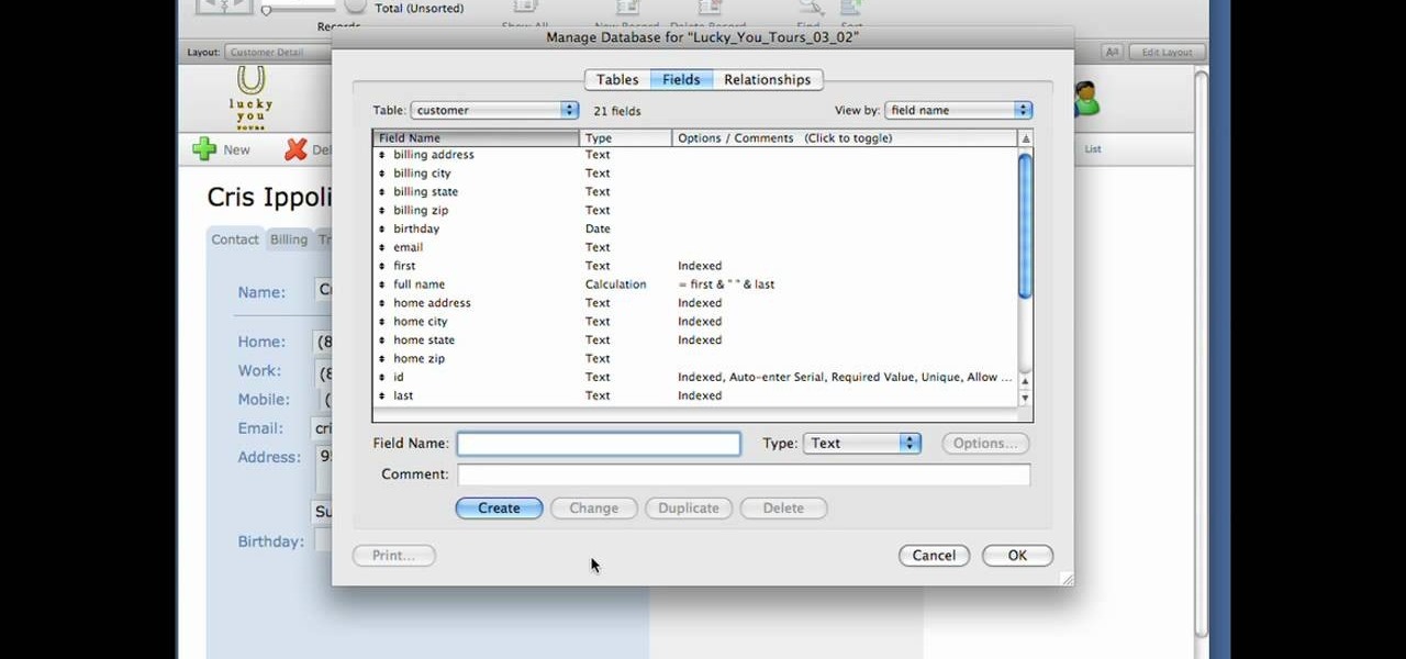
This lynda.com video tutorial shows how to use container fields with FileMaker Pro 10. When you want to create fields in FileMaker database you have the choice on what kind of fields you want to make. Many general fields are self explanatory like text, date etc., but there is a special kind of field called the container field. FileMaker Pro container field is a versatile data type in that it can store any kind of binary data. Container fields can be used to hold binary data in four broad clas...

In this video tutorial, viewers learn how to create drop down menus in Microsoft Excel. This task is very easy, fast and easy to do. Begin by highlighting a desired cell. Then click on the Data tab and click on Data Validation under Data Tools. When the Data Validates window opens, click on the Error tab and deselect "Show error alert after invalid data is entered". Then click on OK. Now simply type in the data into the selected cell. This video will benefit those viewers who use Microsoft Ex...

Excel is great, and if you're a Mac user, Excel 2008 for Mac has a lot of new and useful great features you can use to maximize efficiency in your spreadsheets. Excel doesn't have to be the boss anymore, you can! The Microsoft Office for Mac team shows you all the great features in this how-to video.

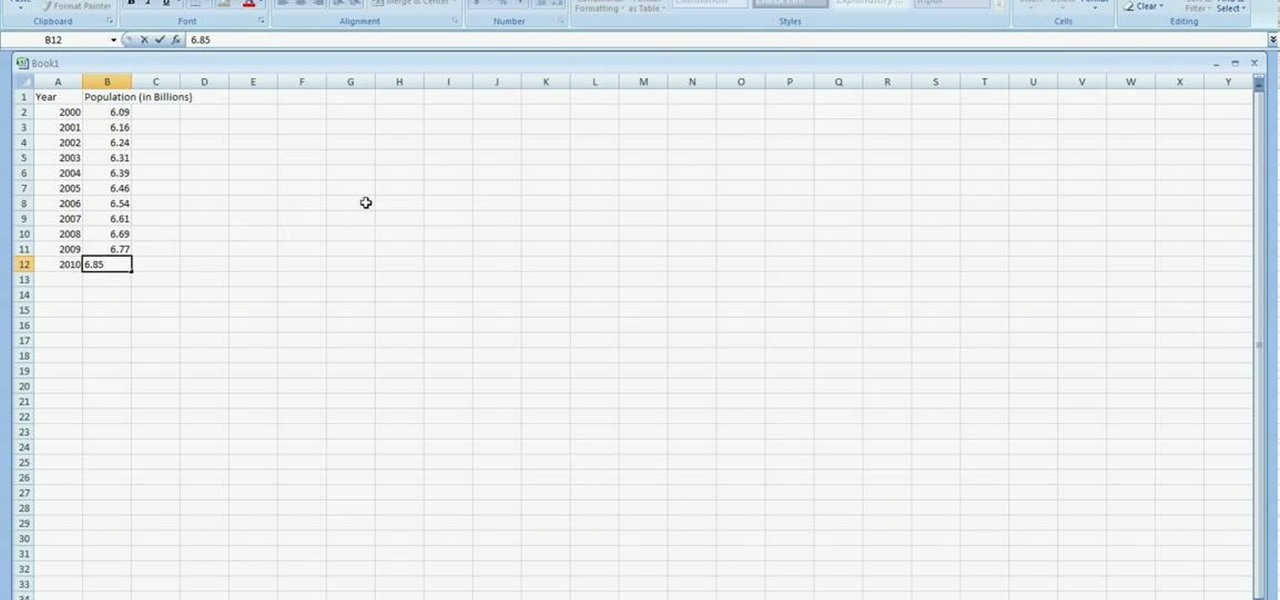
In excel a left click is made on box A1 and the X title is typed in as year. In A2 the year 2001 is typed and in A3 the year 2002. Both A2 and 3 boxes are highlighted and the bottom right hand corner is used to drag the work into a copied sequence down to A12. In B1 "population in billions" is typed. From the web site the data is copied and typed in as it appeared and the numbers are rounded off. A click is made on the "insert" tab and line is selected from the menu which appears. The upper l...

Here is a quick video on how to convert Excel spreadsheet data to XML for import into Flash or Flex. Don't spend time typing all that data again, instead create a schema in Excel and convert it to XML.

If you want to manage what sort of data is entered into your Excel spreadsheet, data validation will help you to accomplish just that. In this Excel tutorial from ExcelIsFun, the 549th installment in their series of Excel magic tricks, you'll learn how to use data validation to full effect in your Microsoft Office projects.

The new Pyro FX in Houdini 10 are very impressive with improved workflow. The Pyro FX are great for creating 3D fire and smoke effects. And in this video tutorial series, you will learn the Pyro FX workflow in-depth and the parameters used to create fire and smoke effects. You will also see how volumetric data is created and recorded, and how to visualize it.

This is a basic lesson with an intro for arrays in the C# programming language. You'll learn how to create and declare and add date to a C# array. An array is a data structure, or object, that contains several variables of the same type. Learn all about it!

In order to format graphs and charts using Microsoft Word 2007, click on Chart Tools. The tabs at the top of the screen provides you with your options. You can change the type of chart or graph by clicking on Change Chart Type. If there is a particular type of chart that you would like to use again and again, then you can save it as a template via the Save As a Template icon. You can edit the data in your chart of graph by clicking on Edit Data. You can modify the chart layout by clicking on ...

This tutorial on the companion Tech Ease for Mac site shows you how to use Inspiredata to collect, organize, and visualize data using several types of diagrams supported by the program. The movies were recorded on a Mac, but Inspiredata is a cross-platform program so the steps shown should work on the Windows version of the program as well. Inspiredata works like a database system that allows you to add notes and more.

Get a crash course on HScript Expressions, Variables, and Attributes in Houdini 10. If you don't even know what this means, then you probably need to check this video tutorial series out. Understanding how to massage data in Houdini is key to giving yourself the creative edge and allowing you to unleash mind-blowing visual effects. This 18-part video series covers a variety of simple yet essential weapons in your arsenal including Global, Standard and Custom Variables to Math and String Modif...

MySQL is a database for serving data on the web. This video teaches viewers how to connect to a database and add data in PHP & MySQL. PHPMyAdmin is an interface that allows you to interact with MySQL more easily. Use the form in the program to create a database; choose the name for your database and select 'create'. Next you can create tables within your database, also using the forms provided. Within the tables you can set your variables; PHPMyAdmin has fields that allow you to choose the ty...

In this video tutorial, viewers learn how to data clear and erase an LG CU720 Shine mobile phone. This task is very fast, easy and simple to do. Begin by clicking on the Menu button and select Settings. Then scroll down the list or press the # sign to select Reset Settings. Now select Master Clear and select Handset. If there is data in the memory card, clear it as well. Click on Yes to confirm the resetting and type in your security code. This video will benefit those viewers who have a LG S...

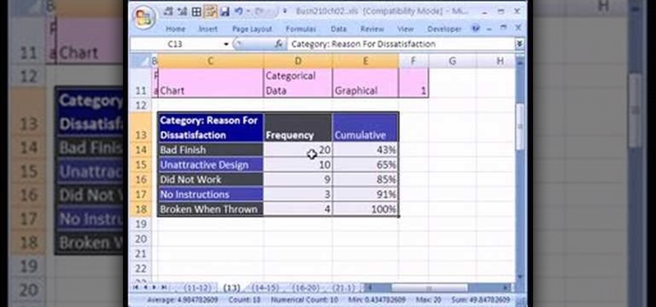
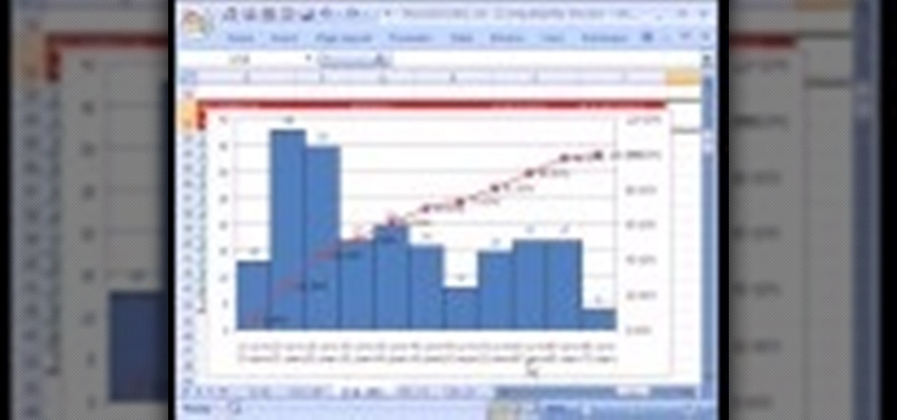
If you want to create a Pareto Chart for categorical data in MS Excel you should first have your data input into Excel already. From your data, you should highlight the cells that you want to count the frequency for and in the frequency box you should type in =COUNTIF and highlight the data you want the frequency for and put in F4 and then press , click on cell to the left and click enter. Now this will work all the way down. If you have not sorted it, you can right click and then click sort....

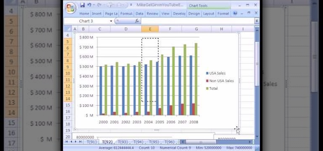
New to Microsoft Excel? Looking for a tip? How about a tip so mind-blowingly useful as to qualify as a magic trick? You're in luck. In this MS Excel tutorial from ExcelIsFun, the 92nd installment in their series of digital spreadsheet magic tricks, you'll learn how to add data series to a chart, change the chart type for just one data series and see an excellent copy data to chart trick.

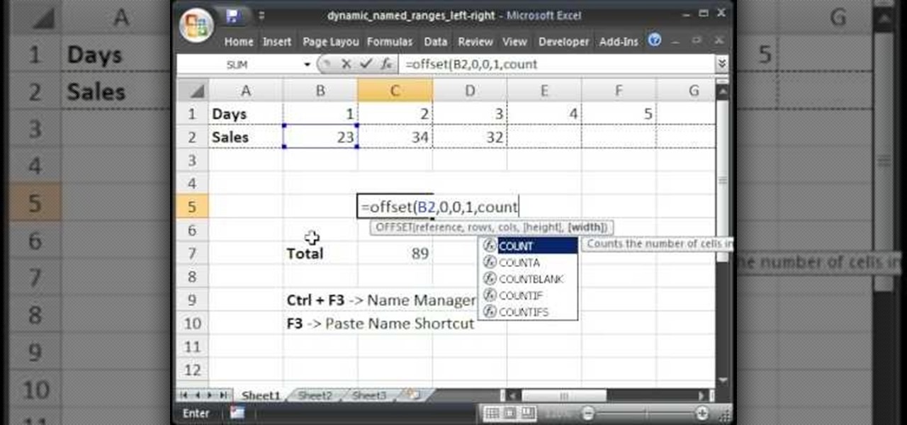
Teach Excel describes how to create a dynamically updating named range that goes from left to right using Excel. First, you define the named range by highlighting the cells containing numbers in a certain row. In the name box to the left of the formula bar, type the name of the data. In this example, the numbers correspond to sales, so type "sales." To check if the named range works, click on an empty cell and enter =sum(sales). That should return the sum of the highlighted cells. However, as...

Whether you're new to Adobe Photoshop or a seasoned graphic design professional after a general overview of CS5's most vital new features, you're sure to be well served by this official video tutorial from the folks at Adobe TV. In it, you'll learn how to automatically correct lens distortions and fix chromatic aberration and vignetting with Photoshop CS5 and Photoshop CS5 Extended, which use an image file’s EXIF data to make precise adjustments based on the type of camera and lens you used.

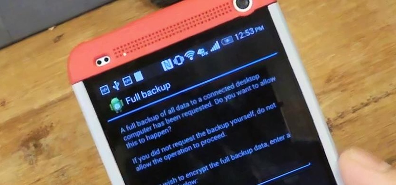
Today, I'm going show you how to back up all of your apps and their data using Android Debug Bridge (ADB)—an essential function for all softModders. These commands will be especially useful when you are updating your version of Android, since they don't require a third-party program to run on your device.

Create a table with sales data with this video.

The User Dashboard in OnTime is a great way to look at items across types and edit them. See how to view and search through data regardless of its type (Defect, Feature, Task, Incident) by taking advantage of the User Dashboard. For detailed instructions on using the dashboard, watch this installment from Axosoft's own series of video tutorials on the OnTime Project Management Suite.

In this überbrief video tutorial, you'll find instructions for adding a CNAME record to tinydns. The steps, demonstrated in the video, are as follows: Open up the data file, type a capital C, the domain you'd like to use, or subdomain, the IP address of the machine or destination you'd like that hostname to route to and the TTL or time to live. Save the changes, type make, and test it out!

With the Wigle WiFi app running on an Android phone, a hacker can discover and map any nearby network, including those created by printers and other insecure devices. The default tools to analyze the resulting data can fall short of what a hacker needs, but by importing wardriving data into Jupyter Notebook, we can map all Wi-Fi devices we encounter and slice through the data with ease.

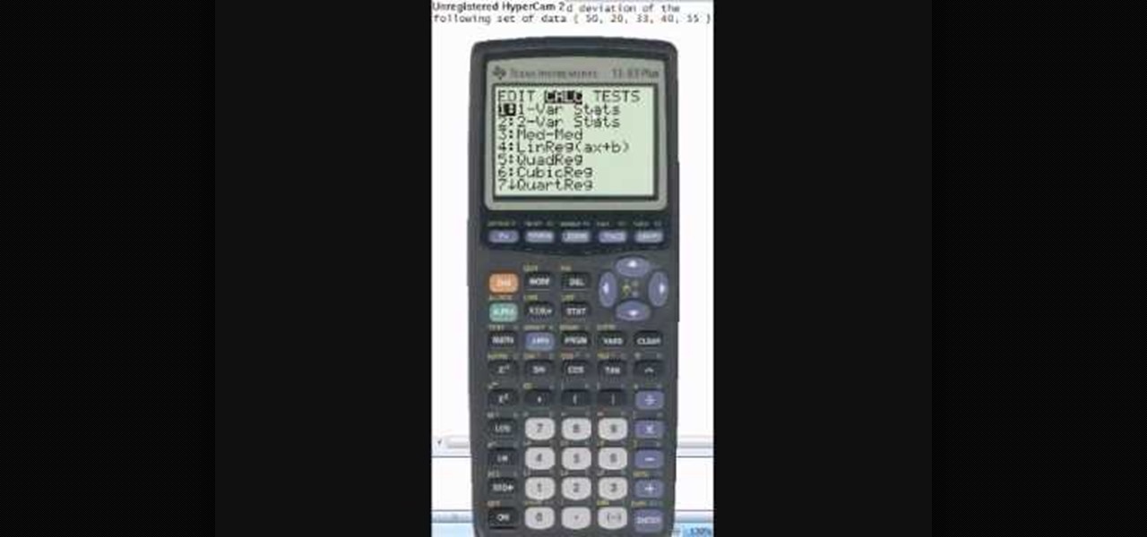
This video tutorial is in the Education category which will show you how to calculate standard deviation with TI graphing calculator. First you got to enter the data in to the calculator. Go to stat and click on enter. This will edit a list. Now you type in these numbers: 50, 20, 33, 40 and 55. Then press stat and click on enter. This will bring up the 1-var stats page. Press the "2nd" button and L1, because all our data is in L1. Click on enter and you will get all the data that you will nee...

If your into data based business,then this one's for you. Text field's are very much important while making a data based solution in FileMaker Pro 10.You can go to file menu>manage>database and there is the field's tab. Text field is used for storing text and no other such use. Text field's can hold up to 2GB of information. It can help to store raw data and formatting information, i.e., color,point size as well as type face.

MotionTraining gives an overview for using Microsoft Excel for beginners in this video. This video gives a rundown and overview of the basics of this spreadsheet program: from typing in the columns and rows, adding dollar signs to data, and how to make basic calculations. MotionTraining will show how to make text stand out with bold and italics, adding colors to your data, and how to make a grid appear during the printing process. Creating various charts of the data in the spreadsheet is also...

With Gboard, Google created a keyboard with more functionality than just inputting words. The app includes features such as GIF search and live text translation, but it gets even better when you let it learn more about you. With this data, Gboard grows from a good keyboard to one that can complete your sentences.

What's up, peeps? In this quick tutorial, we will be looking at structs, a special kind of data type.

Welcome back, my greenhorn hackers!

The key to becoming a competent white hat is knowing how the technology that you are trying to exploit actually works. SQL injection is one of the most common methods of attack used today and also one of the easiest to learn. In order to understand how this attack works, you need to have a solid grasp of ... you've guessed it ... SQL.

Oops... did you forget to connect to a Wi-Fi network before streaming HBO GO on your iPhone? While those episodes of The Wire may have been absolutely life-changing, your three-digit cellular bill is definitely going to hit you a little harder.

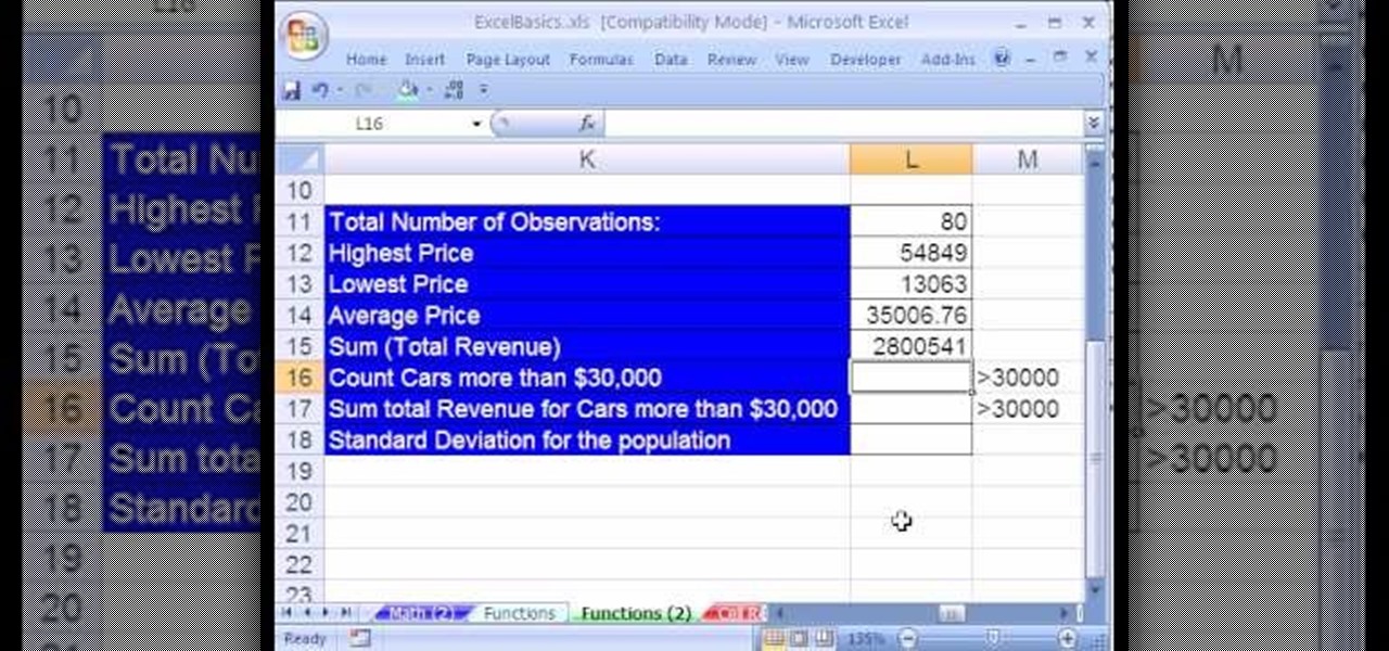
If you use Microsoft Excel on a regular basis, odds are you work with numbers. Put those numbers to work. Statistical analysis allows you to find patterns, trends and probabilities within your data. In this MS Excel tutorial from everyone's favorite Excel guru, YouTube's ExcelsFun, the 22nd installment in his "Excel Statistics" series of free video lessons, you'll learn how to create a percent (%) cumulative frequency distribution with formulas, a histogram and an ogive chart. See how to add ...


