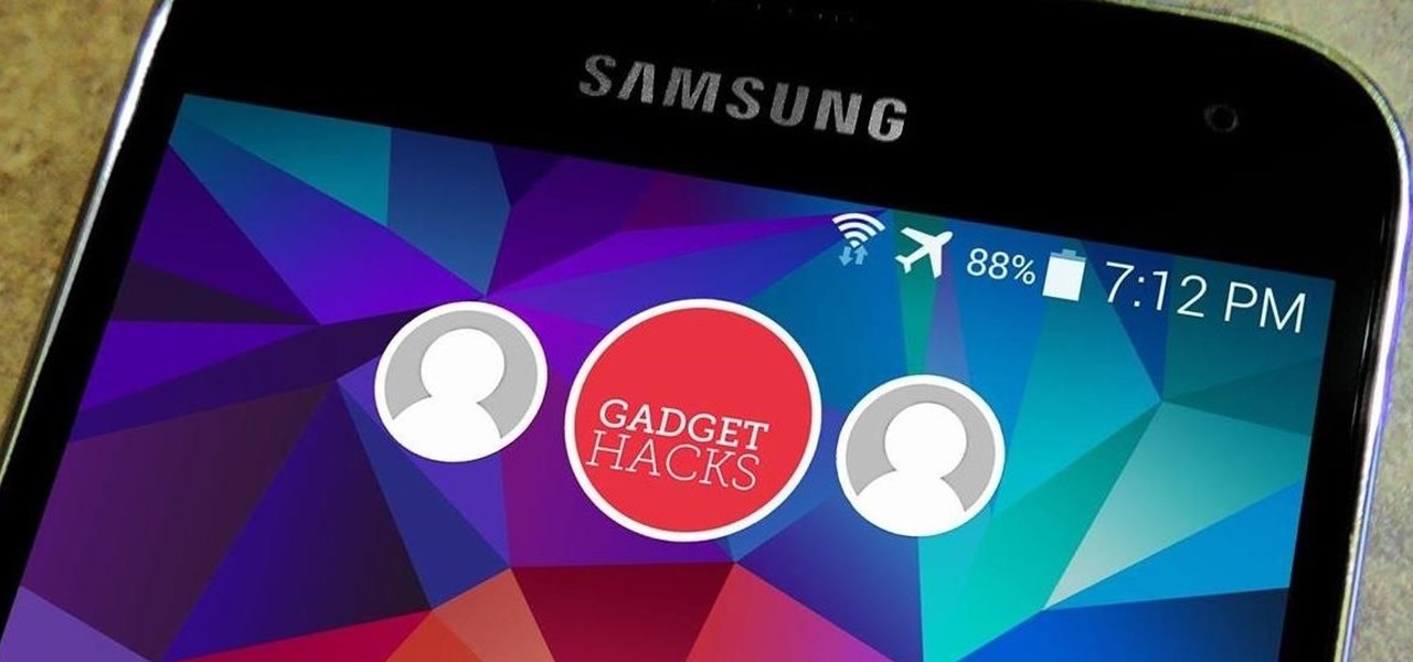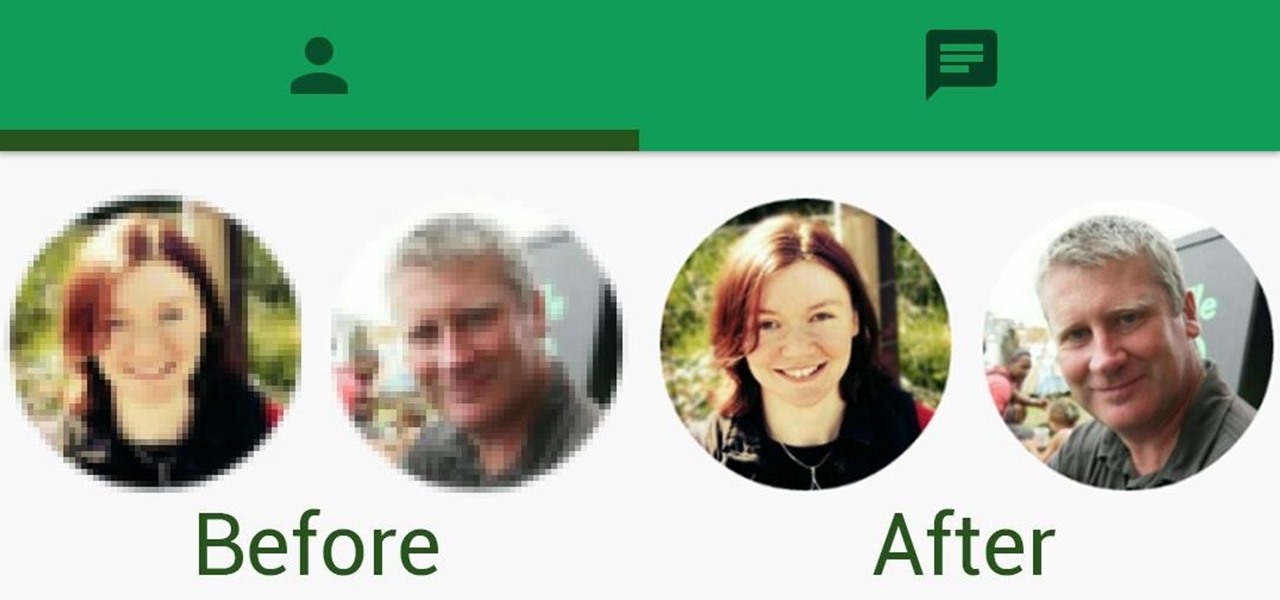
For every contact photo you add, Android keeps two copies. The first is stored at a 720p resolution, and this is used for high-definition imagery when you're looking at a full-sized contact card. But the second image is only 96 pixels by 96 pixels, and this is used for all thumbnails throughout the operating system.

The switch from Dalvik runtime to ART in Android Lollipop has rendered the Xposed Framework useless until a new version is released, but Xposed isn't the only way to mod a phone.

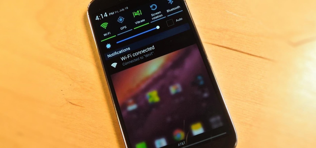
While the Quick Settings feature on Android is great, manufacturers like HTC, LG, and Samsung took it a step further in their custom skins. For instance, on Samsung devices, you can access the most common toggles at the top of the Notification tray, and you can tap once to access more tiles. This makes toggling cellular data, Bluetooth, and Wi-Fi a fast and painless process.

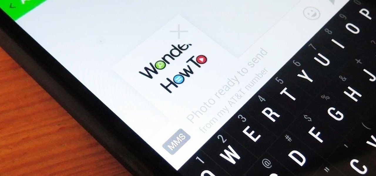
Whenever a picture is sent via MMS, a certain amount of compression needs to be done in order for a carrier's network to send it. That compression is meant to ease strain on the network, but in the end it leads to heavy downsizing and increased graininess in pictures.

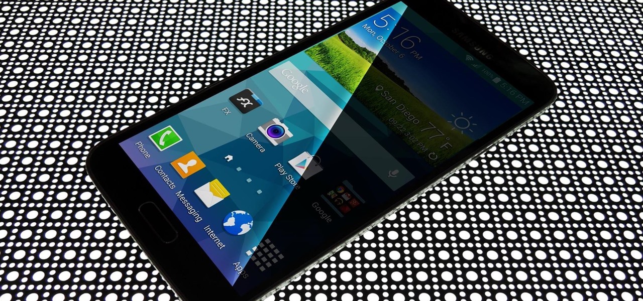
If you pay close attention, you might notice that the screen on your Android begins to flicker or pulsate when you lower the brightness past a certain point. This is a result of the AMOLED technology Samsung, among other manufacturers, use in their displays, and the way that these types of screens operate.

Pie controls are navigation soft keys that can be displayed by swiping up or from the side of your screen, allowing you to navigate, search, call up the power menu, take screenshots, and a lot more. Not only are pie controls functional, they make using Immersive Mode a breeze since the regular nav bar was no longer required.

The fact that we own a Nexus means we get to experience the Android interface exactly as Google intended it. But that doesn't mean we can't make a UI tweak here and there, does it?

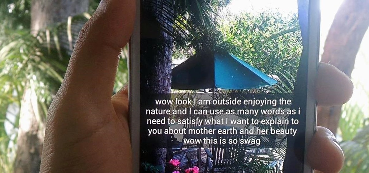
Twitter found a sweet spot with its 160-character limit, but Snapchat sports a social media low of 31 characters, forcing us to condense our ideas into a few short words when typing in picture captions because of their ephemeral nature. While this severely limited amount of words is Snapchat etiquette, I've got so much more to say than 31 characters!

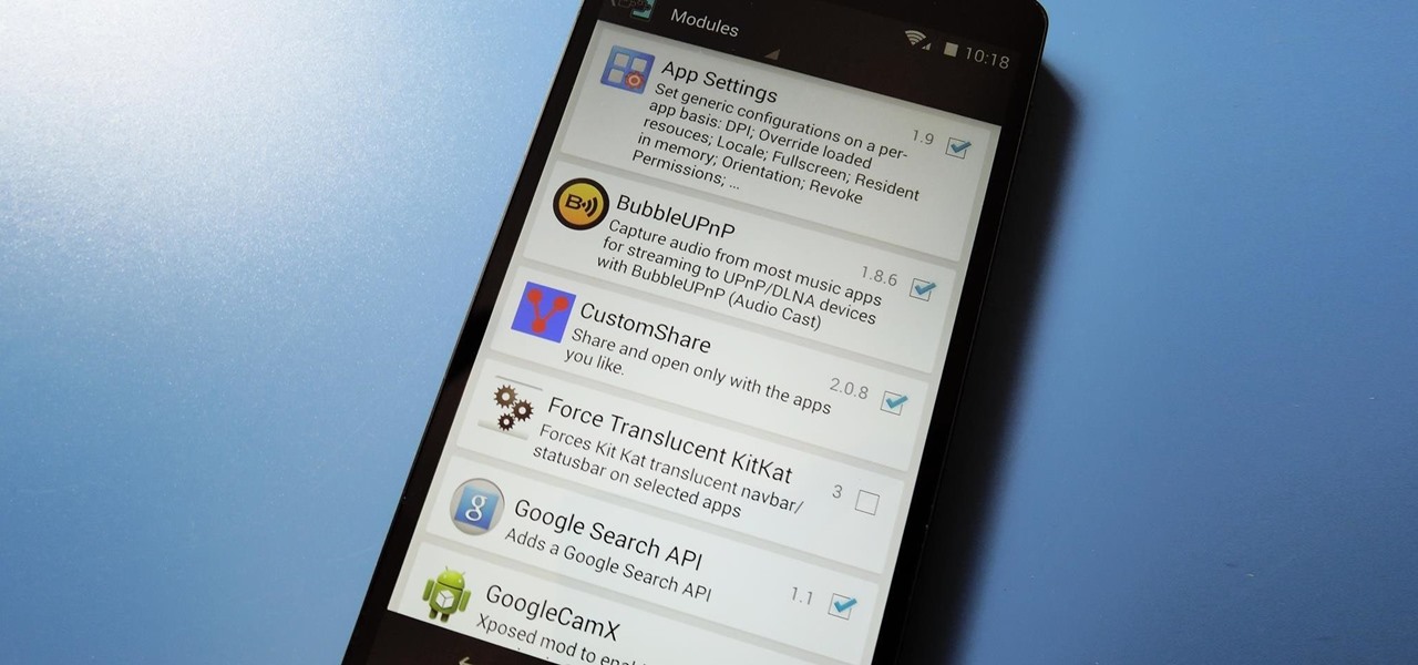
Over the weekend, rovo89 and the guys behind the wildly-popular Xposed Framework released a huge update. Leaving practically no UI element untouched, this new version brings a lot of polish and functionality to the revolutionary root softModding tool.

Ever since Android 3.0 Honeycomb, Google has been trying to push phone manufacturers to do away with physical menu buttons. Samsung has been one of the lone holdouts, retaining the menu key up until the Galaxy S5, where they finally replaced it with a "recent apps" multitasking button.

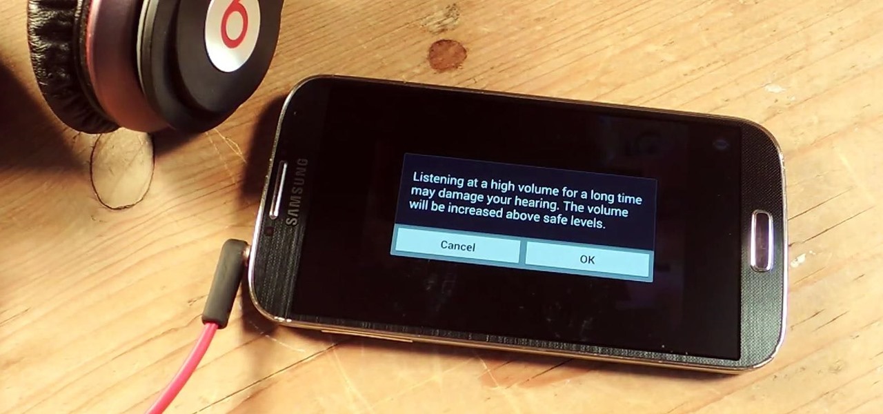
I've been told numerous times that I listen to music way too loud, to the point of potential hearing damage, especially when I have my headphones plugged in. Not only do my friends tell me this, but my Samsung Galaxy S4 likes to nag me as well. Once I pass a certain volume threshold (nine steps) with my headphones, I get that annoying high volume alert. Sorry, my hearing isn't as good as it once was, so let me jam in peace!

When the Nexus 5 was released, a new version of Android came along with it called KitKat. In the 4.4 update were some fancy new UI elements, one of the most noticeable being the translucent decor. By that, I mean the status and navigation bars being semi-transparent.

Multi Window, a feature that was greatly improved with the release of the Samsung Galaxy Note 3, is still quite limited on the older Note 2, allowing only the use of a few stock applications to multitask with.

Google released its long-awaited Google Now launcher a couple months ago, allowing users to access Google Now with the simple command of the voice. As great as the feature is, it requires that our screens be on, unlike the Moto X's "active listening" service that operates with Google Now, activating through a screen-off state.

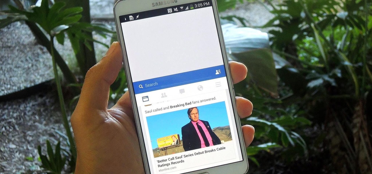
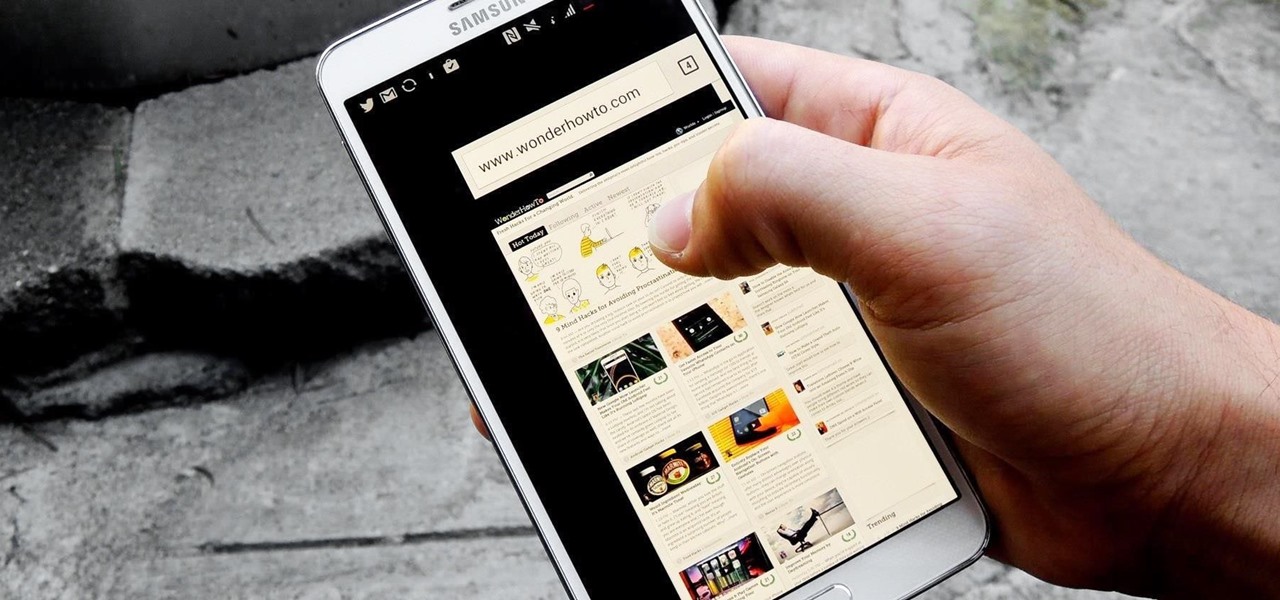
Efficiency is one integral attribute that I need from my Android device. I want to be able to multitask like a maniac and do things on the fly. While multitasking itself is nothing new, actually being able to watch Netflix while scrolling through IMDB at the same damn time was reserved mainly for newer Samsung-ier devices.

The status bar is an omnipresent force on our Samsung Galaxy S3s; always there to give us that vital information about battery life, date and time, Wi-Fi access, and much more. But there's just something about that default black bar that's so...boring.

Pinch-to-zoom has been a well-known feature in Google Maps, but one-finger zoom has always been a more practical way of navigating, especially for those of us using our phones with one hand.

Toast notifications are a type of pop-up alert built into Android, letting us know when an app has performed a certain action. Whether it's Gmail saving a draft or Firefox opening a new tab, toasts are meant to be informational while not being totally intrusive.

Facial, voice, and hand gestures are the way of the future for controlling our devices, and even gaming consoles like the Xbox One have incorporated them. Unfortunately, our Nexus 7 tablets have not. We're currently limited to using soft keys for most actions, but we can inch closer to the future by replacing one critical action with a simple touch gesture—going back.

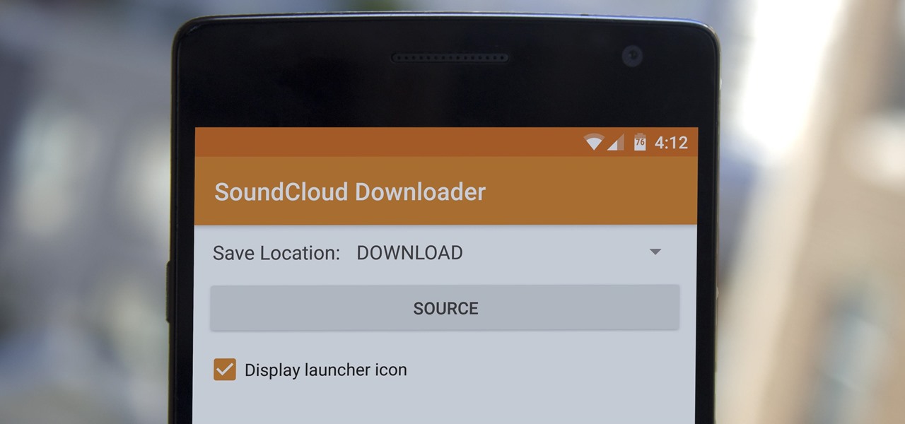
SoundCloud is one of the most popular music streaming services for good reason. You can upload your own music, listen to remixes from your favorite DJ, check out the latest releases from mainstream artists, and even discover new artists. But while you've always been able to listen to most songs for free, you couldn't download MP3s in the official app without paying for SoundCloud Pro — until now, that is.

Nobody likes ads, especially when they're tailored to your browsing history like the promoted content posts on Twitter. These deceptive advertisements are injected into your feed, trying to hijack your attention with clickbaity headlines and distracting images. You most certainly don't need it, and I'm positive the Kardashians don't need any more publicity, they seem to be doing quite well.

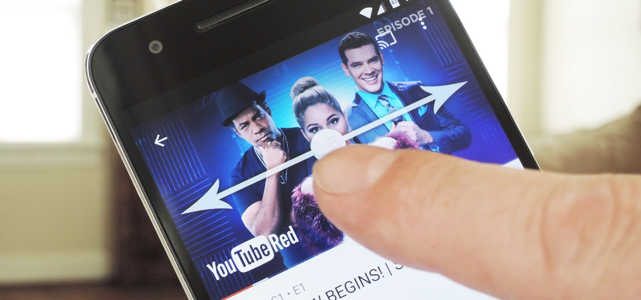
We recently covered an app called Touch Controls for YouTube that allows you to swipe up or down on any YouTube video to quickly adjust volume levels or brightness. As awesome as that app is, commenters here and on our YouTube channel thought it was lacking one big feature—the ability to seek forward or backward in the video by swiping the screen.

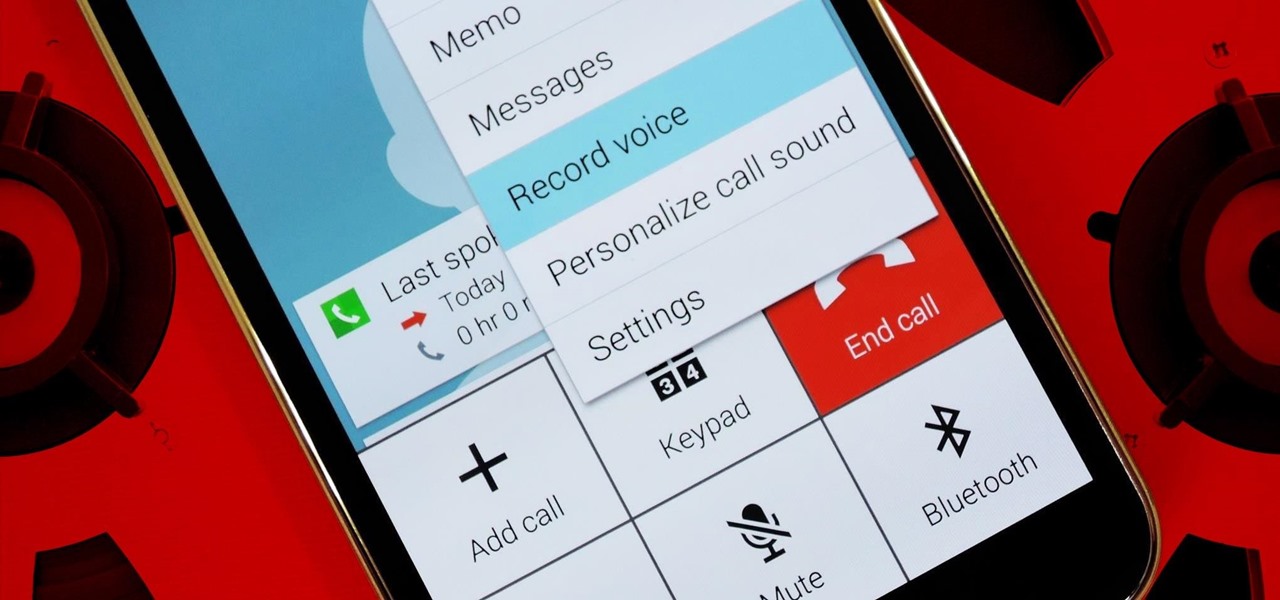
Before your carrier got its grubby little hands on your Galaxy S5, there was less bloatware installed and more functionality offered by the Samsung flagship device. Case in point: the GS5 that Samsung designed was capable of recording phone calls, yet the one that you own probably isn't.

Surely you've heard of the wildly-popular custom ROM CyanogenMod, right? As the longest-tenured third-party firmware for Android devices, CM has been able to maintain its popularity by supporting a wide array of devices and offering many customization options.

Screen timeouts serve mostly as security measures and energy savers, but they can also interrupt you when you're reading a book or editing a document. There is no built-in way to manage screen timeouts on a per-app basis, but if you've got root access, you can do just that using Never Sleep from Android dev Hamzah Malik.

According to a recent survey conducted by Edison Research and Statista, Pandora still has a firm grasp as the most popular music streaming service in the United States. With iHeartRadio, iTunes Radio, and even Spotify trailing behind by a large margin, it doesn't look like Pandora will lose their footing in the near future.

For the most part, Google Play Music makes it extremely easy to upload and organize your music library, as well as access it quickly using the default settings—but there are a few things it could do better.

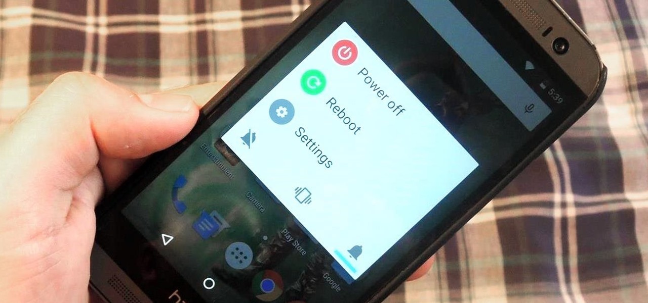
Out of the box, your Android device can be customized in many different ways, and a ton more with root access, but adjusting the actual interface of the system is a little bit more challenging. Changing the status bar size, icon width/length, and positioning of toast notifications are things that require a little bit more know-how—until now.

Twitter's video-sharing app, Vine, had some very stiff competition once Instagram added video sharing to its repertoire. Recent figures show Instagram at 130 million followers compared to Vine's 40 million. Many think that Vine is on its way out, but on the contrary, I think it's here to stay.

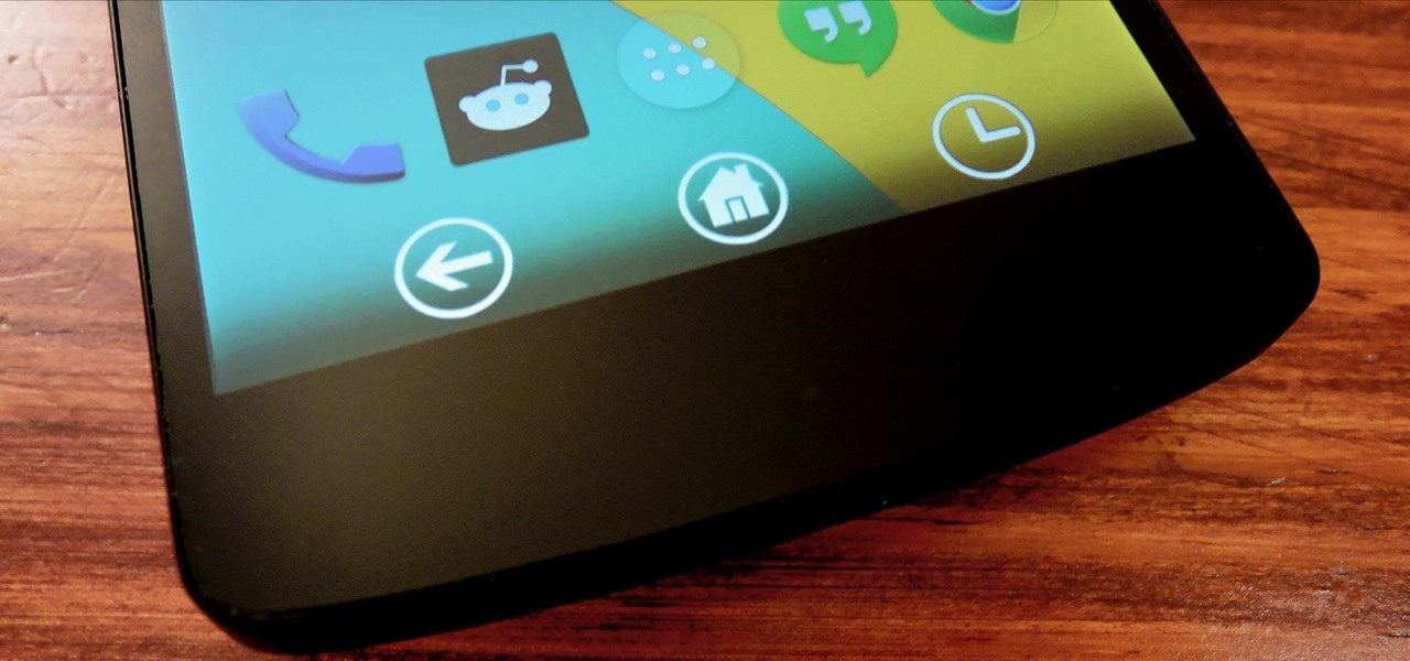
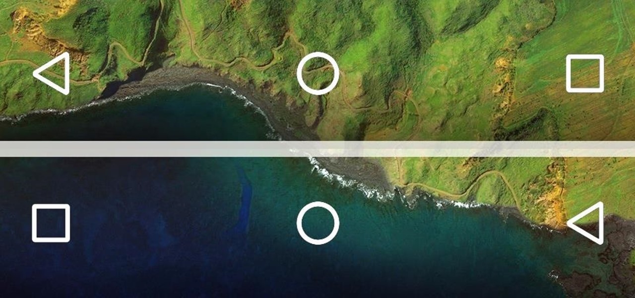
If you find yourself switching between Android devices frequently—for instance, your Nexus 6P and a Samsung tablet—you've probably noticed how the button placement can be different. Normally, it's back, then home, then the recent apps button, from left to right. But Samsung devices have this backwards, which can lead to frustration when muscle memory kicks in and the back button isn't where you expect it to be.

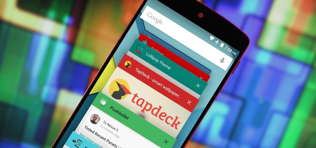
The Overview screen (aka Recent Apps) on Android got a huge upgrade when 5.0 Lollipop was released. Chrome tabs now hold separate entries in this multitasking list, which also got a nice new Material Design theme. One of the biggest changes, though, was a new API that allows apps to color the header on their entries in this list.

When Apple released their plus-sized iPhone 6 and 6 Plus models, it only made sense that they would include a one-handed feature to accommodate the larger displays. That particular feature is called Reachability, and with just a quick double-tap of the Home button, the screen shifts to the bottom half of the device for easier use with one hand.

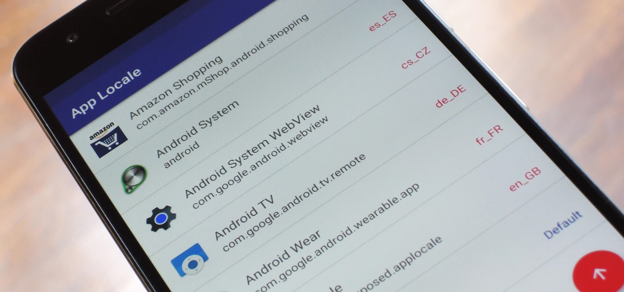
Android clearly wasn't made with bilingual users in mind. When you set a default system locale, every app on your phone uses that region's language—and there's no granular control here. This really becomes an issue if you use social media or news apps that are primarily in a different language, because apps are generally written in the developer's native tongue, then poorly translated to all other languages.

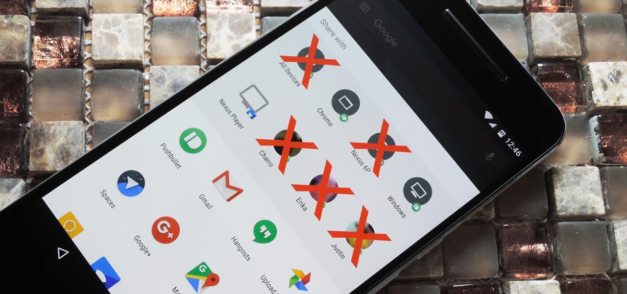
Android 6.0 introduced a new feature called Direct Share that allows apps to pin a more specific set of targets to Android's share menu. You've probably seen it already—messaging apps will allow you to share a file directly to a specific contact instead of just to the main app, and there are several other implementations like this.

For many people, the two main advantages of buying a Nexus device are prompt updates and the ability to root without much hassle. But in a cruel twist of fate, these two features are almost mutually exclusive, since OTA updates will refuse to run on rooted devices.

Our hands aren't necessarily getting any bigger, but smartphones still seem to be getting larger and larger. With average cell phone display sizes nearly doubling since 2007 (leading to new terminology like "phablet"), reaching all corners of a screen can become nearly impossible with one hand. Granted, most larger devices like the Samsung Galaxy Note 3 and Galaxy Note 4 come with a one-handed option to make navigating easier, but other popular devices like the Nexus 6 don't. While it may see...

On most Android devices, the various volume levels are comprised of either 7 or 15 steps between minimum and maximum. For voice-call volume, alarms, and notifications alike, 7 presses of a volume button will bring you all the way from silent to full-blast. With media controls, you get 15 steps between mute and max.

When Google released Android 4.2, a new feature was introduced for tablets that allowed for multiple accounts to be used on a single device. In order to create a unique experience for each user, apps and personal data were kept separate, and switching between users became as simple as tapping your profile photo from the lock screen.

Keeping prying eyes off your device isn't always the easiest thing to do, especially once you lend somebody your phone to make a call. Seems that whenever someone is scrolling through your pictures or checking out your new phone, they always end up somewhere you don't want them be. You could always hover over their shoulder to make sure they're not getting into your texts or photos, but that isn't always possible.

There's a lot you can access from the Notification tray on your Galaxy S4. Quick settings toggles, brightness controls, and of course, notifications. However, despite the power this simple pull-down gives you, you're still left with a boring, black background for the shade.


