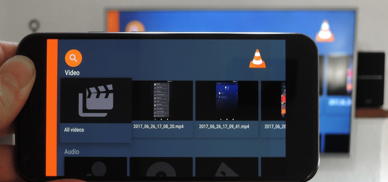
When it comes to playing videos from your personal media library, VLC is hard to beat. But let's say you want to play videos from an Android device by connecting it to your TV — what app should you use then? VLC is still the answer, particularly once you've enabled its TV-friendly UI.

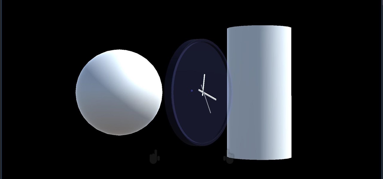
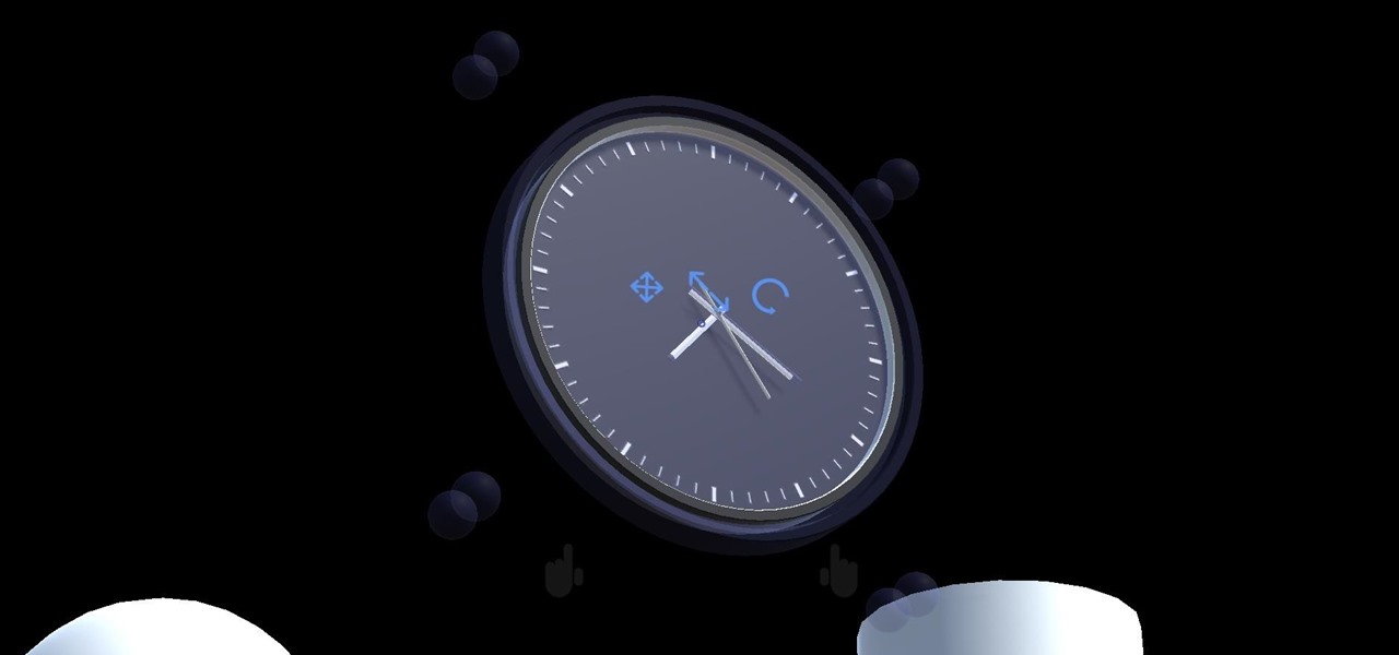
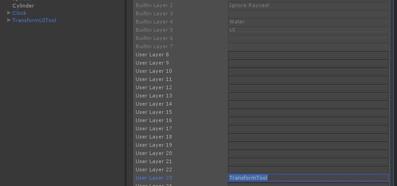
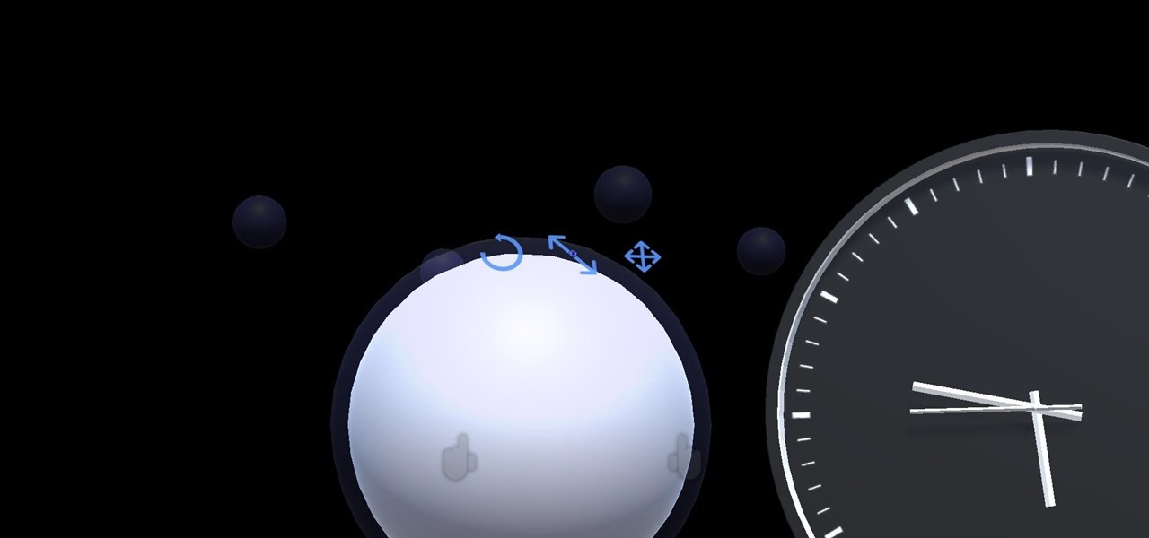
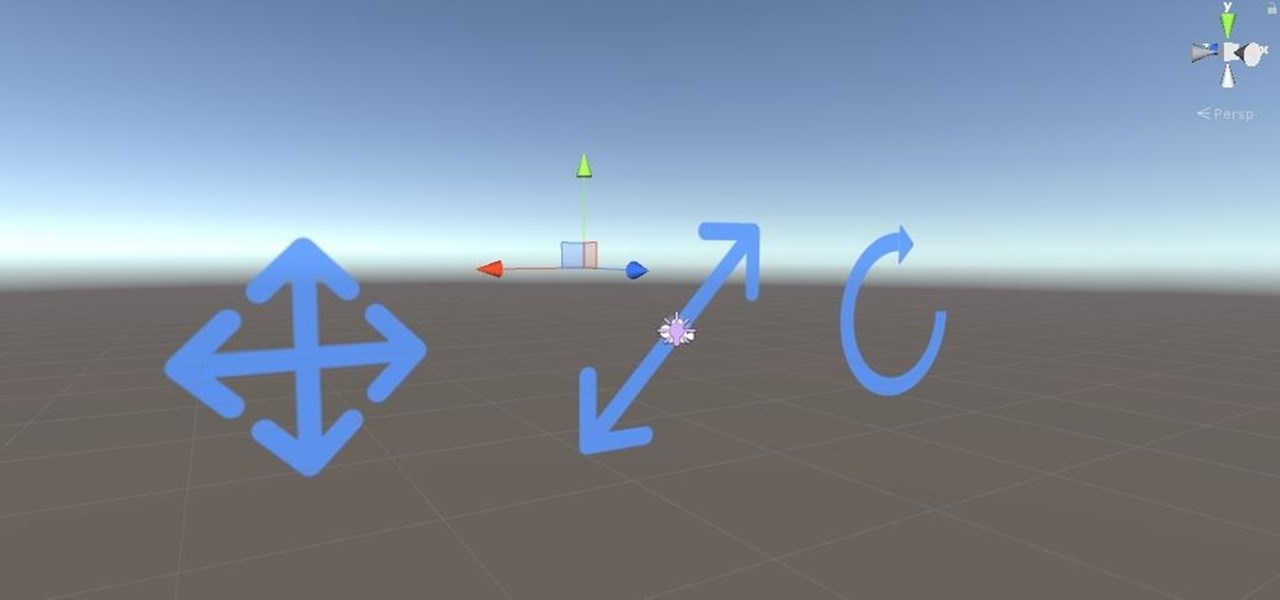
We started with our system manager in the previous lesson in our series on building dynamic user interfaces, but to get there, aside from the actual transform, rotation, and scaling objects, we need to make objects out of code in multiple ways, establish delegates and events, and use the surface of an object to inform our toolset placement.

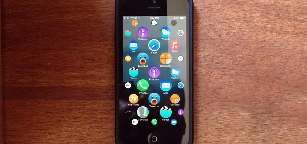
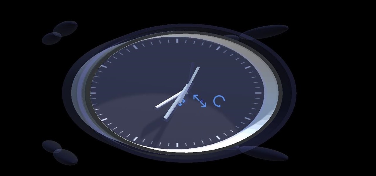
The first thing most of us noticed after Apple announced plans for its wearable—the Apple Watch—was the importance and focus they placed on its interface. Starkly different from their Android Wear counterparts, the Apple Watch's interface has applications scattered around the screen and relies on the device's dial to zoom in and out.

If you're one of the millions of people who use the WhatsApp service for messaging, you've probably noticed a recent propensity that the app has had for adding buttons to its interface. Two such buttons have made their way into the message thread screen, cluttering up the interface with functionality that is a tad bit redundant.

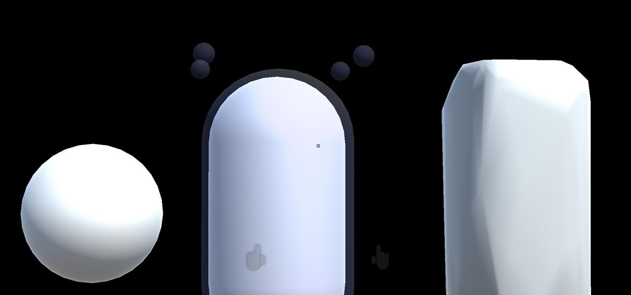
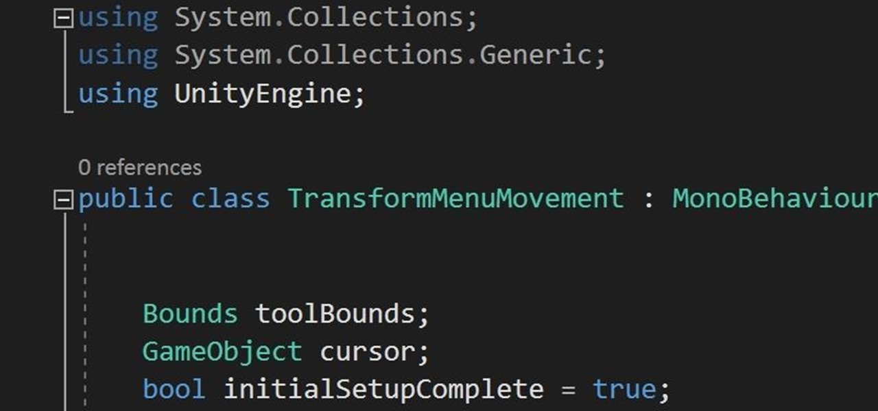
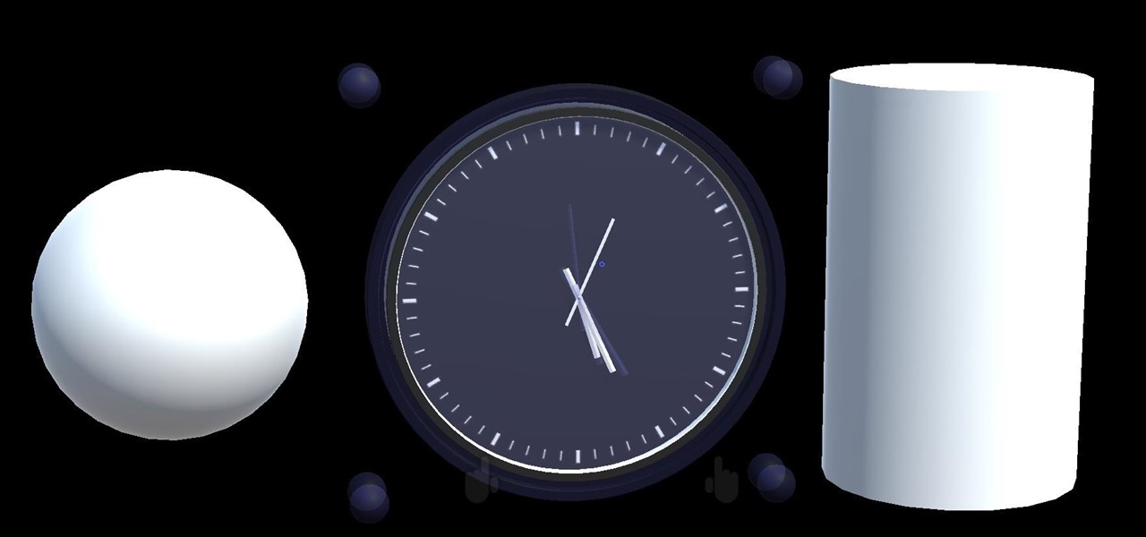
So after setting everything up, creating the system, working with focus and gaze, creating our bounding box and UI elements, unlocking the menu movement, as well as jumping through hoops refactoring a few parts of the system itself, we have finally made it to the point in our series on dynamic user interfaces for HoloLens where we get some real interaction.

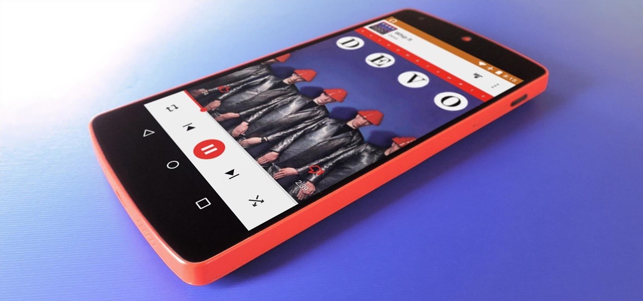
Google Play Music is an awesome app—even if you don't subscribe to their $9.99/month All Access service, you can still use it to store and stream up to 50,000 of your own songs for free. Add to that the fact that it's a pre-installed app on most Android devices, and there aren't many reasons not to be using Play Music.

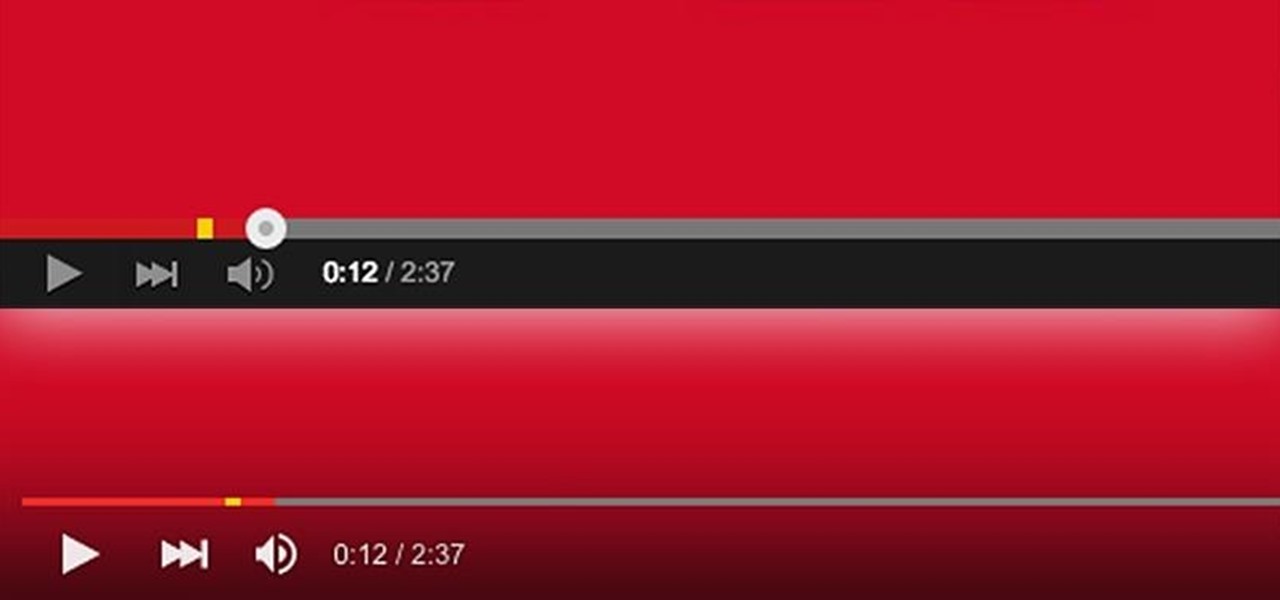
YouTube's main player interface got a pretty big makeover recently, but chances are, the new UI hasn't made it your way just yet. Google has a habit of slowly testing the waters as they roll out new features, so cool tweaks like this can take some time to reach all users.

Learn the and understand the mechanics of the PowerPoint interface. This tutorial will explain the Ribbon, Slides Pane and Slides Tab. Throughout this tutorial it is assumed that you are a complete beginner however as new tutorials are added the complexity will slowly increase from basics to advance. This tutorial is brought to you by Cozy HowTo your place for a snugly warm learning experience.

Every step in the evolution of computing brings an in-kind leap forward in user input technology. The personal computer had the mouse, touchscreens made smartphones mainstream consumer devices, and AR headsets like the HoloLens and the Magic Leap One have leveraged gesture recognition.

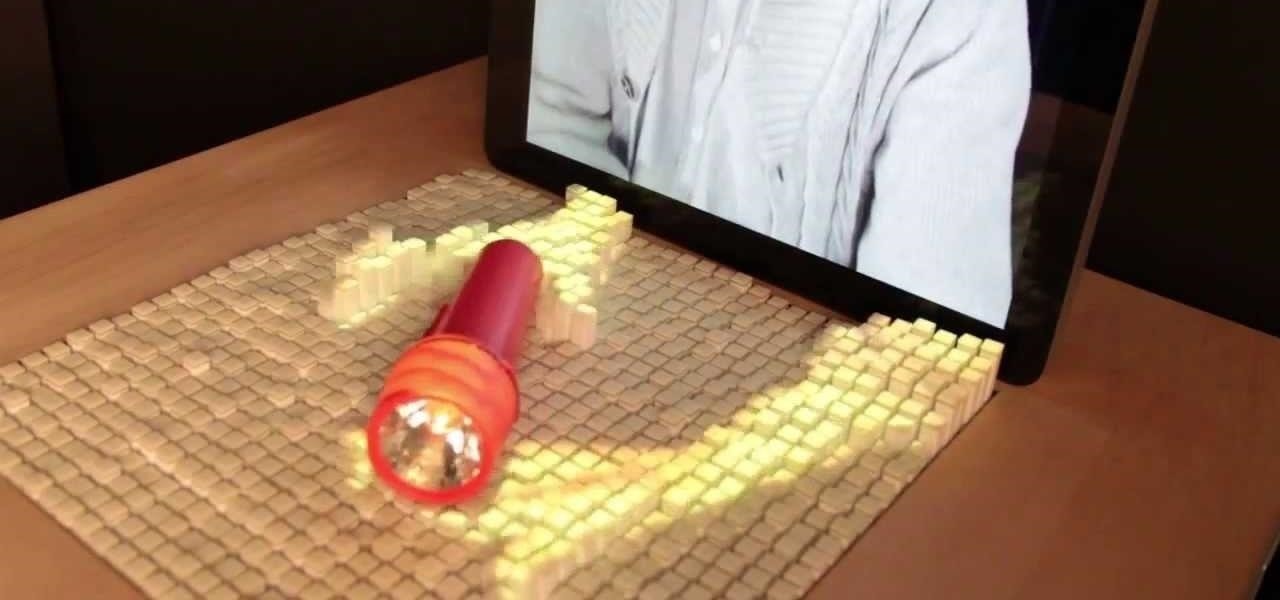
We can't be in two places at once, but with virtual touch interfaces we can theoretically use a machine to act as our second body in a remote location. Over at MIT, Daniel Leithinger and Sean Follmer, with the advisement of Hiroshi Ishii, created an interface that makes this possible.

Now that we have unlocked the menu movement — which is working very smoothly — we now have to get to work on the gaze manager, but first, we have to make a course correction.

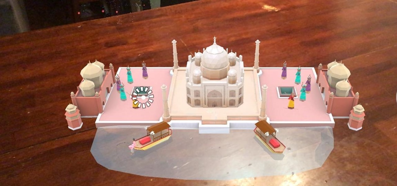
Last week, I tried out StackAR, a puzzle app updated to support ARKit where the AR features felt mostly unnecessary.

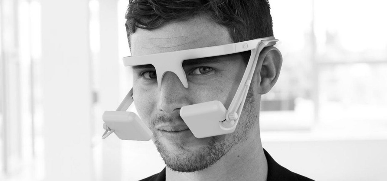
As promised earlier this year, Neurable has introduced limited beta of a Unity-compatible software developer's kit (SDK) for its brain control interface (BCI) for augmented and virtual reality.

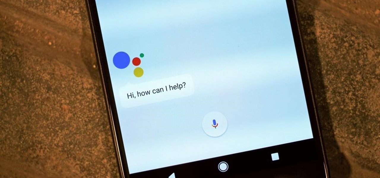
Google Assistant has introduced tappable shortcuts on the Google app for Android, iOS, and Google.com this week.

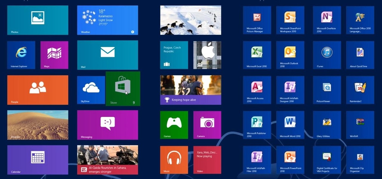
This Windows 8 tutorial, I will show you how to change the name of groups, and rearrange groups and applications in the Windows 8 start menu metro interface.

Now that we have installed the toolkit, set up our prefabs, and prepared Unity for export to HoloLens, we can proceed with the fun stuff involved in building a dynamic user interface. In this section, we will build the system manager.

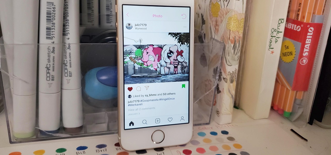
Your Instagram feed is jam-packed with interesting and lively photos, videos, and stories that largely offset the iOS app's comparatively bland user interface. If the interface's dull colors have always bothered you, you can splash on some much-needed color to better reflect your personality and tastes.

Generally speaking, in terms of modern devices, the more simple you make an interface to navigate, the more successful the product is.

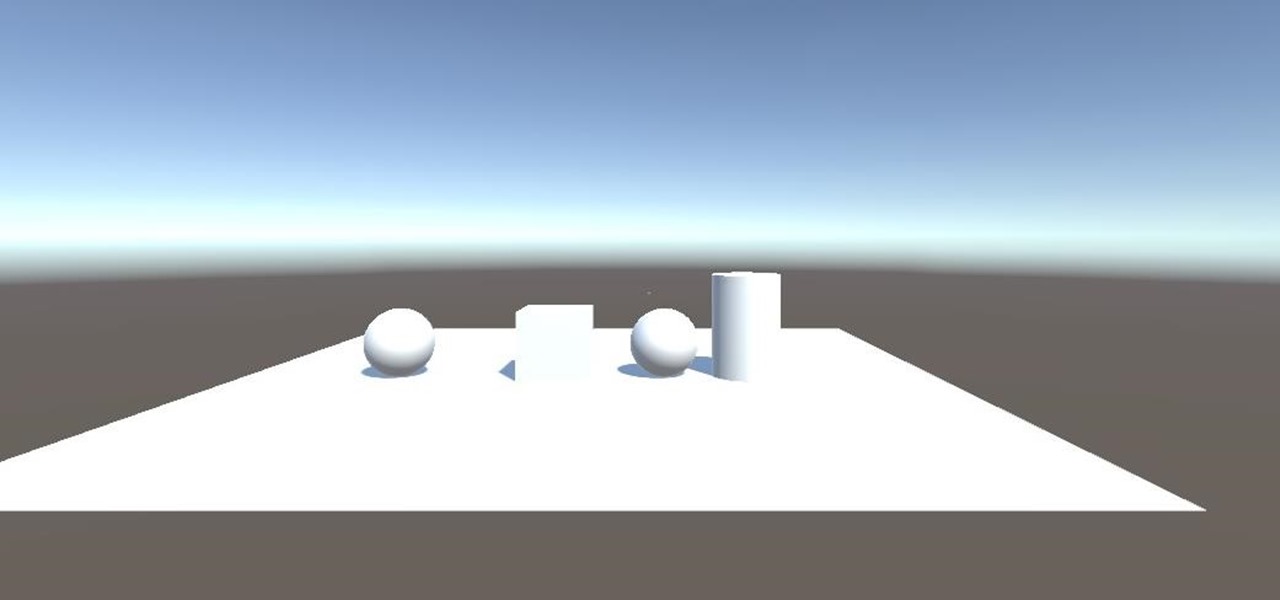
An incorrectly scaled object in your HoloLens app can make or break your project, so it's important to get scaling in Unity down, such as working with uniform and non-uniform factors, before moving onto to other aspects of your app.

In this chapter, we want to start seeing some real progress in our dynamic user interface. To do that, we will have our newly crafted toolset from the previous chapter appear where we are looking when we are looking at an object. To accomplish this we will be using a very useful part of the C# language: delegates and events.

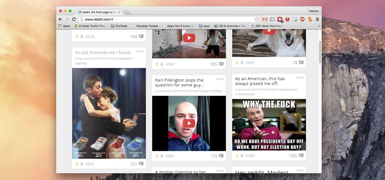
Reddit's overall design has stayed relatively unchanged for as long as I can remember. It's easy to use and is as popular as ever, so why mess with a good thing, right? Well, everyone's different, and if you're looking for ways to beef up your Reddit experience, try out the Chrome extension SHINE.

PowerPoint Tutorials for Microsoft PowerPoint presentation software. In this introduction tutorial we will be using PowerPoint 2010 and will focus on the interface workspace by reviewing the ribbon, slide pane and slide tabs. The ribbon is designed much like a website navigation menu bar and has multiple categories to separate all of the tools into an organized bar. By default the Home tab is selected and will include most of the tools that are commonly used when editing and creating a PowerP...

Back in 2008, media artist Kyle McDonald created a 3D interface that could track movement, which he turned into a virtual Tic-tac-toe game.

Alright, calm down and take a breath! I know the object creation chapter was a lot of code. I will give you all a slight reprieve; this section should be a nice and simple, at least in comparison.

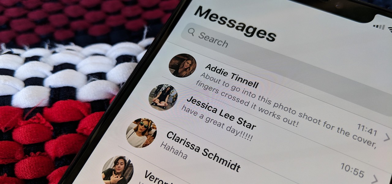
The Messages app on iOS features contact photos for every one of your conversations — including group chats. Even if you don't have a picture for a specific contact, their initials will appear instead. For non-contacts, a generic profile avatar appears. These give threads a bit of flare, but if you're looking for extra privacy or don't enjoy the look, you can easily hide those images and icons.

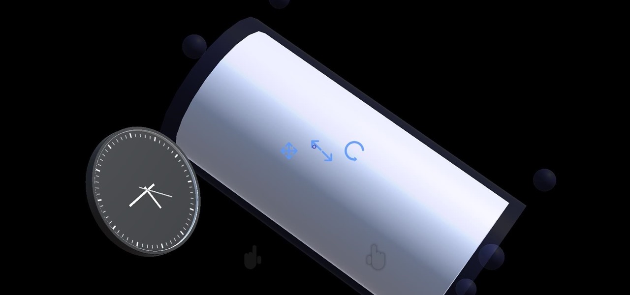
Continuing our series on building a dynamic user interface for the HoloLens, this guide will show how to rotate the objects that we already created and moved and scaled in previous lessons.

Keyboards and mice work fine for computers, but in a holographic environment you'll want to do more than just point, click, and type. While we can still benefit from these input devices, complex hand-tracking methods are necessary for the evolution of mixed reality user interfaces.

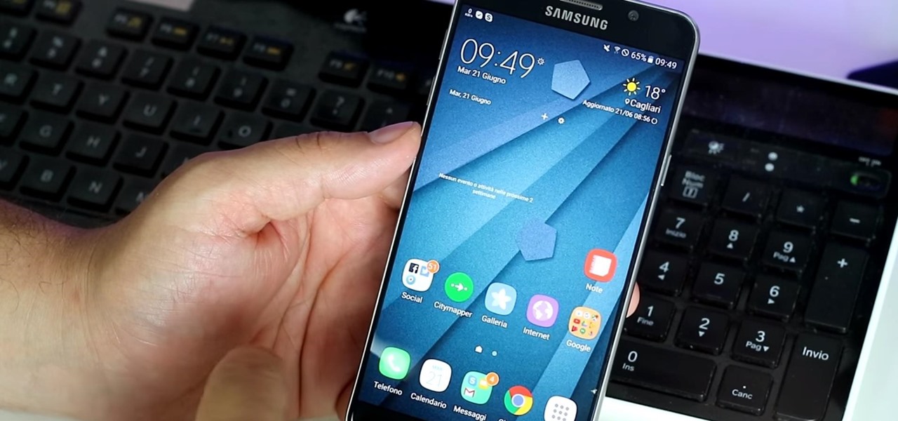
It looks as though Samsung will continue to tone down the look of TouchWiz, according to a leaked look at the newest "Grace" user interface for the upcoming Galaxy Note 7. HDblog, who acquired the leaked UI, shows off the beta version of the new skin in their video below.

In the previous section of this series on dynamic user interfaces for HoloLens, we learned about delegates and events. At the same time we used those delegates and events to not only attach our menu system to the users gaze, but also to enable and disable the menu based on certain conditions. Now let's take that knowledge and build on it to make our menu system a bit more comfortable.

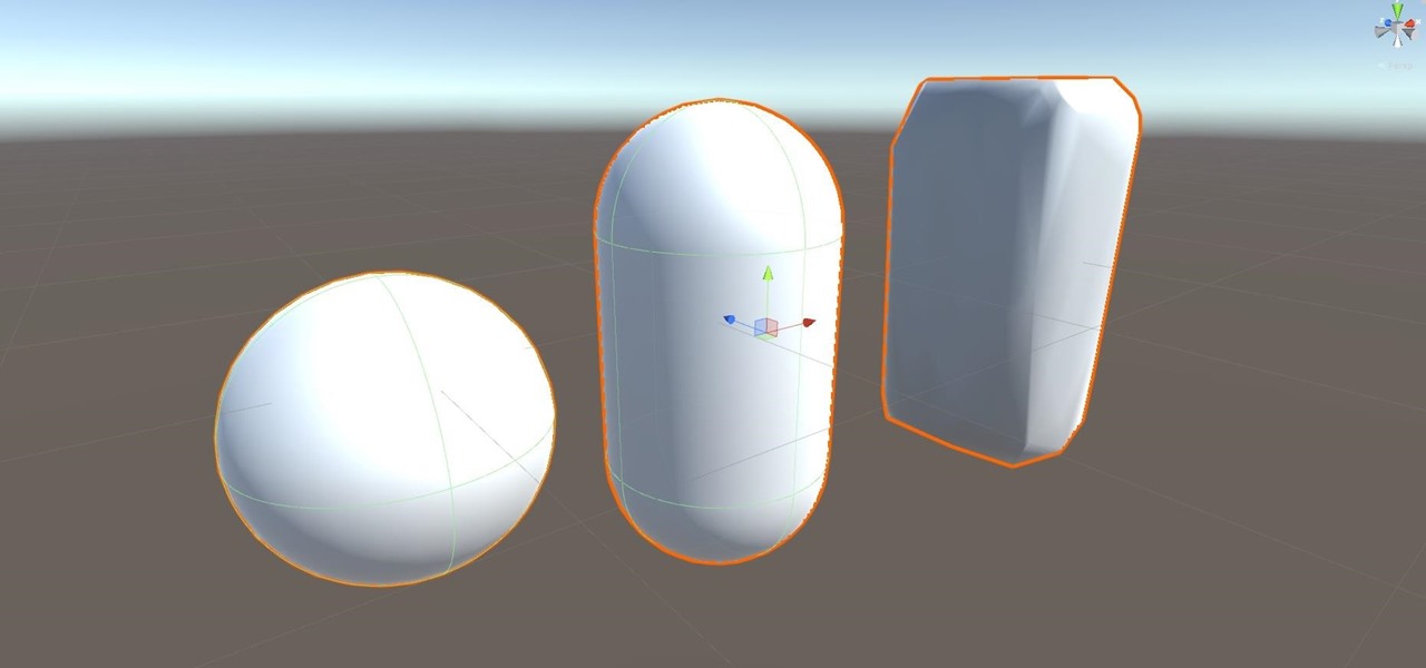
After previously learning how to make the material of an object change with the focus of an object, we will build on that knowledge by adding new objects through code. We will accomplish this by creating our bounding box, which in the end is not actually a box, as you will see.

Google's been using their "Material Design" look in Android for years now, but a change is coming up with "Material Design 2," their updated version focusing on new colors, icons, and spacing. Whether it'll be called "Material Design 2" or not remains to be seen, but you can try it out right now in Google Chrome on your Android device right now.

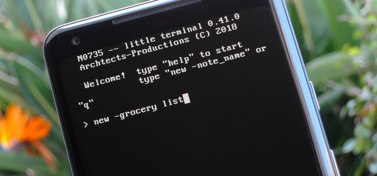
Deep down inside, Android is really just a fork of Linux, the popular open source desktop OS. You can see traces of its roots everywhere, and this lineage still holds a certain appeal with many Android fans. If you're in that boat, you'll love the newest notes app we just found.

Alright, let's dig into this and get the simple stuff out of the way. We have a journey ahead of us. A rather long journey at that. We will learn topics ranging from creating object filtering systems to help us tell when a new object has come into a scene to building and texturing objects from code.

Welcome back, my hacker noviates! In a recent post, I introduced you to Shodan, the world's most dangerous search engine. Shodan crawls the globe from IP to IP address, attempting to pull the banners of each web-enabled device and server it finds.

Few apps on the iPhone give you ways to change their color scheme aside from Dark Mode in iOS 13 and later, but that doesn't mean you can't give an app a new color theme or filtered look. With the Shortcuts app in iOS 14 and later, it's totally possible, and it'll work in practically any app.

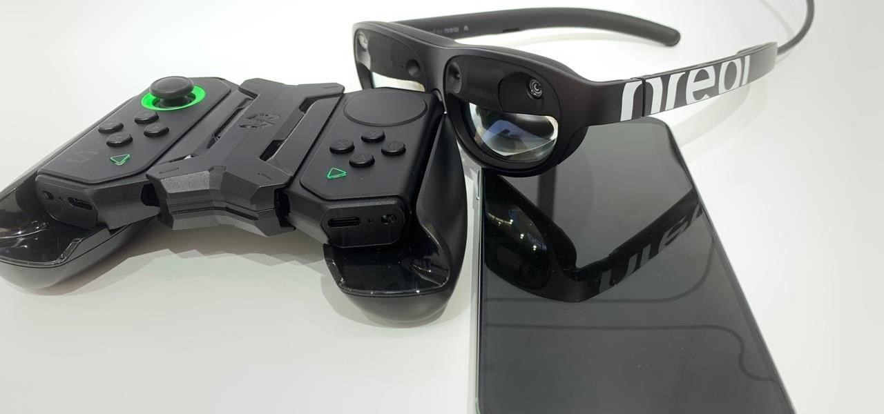
With the consumer edition of its Nreal Light headset, scheduled to ship in 2020, Nreal is prepared to bring the entire Android app ecosystem into augmented reality.

The results of Microsoft's $480 million contract with the US Army are on display and users continue to test the suped-up version of the HoloLens 2.

Who's ready to let future Facebook augmented reality smartglasses read their brain? Well, ready or not, the tech giant is making progress in the area of brain control interfaces (BCI) by funding research.

Software manufacterers always advise you to read the instruction manual first before attempting to do anything on a new program. But who has the time to obsess over ever little boring detail in a 300-page tome when just playing around the controls on your own gets you attuned to the program immediately?

Changing the way the Bridge looks is a personal touch everybody can make to streamline their workflow. Changing layout settings in the bridge is actually quite easy and very helpful for customizing for individual needs. In this video tutorial, see the ways that you can change the Bridge's look and feel to suit your work environment and to free up the space necessary to have a comfortable working window. This video also covers the viewing options given to you by the Bridge to allow for quick a...
