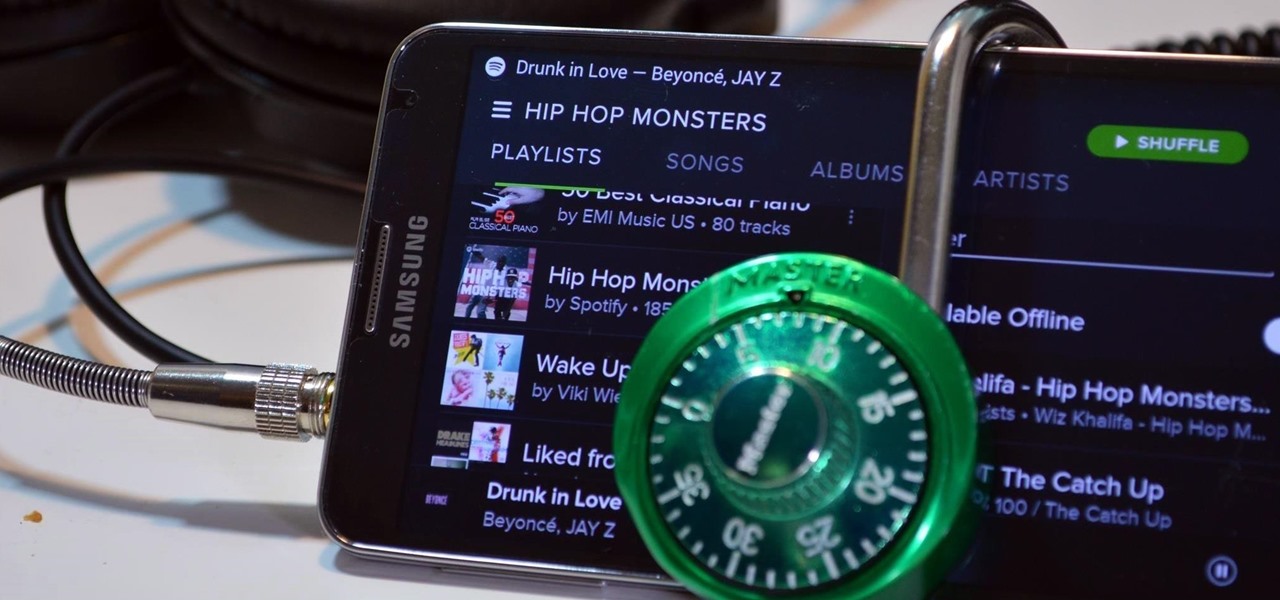
How To: Trick Spotify into Playing Any Song in Its Free Android App
With over 20 million songs, Spotify has become my go-to source for music. I can stream tunes to my desktop or phone, without ever having to worry about storage space being eaten up.


With over 20 million songs, Spotify has become my go-to source for music. I can stream tunes to my desktop or phone, without ever having to worry about storage space being eaten up.

In the past few weeks, the internet has been abuzz with nightmarish horror stories of Comcast's questionable decision-making and downright terrible customer service. The central theme of many of these disputes with the nation's largest cable provider is that without evidence, the conglomerate will refuse to acknowledge its mistake and place the burden of proof on the customer.

When it comes to passwords, the longer and more complex they are, the better the security. Even professional hackers say so. But if you've ever tried to type in such a password, you've surely noticed that it can be a bit of a pain. Mistype one character, and you're probably going to have to clear the field and start all over again.

Only scumbags hide their call and message history, right? Wrong. While it may seem like a tactic for the unfaithful, it's still a good thing to do for certain contacts on your phone that you don't want to block outright.
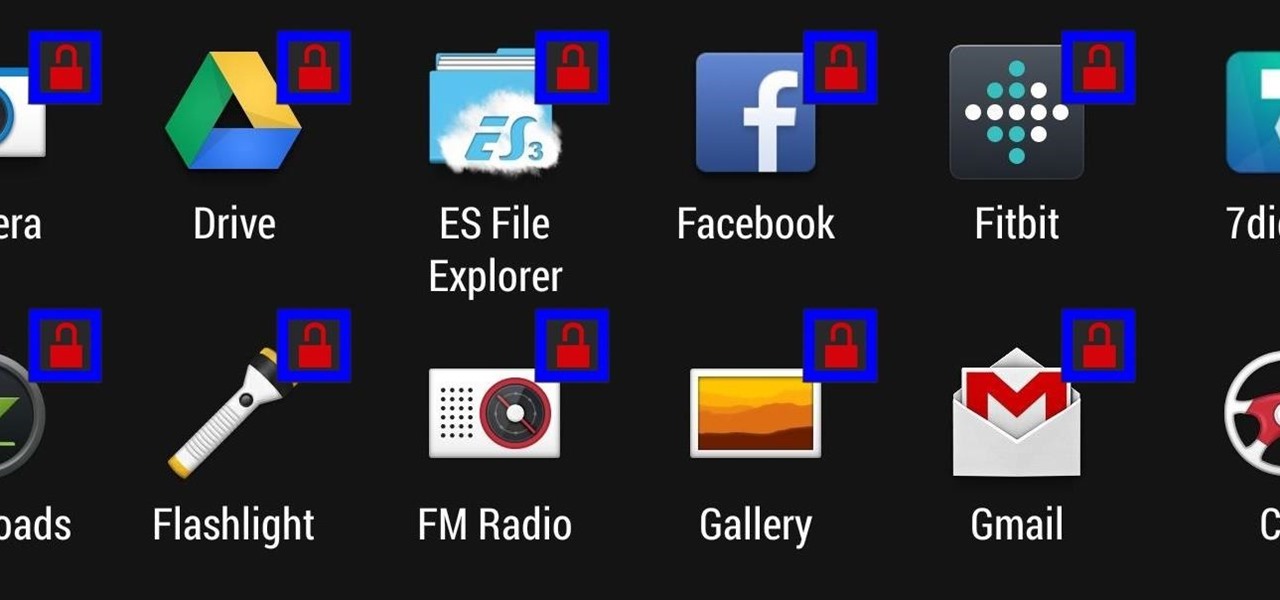
Keeping prying eyes off your device isn't always the easiest thing to do, especially once you lend somebody your phone to make a call. Seems that whenever someone is scrolling through your pictures or checking out your new phone, they always end up somewhere you don't want them be. You could always hover over their shoulder to make sure they're not getting into your texts or photos, but that isn't always possible.

Even with the highest-tiered data plan available, there are times that your phone or your carrier might downgrade your connection to 3G or even lower. This usually occurs when you've made a phone call, or you've switched cell towers while traveling.
Honestly, Android's stock alarm icon is completely useless. It doesn't relay any information other than the fact that, at some point in the future, you have an alarm coming up. Considering how pointless it is, I normally install GravityBox or other similar mods just to get rid of it.

Even with display sizes increasing by the year, smartphone screen real estate is still at a premium. We want the content we're viewing to take center stage, and this leaves little room for functionality beyond the focused app.

If you're like me, then you've got an incredibly complicated Wi-Fi password with uppercase and lowercase letters, numbers, and special characters.

If you're one of the millions of people who use the WhatsApp service for messaging, you've probably noticed a recent propensity that the app has had for adding buttons to its interface. Two such buttons have made their way into the message thread screen, cluttering up the interface with functionality that is a tad bit redundant.

There's a lot you can access from the Notification tray on your Galaxy S4. Quick settings toggles, brightness controls, and of course, notifications. However, despite the power this simple pull-down gives you, you're still left with a boring, black background for the shade.
The Galaxy S5's screen is truly a feat of modern technology. It uses what is known as an AMOLED display—an acronym for Active-Matrix Organic Light-Emmitting Diode. In short, this technology means that every individual pixel on your phone's screen emits its own light. This is a break from the traditional LCD technology that requires a backlight for any pixels to be visible.

Think of all the times you've ever copied and pasted a string of text on your device. At least once, I bet you've wanted to see your copy history.

Stock Android has come with lock screen widget support for a couple of years now, ever since the days of the first Ice Cream Sandwich build. But for some reason, Samsung decided to remove this feature in the Galaxy S5.

Auto-correction is a double-edged sword if I ever saw one. It's great because I'd have an abundance of typos without it, yet it's extremely frustrating (and embarrassing) when it doesn't actually work. Just take a look at the very recent example below from Breaking Bad star Aaron Paul. Funny for us, embarrassing for him. I have a particularly difficult time typing on small keyboards (i.e. fat-finger syndrome), so disabling auto-correction on my Samsung Galaxy S4 is a no-go. I'm willing to ris...

Even as a writer by trade, I'm not intimately familiar with every word in the English language. When you're typing something out on your Nexus, sometimes you think to yourself, "Is that right? Am I using the correct word here?" Then, you have no choice but to bring up Google Now and do a search for that word to make sure you're using it correctly.

One of the coolest features of the Galaxy S5 is its IP67 certification. This means that the S5 is internally impenetrable to dust and can be submerged in water for thirty minutes at a depth of one meter. It's definitely a handy feature for folks who've lost a phone to a toilet in the past.

Unlike the Galaxy S4 and other Samsung devices, the Nexus 7 doesn't have a Clear All option in the recent apps menu. It's a highly requested feature, as it cuts down the time required to go one-by-one swiping each individual app (you can't swipe away multiple ones at the same time).
Many of our everyday apps include a menu tab or search bar, like Chrome and Twitter. In fact, a lot of times those are the first things we go for, as search is universal in most apps, and app settings are just about always accessible through the menu.

The fact that we own a Nexus means we get to experience the Android interface exactly as Google intended it. But that doesn't mean we can't make a UI tweak here and there, does it?

If you've followed our guide on unlocking KitKat's real full screen capability using the immersive mode mod, then your status and navigation bars will be hidden when not in use, giving you a more expansive full screen experience.

Over the years, we've probably all complained at some point about Android's lack of an "Undo" feature. When you're typing something out, there are times when you might want to go back a step.

Let's say you're watching a video and everything's going great, but you feel the need to raise the volume a tiny bit. You hit the volume button on your Nexus 5, and all of a sudden, a giant volume slider appears that obscures half of your video for 3 seconds.

Ever since Android 3.0 Honeycomb, Google has been trying to push phone manufacturers to do away with physical menu buttons. Samsung has been one of the lone holdouts, retaining the menu key up until the Galaxy S5, where they finally replaced it with a "recent apps" multitasking button.
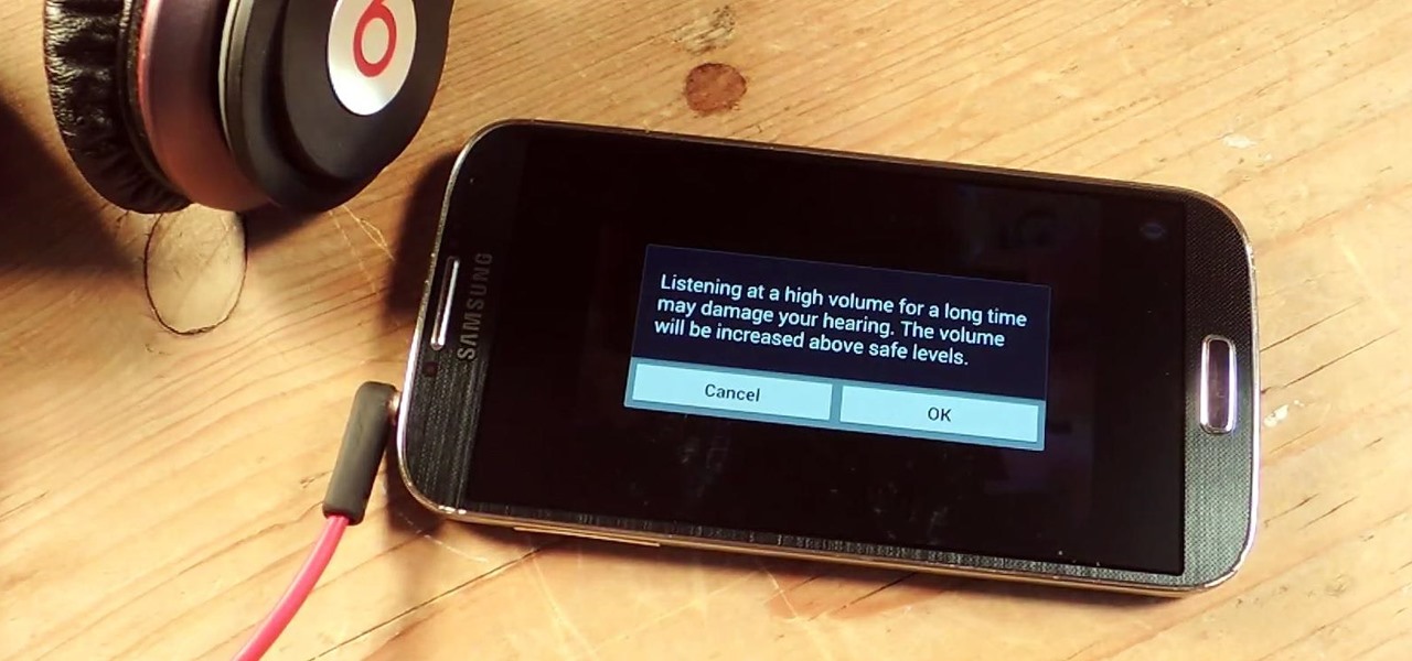
I've been told numerous times that I listen to music way too loud, to the point of potential hearing damage, especially when I have my headphones plugged in. Not only do my friends tell me this, but my Samsung Galaxy S4 likes to nag me as well. Once I pass a certain volume threshold (nine steps) with my headphones, I get that annoying high volume alert. Sorry, my hearing isn't as good as it once was, so let me jam in peace!

When the Nexus 5 was released, a new version of Android came along with it called KitKat. In the 4.4 update were some fancy new UI elements, one of the most noticeable being the translucent decor. By that, I mean the status and navigation bars being semi-transparent.
When it comes to blocking unwanted calls, your Android device comes stocked with a native blocking feature that allows you to reject certain phone numbers. That being said, the native blocking feature on the Samsung Galaxy Note 3 isn't the prettiest or the smartest, with its non-obvious setup and lack of features.

Multi Window, a feature that was greatly improved with the release of the Samsung Galaxy Note 3, is still quite limited on the older Note 2, allowing only the use of a few stock applications to multitask with.

If you've ever noticed, even just for a fleeting moment, that the auto brightness on your Nexus 5 seemed to "glitch out"—you are not alone.

Google released its long-awaited Google Now launcher a couple months ago, allowing users to access Google Now with the simple command of the voice. As great as the feature is, it requires that our screens be on, unlike the Moto X's "active listening" service that operates with Google Now, activating through a screen-off state.

Figuring out someone's password, pattern, or PIN isn't very difficult—simply watching over their shoulder or following the oil marks left across their screen is enough to figure them out and bypass whatever lock screen security they have.

I love my status bar. Not only does it tell what time it is and how much battery juice is left, but it gives me cellular connection info, text alerts, and app update notifications. However, one thing is does not give me is customization. Since you're looking at it all the damn time, why not personalize it?
Android updates are a funny thing—they give us a host of new features and upgrades, but they can also change things that we're used to. And sometimes we prefer to have things the way they were.

You've seen it a million times. You try to do something on your Android device and a box pops up asking you which app you'd like to use. You could try Photos, Gallery, Drive, Picasa Web Albums...the list is fairly extensive sometimes. And what's worse, after that you have to select "Always" or "Just once". Add it all up, and that's three taps to do something you thought would take just one!
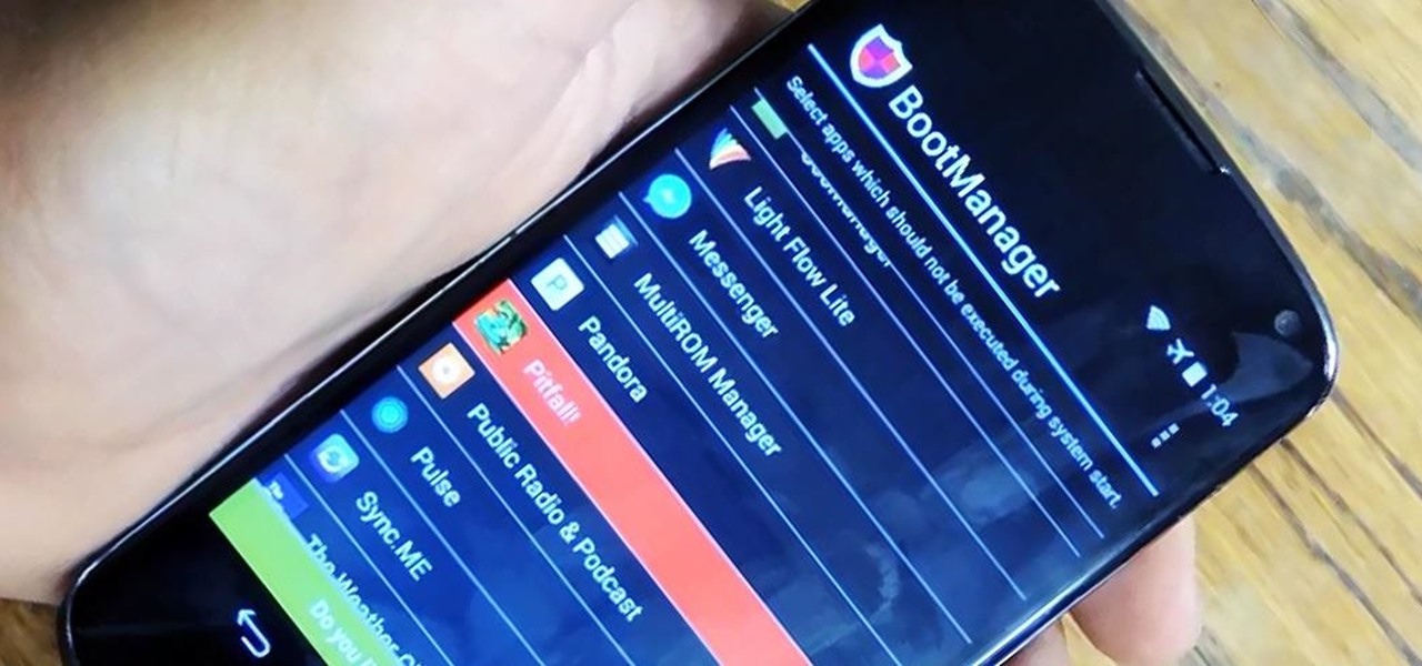
The more you use your device, the more you'll download and install apps. These apps range from helpful to fun to simple distractions, but after a while, you may notice slow down on your device or a marked reduction in battery life.

Accessing notifications and quick settings from the lock screen just makes things move quicker and more efficiently, unless of course we're using a secure lock screen. It makes sense that if we have face, pattern, or pin security enabled, we may not want notifications accessible, but really, that should be something we decide for ourselves—and now we can.

Android is all about the fine details. You can make a little tweak here and a little tweak there and completely customize your experience to be exactly how you want it to be. Sure, you don't need to customize LED colors or screen record, but it's nice to know you can.

On more than one occasion, I've wanted to check out the Google Play page for an app I was currently using, whether it was to get contact information or read recent reviews to see if others were experiencing issues that I was.

Notifications, while certainly helpful, can at times be overbearing. There are banners plastered every which way on your smartphone for almost every application. While many of the notifications can simply be swept away or turned off, the same can't be said of persistent notifications.

Normal wear and tear, combined with unfortunate accidents, can take a toll on any smartphone leading to scratches, cracks, and breaks that can leave physical buttons useless. One of the first buttons to usually go is the power button, since it's the main way to turn your phone (and screen) off and on.