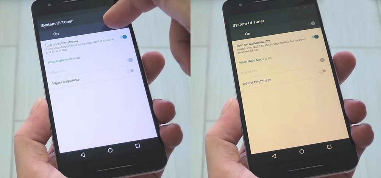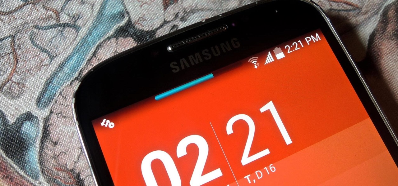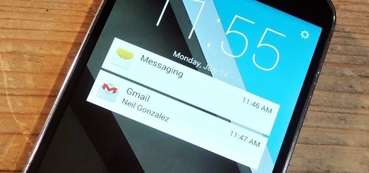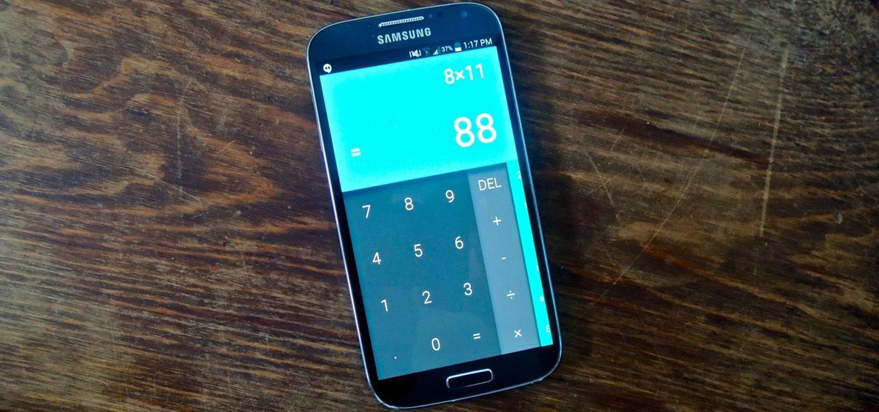
It's now common knowledge that the blue light emitted by phone screens makes it harder to get a good night's sleep. Apple's Night Shift in iOS and its steamrolled predecessor, f.lux (still available for desktop computers), are attempts to combat these harmful effects by limiting the amount of blue light from the screen at certain times of day (nighttime, say). For Android users who installed the Developer Preview build of Android 7.0 Nougat, the included "Night Mode" feature was all set to do...

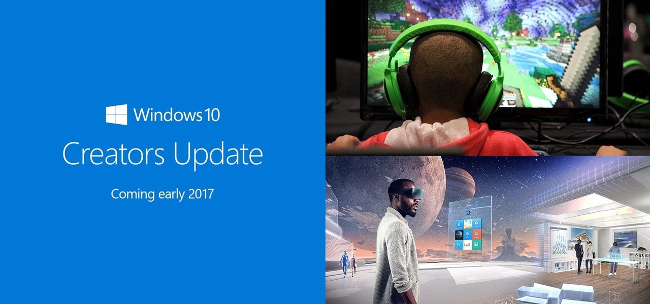
Today, Microsoft announced its Windows 10 Creators Update, adding the ability to scan objects in your world and bring them into the computer. With newly-announced inexpensive VR headsets and the HoloLens, you can enjoy those transplanted 3D objects in mixed and virtual reality.

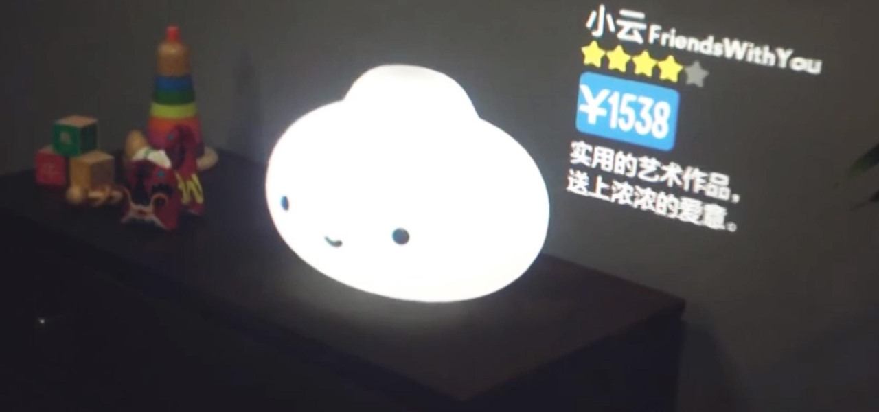
We've seen how mixed and augmented reality can offer better shopping experiences for consumers, and even how Magic Leap wants to make advertising a non-intrusive experience. So it's no surprise that Magic Leap seems to have partnered up with Chinese e-commerce company Alibaba—one of their largest investors—to create an augmented reality shopping app.

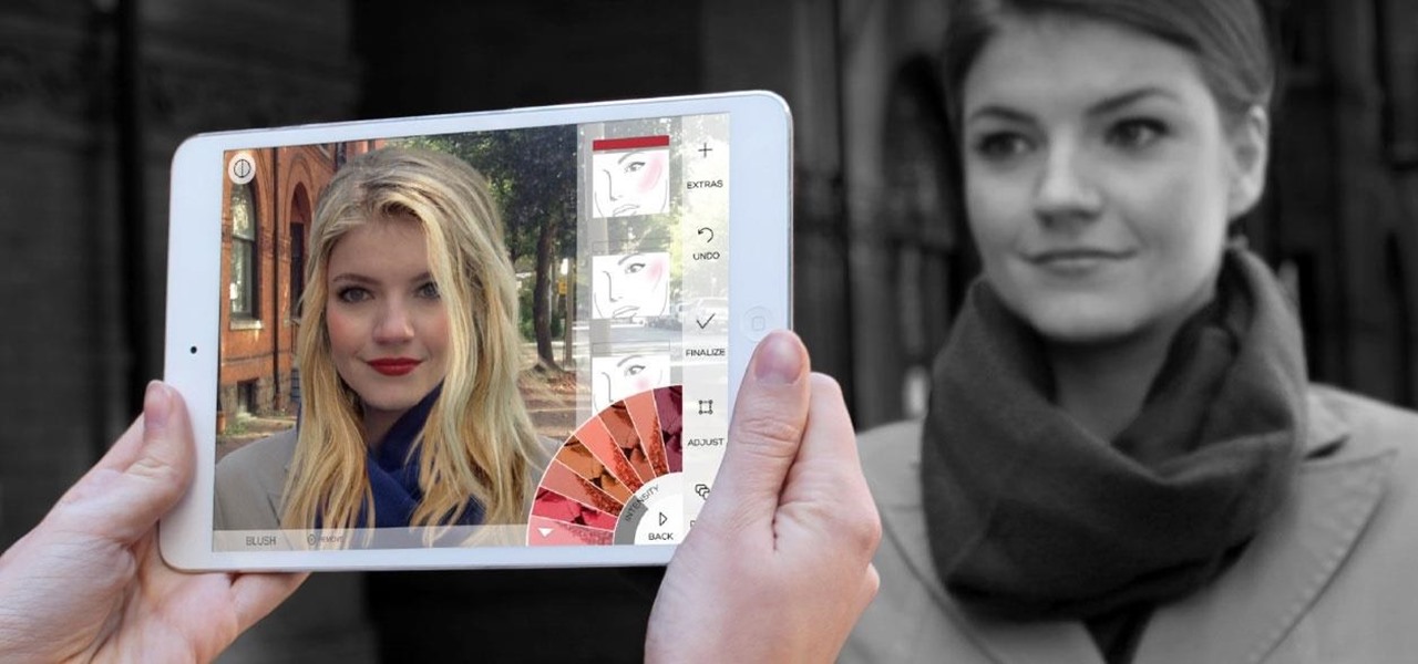
Augmented reality has a variety of applications, but lately the face has been a major point of concentration for many companies. We're all pretty familiar with face swapping by now, but ModiFace employs similar technologies for more practical purposes.

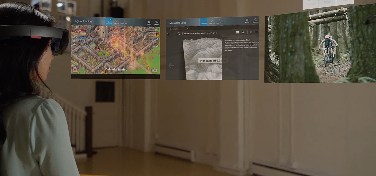
Microsoft released a robust version of the HoloLens when shipping the developer kits, but there's still lots of room left to grow. Today, they've released the first update to Windows Holographic, the operating system of the HoloLens, with a whole bunch of cool new features like voice commands and app multitasking.

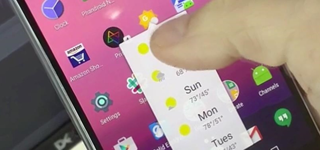
Launcher shortcuts, which let you skip directly to a specific function on an app when you open it, first appeared in a recent Android N preview build, and now we're getting a look at how the feature might look in action.

It sounded great on the surface when Microsoft announced that existing Windows 7 or 8 users would be able to upgrade to Windows 10 for free, but the execution so far has left a lot to be desired. Upgrading from an existing installation is relatively easy, but when you start with a clean install of Windows 10, you run into some problems.

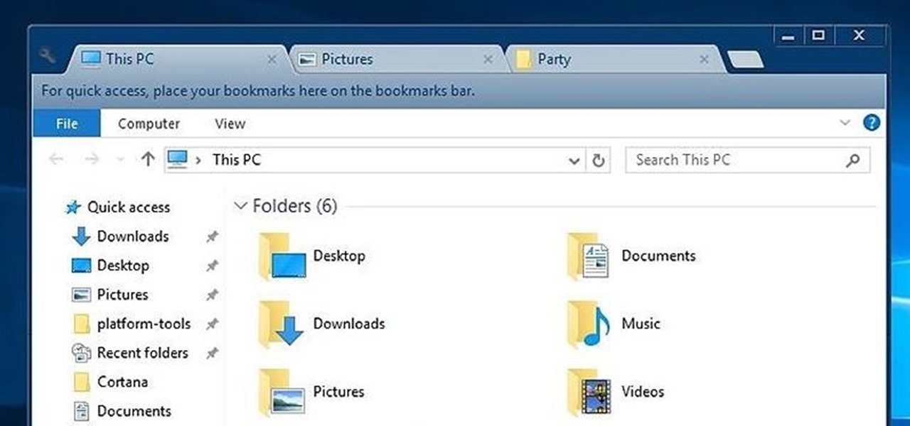
While Windows 10's new File Explorer is just as, if not more, useful as it was in previous iterations of Windows, it could definitely still be better. Two features that would greatly improve File Explorer are tabbed results and a customizable user interface, similar to how they are in Google Chrome.

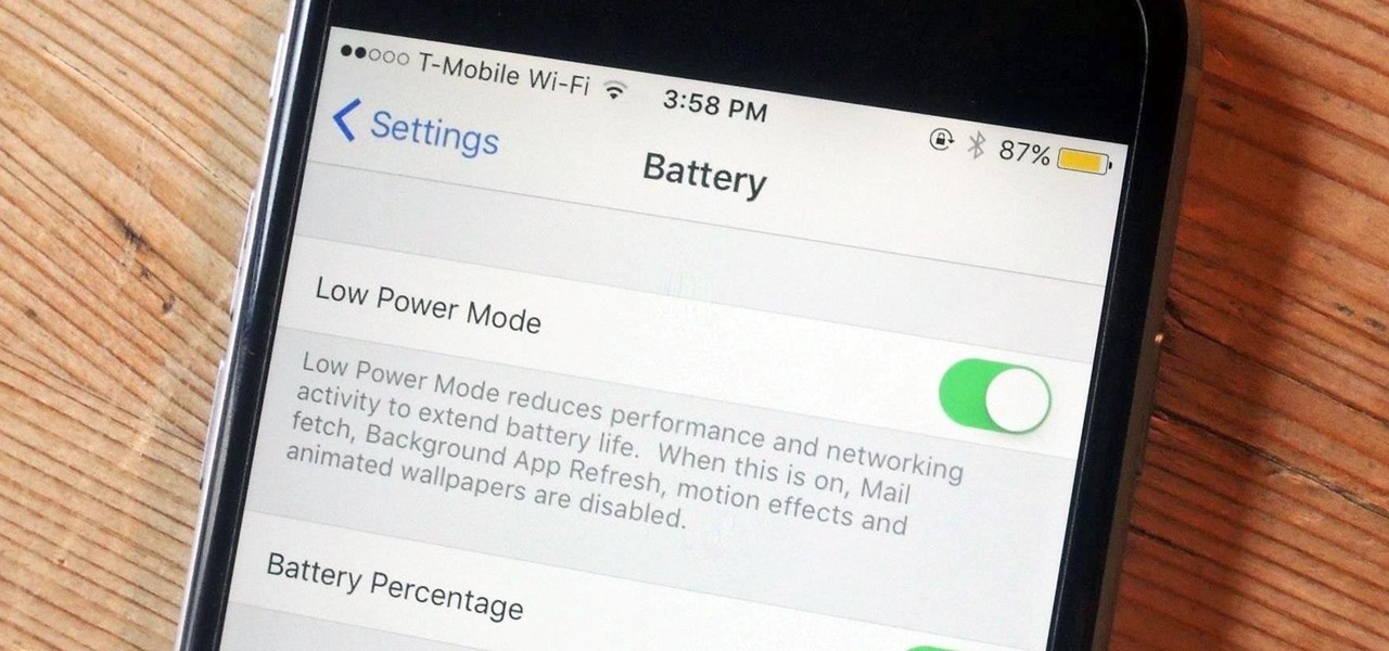
One thing Apple users universally complain about is battery life, whether it's on an iPad, iPhone, or Apple Watch. Apple did include a Battery Usage feature in iOS 8 to help us monitor which apps suck up the most energy, but it's too big a pain to deal with. Now, in iOS 9, there gave us something that actually matters—Low Power Mode.

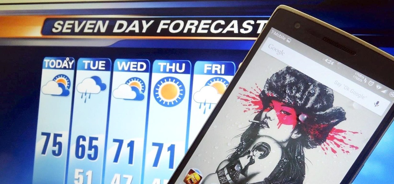
Living in Southern California means I don't really have a need to check the weather all that often. But every now and then, I'm caught off guard by a particularly chilly or hot day—no one wants to be the only person walking around with a T-shirt and sandals on a rainy, 50-degree day.

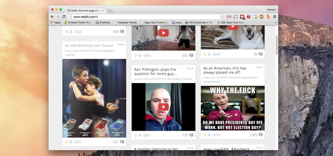
Reddit's overall design has stayed relatively unchanged for as long as I can remember. It's easy to use and is as popular as ever, so why mess with a good thing, right? Well, everyone's different, and if you're looking for ways to beef up your Reddit experience, try out the Chrome extension SHINE.

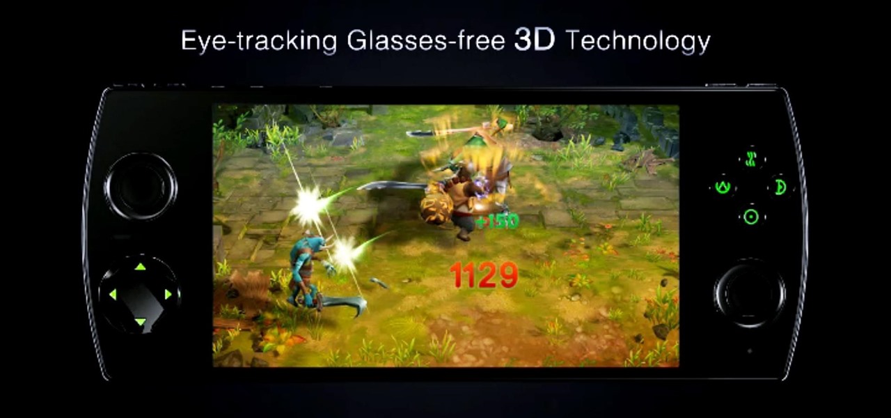
The upcoming W3D gaming smartphone by Snail isn't like anything you've ever seen before. It's pretty much a cross between an Android phone, Nintendo 3DS, and PlayStation Vita. It runs on Android, has a 3D screen similar to the 3DS, and gamepad controls like the Vita, making it one hell of a portable gaming device (that's also a phone).

Adjusting the brightness on your Android device is a simple but highly utilized action. For the most part, aside from the Sprint LG G3 variant, the brightness slider can be conveniently found nestled in your notification panel. And though it is easy to access, there is a small drawback to this feature.

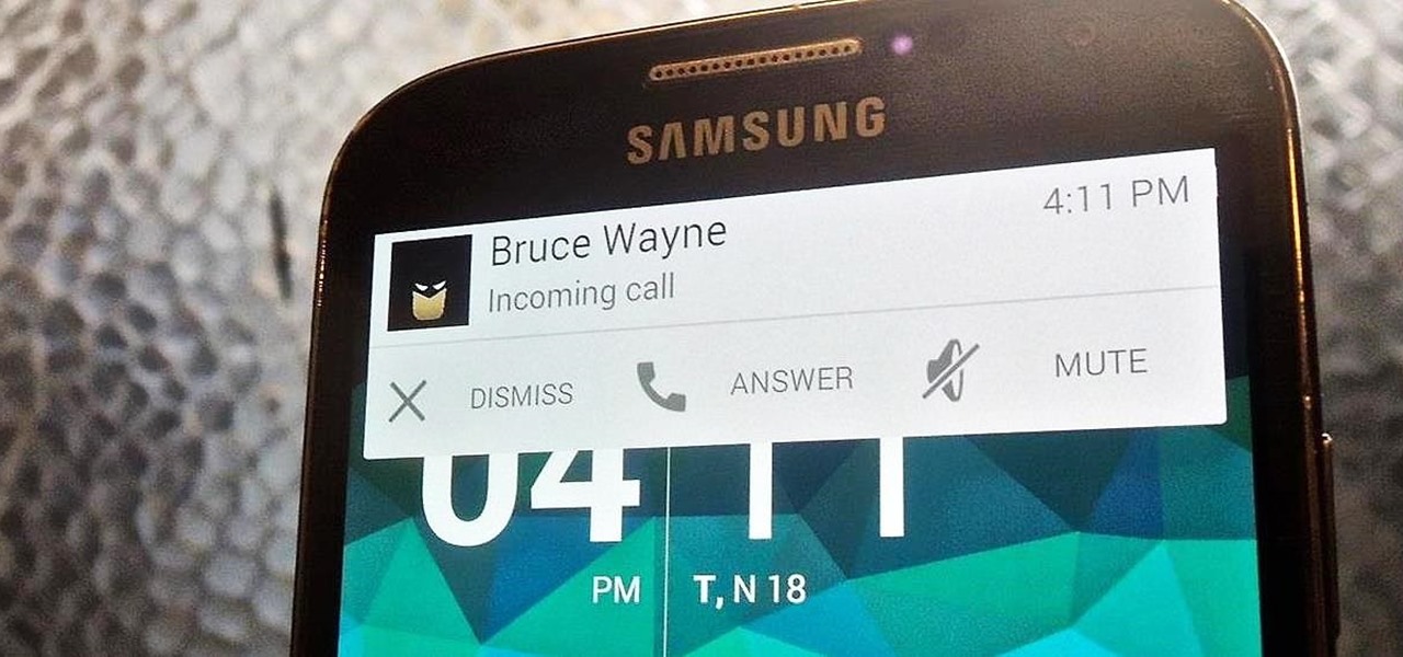
When playing a game or using an app, incoming call alerts can be extremely irritating on my Galaxy S4 because they insist on taking over the entire screen. The alert is a little different on other Android phones, depending on the manufacturer's skin, but all are fairly intrusive in one way or another.

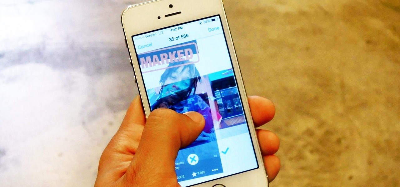
Apple doesn't make it very easy to delete things quickly from your Photos library, mainly for two reasons. First of all, if you delete multiple pictures at once, it's difficult to know the full details of each individual one you're selecting because the tiny thumbnails don't show very much detail. Secondly, if you delete the pictures one-by-one, you'll be able to view them in full screen, but it will take forever. And dealing with a delete confirmation each time is enough to drive anyone crazy.

Oddly enough, stock Android does not come with a "do not disturb" function out of the box. Samsung has their own version built into to TouchWiz called "Blocking Mode," and Apple has had their "Do Not Disturb" feature since iOS 6, so why is stock Android so late to the game?

Whether you are just starting or returning to college, or have already been out in the real world for some time, it's always a good idea to stay on top of your game by keeping your intellect sharp. While it may be easy to just sit in front of your TV, watching reruns of The Big Bang Theory, why not use that time to brush up on some chemistry, calculus, or general learning strategies?

This year's Google I/O brought the announcement of Android L, as well as the Preview builds of L for the Nexus 5 and Nexus 7 (2013), installed using either ADB on Windows or fastboot on any computer. Unfortunately, those of us without a Nexus device are out of luck—but not entirely.

Emoji are great for conveying your exact emotion or mood in a text message, but GIF animations are even better. They're convenient, hilarious, and they accomplish so much more than a little icon or photo ever could.

With Google's latest version of their mobile OS, Android L, the most notable aesthetic difference is the newly introduced Material Design concept that will soon be ever-present through the interface. The objective of this bold design is to create "hierarchy, meaning, and focus," as described by Google, and the deliberate choices of color and white space "to create immersion and clarity."

If you want to try out some of the new features in Android L, but can't run the developer preview on your Nexus—or simply don't want to—there's still hope. You don't actually need to be running Android L to try out some of the new improvements.

When a big company (Google) concentrates on big things (Auto, TV, Wear), some of the smaller aspects of their design can be overlooked. Just as we saw in Android KitKat, battery percentage information is absent from the status bar. While we were able to enable a hidden setting to show that all-important number in KitKat, you could see why it was never enabled—the white text on the white battery icon made it nearly impossible to read.

Even if your business is mostly online and computer related you will need paper, which in other hand will need classifier to be sorted out and easily accessed. The paperless office is as much of a myth as the paperless toilet, so accept it, if you are serious about business, you need paper. Important contracts between customers signed on papers, leaflets, reminders, advert previews, drafts for preview at the table. The paper is always used even in today highly computerized epoch.

The official Google Hangouts app has been around for a while, and is the standard messaging app on Nexus devices, but Google didn't make each version equal. On the iOS version, you get the feature of adding "stickers"—GIF emoticons—but Google left that out of the Android version.

This how-to article is about changing you Mac icons. It goes into detail on how to make your dock icons a different image, like your favorite sports team or just a cool looking image.

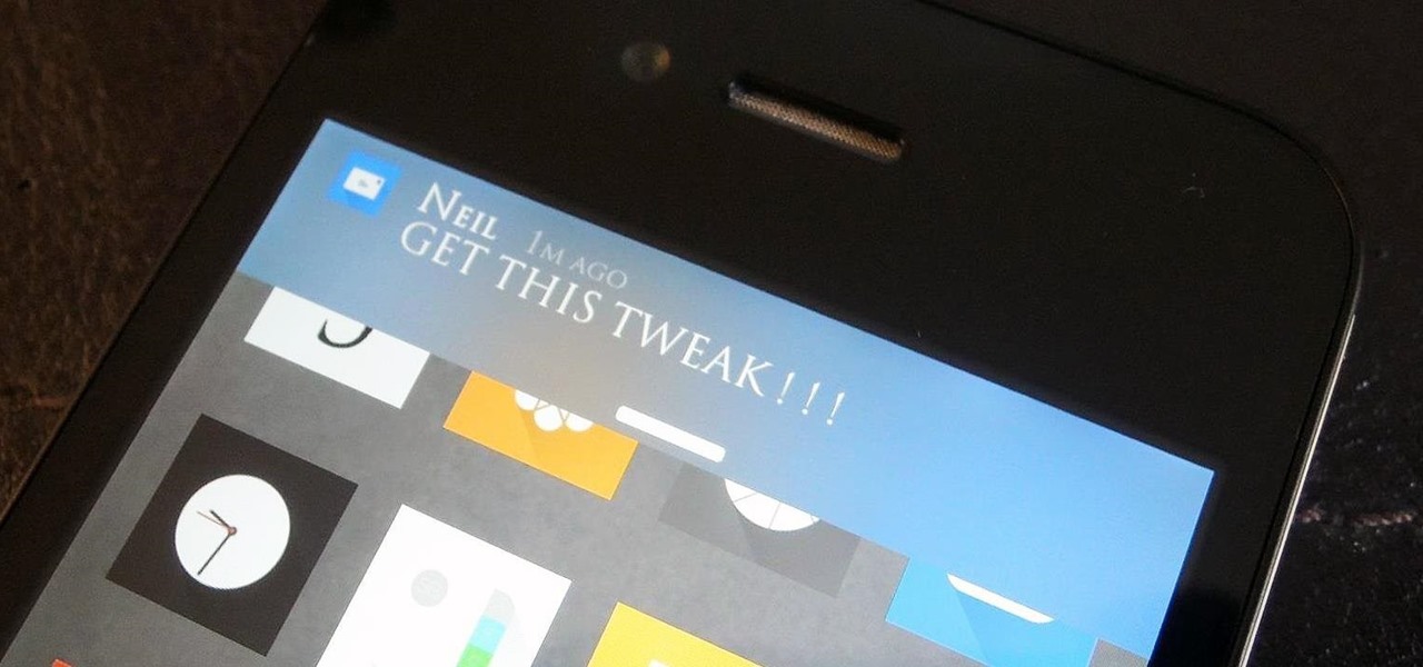
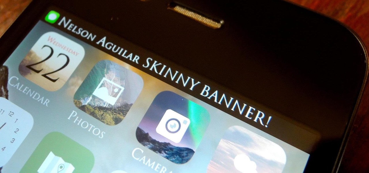
A banner alert for notifications is like the Robin to our iPhone's Batman—they're taken for granted and don't really get the recognition they deserve. Yes, they can be disruptive at times, but just like Robin, they can be necessary for getting things done.

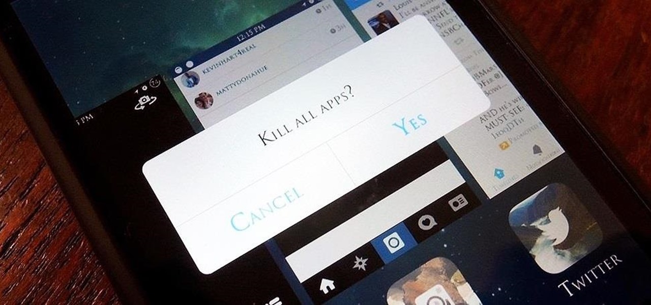
When lending our iPhone to our kids, siblings or friends, it's not uncommon to have it returned with what seems like a million apps open in the background. What's worse is being too lazy to close all those open apps, in turn having our battery drain much faster than normal.

So, I'm playing Injustice: Gods Among Us and whooping some serious superhero ass when out of nowhere I receive a stupid notification that ruins my game and subsides my thunder!

Those of you using iOS 7 probably know by now that swiping down on an app's preview screen in the multitasking menu does absolutely nothing. Swiping up force closes the app, but down is useless—unless you're jailbroken.

To say that there are a lot of app switchers and launchers available is an understatement. We've covered a few ourselves, including Loopr and Switchr. But why not check out one more?

There are thousands of fonts you can download online. Some are free, some you have to pay for, but they all have something in common—if you can get them, so can everyone else. If you want a truly unique font that no one else is using, you have to make your own, and what's more unique than your own handwriting?

I have been a fan of pirates ever since I downloaded my first movie on LimeWire. Wait, wrong pirates. I guess real pirates are pretty cool too. Johnny Depp brought pirates back into the spotlight with his role as Captain Jack Sparrow in Pirates of the Caribbean. And a Somali pirate from Captain Phillips got nominated for a Golden Globe.

If you're lucky enough to have an iOS developer account, then you had a brief glimpse of some of the darker options with the 7.1 update, including a darker keyboard. This was exclusive to developers who installed the first iOS 7.1 beta, but is no longer available, unfortunately.

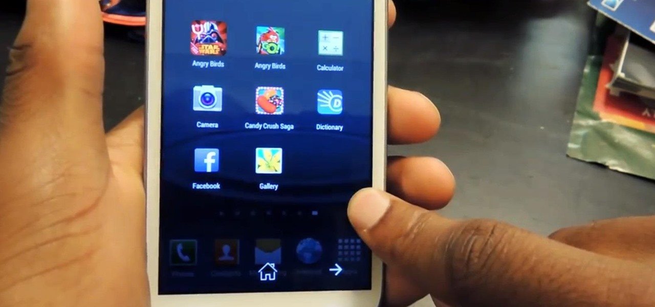
I like to hop between apps pretty often, and luckily my Samsung Galaxy S3 let's me do that fairly quickly. By simply holding the Home button for a few seconds, it will bring up my most recent apps, and I can switch between them with a simple tap. So if I am playing Injustice: Gods Among Us and want to switch the song currently playing on Pandora, I can bring up the recent apps menu to navigate there. While this default app switcher is more than adequate, it takes up the entire screen and coul...

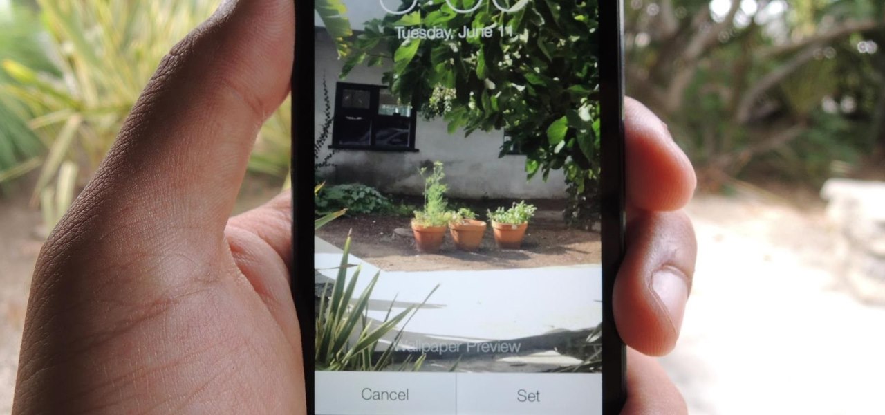
Panoramic live wallpapers for the iPhone? If the first beta version of iOS 7 is indicative of the imminent public release of Apple's revamped mobile operating system, the answer is a resounding yes.

As most everyone knows, Android and Apple don't get along so well. Even the users don't get along well, with Android and iPhone users constantly berating and insulting each other online—any chance they get. I should know, since I was one of them, but I'm now rare breed who's learned to appreciate both. People just need to realize that they have their own unique strengths—Android with its customization and Apple with its simplicity.

Yesterday, Microsoft released the customer preview of its newest version of Office, the first version optimized for both touchscreens and desktop systems. The entire suite got a much-needed facelift and a few new cool features. Here are some of the most notable changes.

The cinematic photos feature in Google Photos can create impressive three-dimensional views of normally flat images, turning ordinary pictures into life-like representations of the moment captured. Google Photos would automatically pick images from your library to apply the effect to. Now, you can choose images on demand from your library — it's just not super obvious that you can.

While I prefer Android in my personal life, I've had the opportunity to work in the Apple ecosystem. One of the coolest features I've come to rely on is AirDrop, which makes it easy to beam content from mobile devices to desktops and vice versa. Thankfully, Android now has an equivalent.

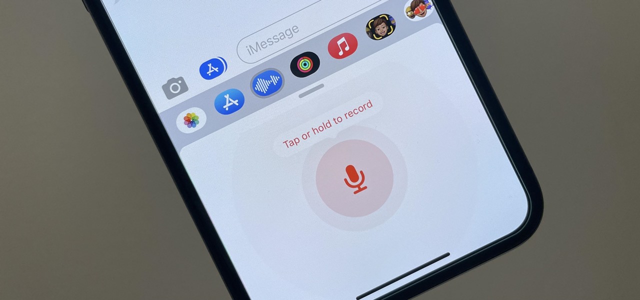
To record an audio message in the Messages app on iOS 15, you would tap and hold the audio messages button in the text entry field of the conversation. Then, you could let go to preview it before sending it or swipe up to send it right away. That's no longer the case on iOS 16 for iPhone.
