How To: How Do You Do a Business Plan? Part 1 of 5
How Do You Do A Business Plan? Part 1 of 5 (Series designed to discuss the parts of a business plan, what information is involved in each part, and why a business plan is needed.)

How Do You Do A Business Plan? Part 1 of 5 (Series designed to discuss the parts of a business plan, what information is involved in each part, and why a business plan is needed.)
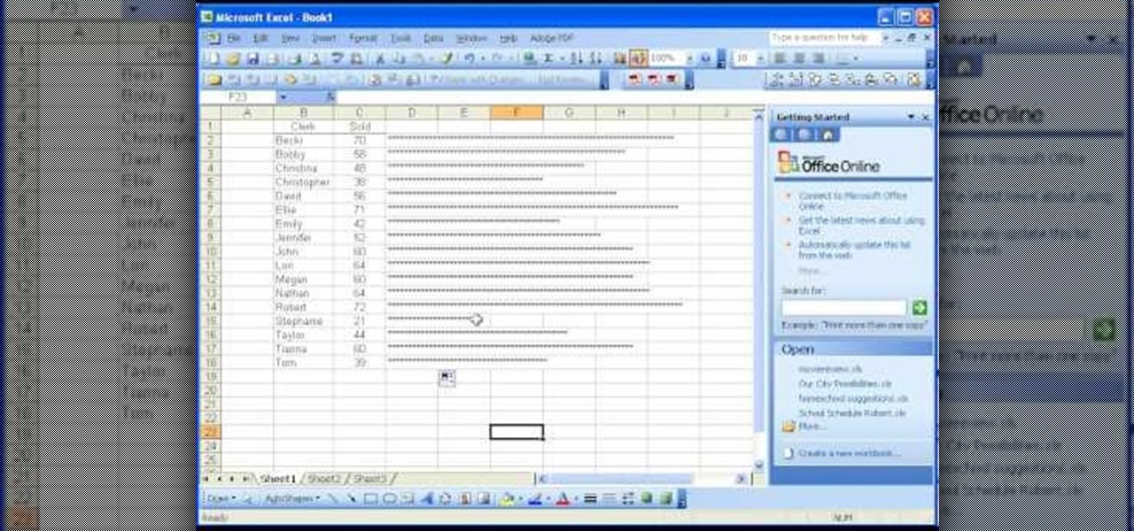
There are many functions in Microsoft Excel. One function that people rarely use is the Repeat function or REPT. In this video, an example used is a chart of people and their sales of a certain item. Just looking at the numbers, it is hard to compare the different sales easily, but a more visual approach may work better. Next to one of the cells, type in "=REPT(" which is the repeat function. A popup should say "=REPT(text, numbertimes)". For "text", type in *** or anything, really. For "numb...

The rumors have been circulating for months, but now there's a source attached to the notion that Magic Leap is looking to sell itself off after a rough couple of years following the launch of its Magic Leap 1 augmented reality device.

Second-generation AirPods just went on sale with the best prices since Black Friday's deals. So if you missed your shot at snagging a set of AirPods with the Charging Case or Wireless Charging Case, you've got another chance. But you'll need to act quickly to take advantage.

Now that some of the best-known beauty brands are leveraging augmented reality to market and sell products, the rest of the market is beginning to catch up — fast. The latest competitor to add AR to its arsenal is direct sales makeup company Younique.

Just when we thought the AT&T partnership with Magic Leap wouldn't really take off until the latter launched a true consumer edition of the Magic Leap One, the dynamic duo jumped into action this week to offer the current generation headset to customers.

After entering the UK's version of bankruptcy last month, Blippar's assets are up for sale, and bidding ended today.

Many Americans will celebrate the start of the summer this Memorial Day weekend with backyard cookouts, and two brands hope to solidify their invites to those parties through augmented reality experiences in Snapchat.

This week, we're beginning to see the wide ranging impacts of some of the early iterations of augmented reality hardware and software.

With the Super Bowl just days away, it seems appropriate to draw parallels between football and the professional sport of technology business, or, more specifically, the augmented reality segment.

We knew it was coming, it was just a matter of when. Apple has just announced iOS 11.3, a new update for iPad, iPhone, and iPod touch, and it will include a brand-new set of Animoji for the iPhone X.

While it may seem to some like investors are just throwing their money at augmented reality companies simply because the tech is heavily hyped, these money managers do actually want to see a return on their investments.

Apple has billed ARKit as a means to turn millions of iPhones and iPads into augmented reality devices. The refrain is similar for Kaon Interactive, a developer of product catalog apps for businesses.

Update 6/16: This number is now way higher. In just the first two days of this sale, over 350,000 people have pre-registered for the phone.
Savor this moment: we've got a confirmed number of sales for the Google smartphone. We say this because unlike most hardware manufacturers, Google refuses to share official sales numbers for their phone. Instead, during earning reports they simply bundle the product under Alphabet's "Other Revenues", leaving us in the dark about how successful the product is.

In a move that confirms previous speculation, Apple has placed a large OLED display order from Samsung for its next iPhone. At 70 million display units, the order is a large one to be sure, but when stacked against previous iPhone sales, it's no wonder the rumors say there won't be enough 2017 iPhones to meet demand.

For a long time, Apple has kept the upper hand on Android as far as app revenue is concerned. However, this tradition looks likely to change this year, as Android's app sales are expected to surpass Apple's.

All across the country, retailers like Best Buy, Target, and Walmart are gearing up for their Black Friday sales. Brick and mortar stores are already packed to the brim with inventory in anticipation of the craziness that will strike as soon as the doors open the day after Thanksgiving.

With over 2 million uploaded videos and over 28 million people who had talked about it online by the end of August, the ALS Ice Bucket Challenge was the most viral social media event of 2014. Its popularity provided the ALS Association with $115 million in donations to date, with everyone from students to veterans to celebrities contributing.
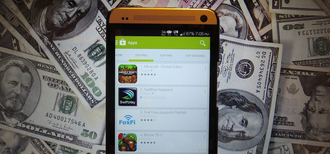
Tricking out your phone is nice, but there's nothing better than saving money in the process. Google Play is full of apps that offer great functionality, but some of them are not always cheap, and that's why AppSales was made. AppSales is an app browser that lists apps that are currently on sale, and can also keep track of those you are interested in buying in case the price drops.
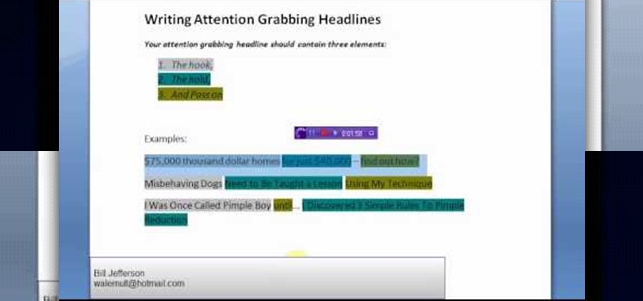
Not selling that much online these days? Maybe it's because your headlines just are reaching out to people the way they should. Good marketing means good writing in the web industry.
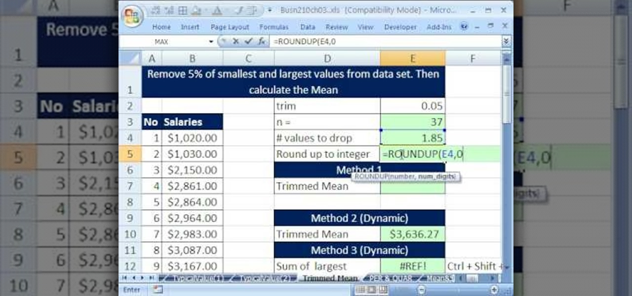
If you use Microsoft Excel on a regular basis, odds are you work with numbers. Put those numbers to work. Statistical analysis allows you to find patterns, trends and probabilities within your data. In this MS Excel tutorial from everyone's favorite Excel guru, YouTube's ExcelsFun, the 36th installment in his "Excel Statistics" series of free video lessons, you'll learn how to calculate a trimmed mean, which is used when there are extreme values in the data set that might skew the mean.
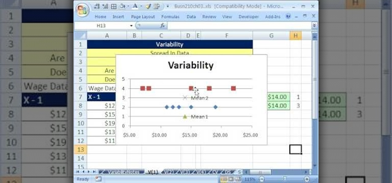
If you use Microsoft Excel on a regular basis, odds are you work with numbers. Put those numbers to work. Statistical analysis allows you to find patterns, trends and probabilities within your data. In this MS Excel tutorial from everyone's favorite Excel guru, YouTube's ExcelsFun, the 39th installment in his "Excel Statistics" series of free video lessons, you'll learn about variability (or dispersion or spread). Create an X-Y Scatter Diagram chart showing data points and the mean.
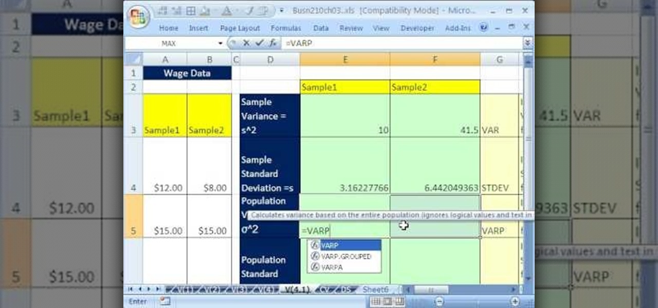
If you use Microsoft Excel on a regular basis, odds are you work with numbers. Put those numbers to work. Statistical analysis allows you to find patterns, trends and probabilities within your data. In this MS Excel tutorial from everyone's favorite Excel guru, YouTube's ExcelsFun, the 41st installment in his "Excel Statistics" series of free video lessons, you'll learn how to calculate deviations, variance and standard deviation for a sample and a population using Excel tables and the VAR, S...
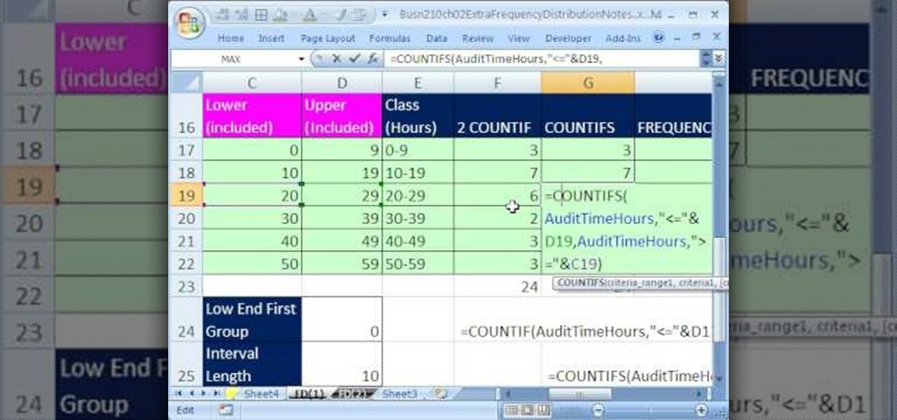
If you use Microsoft Excel on a regular basis, odds are you work with numbers. Put those numbers to work. Statistical analysis allows you to find patterns, trends and probabilities within your data. In this MS Excel tutorial from everyone's favorite Excel guru, YouTube's ExcelsFun, the 32nd installment in his "Excel Statistics" series of free video lessons, you'll learn how to group when the quantitative data are whole numbers, integers or discrete data and how to group when the quantitative ...
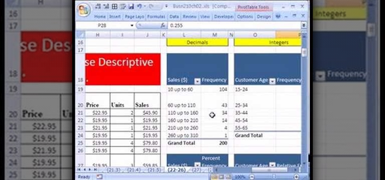
If you use Microsoft Excel on a regular basis, odds are you work with numbers. Put those numbers to work. Statistical analysis allows you to find patterns, trends and probabilities within your data. In this MS Excel tutorial from everyone's favorite Excel guru, YouTube's ExcelsFun, the 25th installment in his "Excel Statistics" series of free video lessons, you'll learn how to create quantitative data percent & relative frequency distributions with pivot tables. Also see how to create a histo...

If you use Microsoft Excel on a regular basis, odds are you work with numbers. Put those numbers to work. Statistical analysis allows you to find patterns, trends and probabilities within your data. In this MS Excel tutorial from everyone's favorite Excel guru, YouTube's ExcelsFun, the 22nd installment in his "Excel Statistics" series of free video lessons, you'll learn how to create a percent (%) cumulative frequency distribution with formulas, a histogram and an ogive chart. See how to add ...
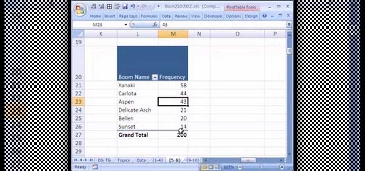
If you use Microsoft Excel on a regular basis, odds are you work with numbers. Put those numbers to work. Statistical analysis allows you to find patterns, trends and probabilities within your data. In this MS Excel tutorial from everyone's favorite Excel guru, YouTube's ExcelsFun, the 15th installment in his "Excel Statistics" series of free video lessons, you'll learn how to use create a frequency distribution, relative frequency distribution, percent frequency distribution and pie chart wi...
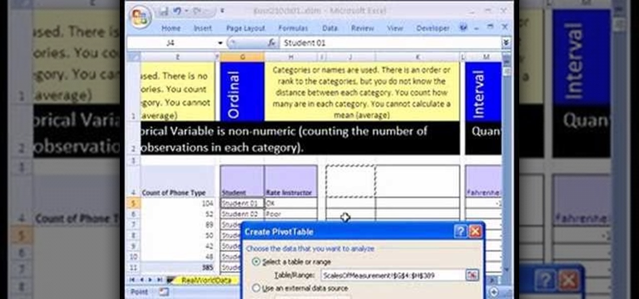
If you use Microsoft Excel on a regular basis, odds are you work with numbers. Put those numbers to work. Statistical analysis allows you to find patterns, trends and probabilities within your data. In this MS Excel tutorial from everyone's favorite Excel guru, YouTube's ExcelsFun, the 10th installment in his "Excel Statistics" series of free video lessons, you'll learn how about data sets and the nominal, ordinal, interval and ration scales/levels of measurement and see two Pivot Tables that...
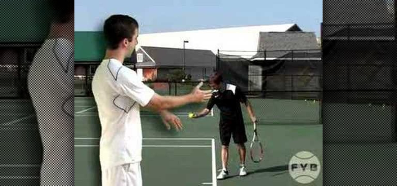
Welcome to a tennis lesson from FuzzyYellowBalls, the the best place to learn how to play tennis online. Our free video tennis lessons teach you how to play the game in a new way that combines technical analysis, visual learning, and step-by-step progressions.

Welcome to a tennis lesson from FuzzyYellowBalls, the the best place to learn how to play tennis online. Our free video tennis lessons teach you how to play the game in a new way that combines technical analysis, visual learning, and step-by-step progressions.

Welcome to a tennis lesson from FuzzyYellowBalls, the the best place to learn how to play tennis online. Our free video tennis lessons teach you how to play the game in a new way that combines technical analysis, visual learning, and step-by-step progressions.

Welcome to a tennis lesson from FuzzyYellowBalls, the the best place to learn how to play tennis online. Our free video tennis lessons teach you how to play the game in a new way that combines technical analysis, visual learning, and step-by-step progressions.
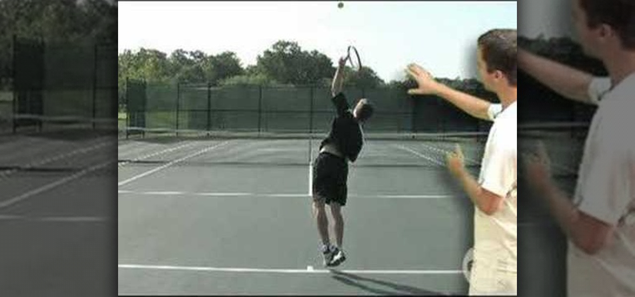
Welcome to a tennis lesson from FuzzyYellowBalls, the the best place to learn how to play tennis online. Our free video tennis lessons teach you how to play the game in a new way that combines technical analysis, visual learning, and step-by-step progressions.

Welcome to a tennis lesson from FuzzyYellowBalls, the the best place to learn how to play tennis online. Our free video tennis lessons teach you how to play the game in a new way that combines technical analysis, visual learning, and step-by-step progressions.

Welcome to a tennis lesson from FuzzyYellowBalls, the the best place to learn how to play tennis online. Our free video tennis lessons teach you how to play the game in a new way that combines technical analysis, visual learning, and step-by-step progressions.

Welcome to a tennis lesson from FuzzyYellowBalls, the the best place to learn how to play tennis online. Our free video tennis lessons teach you how to play the game in a new way that combines technical analysis, visual learning, and step-by-step progressions.

Welcome to a tennis lesson from FuzzyYellowBalls, the the best place to learn how to play tennis online. Our free video tennis lessons teach you how to play the game in a new way that combines technical analysis, visual learning, and step-by-step progressions.

Welcome to a tennis lesson from FuzzyYellowBalls, the the best place to learn how to play tennis online. Our free video tennis lessons teach you how to play the game in a new way that combines technical analysis, visual learning, and step-by-step progressions.

Welcome to a tennis lesson from FuzzyYellowBalls, the the best place to learn how to play tennis online. Our free video tennis lessons teach you how to play the game in a new way that combines technical analysis, visual learning, and step-by-step progressions.