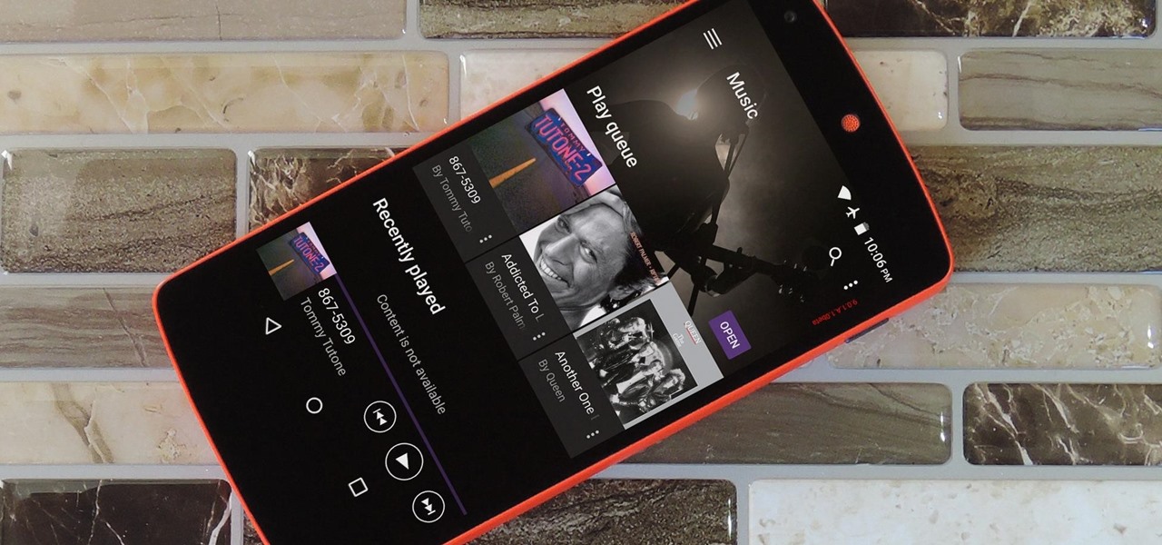
Sony's Xperia line of smartphones are beautifully crafted and have many great features. But considering the fact that Sony has evolved into a media company over the last two decades, it's their media-related apps that stand out the most.

Apple's latest round of devices—including the MacBook Pro, Apple Watch, and the iPhone 6S—use a new touch input method that can detect when you've applied a bit more force than usual. Dubbed "Force Touch" ("3D Touch" on the new iPhones), this gesture simulates a long-press or right-click, but it usually requires special hardware to detect the amount of pressure you've applied.

Meet the Wonderbag. The "first non-electric slow cooker" uses an insulated bag made of poly-cotton fabric, polyester, and repurposed foam chips. You bring your one-pot meal to the desired cooking temperature, usually via the stovetop. Then you turn off the heat, pop the pot into the Wonderbag, and it will continue to cook thanks to the retained heat in the bag.

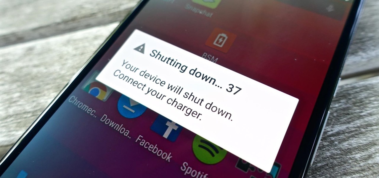
Even if my phone has only 1% of battery life left, I'll keep using it until I can get to a power source somewhere. Most times I never make it to a charger, and my device eventually powers down on its own.

For every contact photo you add, Android keeps two copies. The first is stored at a 720p resolution, and this is used for high-definition imagery when you're looking at a full-sized contact card. But the second image is only 96 pixels by 96 pixels, and this is used for all thumbnails throughout the operating system.

As it stands, Android's notification system is one of its biggest strengths—but that doesn't mean it couldn't use a few tweaks here and there. For one thing, when you receive multiple notifications from the same app, there is no indication as to exactly how many notifications you've received.

It sounds like a dream come true: just press a button on your phone, and 30 seconds later, a machine produces a custom-made, ready-to-eat meal. Finally, science comes through for the truly lazy!

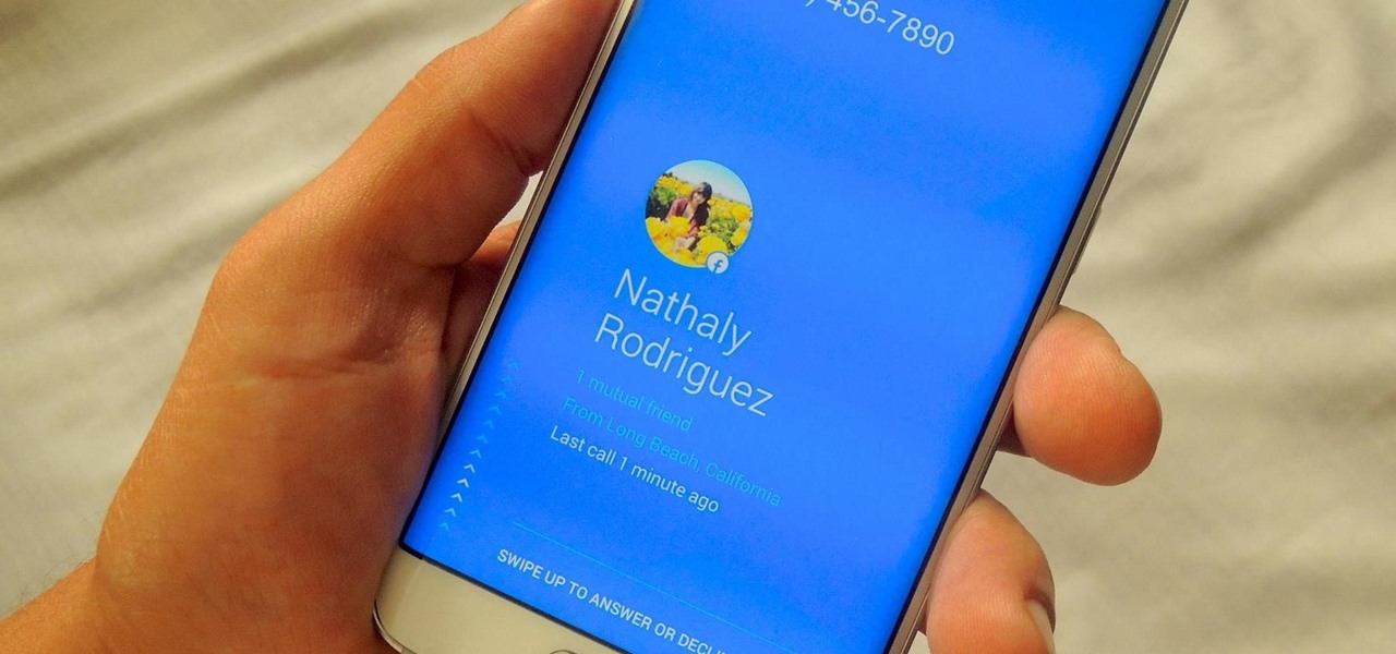
If a tree falls in the woods and nobody is there to hear it, does it make a sound? If a person makes calls but doesn't have a Facebook account, are they even really a person? Yes, of course they are, but it just makes life easier when you're part of the world's biggest social network, as proven with Facebook's latest application, Hello - Caller ID & Blocking.

One of the many additions that appear on Android 5.0 Lollipop is a handy menu that lets users correct for or simulate different types of color blindness. While Google didn't flip the switch on this new feature until Lollipop was released, it turns out they had been working on it for quite some time.

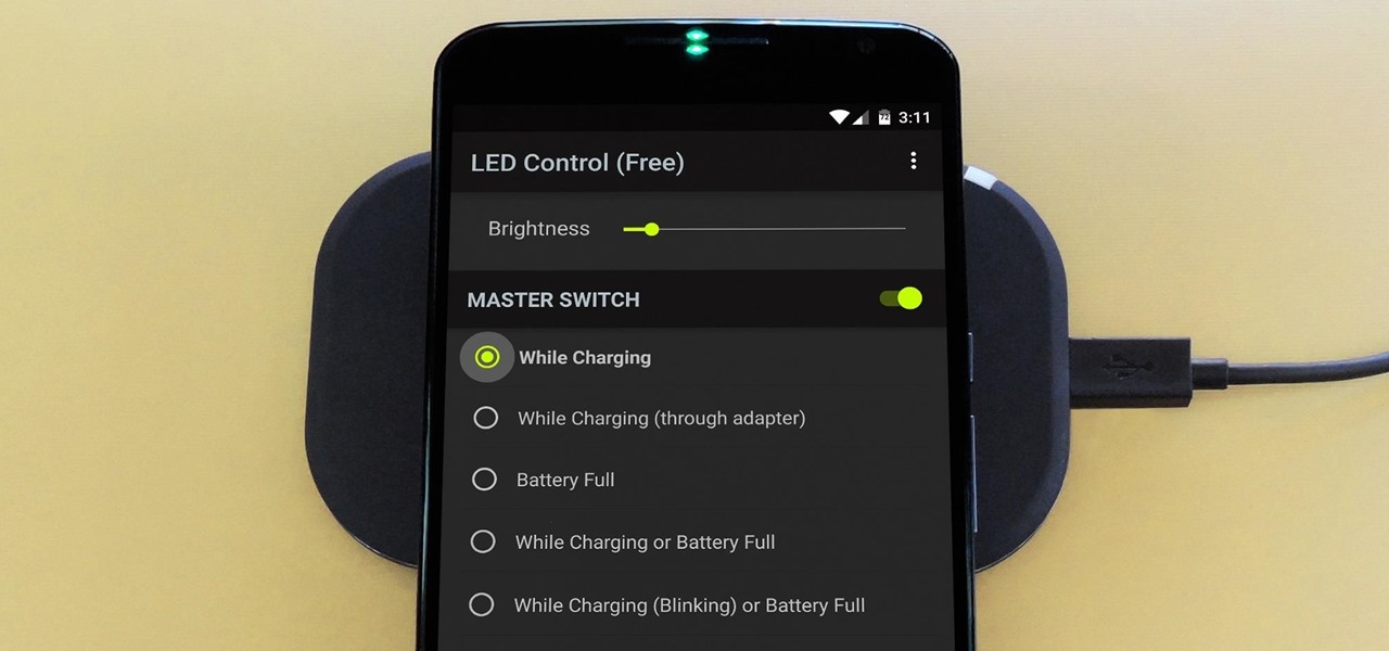
The Nexus 6 has an AMOLED screen that uses virtually no power to display black pixels. To take advantage of this feature, Google included an Ambient Display notification system that shows a black and white version of your lock screen when you get a new message. As a result, the Nexus 6 doesn't use an LED light to notify you of new incoming messages like most phones.

If you're like me, you probably encounter the lock screen on your Android device more than any other screen. Every time you check for new notifications out of habit, or simply pull your phone out to see the time, the lock screen is front and center.

Carriers really suck, don't they? We constantly have to monitor our data usage, even though many of us are on "unlimited" plans, which, in reality, will just be throttled to a slower 2G or 3G connection when we hit a certain download threshold.

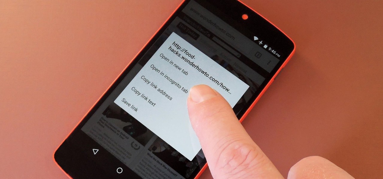
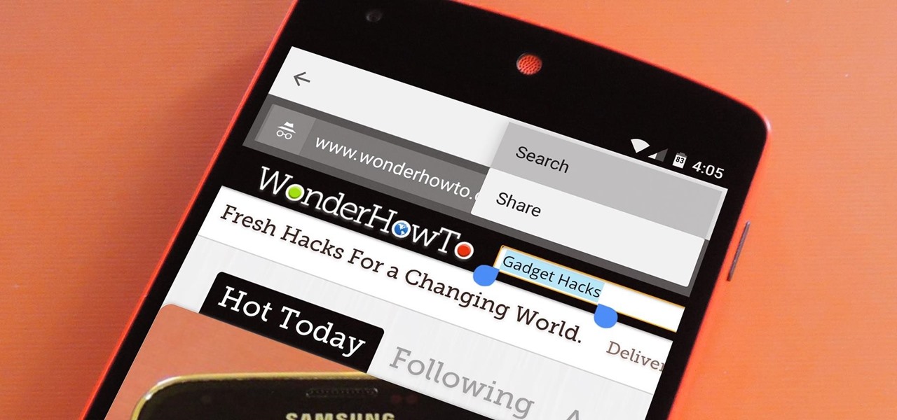
Chrome's Incognito Mode is a great feature for folks that don't want their browsing history tracked. When it's enabled, Incognito Mode makes sure that all cookies and cache that are saved while you're browsing are deleted as soon as you leave a webpage.

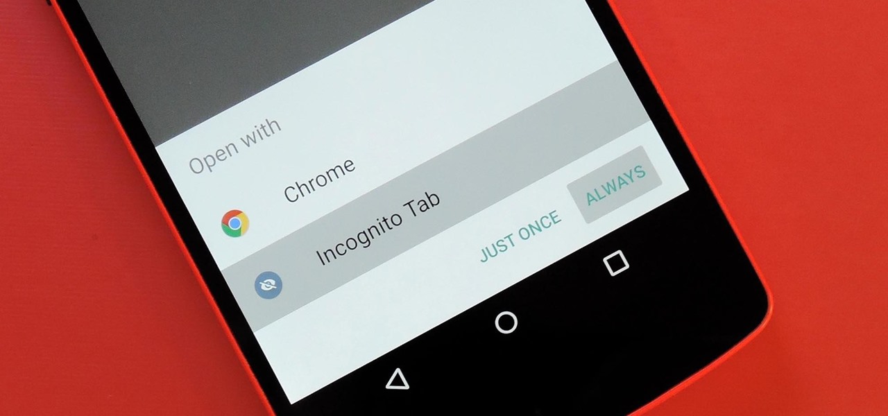
For some odd reason, the Chrome Browser on Android doesn't allow you to search selected text when you're in Incognito Mode. This must have been an oversight on Google's part, because the feature is definitely present with the browser in its normal viewing mode, allowing you to highlight text and quickly perform a Google search.

When you see a color depicted on your computer, smartphone, or tablet, odds are it was processed as a hex triplet before it was rendered. Most modern websites and operating systems use a hexadecimal coding system to signify certain colors, and these are represented as 6 letters and numbers.

As the granddaddy of all gesture-based keyboards, Swype has seen quite a few updates in its day. A recent version bump, however, added a feature that has been universally panned by Swype users.

Android's lock screen has evolved quite a bit over the years. From the Donut days of two tabs that launched the phone app and unlocked the device, to KitKat's clean and simple approach, shortcuts have come and gone.

If you've ever used a custom ROM on one of your devices, chances are it had a built-in feature that allowed you to kill any app by long-pressing the back button. This function comes in handy quite often, especially in situations where an app is acting up, since it stops all associated processes and clears the app from memory.

A new API in Android Lollipop allows apps to color the status bar to match their overall theme. Google billed this as a more immersive user experience that allows app developers to extend their color branding even further. It certainly seems like a win-win on the surface, but unfortunately, not many apps are using this feature yet.

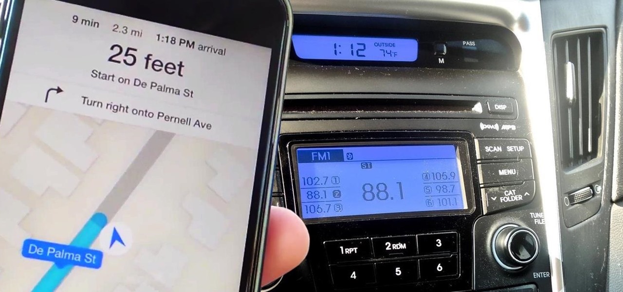
Maps is great for making sure you always get to your destination, until you miss that critical turn because you couldn't hear the turn-by-turn directions.

Lollipop brought a complete visual overhaul to Android, and while the vast majority of changes have been met with praise, some UI tweaks missed their mark.

Android Lollipop has an awesome feature called "Battery saver" mode that reduces power consumption through various tweaks in order to squeeze in an extra hour or two of standby time when your battery is running low. It does this by disabling background processes as well as location services and transition animations, so the phone is essentially running at half-throttle.

Most custom ROMs are built from the freely-available source code of AOSP, so they share a lot of common ground with stock Android. The difference, though, is the fact that Google adds many minor tweaks and finishing touches to AOSP while creating the version of Android that ultimately comes pre-installed on Nexus devices.

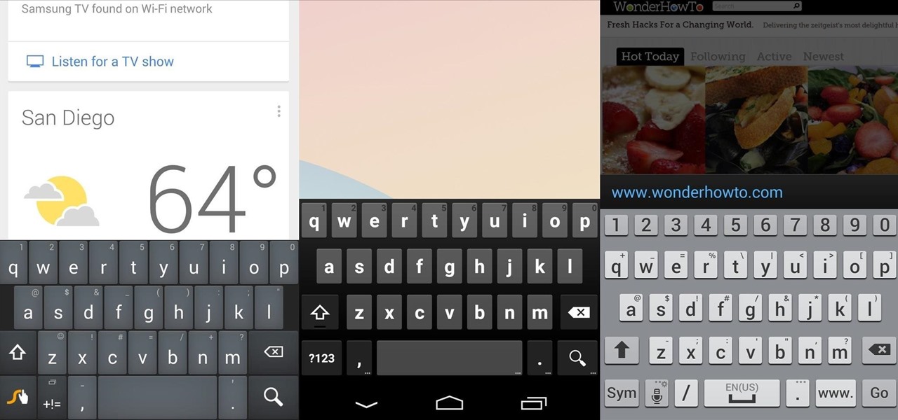
There's no such thing as a perfect Android keyboard. Some, like Swype, have gesture typing down to a science, but lack in predictive technology. SwiftKey, on the other hand, boasts awesome next-word prediction, but less than stellar gesture typing. Many others are optimized for multiple languages, space saving, or emojis, but none are without their flaws.

The Nexus 6 came with a hidden kernel module that allowed for double-tap-to-wake functionality, essentially letting you turn your screen on just by tapping it. A simple root app allowed us to activate this feature, which meant we were always two quick taps away from waking our device.

Many manufacturers add a custom skin on top of their Android builds, but none are more widely praised than HTC's Sense UI. The general consensus among Android users says that HTC's visual tweaks are done in good taste, and the features they add are both functional and warranted.

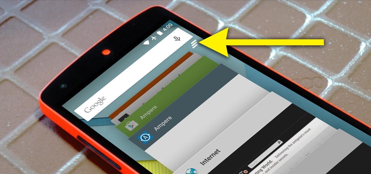
Android 5.0 brought a lot of changes to the world's most popular mobile OS, but few were more central to the user experience than tweaks made to the "Overview" menu (more commonly known as the "Recent Apps" menu). Aside from a visual overhaul, Chrome tabs now exist as separate entries in this list, as do Google searches and a few other activities.

When you search for a specific location or business with the Google app, a Knowledge Graph card is usually the top result. This card displays a handy mini-map and offers a quick link for directions to the location of your query, but it has one irksome flaw—these links can only be opened by the Google Maps app.

Android Lollipop promises tons of new features and functionality when it comes to a device near you, but as we wait, it's almost painful to see the screenshots and demo videos from Nexus devices and how downright pretty the new operating system looks.

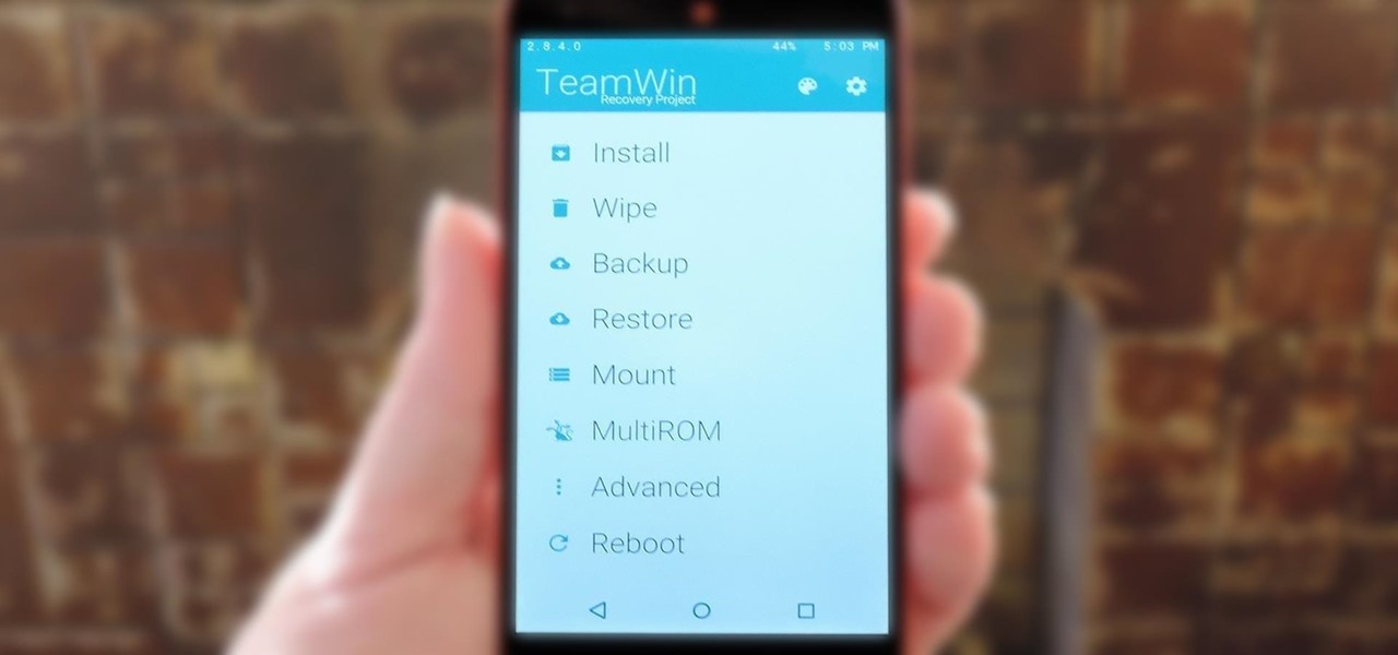
TWRP is hands-down the best custom recovery out there. Its interface, on the other hand, is... well, let's just call it utilitarian. The guys over at Team Win made sure that their product was robust, functional, and easy-to-use, but they didn't put a tremendous amount of effort into polishing the looks.

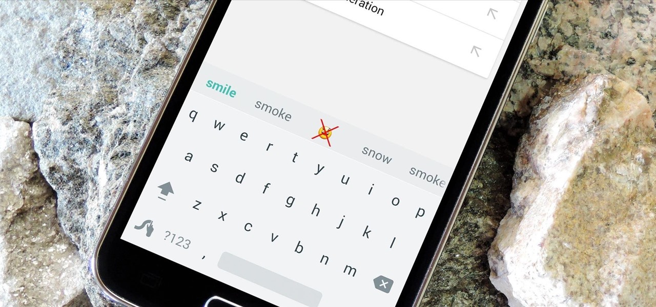
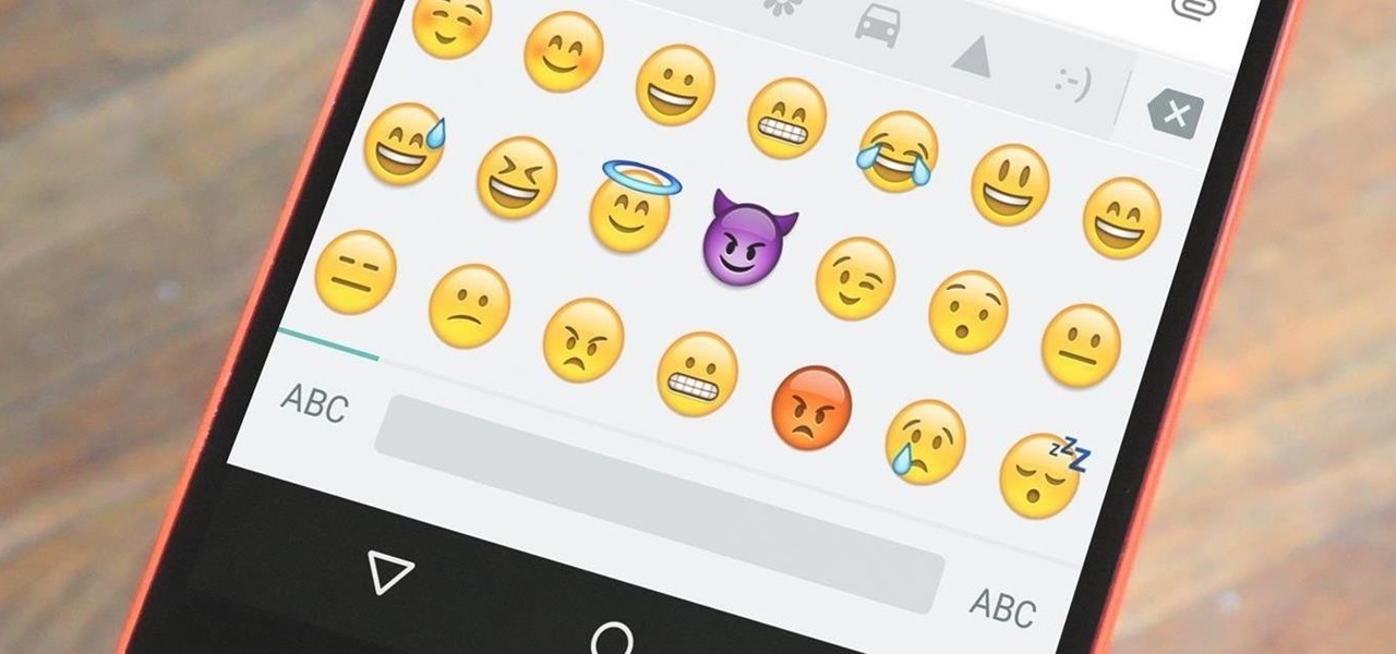
Emojis are a huge part of communication these days. In fact, I'm beginning to think that in a thousand years, historians will come across our then-ancient texts and speculate that we used a writing system that evolved from hieroglyphics.

Android's biggest selling point over alternatives like iOS or Windows Phone is the level of customization that it offers. If you don't like something about the UI, you can change it, whether it's as small as an icon set or as big as the entire home screen.

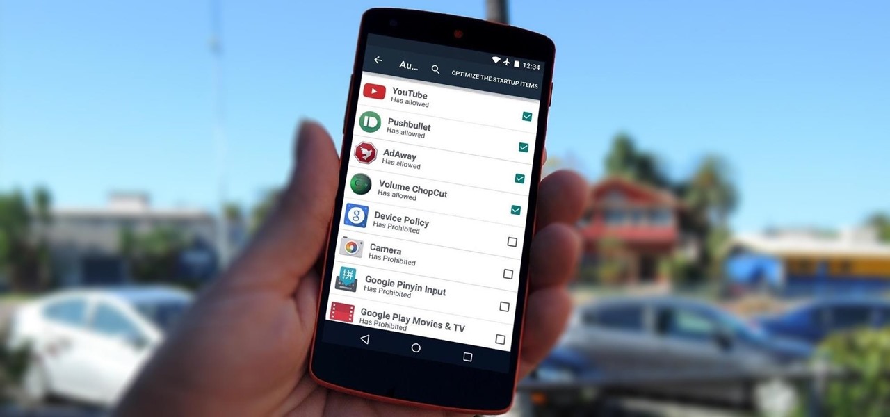
By default, any app that requests a certain permission can run automatically as soon as you start your device. Since Android doesn't offer a granular permission control system like iOS, this gets lumped in with all of the other permissions that you have to accept when you're installing an app from the Google Play Store, and you effectively have no choice in the matter.
I wrote this about two years ago to help people make realistic passwords. The best part was while writing it I realized I encrypted the list in a manner only the maker would know.... on to the show

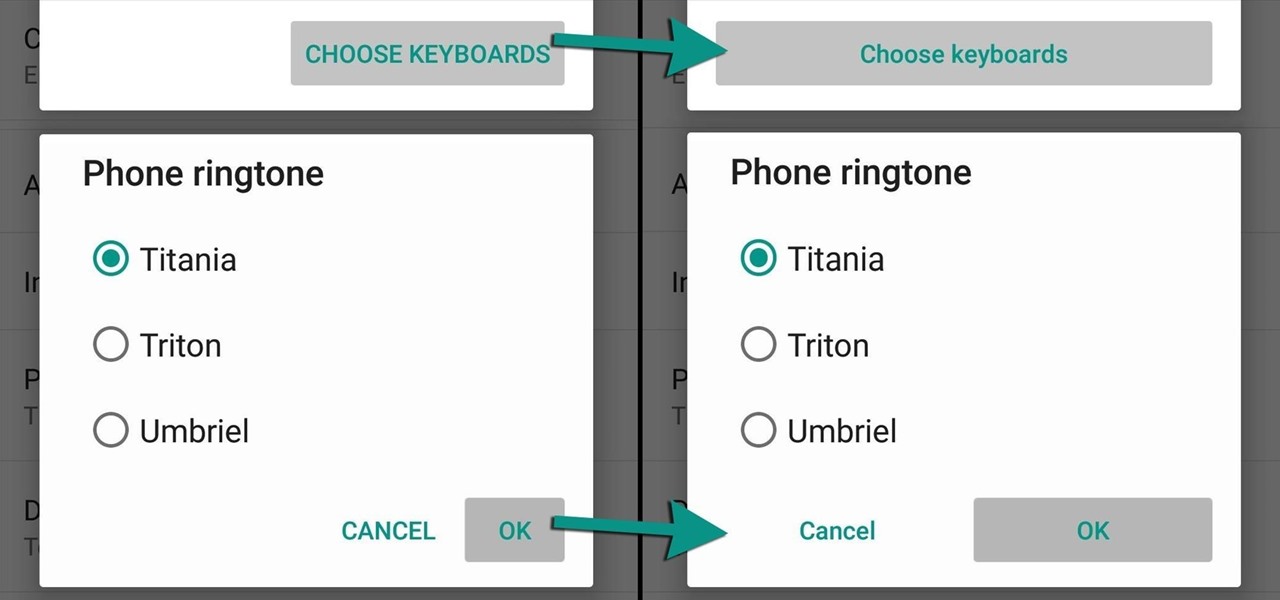
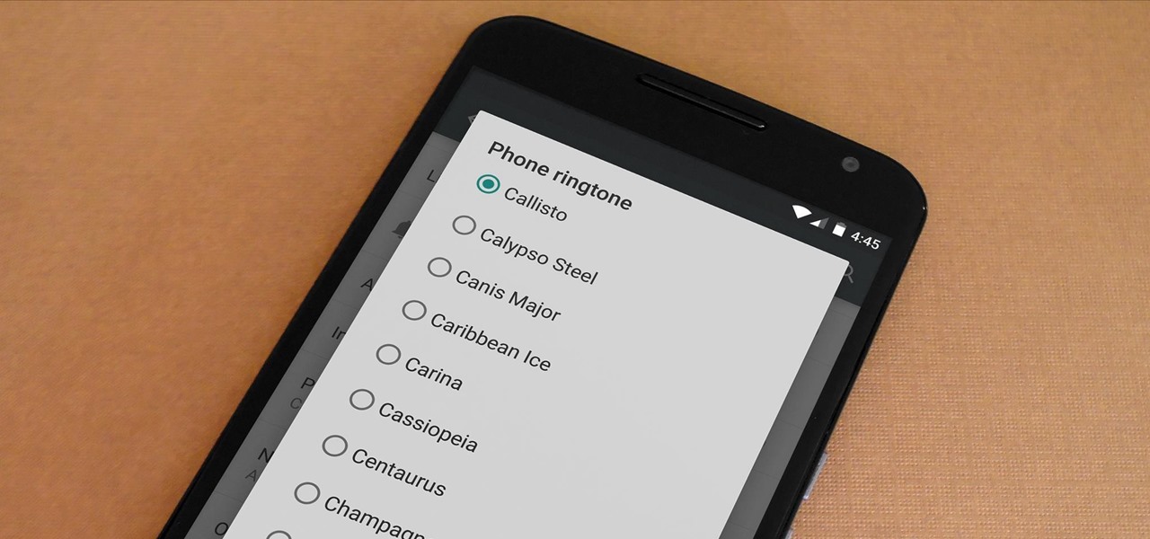
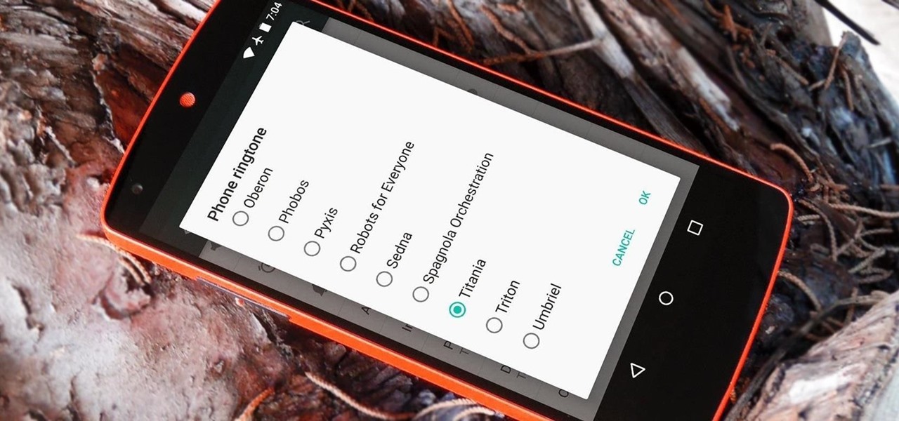
For some strange reason, when the Nexus 5 got its Lollipop update, the new stock system sounds were left out. These include updated versions of all of the ringtones and notifications, which Google revamped with a more mature sound that matches Android 5.0's elegant Material Design.

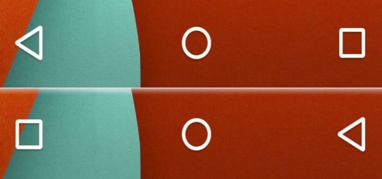
Unless you own a Samsung device, your Android's navigation buttons have probably always been in this order (from left to right): "Back," "Home," "Recent Apps." But depending on which hand you use to hold your phone, this may not be the most ergonomic layout for you.

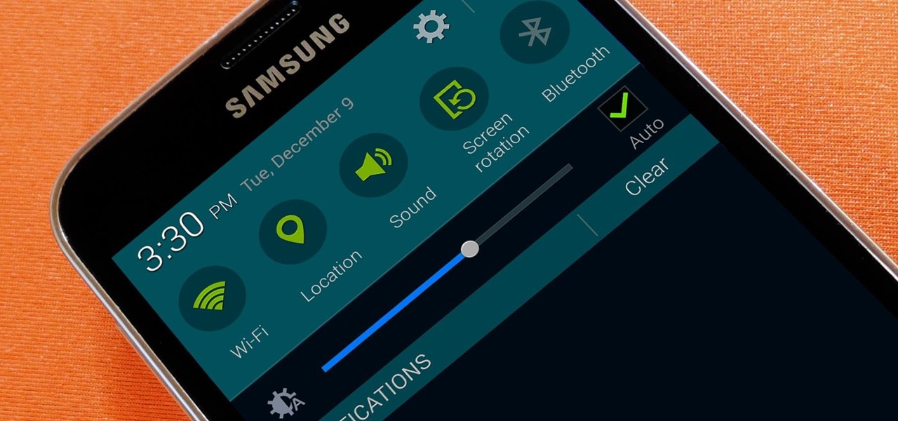
Picture this scenario—you're using your phone in a dimly-lit room, then you move to an area with a lot more ambient light, and Auto Brightness kicks in within a few seconds to ramp up the backlight. That's the way it should be, right? But then you move back to the darker area, and your phone takes 30 seconds before it decides to dim back out. Pretty annoying, isn't it?

The front-facing stereo speakers on the Nexus 6 certainly pump out some awesome sound—but it could always be better, right?

At $349 off contract, the Nexus 5 has always been one of the best bang-for-your-buck smartphones on the market. In order to keep the price that low, however, Google had to pass up on some of the minor features that other flagship phones offer.

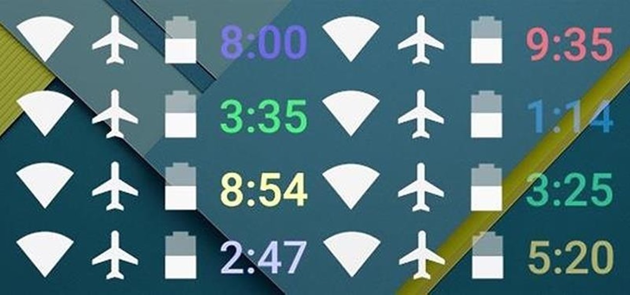
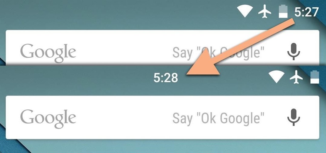
If you're like me, things just seem to look better when they're symmetrical. While Android's status bar icons are indeed weighted against the notifications that show up on the left side of this area, the balance still seems skewed to the right.
