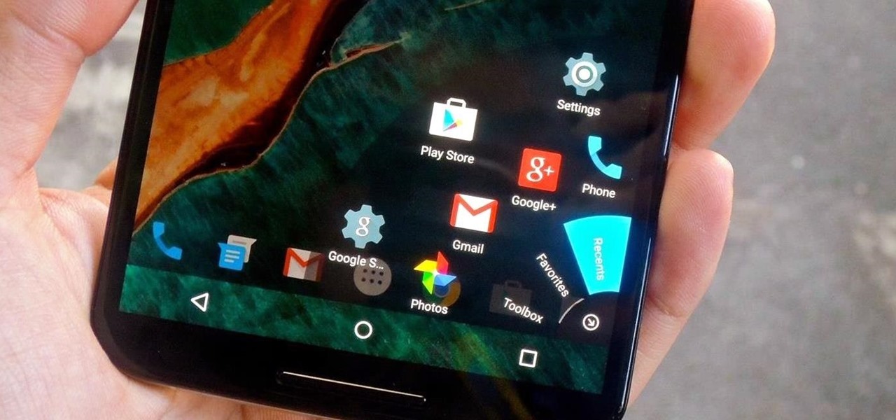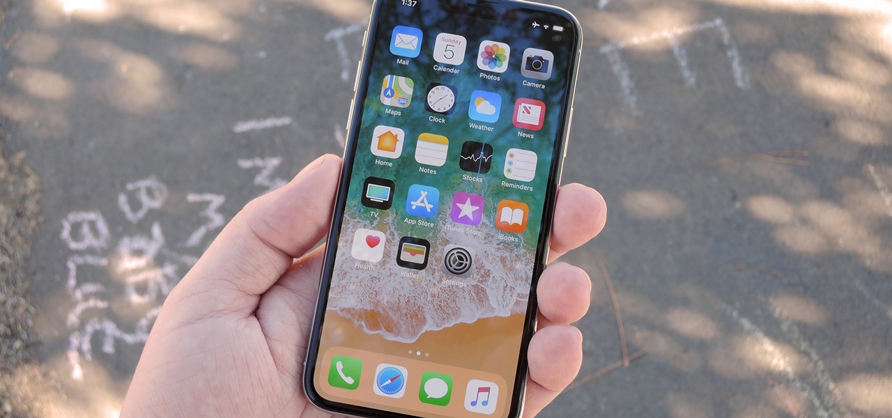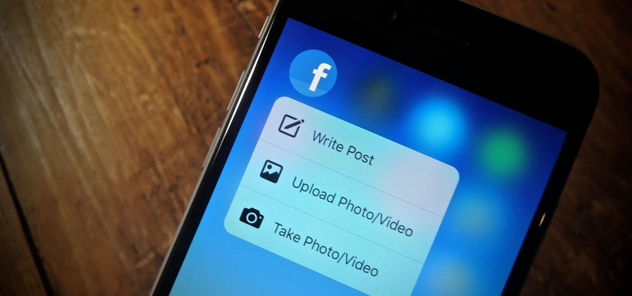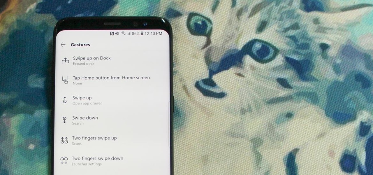
I go back and forth between two home screen apps: Nova Launcher and Action Launcher. While I prefer the aesthetics of Nova, I like Action's Quickpage feature since it puts some of my favorite apps just a swipe away. But now, I've found a way to replicate this feature on Nova (or any other launcher), and it works even better.

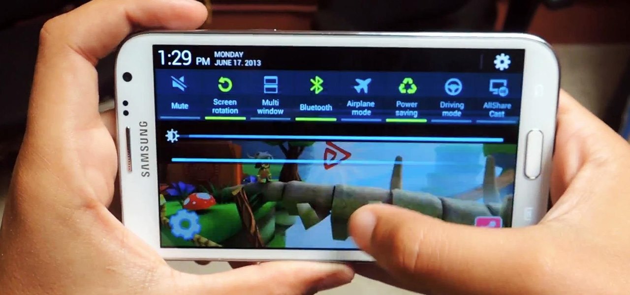
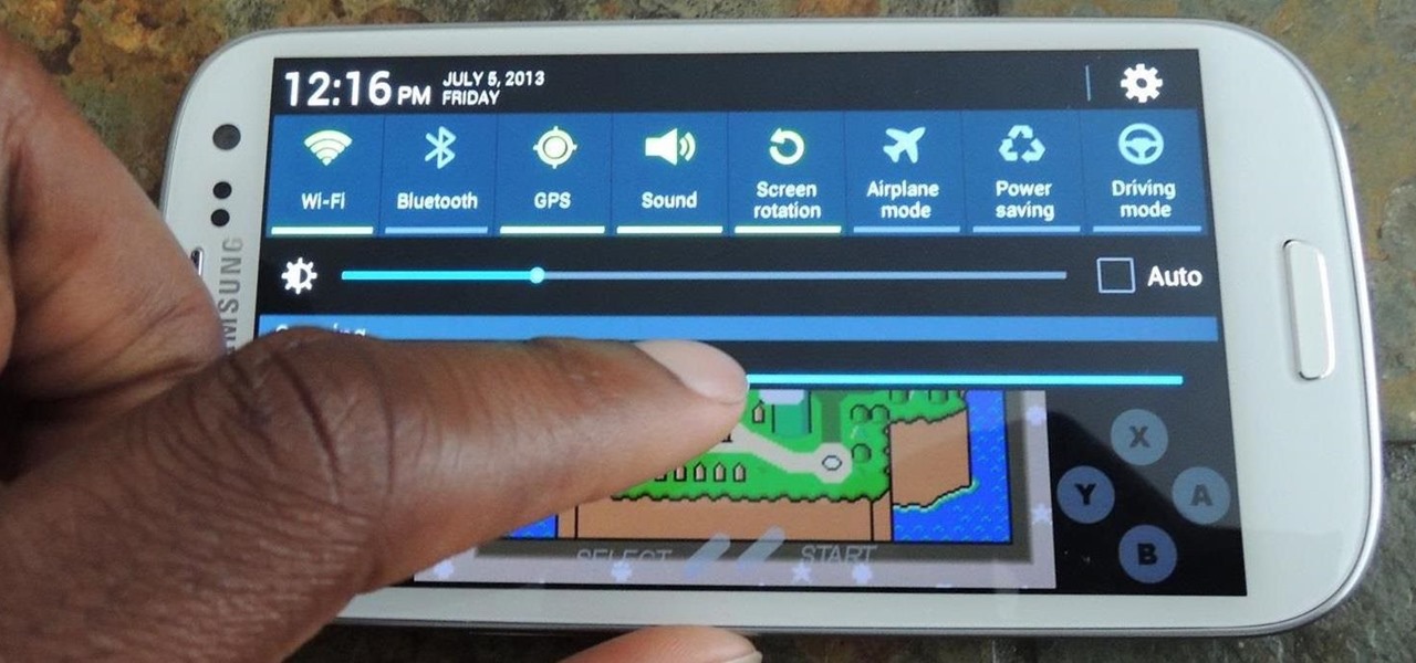
Although the Samsung Galaxy Note 2 is a speedy device, one feature that feels a bit slow is swiping down from the Status bar to see the Notification tray when I'm using a full-screen app. When a full-screen app is open, I have to swipe down not once, but TWICE, on the upper portion of the screen in order to bring down the Notification tray.

Apple has finally released iOS 12 for everyone to enjoy, and there are plenty of cool features to go around. Perhaps the coolest feature, at least, for those of us with an iPhone X, is the return of an oft-used gesture we loved on other model iPhones.

While some Android applications have built-in gestures that allow you to perform certain actions, it's not a feature that's been comprehensively, let alone consistently implemented. If you're on Twitter or Facebook and you want to go back, the only global way is by tapping on the capacitive back button at the bottom of your device. Thanks to XDA dev PeterCxy, you can now enable a global swipe back gesture on your Android smartphone or tablet, making it easier than ever to backtrack within apps.

In this clip, learn all about the ShapeWriter and how it works. You can follow along with this demonstration and get started texting faster than ever before. Never take your fingers off the screen with this fun, useful writing app.

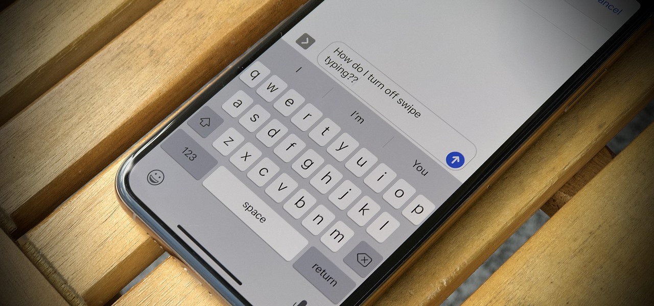
One core theme with each new iteration of iOS is the introduction of at least one or two features that fans have been hoping to see for years. With iOS 13, that feature is swipe typing, a first for the native iOS keyboard. While some of us have been getting our glide-typing fix with apps like Gboard for years, you might find swiping isn't quite your style. Luckily, the feature is easy to disable.

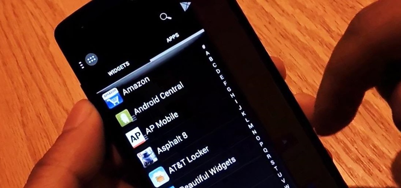
One thing almost every Android launcher has in common, from stocks to skins, is the way they handle organizing and launching apps and widgets. Tap an app icon to open the app. Drag apps together to create a folder. It's simple, it works, and it's what we know.

Personally, my favorite new feature in iOS 7 is the Control Center. With it, you can very quickly and efficiently access popular and much used settings, such as Wi-Fi, Bluetooth, brightness and more—all with one simple swipe.

Between school, work, and your personal life, there's a good chance you have multiple Google accounts. Most Google apps let you log into all of them simultaneously to receive applicable alerts when they arrive. Well, there's a dead-simple way to switch between these accounts, and it just takes one swipe

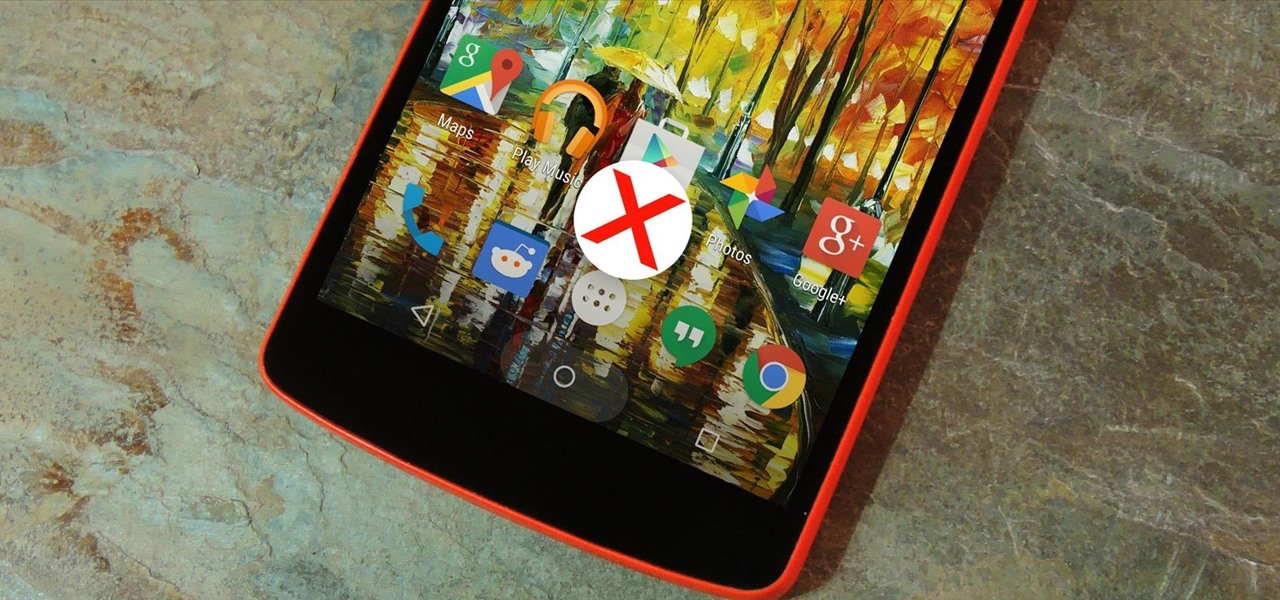
In a previous guide, I showed you how to add a 5th app to your icon dock. This is both useful and cool-looking. Unfortunately, cramming a 6th would be make the tapping area too small, so instead I'll show you how to save space by making your most used app easily accessible with a simple swiping gesture.

Android Pie is bringing in plenty of changes, but the headlining feature is a set of navigation gestures like the iPhone X uses. With Android 9.0, you can now navigate through your phone using a total of seven new swipe gestures.

Smartphones like the Nexus 6 and those in the Samsung Galaxy Note series border on being called tablets due to the sheer size of their displays. They are essentially "phablets," i.e., devices too large to be a typical smartphone, yet too small to be a tablet.

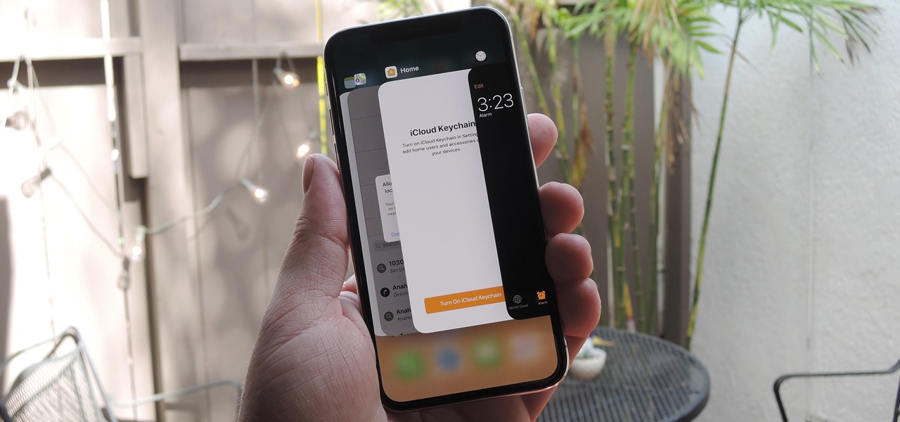
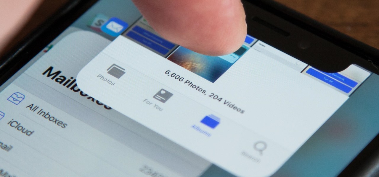
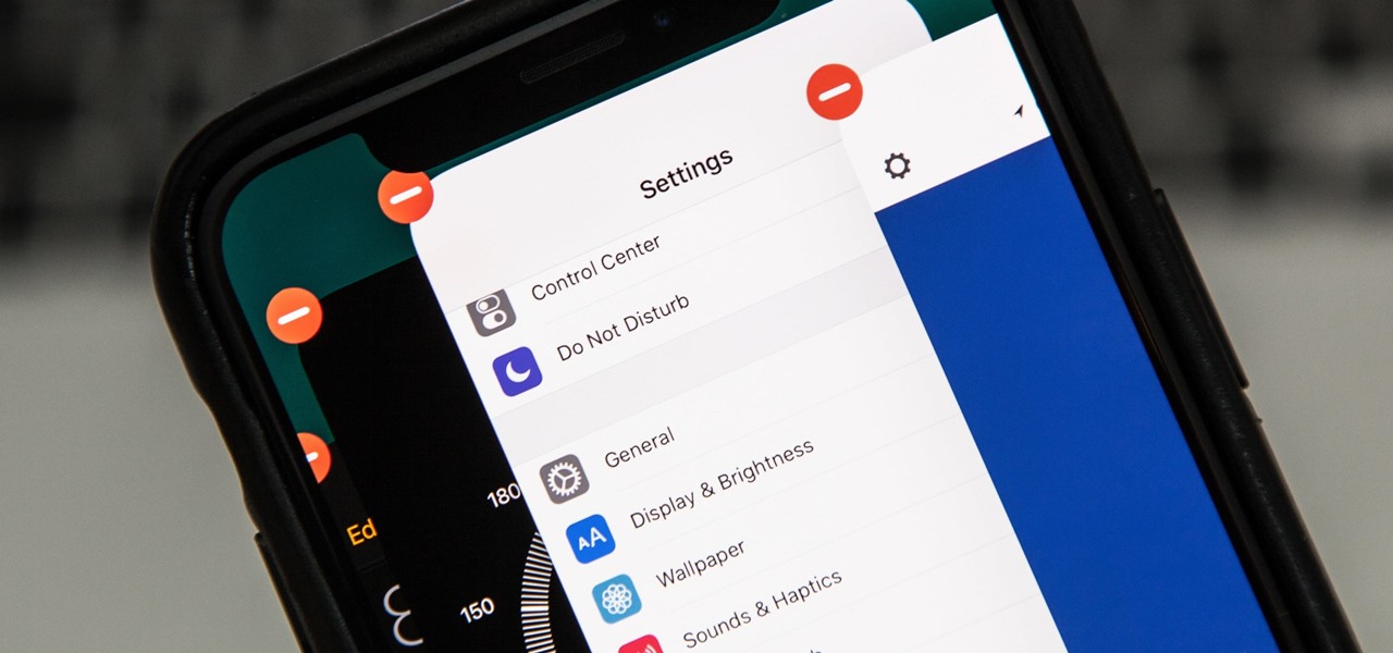
If the iPhone XS, XS Max, or XR is your first Home button-free iPhone, you might have some questions, such as "How do I access the app switcher?" and "How do I use reachability?" While iPhone X owners have had over a year of practice, newcomers to Apple's buttonless revolution might feel a bit confused when it comes to actions they used to perform on iPhones with ease.

The iPhone X is Apple at its most classic — they take away a key feature that seems odd at first, but usually, the change pans out in the end. So is the case for the long-lived Home button, whose last appearance may be on the iPhone 8 and 8 Plus. That begs the question — how do you use an iPhone without a Home button?

I like being fast at everything (well, almost everything), and I expect no less from my smartphone. So when I'm using an app on my Samsung Galaxy S3 that takes up the full display, I don't want to swipe down twice to get to my notifications—I want to swipe down once.

When you're on the road, the last thing you need to be doing is fumbling around with your phone. But with online radio services like Spotify and Google Play Music, you almost have to use your phone to play music through your stereo, because the in-dash head units on most cars lack the ability to connect to these services.

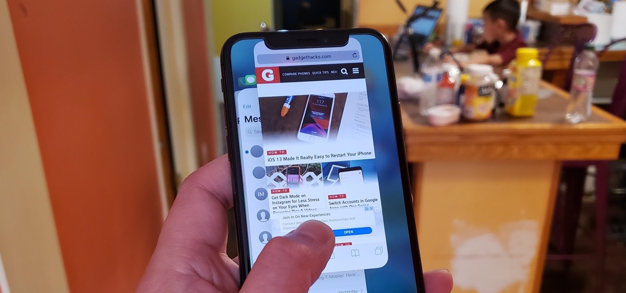
While fully closing apps on your iPhone can keep it running at peak efficiency since it frees up memory and stops background refreshing, it's most critical when dealing with unresponsive apps. If you have an issue with a certain app, you can just force-close it instead of rebooting.

As efficient as your iPhone is, it doesn't hurt to fully close running apps from time to time to free up memory and keep background processes to a minimum. Force-closing is also a great way to troubleshoot buggy apps, and can often resolve minor issues without having to restart your device.

When the iPhone X was first introduced, it came with an odd way to force-close apps. While all other iPhone continued to use a two-step gesture in iOS 11, iPhone X users were stuck with an annoying three-step gesture that was seen last in iOS versions from at least six years ago. Thankfully, iOS 12 has changed this and makes force-closing apps as simple as it should be.

If you tend to use the app switcher a lot to open recent apps, then all of the apps you accessed months ago are just sitting there cluttering things up. While force-closing all of the recent apps on your iPhone isn't really necessary, it's sometimes nice to wipe the slate clean and empty the app switcher completely to start fresh.

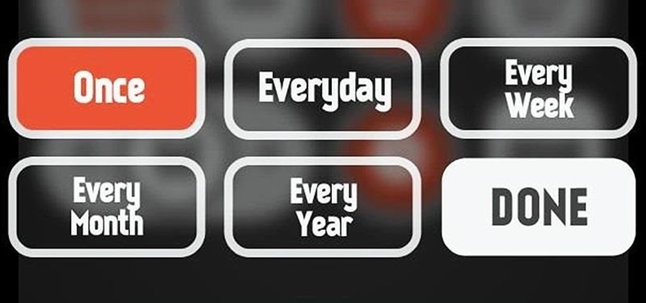
Back when I was a kid, I didn't get many awards or trophies, aside from perfect attendance three years in a row. If only there was an award for procrastination. While there are apps out there for my iPhone like Clear and even the stock Reminders app, they still don't push me hard enough to get things done on time—or at all.

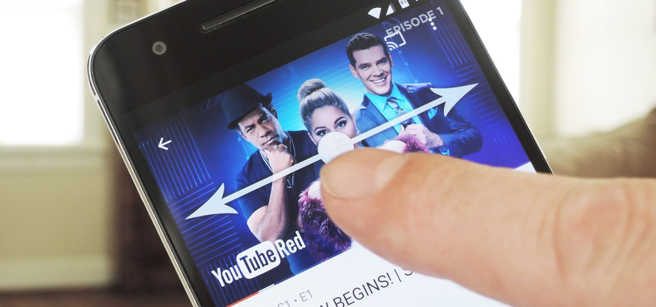
We recently covered an app called Touch Controls for YouTube that allows you to swipe up or down on any YouTube video to quickly adjust volume levels or brightness. As awesome as that app is, commenters here and on our YouTube channel thought it was lacking one big feature—the ability to seek forward or backward in the video by swiping the screen.

On-screen navigation buttons offer many distinct advantages over physical buttons—they can change orientation along with your device, they're capable of visually morphing to indicate secondary functionality, and the user experience is more consistent when buttons and app elements require the same amount of force to press. Add to that the fact that they're far less likely to fail and can be themed or even switched out altogether, and it's hard to come up with an argument in favor of physical b...

Quickness and efficiency should always be a fundamental aspect of the experience when using any Android device. Anything less, and we've got a problem. As app development continually progresses, these adjectives become much more refined and polished, making the use of a smartphone a flawless affair of swipes and gestures.

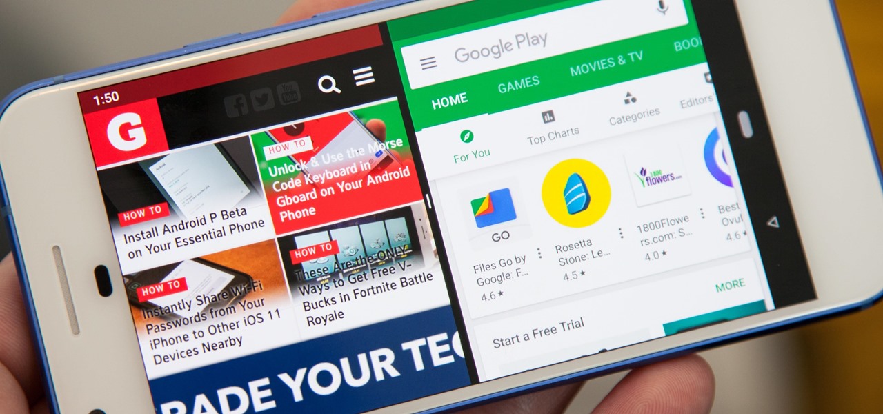
In the new Android P, the multitasking view is reminiscent of webOS days. As a result, enabling split screen mode no longer works as it once did. However, it's still easy to use, whether or not you're using the new "Swipe up on Home button" gesture or have stuck with the old-style navigation buttons that include the "Recents" aka "Overview" softkey.

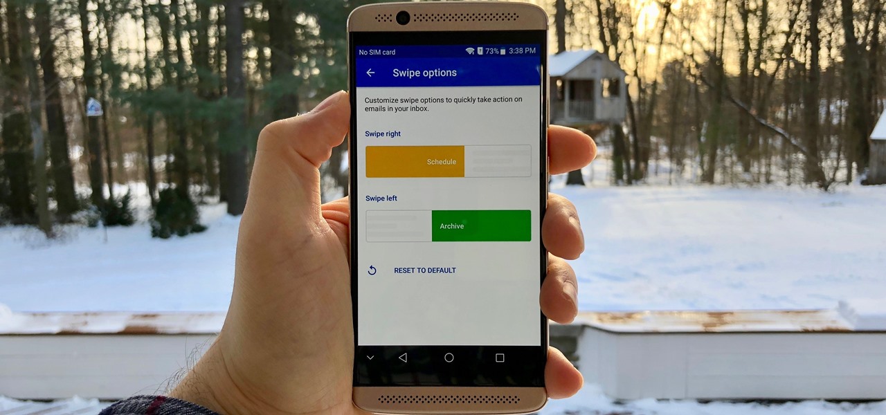
Swipe actions are an integral multitasking feature of any good email client, and Outlook is no exception. The application allows for two swipe actions at a time, but offers seven total options for those actions. We'll show you how to choose which actions go with which swipes to best tailor the app to your needs.

For some strange reason, Google left several of the Pixel's best software features disabled by default. One of the more interesting tweaks that fall into this category is a gesture that puts your fingerprint scanner to use after you've unlocked your phone.

When on-screen buttons were introduced alongside Android 4.0, it didn't take long before Google added a gesture to these virtual navigation keys. Since then, an upward swipe originating from the home button has always been a shortcut to Google Now on Nexus devices.

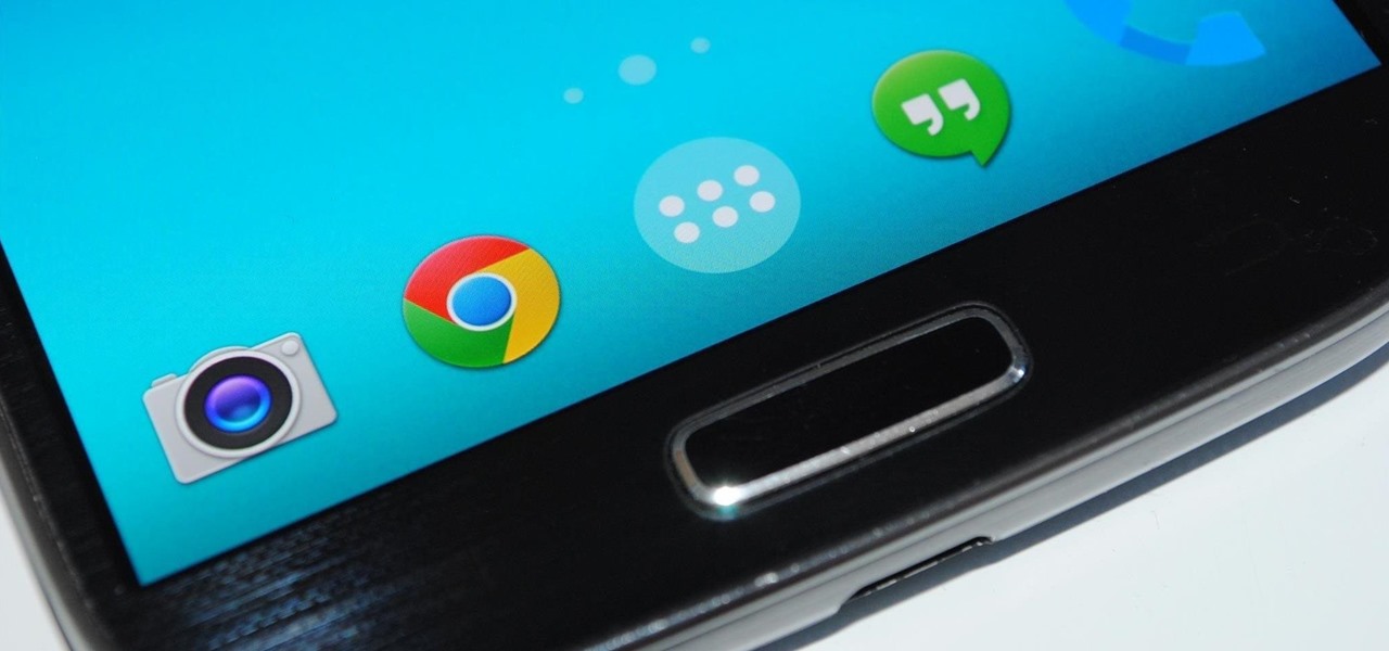
Like the buttons on your computer's mouse and keyboard, the Home key on your Samsung Galaxy S4 serves a vital function in navigating through your device. It can get pressed dozens of times a day, going through hours of use and abuse.

Is the Home button the main reason you haven't pulled the trigger on a new iPhone? Are you worried that you'll miss its functionality too much, or that simple things like accessing your home screen will be too hard? Well, don't worry about any of that, because Apple came up with some intuitive gestures that makes the old Home button seem clunky and outdated once you get used to things.

If you have stuck volume buttons, it can be a real pain to adjust sound levels since your only other option is to use the volume menu in Settings. But even if your volume rocker is working fine, it's still a little weird to have to click a mechanical button to control one of the most central aspects of an operating system that is otherwise entirely touch-based.

Ever since iOS 8, you could add widgets on your iPhone using the "Edit" menu on the Today view page, but there's an easier and faster way to get widgets set up for viewing via a right swipe on the lock screen, a swipe right from the first home screen page, and a swipe down from center top everywhere else.

The new iPhone 6S and 6S Plus models have a really cool feature called 3D Touch that lets you perform app-specific Quick Actions from the home screen for apps that support it. The only downside is that this awesome new feature is not available on older iOS devices.

Using the overview screen (aka recent apps) is a simple way to jump back to a previous task to continue where you left off, but as you use more and more apps, jumping back to that initial task isn't really that "recent" with all of those new tasks stacked on top of it. Now, thanks to developer PhinxApps, we can redefine what "recent" truly means using PinTasking. With this app, you can pin any app or webpage you're currently using onto your device's screen in the form of a Facebook-like chat-...

Beyond Apple-specific services like iMessage, having intuitive navigation gestures is certainly one of the features that makes the iPhone so hard to quit. Thanks to Android 10 and One UI 2, however, devices like the Samsung Galaxy S10 have caught up and now provide you with a less clunkier way of getting around, and one more reason to give the Google-based platform a try.

YouTube has a couple of basic gestures: you can double tap each half of the video to skip forward or back ten seconds, and you can swipe down to minimize the video. But wouldn't it be more useful if there were gestures to control brightness and volume? Well, as with all things Android, where there's a will, there's a way.

Ever-shrinking bezels and disappearing hardware buttons make for good looking phones, but they also increase the need for gesture controls. Android Pie comes with seven new swipe gestures, but if you don't have the update yet (or find its default gesture options to be lacking), you should take a look at the Microsoft Launcher.

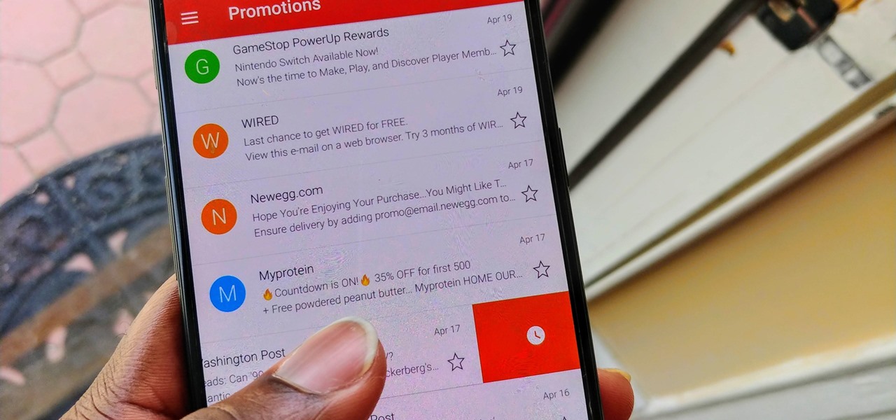
For a while, Gmail only had one swipe gesture, and it could only perform one of two actions: Archive or Delete. Not that it wasn't useful — you could eliminate most spam emails in a matter of seconds by swiping left or right on any email in your inbox. But now, Google has finally added more custom actions to its swipe gestures.

If you have more than two home screen pages on your iPhone, jumping back to the main page can seem like a lot of unnecessary swiping. For example, an eight-page home screen would take seven right-swipes to get back from the last page to the main page — but it doesn't have to take that much work.

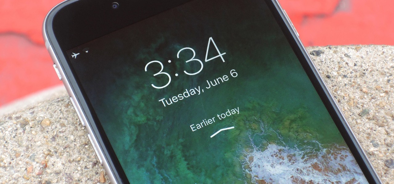
One of the first things you'll notice about iOS 11 is how the Notification Center now has the same interface as your lock screen. It's pretty confusing at first, and it's pissed off tons of users, but it's really not that bad once you learn all of its features.


