There are times when you need to make a super-quick pie chart (such as to insert in a blog post or quick printout) but find that doing it in Excel or OpenOffice takes a bit more effort than you’d like. Is there a faster way for quick’n'dirty pie charts? Yes. You can use Create a Graph. Stupidly easy to use and very fast, just the way people like it. Learn how with this video tutorial.

In this video, Sierra Snowboard gives us some tips on how to select the snowboard that's right for you. Each board comes in a number of different sizes, and most boards come with a size chart specific for that board. These charts can be vague, but are good starting points for selecting your size. One thing to consider is your bossy type. The weight of the rider is the primary factor in selecting the size of a snowboard. You'll notice that the height of a rider is not listed on a size chart. I...
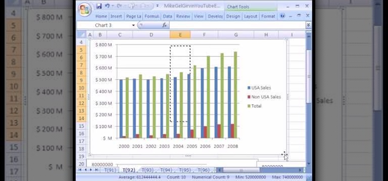
New to Microsoft Excel? Looking for a tip? How about a tip so mind-blowingly useful as to qualify as a magic trick? You're in luck. In this MS Excel tutorial from ExcelIsFun, the 92nd installment in their series of digital spreadsheet magic tricks, you'll learn how to add data series to a chart, change the chart type for just one data series and see an excellent copy data to chart trick.

We all know how volatile the stock market is, especially during times of crisis. That does not mean that the market is impossible to gauge, however. Day traders are trained to read charts in order to recognize market trends and price patterns, giving them the insight they need to make their trades as profitable as possible.

Create a 2-axis chart in Excel 2007 combining a column chart and line chart
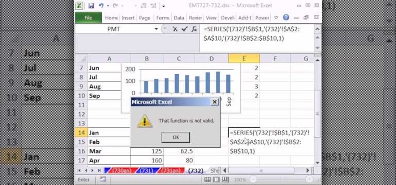
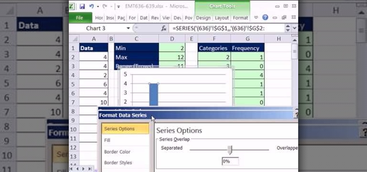
New to Microsoft Excel? Looking for a tip? How about a tip so mind-blowingly useful as to qualify as a magic trick? You're in luck. In this MS Excel tutorial from ExcelIsFun, the 732nd installment in their series of digital spreadsheet magic tricks, you'll learn how to make use of the Excel SERIES chart function.

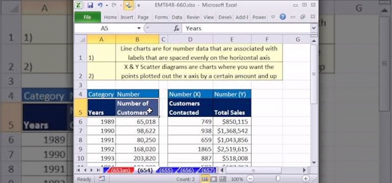
New to Microsoft Excel? Looking for a tip? How about a tip so mind-blowingly useful as to qualify as a magic trick? You're in luck. In this MS Excel tutorial from ExcelIsFun, the 654th installment in their series of digital spreadsheet magic tricks, you'll learn see when to use line charts and when to use an X-Y scatter diagrams.
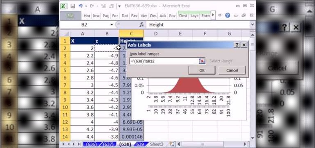
New to Microsoft Excel? Looking for a tip? How about a tip so mind-blowingly useful as to qualify as a magic trick? You're in luck. In this MS Excel tutorial from ExcelIsFun, the 638th installment in their series of digital spreadsheet magic tricks, you'll learn how to add two horizontal axes to a chart.
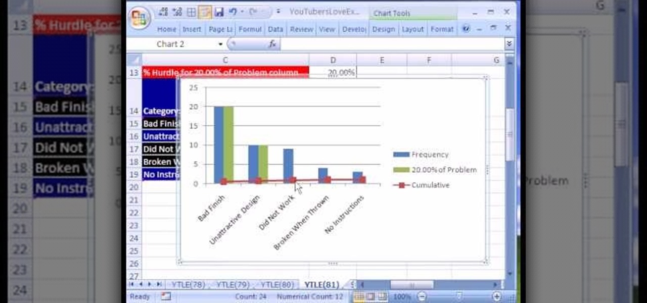
Love Microsoft Excel? This clip contains a tip that just might induce you to. With this free video tutorial from ExcelIsFun, the 81st installment of his "YouTubers Love Excel" or YTLE series of free video MS Excel lessons, you'll learn how to add conditional formatting to a chart by creating a new column of data with a formula.
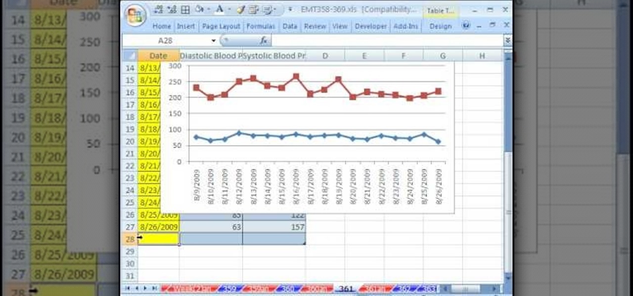
New to Microsoft Excel? Looking for a tip? How about a tip so mind-blowingly useful as to qualify as a magic trick? You're in luck. In this MS Excel tutorial from ExcelIsFun, the 361st installment in their series of digital spreadsheet magic tricks, you'll learn how to create a dynamic two data series line chart for blood pressures.
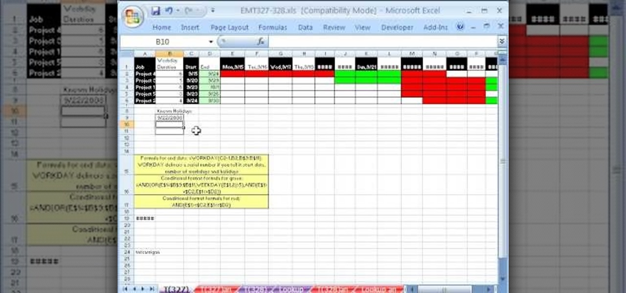
New to Microsoft Excel? Looking for a tip? How about a tip so mind-blowingly useful as to qualify as a magic trick? You're in luck. In this MS Excel tutorial from ExcelIsFun, the 327th installment in their series of digital spreadsheet magic tricks, you'll learn how to create a Gantt Chart that will include highlight the workdays one color and weekends and holidays another color.
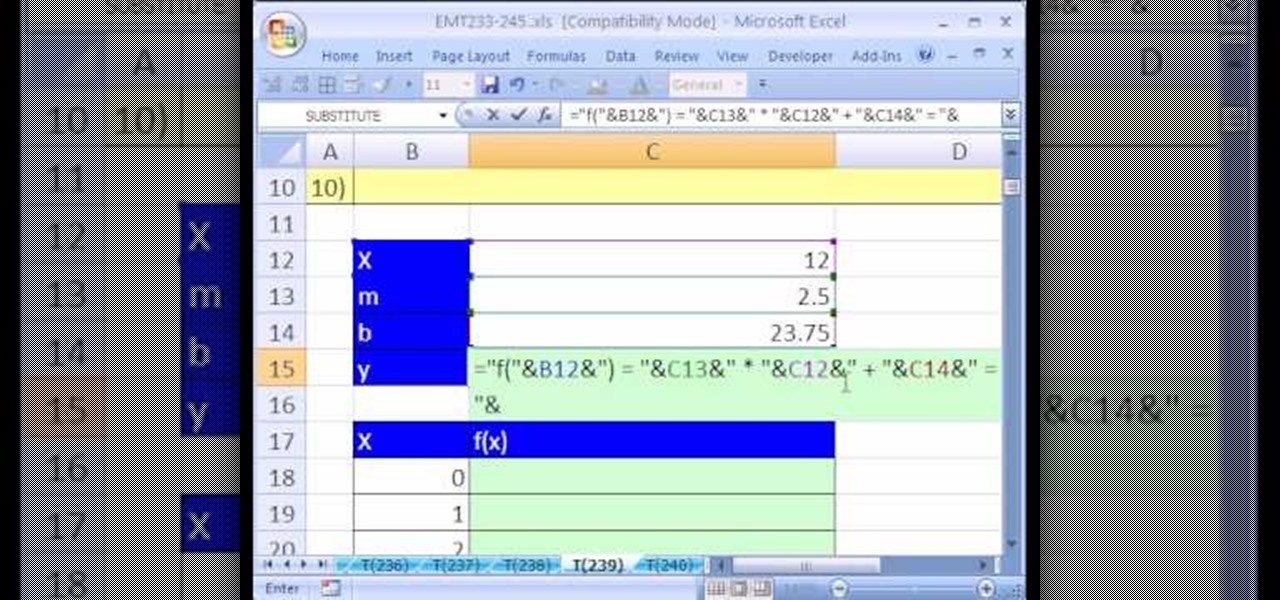
New to Microsoft Excel? Looking for a tip? How about a tip so mind-blowingly useful as to qualify as a magic trick? You're in luck. In this MS Excel tutorial from ExcelIsFun, the 239th installment in their series of digital spreadsheet magic tricks, you'll learn how to create a chart for a linear function of X in Excel as well as how to use a text formula to display a function of X.
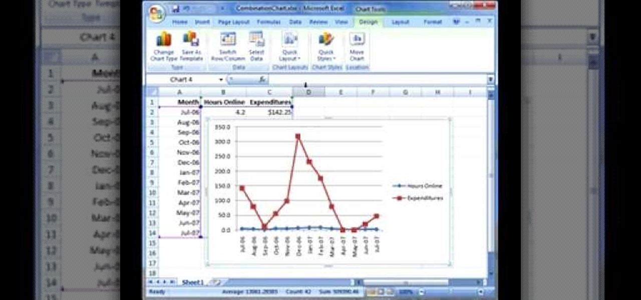
This screencast from Matthew MacDonald, author of Excel 2007: The Missing Manual, guides you through creating and modifying a combination chart in Excel 2007.
If you use Microsoft Excel on a regular basis, odds are you work with numbers. Put those numbers to work. Statistical analysis allows you to find patterns, trends and probabilities within your data. In this MS Excel tutorial from everyone's favorite Excel guru, YouTube's ExcelsFun, the 15th installment in his "Excel Statistics" series of free video lessons, you'll learn how to use create a frequency distribution, relative frequency distribution, percent frequency distribution and pie chart wi...
This video is an entertaining way of learning how to quantify how much time has elapsed from one point to another. It opens with a mischievous person using an unauthorized computer, claiming he had only been on for a shorter time than what was calculated by the owner. The video then instructs how to figure out such a calculation by creating a T-chart. One the left side of the T-chart, the previous time is shown, along with new times as each hour or minute is added. On the right, the desired t...
You can use Keynote to create animated charts and graphs. Then you can export them to use in iMovie and other software to make video presentations. It's easy! So easy, in fact, that this home-computing how-to from MacMost can present a full overview of the process in about five minutes. For more information, including detailed, step-by-step instructions, watch this Apple lover's guide.
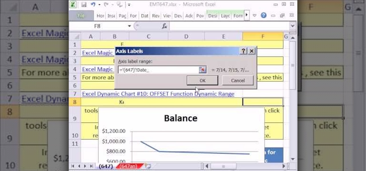
New to Microsoft Excel? Looking for a tip? How about a tip so mind-blowingly useful as to qualify as a magic trick? You're in luck. In this MS Excel tutorial from ExcelIsFun, the 647th installment in their series of digital spreadsheet magic tricks, you'll learn how to create a dynamic line chart that will show any updates to the cash account.
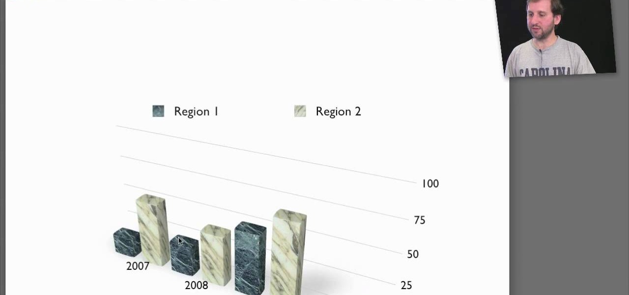
New to Microsoft Excel? Looking for a tip? How about a tip so mind-blowingly useful as to qualify as a magic trick? You're in luck. In this MS Excel tutorial from ExcelIsFun and Mr. Excel, the 4th installment in their joint series of digital spreadsheet magic tricks, you'll learn how to create charts to compare data values.
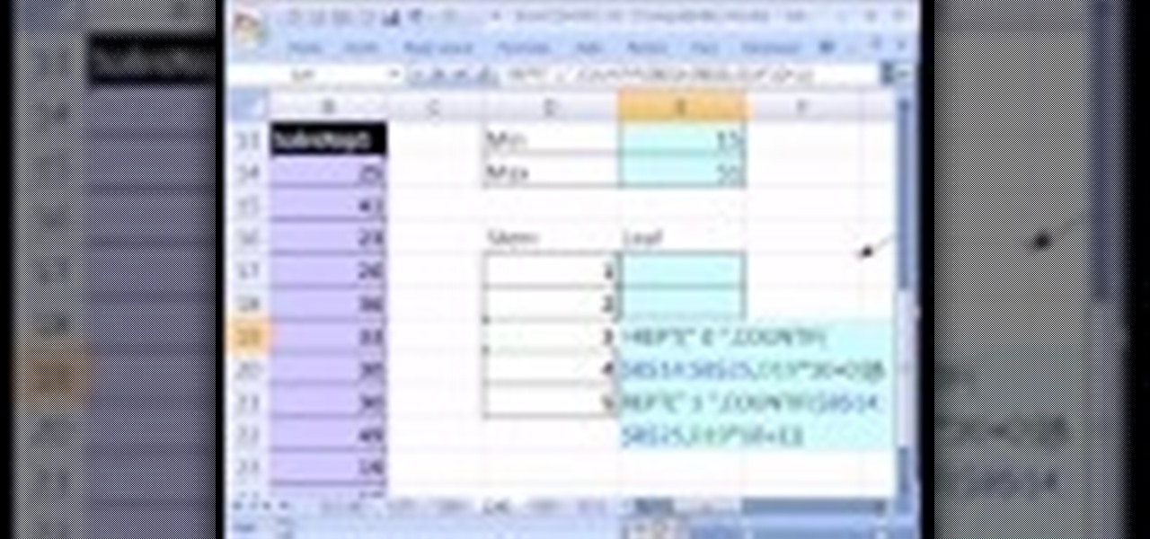
If you use Microsoft Excel on a regular basis, odds are you work with numbers. Put those numbers to work. Statistical analysis allows you to find patterns, trends and probabilities within your data. In this MS Excel tutorial from everyone's favorite Excel guru, YouTube's ExcelsFun, the 28th installment in his "Excel Statistics" series of free video lessons, you'll learn how to create quantitative data stem & leaf charts using the REPT and COUNTIF functions.
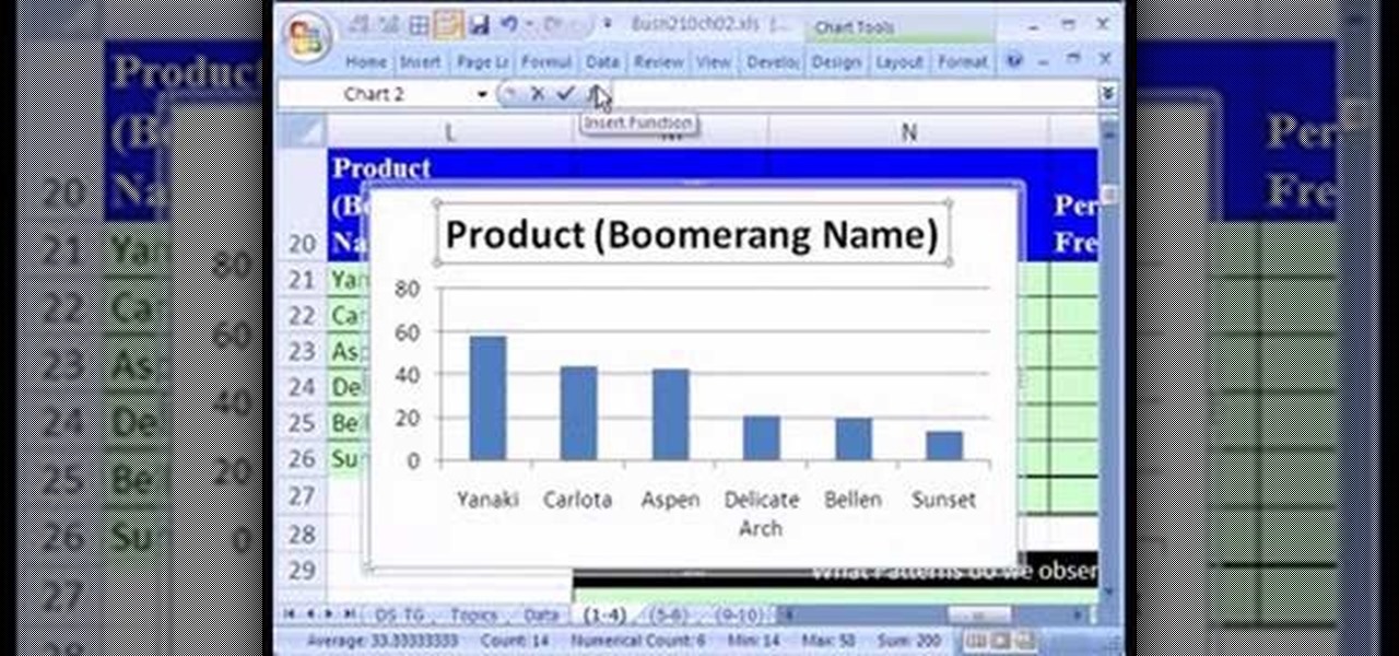
If you use Microsoft Excel on a regular basis, odds are you work with numbers. Put those numbers to work. Statistical analysis allows you to find patterns, trends and probabilities within your data. In this MS Excel tutorial from everyone's favorite Excel guru, YouTube's ExcelsFun, the 13th installment in his "Excel Statistics" series of free video lessons, you'll learn how to create a column chart from a frequency distribution for categorical data.
From Ramanujan to calculus co-creator Gottfried Leibniz, many of the world's best and brightest mathematical minds have belonged to autodidacts. And, thanks to the Internet, it's easier than ever to follow in their footsteps (or just study for that next big test). With this installment from Internet pedagogical superstar Salman Khan's series of free math tutorials, you'll learn how to create a simple histogram chart.
New to Microsoft Excel? Looking for a tip? How about a tip so mind-blowingly useful as to qualify as a magic trick? You're in luck. In this MS Excel tutorial from ExcelIsFun, the 93rd installment in their series of digital spreadsheet magic tricks, you'll learn how to use conditional formatting to create a Gantt cell chart.
New to Microsoft Excel? Looking for a tip? How about a tip so mind-blowingly useful as to qualify as a magic trick? You're in luck. In this MS Excel tutorial from ExcelIsFun, the 304th installment in their series of digital spreadsheet magic tricks, you'll learn how to add a secondary axis to a chart so that you have axes on the left and right.
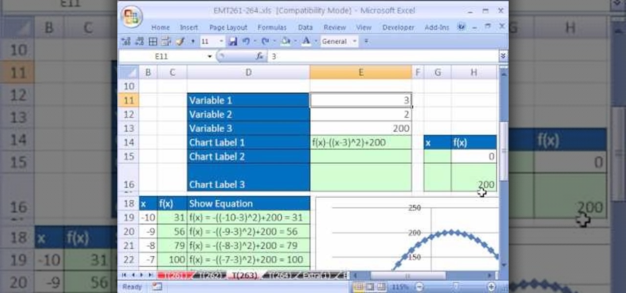
New to Microsoft Excel? Looking for a tip? How about a tip so mind-blowingly useful as to qualify as a magic trick? You're in luck. In this Excel tutorial from ExcelIsFun, the 263rd installment in their series of digital spreadsheet magic tricks, you'll learn how to create a completely dynamic math equation system (function of x) with formulas, data points, charts and chart labels.
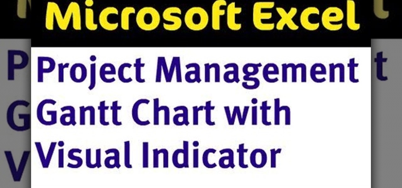
Adding a visual indicator to an Excel Gantt chart of how far into the project you are.
Great news! — Excel isn't just for Windows anymore. Okay, so it's been available on the Mac for awhile now, but if you haven't used it yet, why not start now? Getting started with Excel 2008 for Mac is easy, and this video overview will show beginners or even the most seasoned professional spreadsheet worker a thing or two. The Microsoft Office for Mac team shows you just how to get started in this how-to video.
PowerPoint 2008 for Mac can help you turn boring old bulleted lists into something nobody would forget. With SmartArt graphics in PowerPoint you can now make your bullet lists pop using pre-formatted charts, graphs, and more. The Microsoft Office for Mac team shows you just how to make a bulleted list more visual in this how-to video.
New to Microsoft Excel? Looking for a tip? How about a tip so mind-blowingly useful as to qualify as a magic trick? You're in luck. In this MS Excel tutorial from ExcelIsFun, the 636th installment in their series of digital spreadsheet magic tricks, you'll learn how to create a dynamic frequency table and histogram chart using defined name formulas for dynamic ranges that use the INDEX function. See other formulas that use the COUNTIF, IF and ROWS functions that help to make it fully dynamic....
The flagpoles at the end of each level in Super Mario Bros are rewarding when you're playing the game, but if you're setting up a TAS they suddenly become infuriating wastes of time. This video will show you how to TAS skip the flagpoles, which should improve your time substantially.
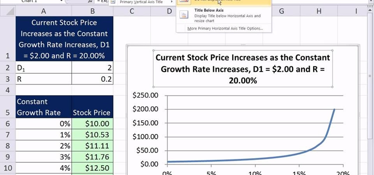
As you might guess, one of the domains in which Microsoft Excel really excels is finance math. Brush up on the stuff for your next or current job with this how-to. In this tutorial from everyone's favorite digital spreadsheet guru, YouTube's ExcelIsFun, the 64th installment in his "Excel Finance Class" series of free video lessons, you'll learn how to chart assumed constant growth rate changes in Excel.
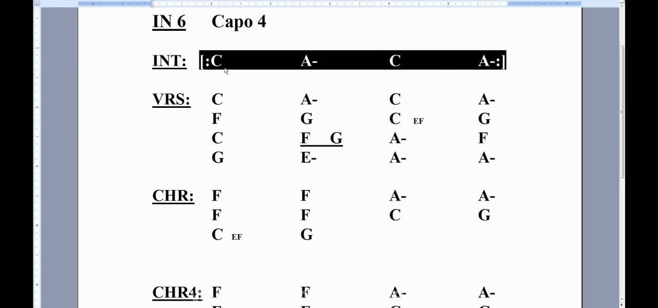
In this clip, we learn how to employ chord charts when playing the uke. Thinking about learning the ukulele? Well, you're in luck, as, thanks to WonderHowTo's ever-growing library of free video ukulele lessons, it's never been easier. For more information, including detailed, step-by-step instructions, and to get started tuning your own ukulele by ear take a look.
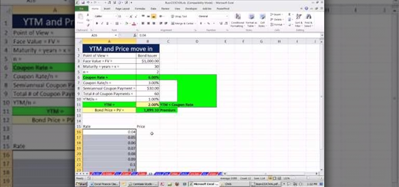
As you might guess, one of the domains in which Microsoft Excel really excels is finance math. Brush up on the stuff for your next or current job with this how-to. In this tutorial from everyone's favorite digital spreadsheet guru, YouTube's ExcelIsFun, the 50th installment in his "Excel Finance Class" series of free video lessons, you'll learn how to demonstrate the inverse relationship between bond rate and price with a scater chart.
New to Microsoft Excel? Looking for a tip? How about a tip so mind-blowingly useful as to qualify as a magic trick? You're in luck. In this MS Excel tutorial from ExcelIsFun, the 258th installment in their series of digital spreadsheet magic tricks, you'll learn how to make charts from noncontiguous data in MS Excel.
In this video tutorial, viewers learn how to create a freeze-frame effect in Adobe Final Cut Pro. Begin by placing the time line indicator to where you would like to place your freeze-frame. Press Shift and N to create the freeze-frame. The default user preference is 10 seconds. To change it, change the time and click on the insert button to splice the new freeze-frame time into the time line. Now click on the Effects tab and select the Dip to Color Dissolve under Video Transitions and Dissol...
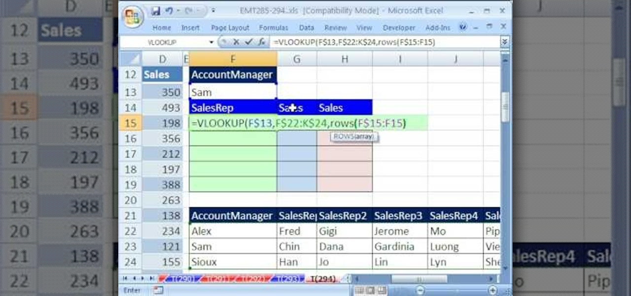
New to Excel? Looking for a tip? How about a tip so mind-blowingly useful as to qualify as a magic trick? You're in luck. In this Excel tutorial from ExcelIsFun, the 294th installment in their series of digital spreadsheet magic tricks, you'll learn how to filter a pie chart.
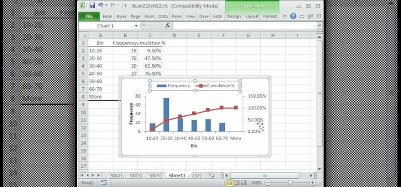
A histogram is a summary graph showing a count of data points that fall in various ranges. Histograms are used in statistics and other forms of mathematics. In this video, learn how to create your own histogram using data analysis on the computer. This tutorial will show you how to create a frequency distribution, a cumulative frequency distribution, a histogram chart and an ogive chart with the data analysis add-in.
Here is a tutorial on how you can design makeup on a paper face chart.
Using Excel 2007 to create a Gantt chart--a popular project management tool.
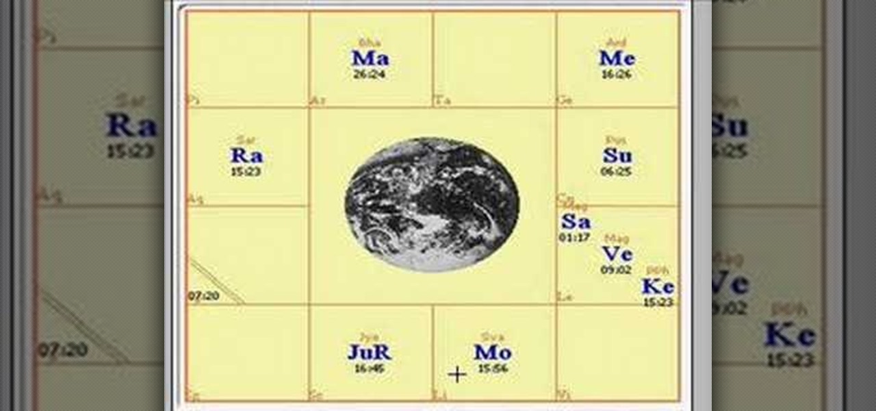
This Video will explain how to read the Vedic astrology chart.
Learn some useful tips to make your Microft Excel spreadsheets soar and how to use Excel to create forms and charts.