
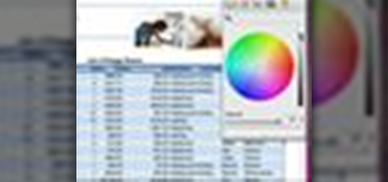
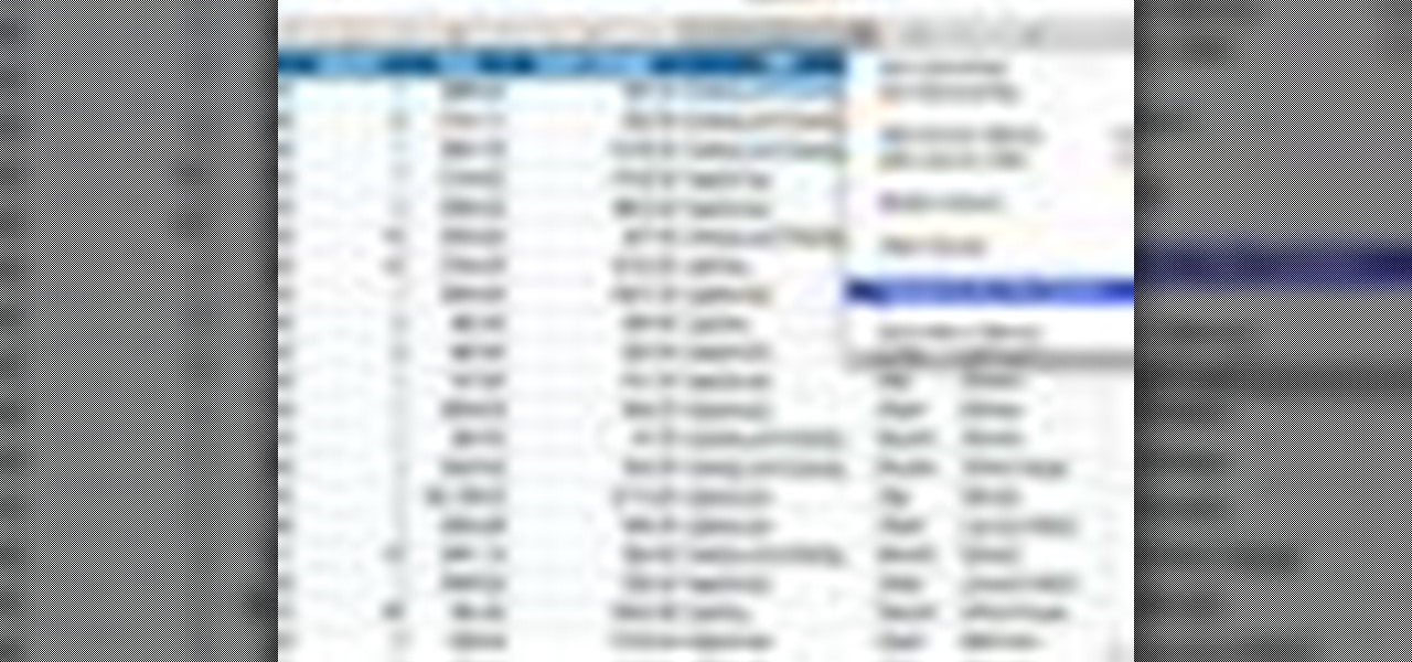
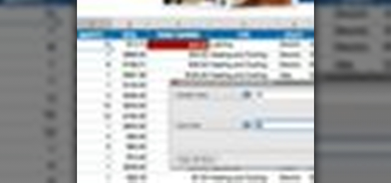
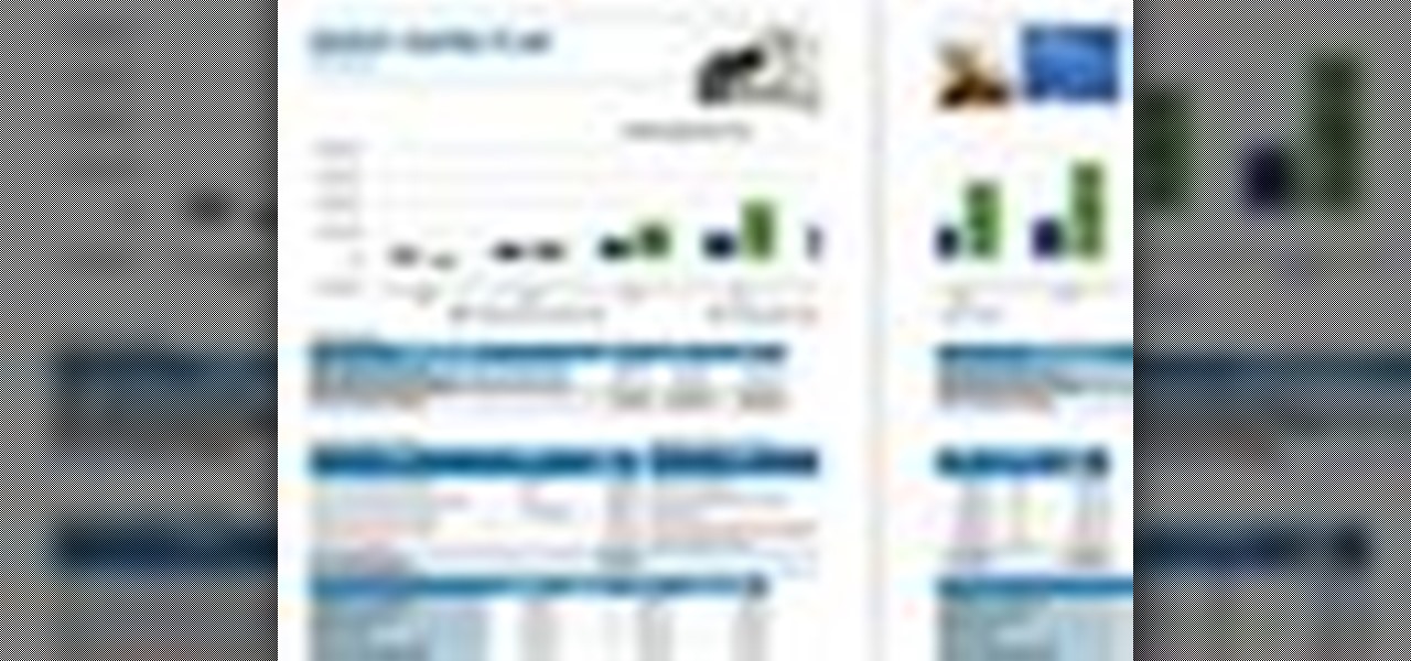
How To: Create custom charts with Microsoft Publisher
Learn how to better organize and convey your data to colleagues- create your own professional-looking charts in Microsoft Publisher.

Learn how to better organize and convey your data to colleagues- create your own professional-looking charts in Microsoft Publisher.

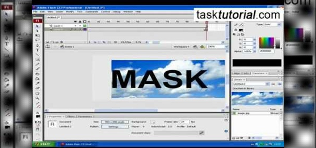
This tutorial will show you how to create a cool image animation using mask in Flash. First lets import image file and now lets create a new layer. Choose oval tools and now lets draw a shape just outside our scene. Then go to frame 30, and add the key frame and select transform tool. Now lets re-size our shape and go to 50 frame and add the key frame. Then go to frame 80 and add the key frame, re-size our shape and use free transform tools. Now lets create shaped in frame over 30, 50,and 80 ...
Want to generate a line chart in Excel 2011? This video will show you how it's done. Whether you're new to Microsoft's popular digital spreadsheet application, new to Excel 2011 or even an expert merely looking to brush up on the fundamentals, you're sure to be well served by this quality video tutorial from the folks at Lynda. For all of the details, and to get started creating and using line charts to visualize data in your own MS Excel '11 projects, watch the video.

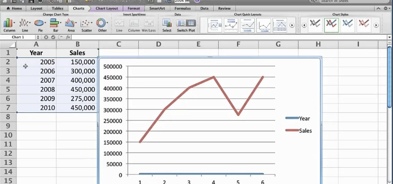
In this tutorial, we learn how to make your first graph in Microsoft Excel. First, open a new graph and enter in your data. Click and drag down from the original date you enter to have the other dates automatically entered in. Enter the rest of your information, then highlight all the data. Go to the menu and click "insert", then "chart". Now, go through the chart wizard to select what kind of chart you want to make. When you are finished entering all your preferences, change your values so t...
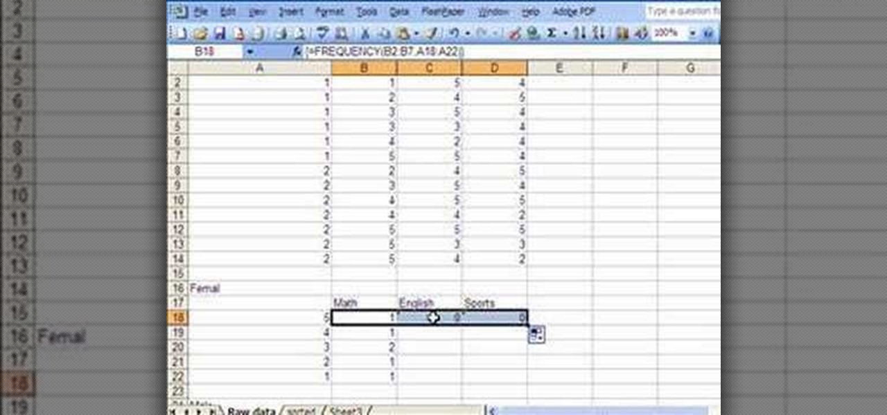
This video introduces how to use Excel to sort data, perform the Frequency function, and present data in line chart. See how to apply condition formatting when working in Microsoft Excel 2007. Whether you're new to Microsoft's popular word processing application application or a seasoned MS Office professional just looking to better acquaint yourself with the Word 2007 workflow, you're sure to be well served by this video tutorial. For more information, and to get started creating your own li...
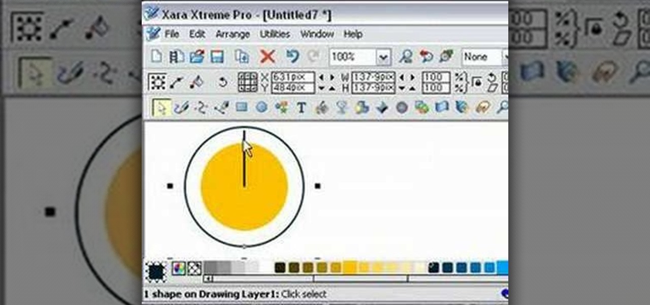
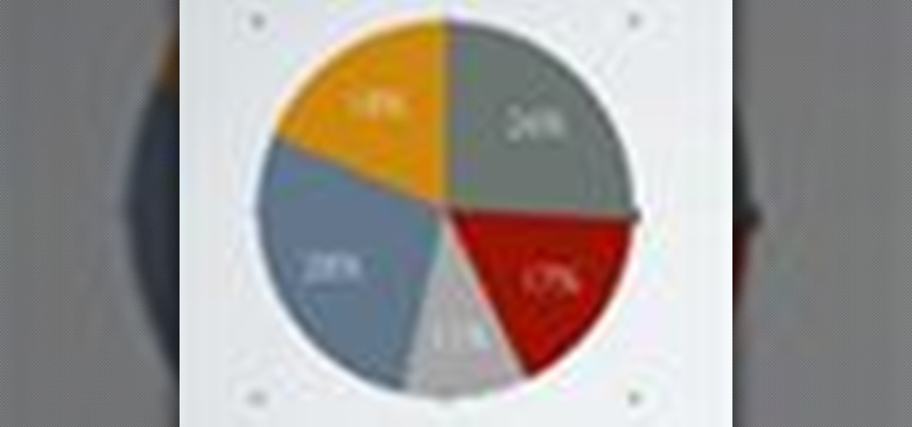
Ever wanted to make a pie chart in Xara Xtreme? This video will help guide you through the process of using Zara Xtreme to cut a circle into a pie chart segments using percentages as angles. After finding the center of the circle using a line and the central alignment tool, you'll begin arranging lines over the circle according to the speakers instructions. By the end of this tutorial you should have your very own pie graph, as well as the knowledge it takes to make bigger and better projects...

When you are solving inequality for a rational function you don't do it the same way as you would solve an equality. Now the instructor shows how to solve an inequality with the help of an example. Now to solve an inequality which is in the form a/b first take the numerator and denominator as separate equations of two lines. Now graph the two lines on coordinate axes. Using the graphs of the lines plot the intercepts of the equations on the number line noting down the sings. Now you can compa...

Check out this informative video tutorial from Apple on how to create and edit charts in Pages '09. iWork '09, the office productivity suite from Apple, is the easiest way to create documents, spreadsheets, and presentations. Writing and page layouts are easy in Pages. Numbers gives you simple ways to make sense of your data. You'll captivate your audience with new and sophisticated features in Keynote.

Check out this informative video tutorial from Apple on how to get started using Numbers '09. iWork '09, the office productivity suite from Apple, is the easiest way to create documents, spreadsheets, and presentations. Writing and page layouts are easy in Pages. Numbers gives you simple ways to make sense of your data. You'll captivate your audience with new and sophisticated features in Keynote.
Check out this informative video tutorial from Apple on how to use tables, color, images and fonts in Numbers '09.
Check out this informative video tutorial from Apple on how to format data values with the format bar in Numbers '09.
Check out this informative video tutorial from Apple on how to create formulas with Quick Formula in Numbers '09.
Check out this informative video tutorial from Apple on how to hide, filter and sort table cells in Numbers '09.
Check out this informative video tutorial from Apple on how to group rows into categories in Numbers '09.
Check out this informative video tutorial from Apple on how to highlight values with Conditional Formatting in Numbers '09.
Check out this informative video tutorial from Apple on how to print spreadsheets in Numbers '09. iWork '09, the office productivity suite from Apple, is the easiest way to create documents, spreadsheets, and presentations. Writing and page layouts are easy in Pages. Numbers gives you simple ways to make sense of your data. You'll captivate your audience with new and sophisticated features in Keynote.
Check out this informative video tutorial from Apple on how to work with Excel users in Numbers '09.
Check out this informative video tutorial from Apple on how to create and edit charts in Keynote '09.
This video demonstrates how to add a data table to an Excel 2007 chart. From the people who brought you the Dummies instructional book series, brings you the same non-intimidating guides in video form. Watch this video tutorial to learn how to add a data table to an Excel 2007 chart, For Dummies.

This video demonstrates how to create a graph or chart in Excel 2007. From the people who brought you the Dummies instructional book series, brings you the same non-intimidating guides in video form. Watch this video tutorial to learn how to create a graph or chart in Excel 2007, For Dummies.
clipping mask Sponsored by SimpleRetouch.com Start by creating a task with the name Mask, then Choose a color and a font size.

With hordes of games populating the Google Play Store, it's grown increasingly difficult to find trending, non-gaming apps that you might find useful on your Android device. There are a few in the Top Charts pages, peppered in among the various games you'll never play, but other than that you'll have to do some serious searching to discover any new apps.

The Billboard Charts have been a measurement of commercial success for pop songs since roughly the time that radios became a household item. In its modern form, Billboard ranks the sales and performance of all singles with its "Hot 100" chart, as well as many other genre-specific rankings.
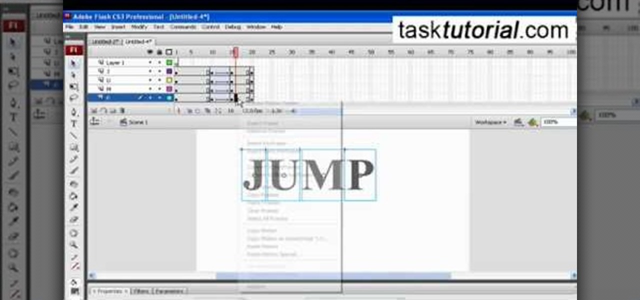
This video describes how to create a jumping letters in Flash, first create the text for example "JUMP" and using Break the letters each and then make the layer and now convert the letters into "Movie clips" and now we should add the key frames to our "time line”. Then moves the letters up by using the up arrow now copy the key frames from font end and paste on the back again for go up and come down the letters again and add the "motion between" for each letters and now skip the key frames by...

This video demonstrates how to create pivot chart in Excel 2007. From the people who brought you the Dummies instructional book series, brings you the same non-intimidating guides in video form. Watch this video tutorial to learn how to create pivot chart in Excel 2007, For Dummies.

In this tutorial, we learn how to make a serving tray from a picture frame. First, grab a picture frame in a larger size that comes with glass on it and a backing. From here, you will grab some scrapbooking paper or another type of paper and cut it to size to fit on the background of your paper. Then, find two handles that you have and screw these onto the sides of the picture frame. After this, glue your favorite pictures onto the paper and then let it dry. When finished, stick this under th...
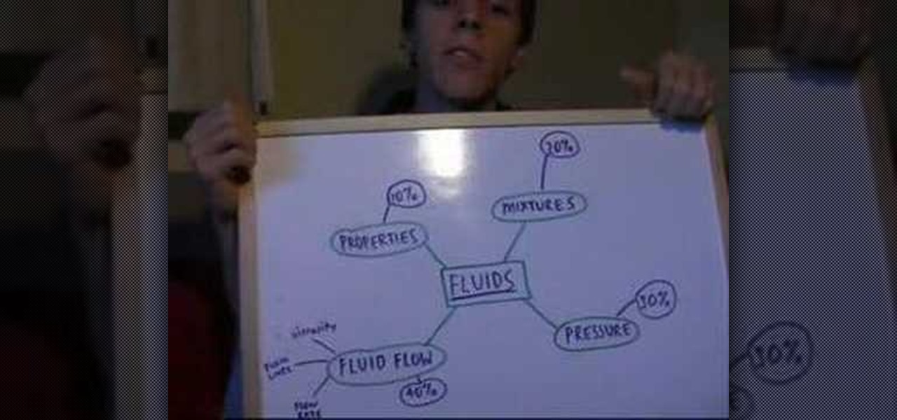
Find out how to dramatically reduce study time & increase your grades. Included is a flow chart to see exactly how to reduce your study time.
Learn how to compare numerical figures and create a simple bar chart in Microsoft Excel.

It's often best to use a graphical representation of the data you've assembled or calculated. This tutorial shows you how to create charts to visually show your results.
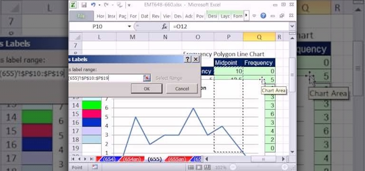
New to Microsoft Excel? Looking for a tip? How about a tip so mind-blowingly useful as to qualify as a magic trick? You're in luck. In this MS Excel tutorial from ExcelIsFun, the 655th installment in their series of digital spreadsheet magic tricks, you'll learn see how to create a statistical frequency polygon using a line chart. Also see how Excel mistakenly interprets number category label data as Number Series data.
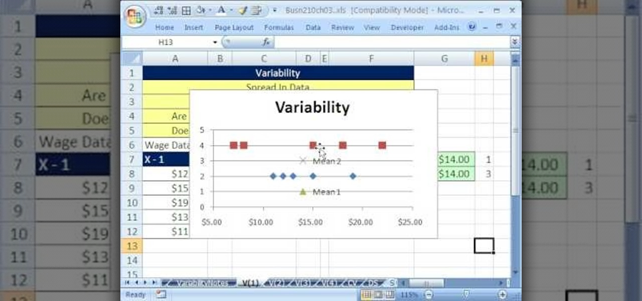
If you use Microsoft Excel on a regular basis, odds are you work with numbers. Put those numbers to work. Statistical analysis allows you to find patterns, trends and probabilities within your data. In this MS Excel tutorial from everyone's favorite Excel guru, YouTube's ExcelsFun, the 39th installment in his "Excel Statistics" series of free video lessons, you'll learn about variability (or dispersion or spread). Create an X-Y Scatter Diagram chart showing data points and the mean.
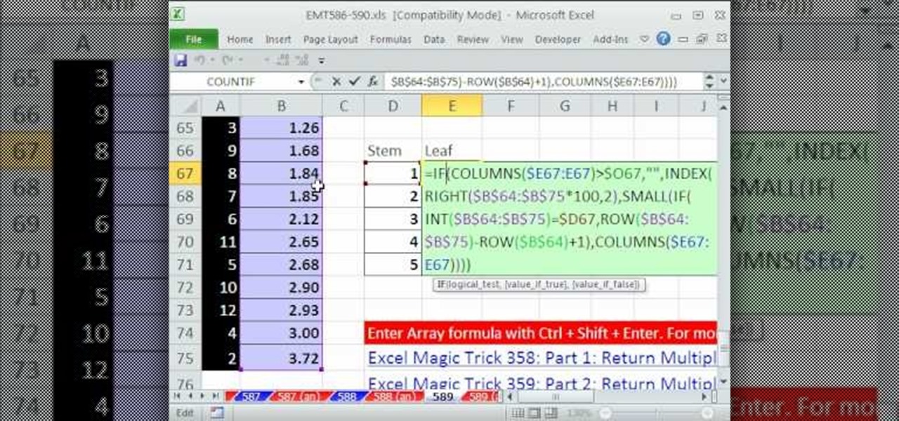
New to Microsoft Excel? Looking for a tip? How about a tip so mind-blowingly useful as to qualify as a magic trick? You're in luck. In this MS Excel tutorial from ExcelIsFun, the 589th installment in their series of digital spreadsheet magic tricks, you'll learn how to create an array formula for a stem and leaf chart for decimal numbers using the IF, COLUMNS, SUMPRODUCT, INDEX, INT, RIGHT, SMALL, ROW and TEXT functions.

In this video, we learn how to create a picture frame on a photo using PhotoShop. First, open up the program and open the picture that you want to change. Next, select the rectangular marquee tool from the toolbar on the side. Now, create a selection of what you want to frame. Then, click with the right key and select "inverse". Click again with the right key and choose "layer via copy". Now, click 2 times on the layer to open and the layer style menu will show up. Now put the contour to crea...
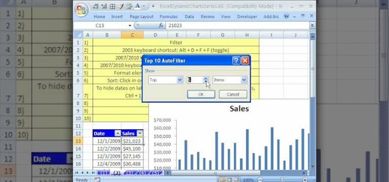
In this Software video tutorial you will learn how to use the filter & sort feature in Excel. First create a column chart on an excel sheet. In this example, it is a date and sales chart. Click alt+F1 and the chart is displayed. Then click and delete the legend and the horizontal lines. Now go back to the data set, click on a cell and click ctrl+shift+L and that will add the auto filter. ctrl+shift+L is for Excel 07. For earlier versions, see the commands listed in the video. This is a toggle...

New to Microsoft Excel? Looking for a tip? How about a tip so mind-blowingly useful as to qualify as a magic trick? You're in luck. In this MS Excel tutorial from ExcelIsFun, the 351st installment in their series of digital spreadsheet magic tricks, you'll learn how to create an area chart for x and f(x) data as well as how to use the IF function to show a second data set plotted to show a specific area section.

The resolution, or sharpness, of a lens is vital to creating and reproducing quality photographs. Watch as this video breaks down how to diagnose the sharpness of your SLR lenses.
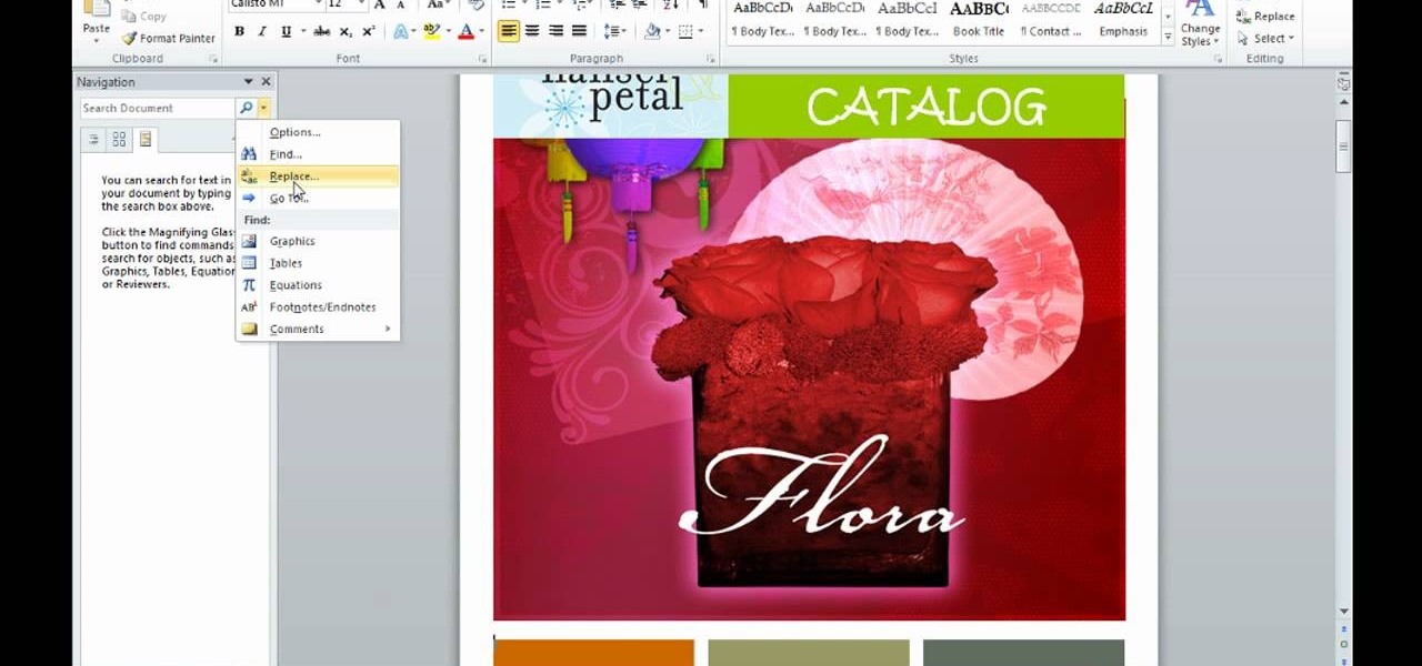
This is an informative video tutorial on how to search graphics, tables and charts using MS Word 2010. The author informs that the earlier MS Word editions had fast and easy search options, but the same feature built into the 2010 edition is vastly improved. One simply has to click the ‘Find’ option at the top right-hand corner and a navigation pane opens on the left-hand side. In the search box, the keyword is typed in and all the instances of that word in the document are highlighted, while...

Looking for a unique picture frame? Learn all about decorative picture frames including rustic frames, veneer frames, ornate and dark wood frames and more in this free video series about professionally framing pictures.

A light meter can prove to be an invaluable tool on any film set, allowing you to quickly and efficiently set lights and know the correct exposure values of those lights. Light meters were initially designed for still photographers and cinematographers can easily calibrate them to a given film stock speed for shooting film. But what about today’s digital cinematographer? I’m glad you asked. In this video tutorial you'll see how you can use a light meter to quickly and efficiently light a scen...
Donnie Hoyle shows us how to edit video frames in Photoshop. So if you suck at Photoshop check out this tutorial and learn how to edit video frames like a pro. This is extra helpful if you need to remove yourself from incriminating video camera evidence.