One of Android's biggest strengths relative to iOS was the ability to switch to a third-party keyboard. While Apple has finally included this feature in its latest OS and leveled the playing field a bit, the variety of options still pales in comparison to what's available on Android.

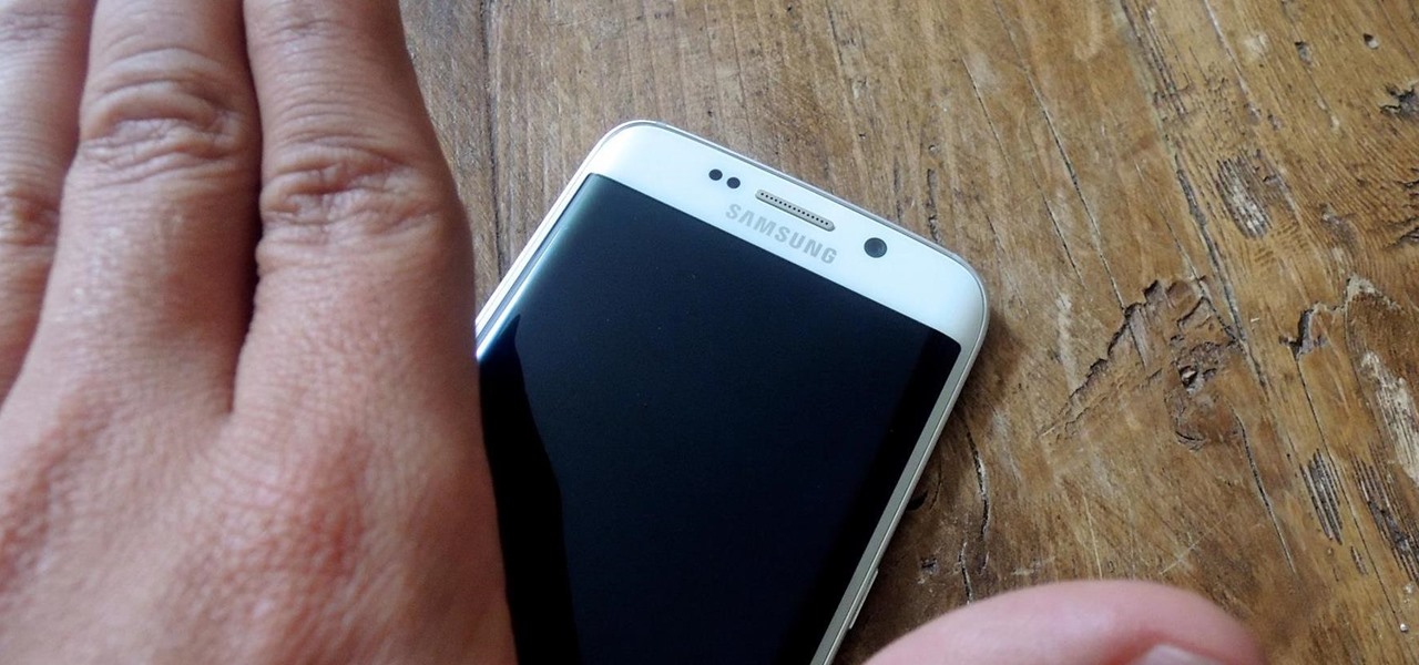
As your Galaxy S6 lies on your desk while you're hard at work, it's difficult to resist from periodically pressing the wake/lock button to check the weather or glance over any notifications you may have on your lock screen. While pressing the hard key is easy enough, there's an even easier method where you simply hover your hand over the device to wake the screen.

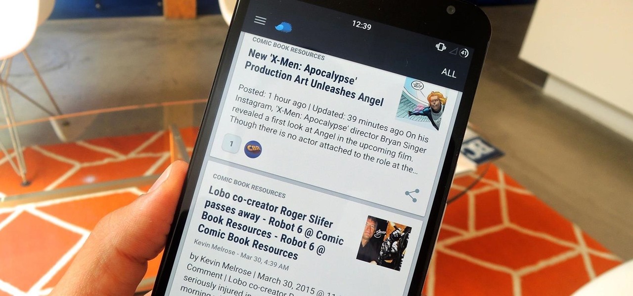
Serving as the primary tool of distribution for many websites, social media is how most of us catch up what's going on around the world. While there is a bunch of clickbait going around on Facebook and Twitter, there are plenty of genuinely interesting articles being shared.

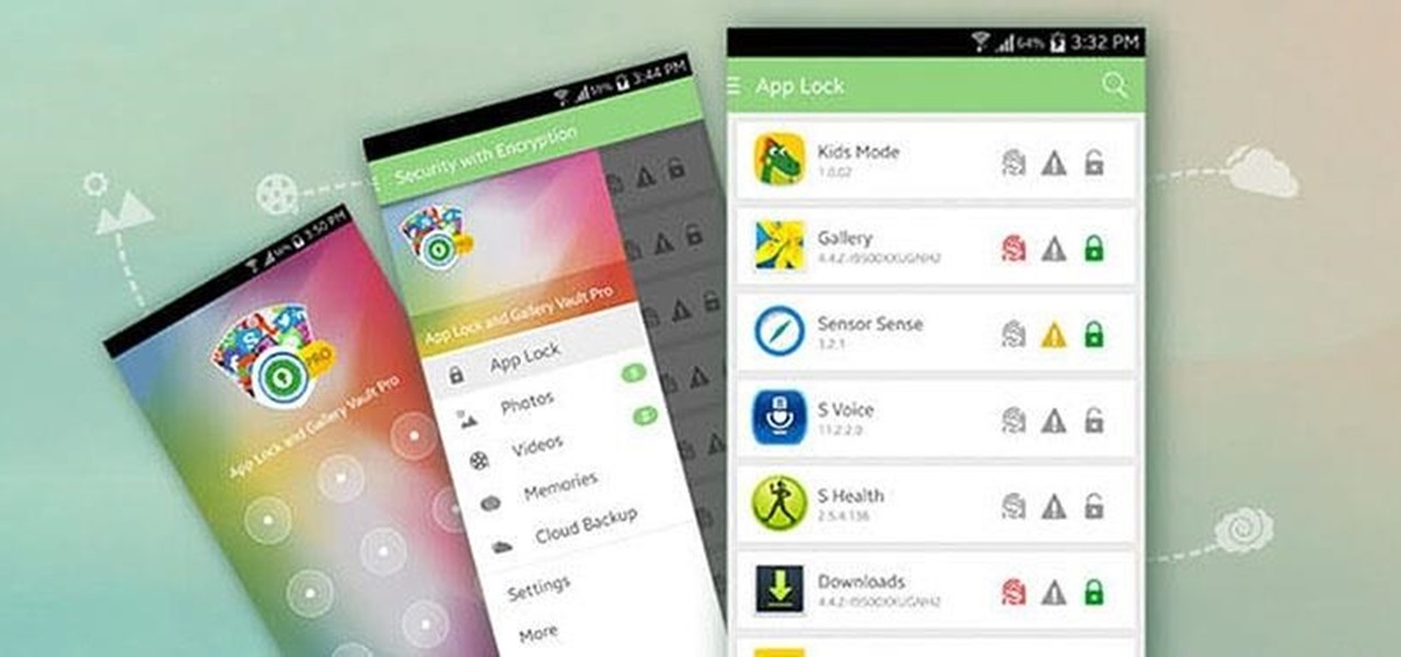
Smartphone users often wish for a privacy, where no one is able to poke his/her nose in their personal stuff. Unfortunately, none of the smartphones have been able to guard their privacy in this fashion. Smartphones usually come up with none or almost negligible built-in security to serve your purpose.

After receiving the fourth beta for iOS 8.3, we can assume that the official release shouldn't be too far behind. Along with plenty of bug fixes from prior iOS versions, Apple is also ushering in a few minor features that are sure to ease some annoyances.

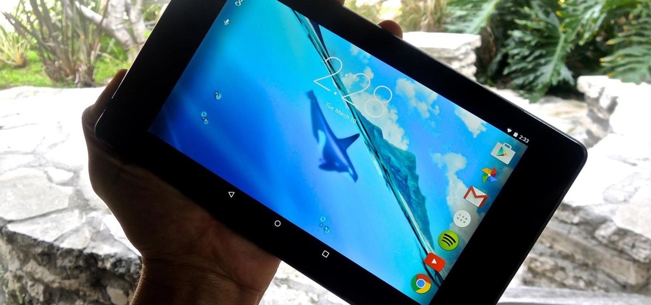
Live wallpapers, like the classic Mario-themed one we previously covered, is a great way to spruce up your device and get some simple amusement. Unfortunately, they also drain more battery than conventional wallpapers. Which brings me to ASUS LiveOcean.

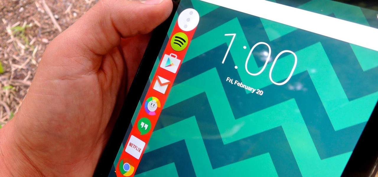
Granting seamless access to your favorite or most utilized apps with just a tap, the Galaxy S5's "Toolbox" feature is one that plenty of other Android users wish they had. Instead of holding your breath for your manufacturer to implement something similar, or hoping that Samsung releases it on Google Play, you can mimic it on your device today with a few simple steps.

Yes, they're called volume keys, but they can do much more than adjust your volume. With minimal effort, you can do some amazing things with these physical buttons, like secretly record videos, toggle on your flashlight, scroll through pages, control your music, and much more. And while using them to wake your screen is useful, let's take it a step further and show you how to use them to completely unlock your device, even if the screen is off.

I've used the flashlight feature on my iPhone more times than I can count. It's an invaluable tool that's super easy to activate; just pull up the Control Center and hit the flashlight icon. However, turning it off isn't always as easy, especially when you're on the lock screen.

These days, using the power button to lock your Android seems a little old-fashioned. Thanks to third-party apps and mods, you could seamlessly lock your device using a double-tap, a swipe, and even gravity, or you could just throw it in your pocket, all of which help prevent additional wear and tear on your power button. Now, we've got another method for you—just shake.

Some elements of iOS's design, like its minimal color palette, are what make Apple products unique, helping to produce a clean, sleek user experience. But after you jailbreak, that all goes out the window. Once you've tried things like theming your status bar, changing your icons, or applying a new lock screen, you'll never see your iOS device in the same way again.

I'm all about customizing my iPhone and making it as different as possible from everyone else's. While it's easy to change the wallpaper, swap keyboards, and hide apps on your home screen, there's not much else you can do aesthetically without jailbreaking, especially when it comes to the status bar and app icons.

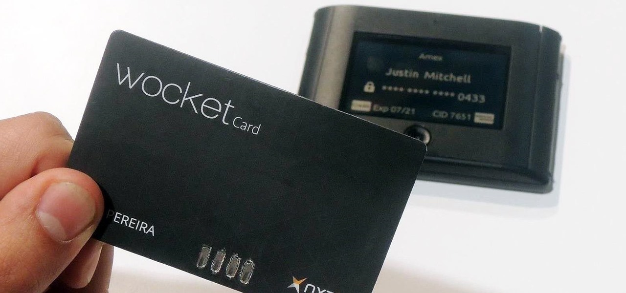
As far as wallets go, mine is as full as they come; think something like George Castanza's overstuffed wallet on Seinfeld. I've got receipts, pictures, and tickets jammed inside, but what takes up the bulk of the space are all of the cards—credit, debit, gift, rewards, customer loyalty... I've got pretty much any card you can think of squeezed in. While it is a strain on my rear end, there's nothing I can do besides keep some of the cards elsewhere. However, looking for them when I need them ...

Sitting at home alone on Friday night, I'm often in the mood to watch something more recent than the offerings on Netflix, Hulu, or Amazon Prime Video. And since the demise of video rental stores, that leaves me with browsing through the Redbox catalogue, then strolling down to the nearest 7-Eleven to pick up my movie.

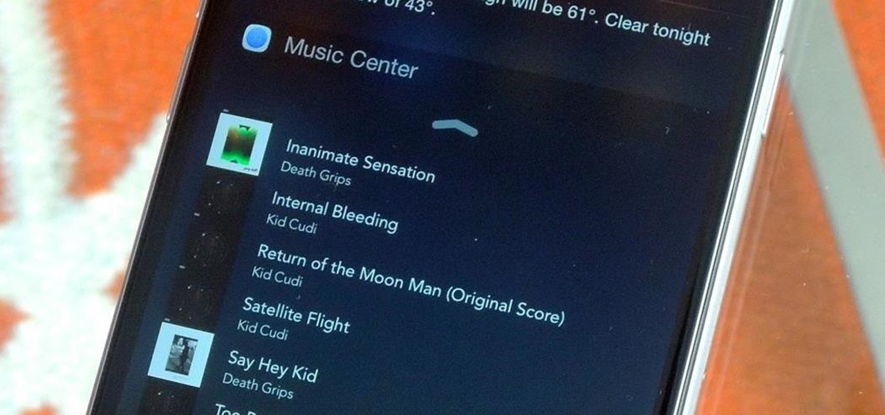
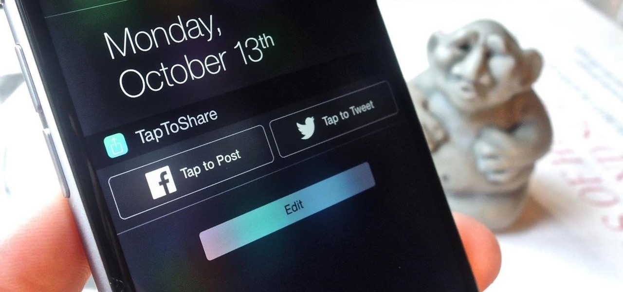
Since Apple released iOS 8, many third-party apps have taken advantage of one of its more resourceful features: Notification Center widgets. These widgets have made it easier to interact with features and settings that would otherwise require launching an app itself, instead offering functionality through the native pull-down Notification Center.

Apple has been one of the biggest trolls when it comes to adding new features to their software. Whether its adding a new boot screen and not letting all devices use it, or adding Dark Mode and making it a hassle to toggle on and off, there is always to be a caveat attached to each new addition.

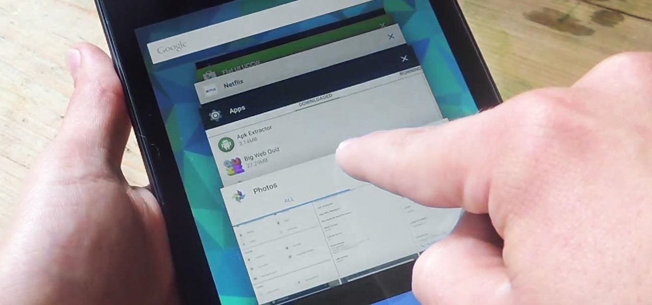
On earlier Android versions, you were able to hold down on an app's icon in the recent apps menu (aka app switcher) and jump straight to the app's info page. From there, you could easily uninstall the app, force-stop its activity, or clear its cache and data.

It's not the additions Apple brought to iOS 8 that irk me, but what they didn't add that breaks my heart. We did get some cool new features, like battery stats and interactive notifications, but what about a simple customization feature that most—the option to have a transparent dock background?

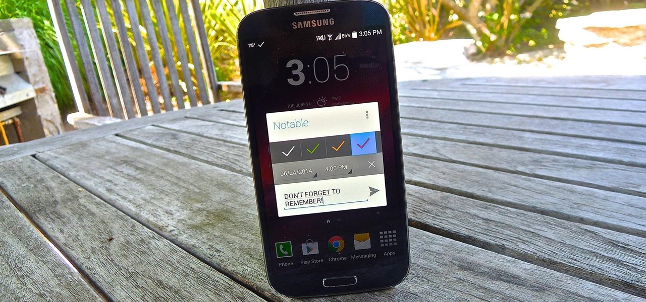
Many reminder apps offer various bells and whistles that make them overly complicated to use when all you want to do is one or two things. If the only things you care about doing are setting quick reminders and adding timers, you probably don't care about cloud syncing or calendar integration features.

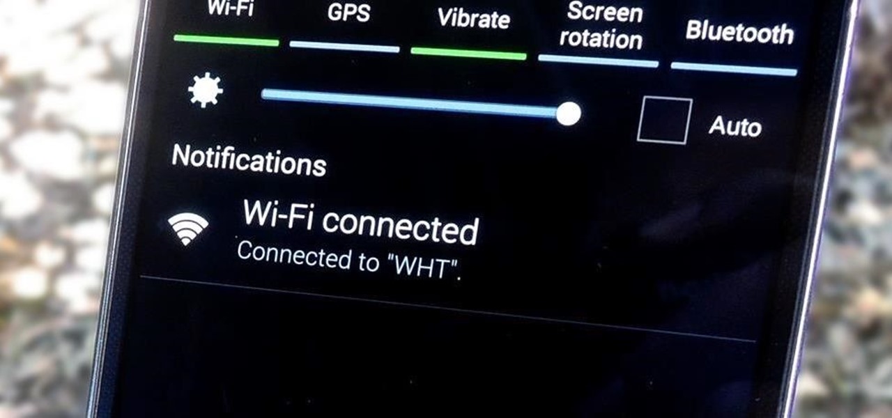
Call it OCD if you will, but I make it a priority to have a clean Notification panel. Like a chalkboard that isn't wiped spotless, I get an unsettling feeling that something in the universe isn't complete when there's unnecessary clutter in the drop-down. For this reason, I loathe the fact that I can't remove the "Wi-Fi connected" tile from my "Notifications."

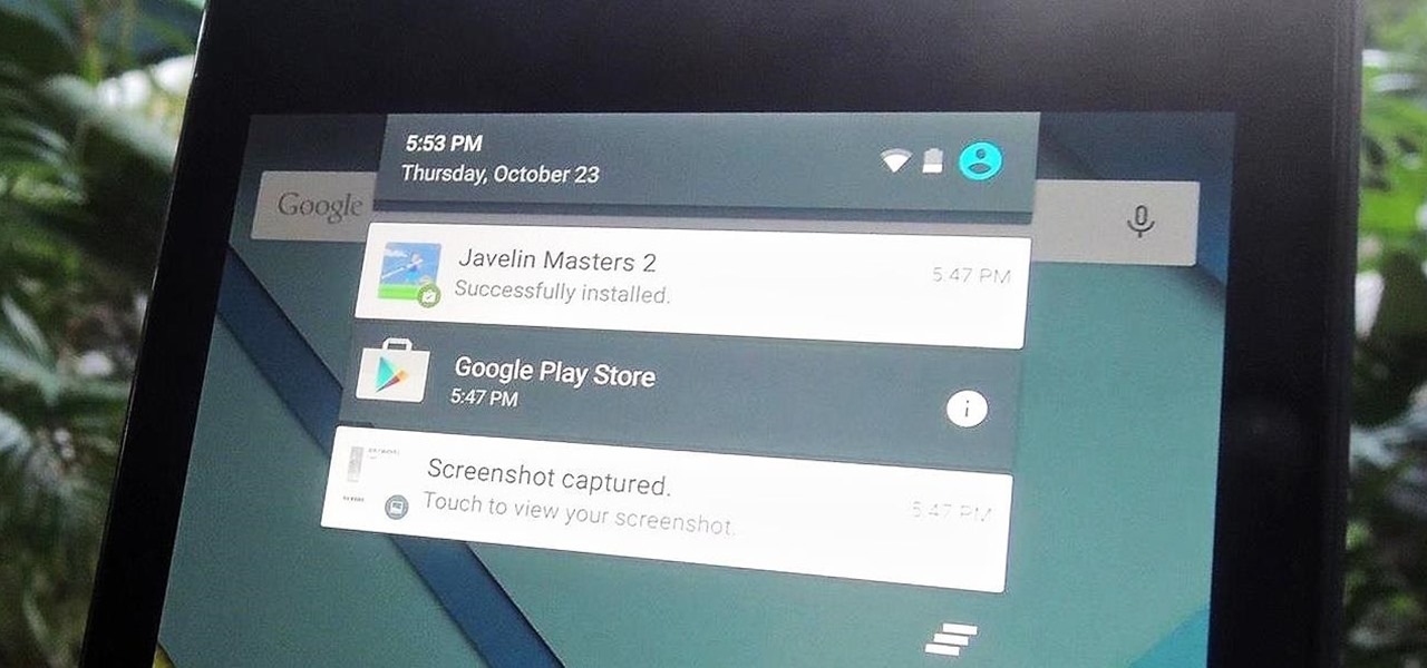
Notifications sometimes come in bulk on Android—especially after booting up. While some of them are helpful or informative, most can be immediately dismissed as soon as they come in.

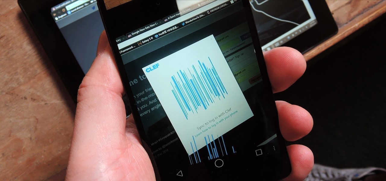
With all of the different websites we use in our day-to-day lives, keeping track of our numerous login credentials can start to become a hassle. This has created a market for password managers that aim to centralize these account credentials and generally streamline the process of logging into our favorite sites.

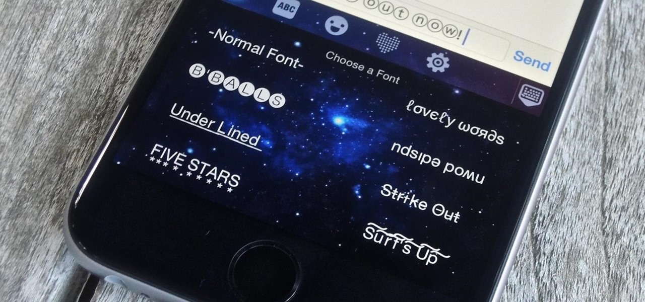
Allowing the use of third-party keyboards on iOS 8 was a great move on Apple's part, providing iPhone users with choices when it came to an often-used and important aspect of their operating system. Unfortunately, as cool as all these keyboards are, they all use the same boring, stock font.

Back in the days of iOS 6, iPhone users were able to send a quick tweet from their notification center, but that has long since been removed. This convenient feature was missed enough on iOS 7 for devs to create a jailbreak tweak in its absence. Thankfully, due to the new widget capabilities of iOS 8, we can have Twitter back in the Notification Center along with Facebook.

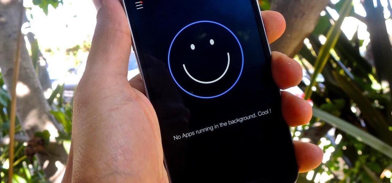
Contrary to what you may think, clearing or swiping away apps in the Recent Apps view on your Android device does not necessarily stop app activity or running tasks—and these running processes can actually be eating away at your battery life. Depending on the app or process, it may only be a small percentage, but every little bit helps these days.

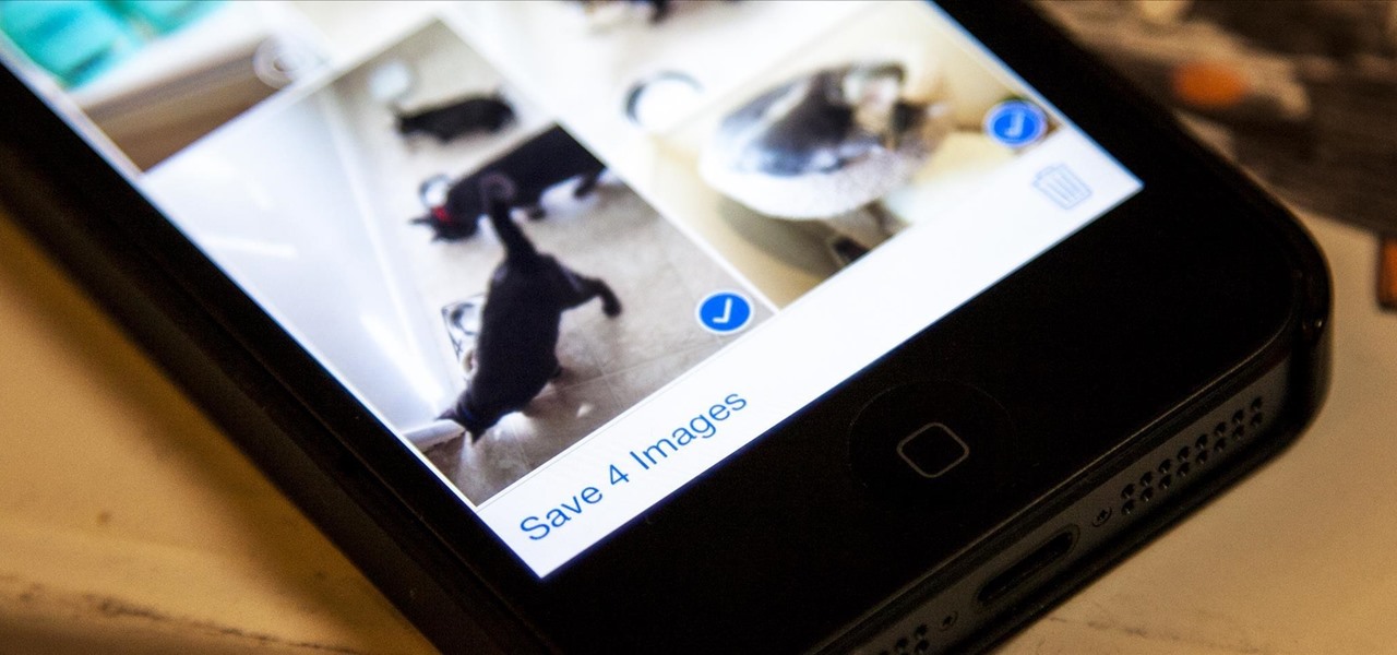
Viewing all of the attachments in a message thread within iOS 7 has never been particularly easy. To see every single picture and video dating back to the beginning of the conversation, you have to manually scroll through the entire conversation and refresh it until all of it appears on your screen. Depending on how long the conversation is, that could take some time.

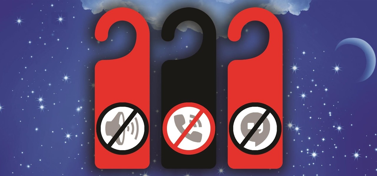
Oddly enough, stock Android does not come with a "do not disturb" function out of the box. Samsung has their own version built into to TouchWiz called "Blocking Mode," and Apple has had their "Do Not Disturb" feature since iOS 6, so why is stock Android so late to the game?

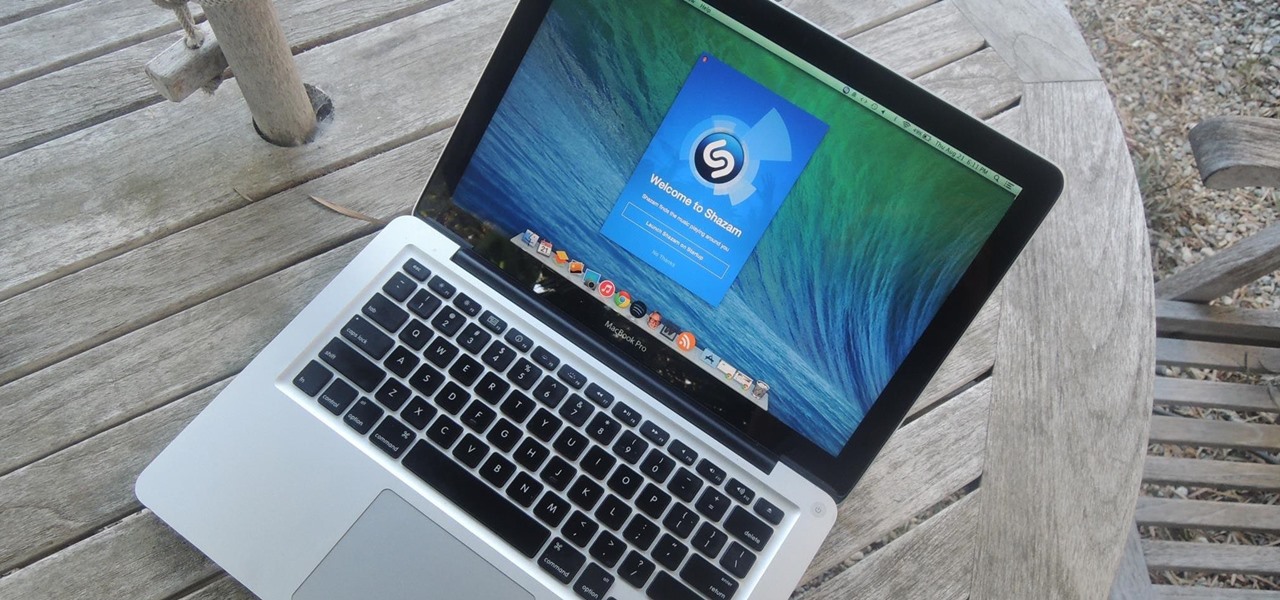
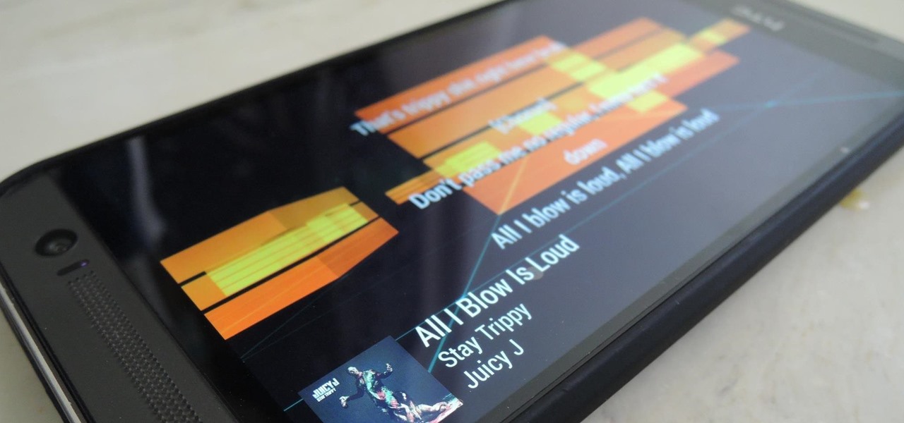
Shazam has ushered in an age where any song we like, but don't recognize, can be almost instantly identified. While the whole process is easy enough—just pull out your phone and hit a button—there are still moments where we might miss those quick and fleeting tunes.

These days, phones are more like portable entertainment systems. It's a hybrid mobile device for gaming, texting, watching movies, and listening to music more than it is an actual "phone" that you talk on.

Sense 6 came with a ton of new features for the HTC One, but for some reason, HTC decided to keep one of them hidden to all non-Harman Kardon editions.

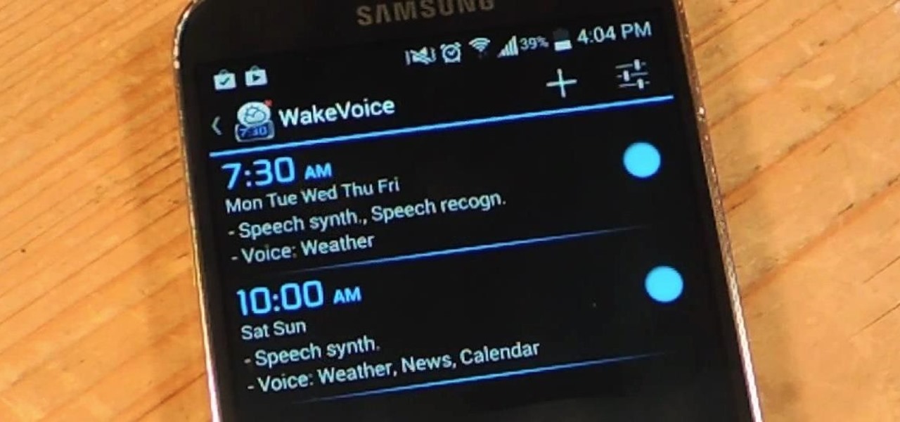
My stock alarm clock does exactly what it's supposed to—it wakes me up. But for those really tough mornings when I just need to hit the snooze, getting my head out of the sheets is a no-go. This leads to trying to find my phone with an outstretched arm, which means knocked-over water glasses and my phone falling under my bed—even more out of reach. Ugh!

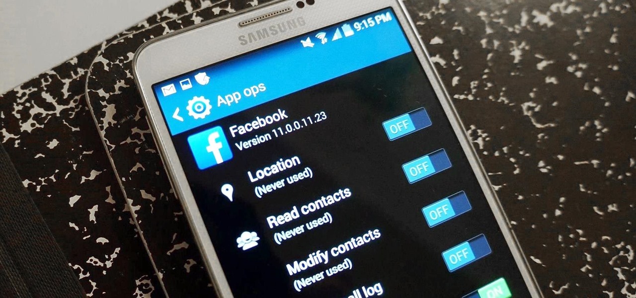
It's a modern day nightmare to accidentally reveal too much information on Facebook. I've inadvertently told the world my location more times than I can laugh off, and my friends haven't fared too well either. Just take a look at the requested app permissions next time you're about to click install and you'll quickly realize how much that app can reveal about you.

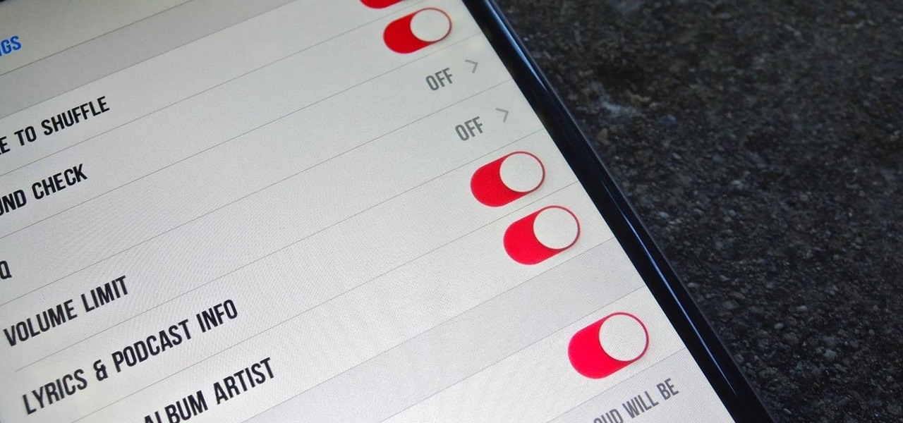
Battery life is and most likely always will be an issue with iPhones and other smartphones and tablets, but Apple is making it easier for us to save juice when we need to. To help monitor per-app battery usage, iOS 8 now lets us view battery usage stats for individual apps.

Utility tool apps provide extremely powerful and useful lightweight replacements for your parents' heavy archaic tools—everything from flashlights to tracking systems and more.

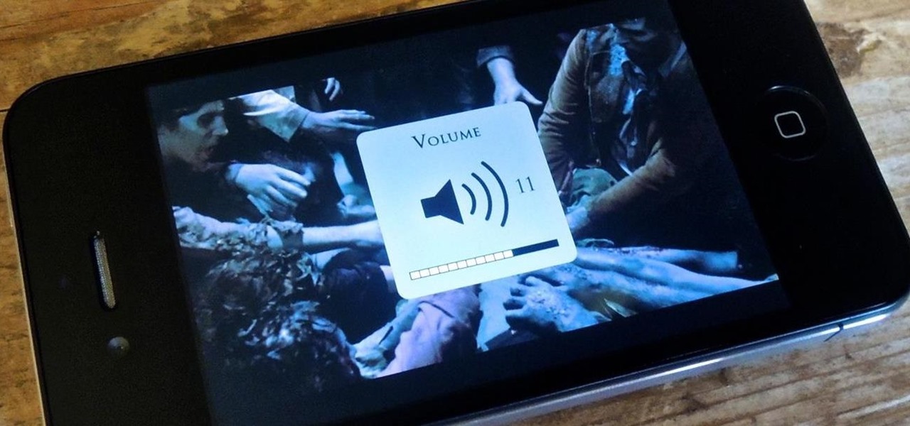
One of the biggest issues I have with iOS 7 is the volume change indicator that pops up every time you adjust the volume of a playing a game or video. Its large, oafish demeanor blocks the entire middle of the screen for a couple seconds, obstructing your view.

With the development kit fully open, the functionality of our Chromecasts seem to expand with each passing day. From a portable gaming system to your own personalized news station, our little gadgets have a lot going for them.

There are a lot of cool new features in iOS 8 that weren't available in previous iOS versions, but it's still lacking overall in terms of customization.

We've always been able to switch between running apps pretty easily, but iOS 7 beefed up the multitasking menu significantly by incorporating app previews in lieu of just icons.

From personal photos and videos to online banking passwords saved in your web browser, your phone has all kinds of sensitive data that needs to be protected. One of the best things you can do for your Samsung Galaxy S4's data is have a lock screen with a hard-to-guess PIN or password.

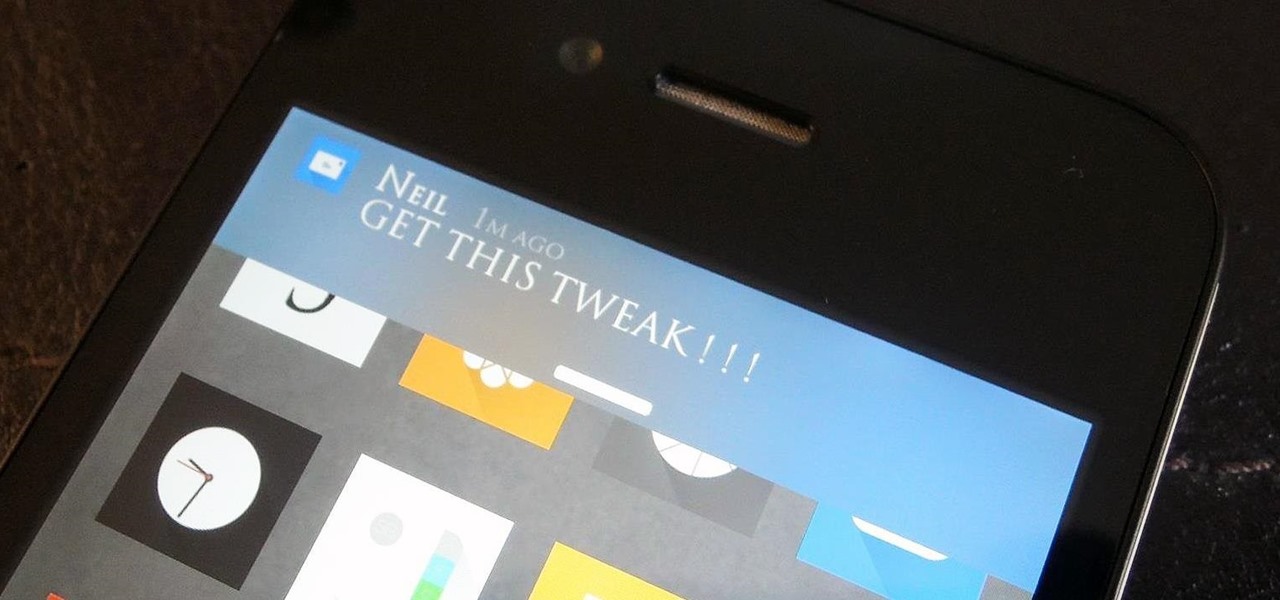
A banner alert for notifications is like the Robin to our iPhone's Batman—they're taken for granted and don't really get the recognition they deserve. Yes, they can be disruptive at times, but just like Robin, they can be necessary for getting things done.


