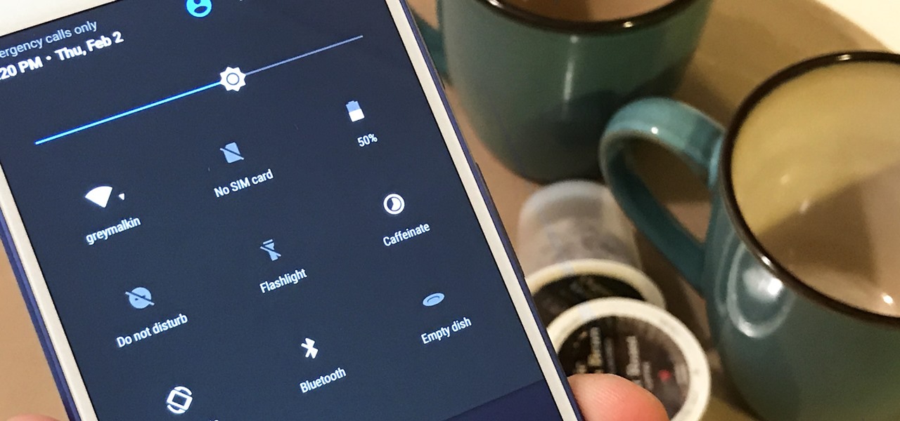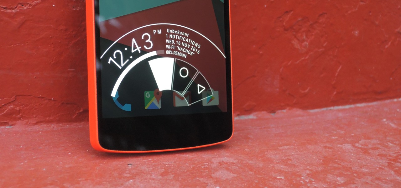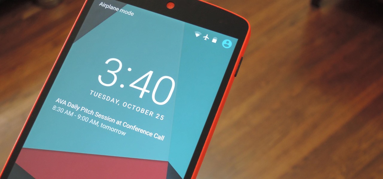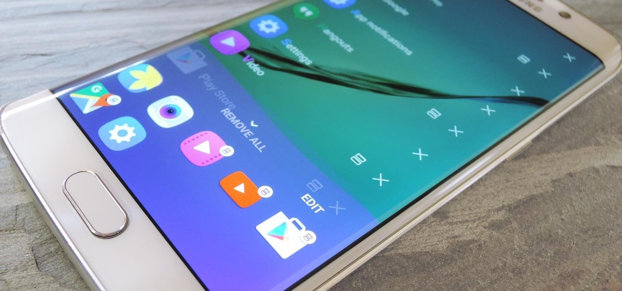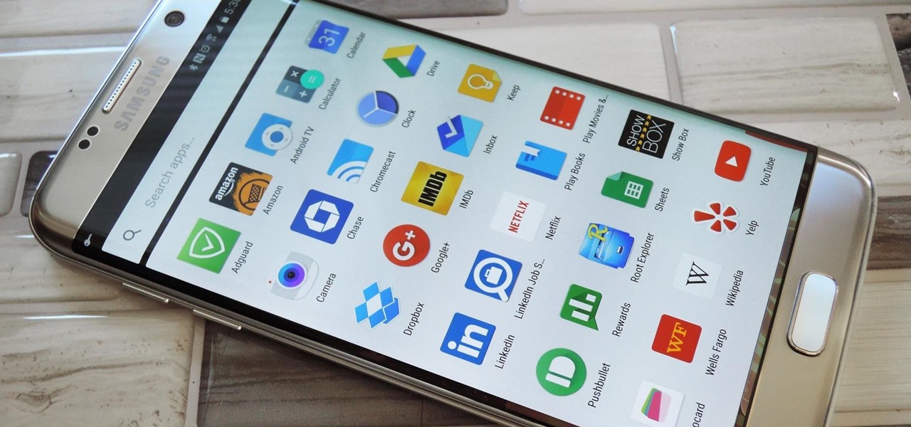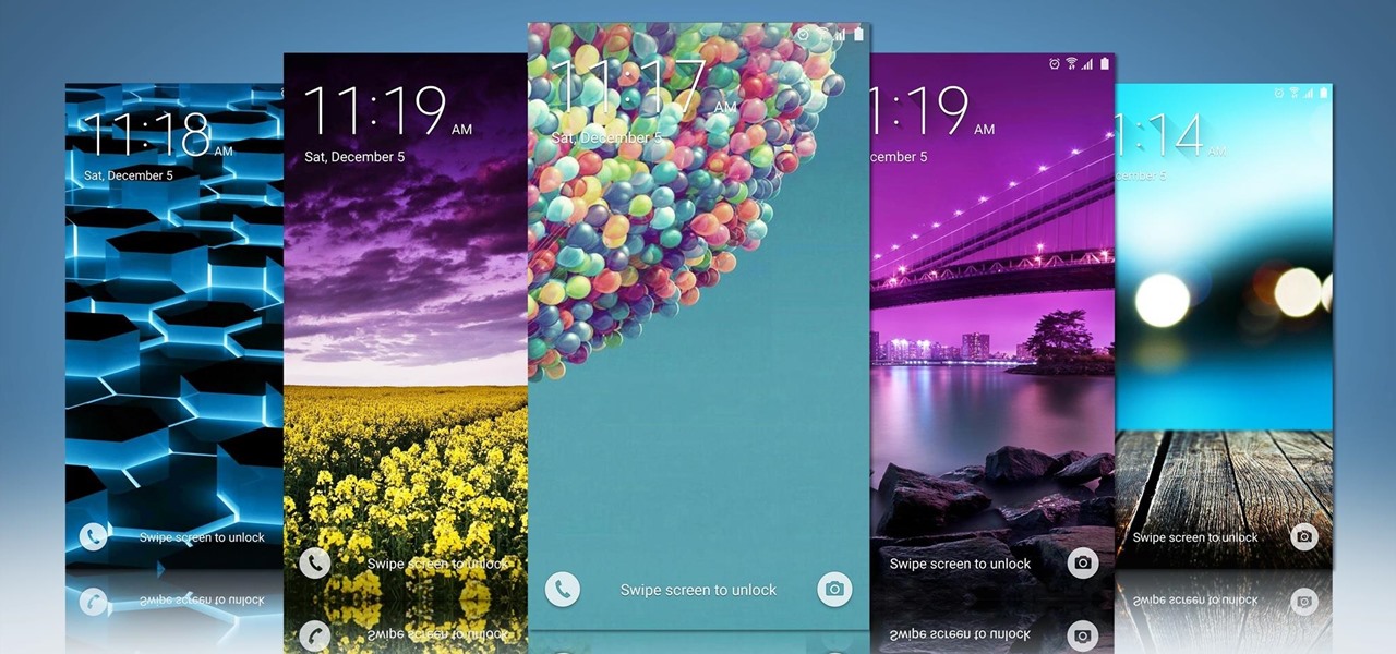
Now that we've had significant time with Samsung's Oreo Beta for the Galaxy S8, many interesting features have come to light. As we continue using the new software, we have uncovered more subtle changes. The home screen already received a few new customization features, it's only fitting that the edge screen get some love, too.
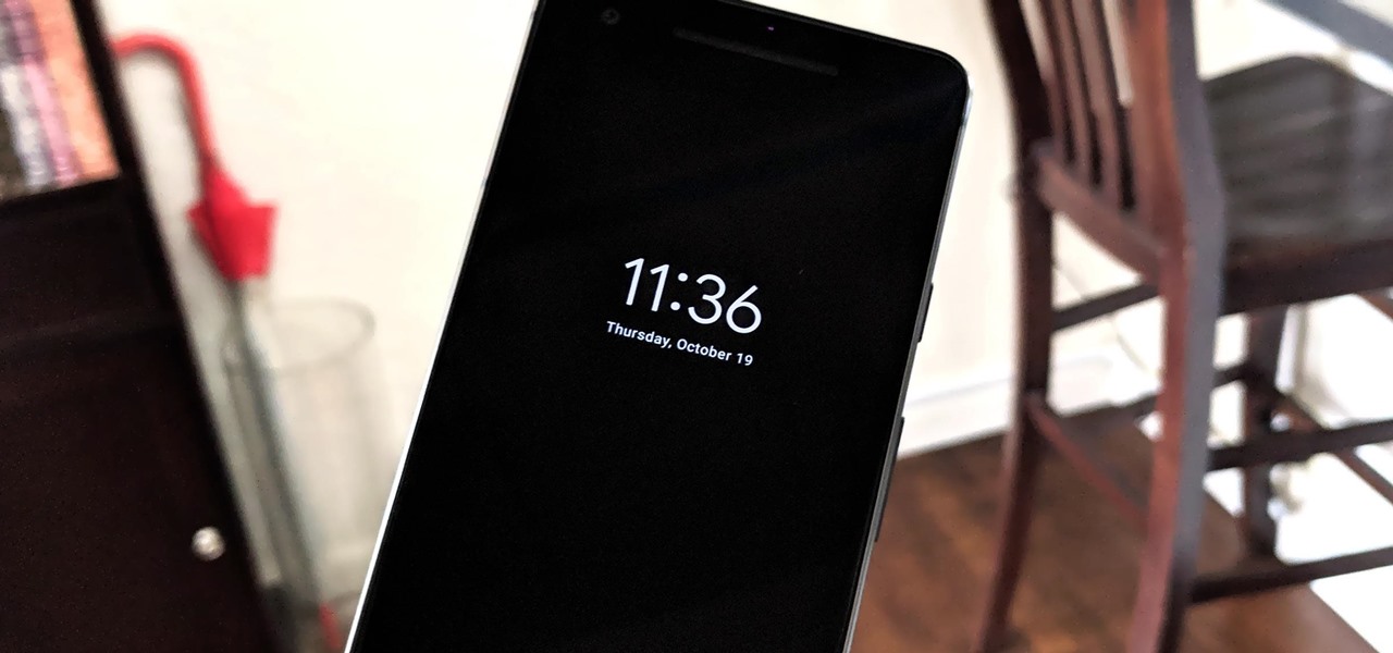
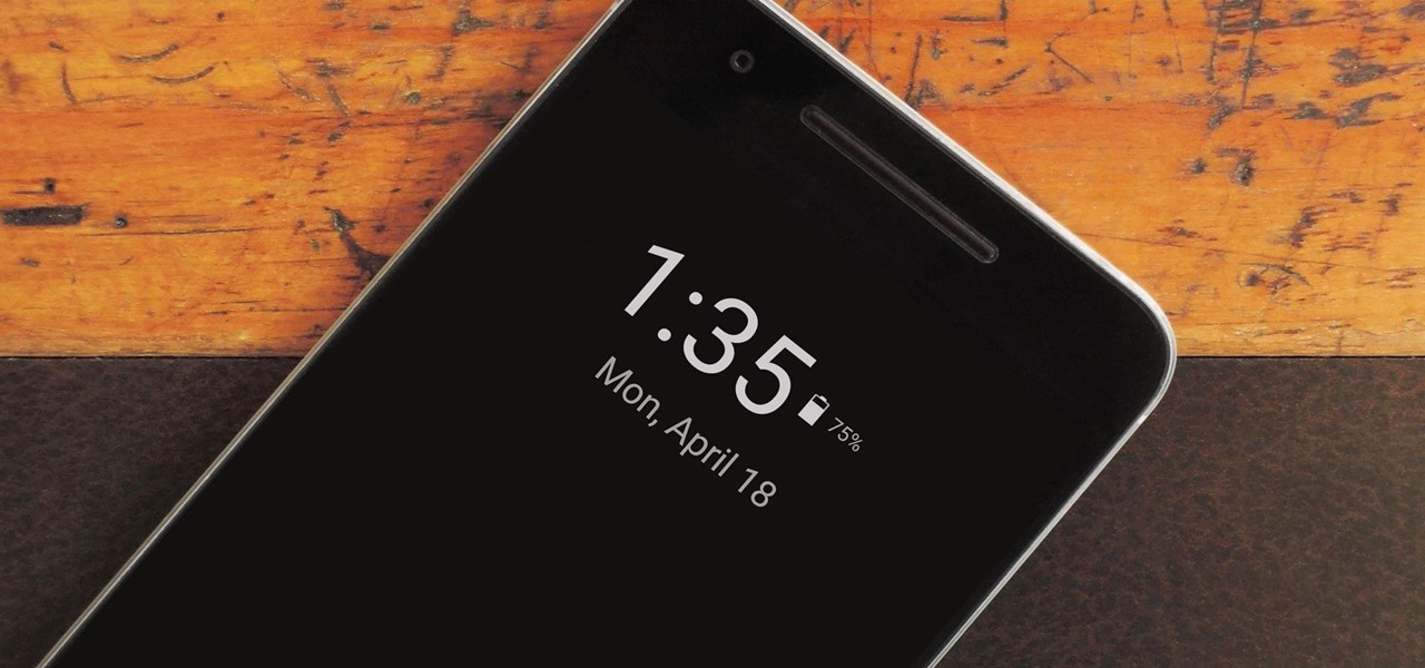
Unlike traditional backlit LCD technology, OLED screens don't use any power to display black pixels. Many manufacturers have taken advantage of this by implementing an always-on display, which only lights up a few pixels here and there to show relevant info when your phone is locked. But this leads to extra battery drain, albeit small, and it increases the risk of screen burn-in.

Most Android launchers limit you to three choices: Icons, widgets, and folders. It's better than nothing, but it's still pretty hard to find the best look without overcrowding your home screen. You could fill everything up with icons, but then you'd have an iPhone. You could toss everything into folders, but that would always require an extra tap. You could mix in some widgets, but that would take up valuable space. So what do you do? Action Launcher has the answer.

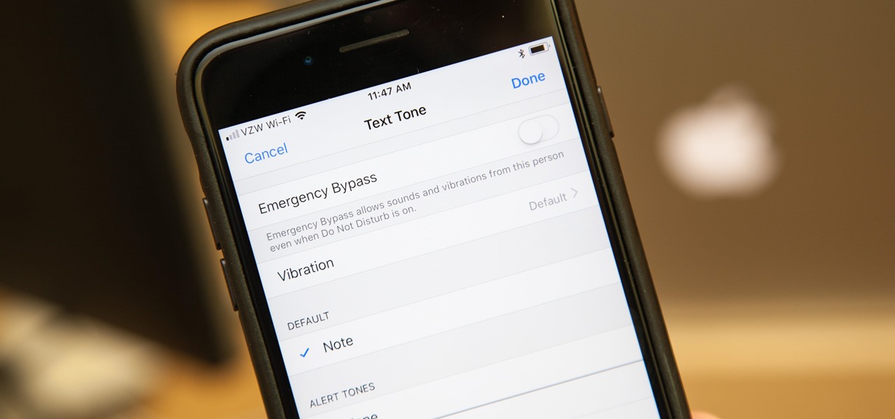
In the "Do Not Disturb" menu in your iPhone's settings, you can choose to allow phone calls from everyone, your favorites, or specific groups. However, this does not apply to text messages, only phone calls, so there's no way to get vibration or sound alert for messages from select contacts — but that doesn't mean there isn't a way.

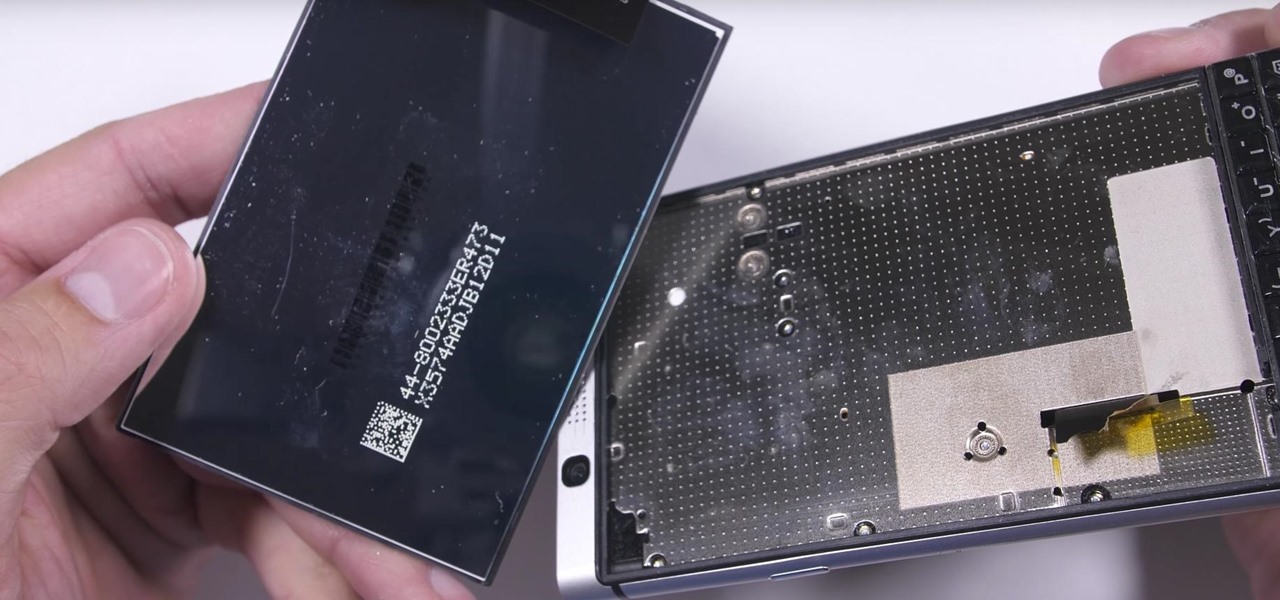
We were really rooting for you this time, BlackBerry! With the phone company having minimal success in the past with smartphones, the BlackBerry KEYone was extremely promising. That is until YouTube Reviewer JerryRigEverything discovered a fatal flaw, the phone's screen popped off with just a bit of pressure and then stopped working. So...there's that.

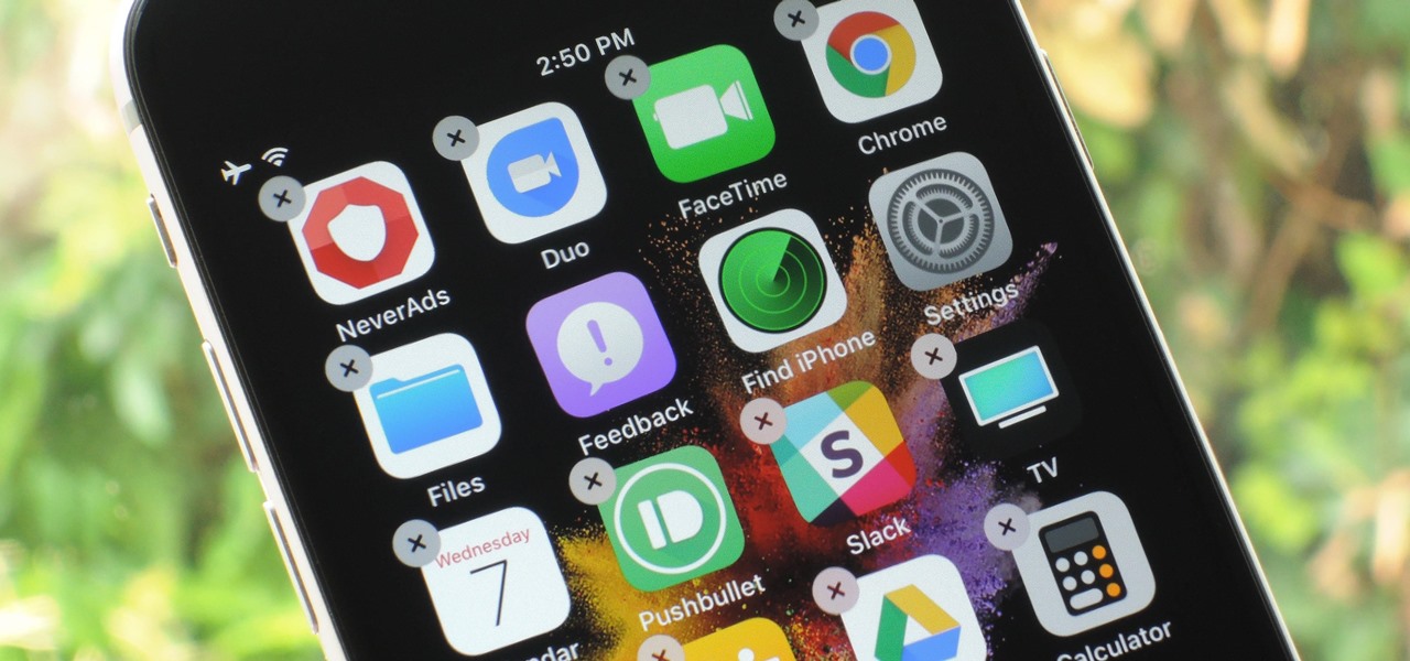
If you've ever tried to make massive changes to your home screen, you know how tedious it can be. Dragging apps one-by-one, in-and-out of folders, all over your iPhone can drive anyone up the wall. It doesn't have to be like this anymore — iOS has a simple way to move as many home screen apps as you need to all at once, saving you both your time and your patience.

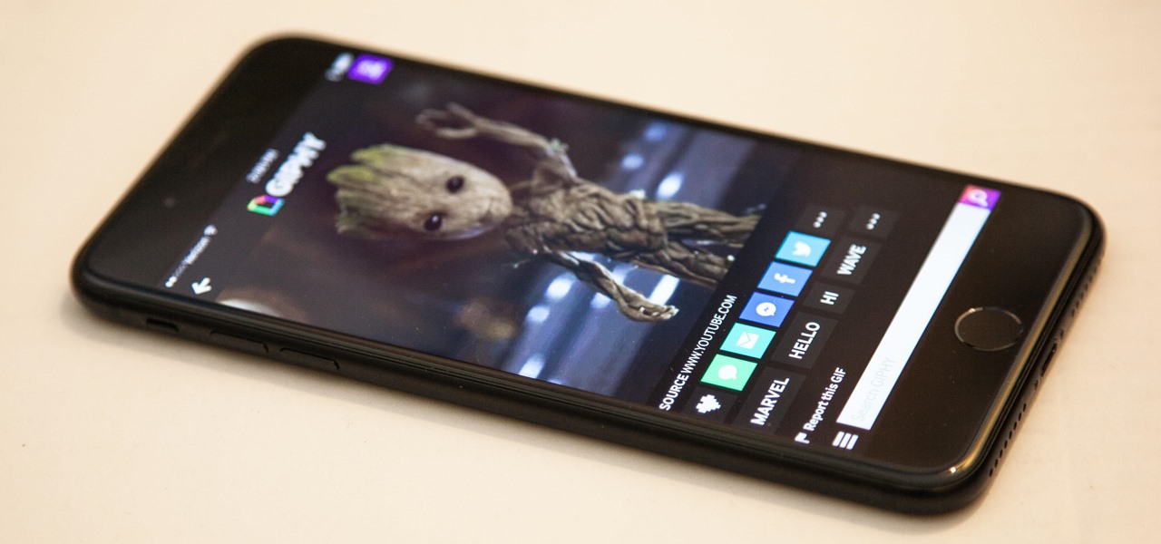
If you've ever wanted to turn your favorite GIF into a live wallpaper for your iPhone or even just make it a 3D Touch-friendly Live Photo that you can share, there's a super simple way to do so.

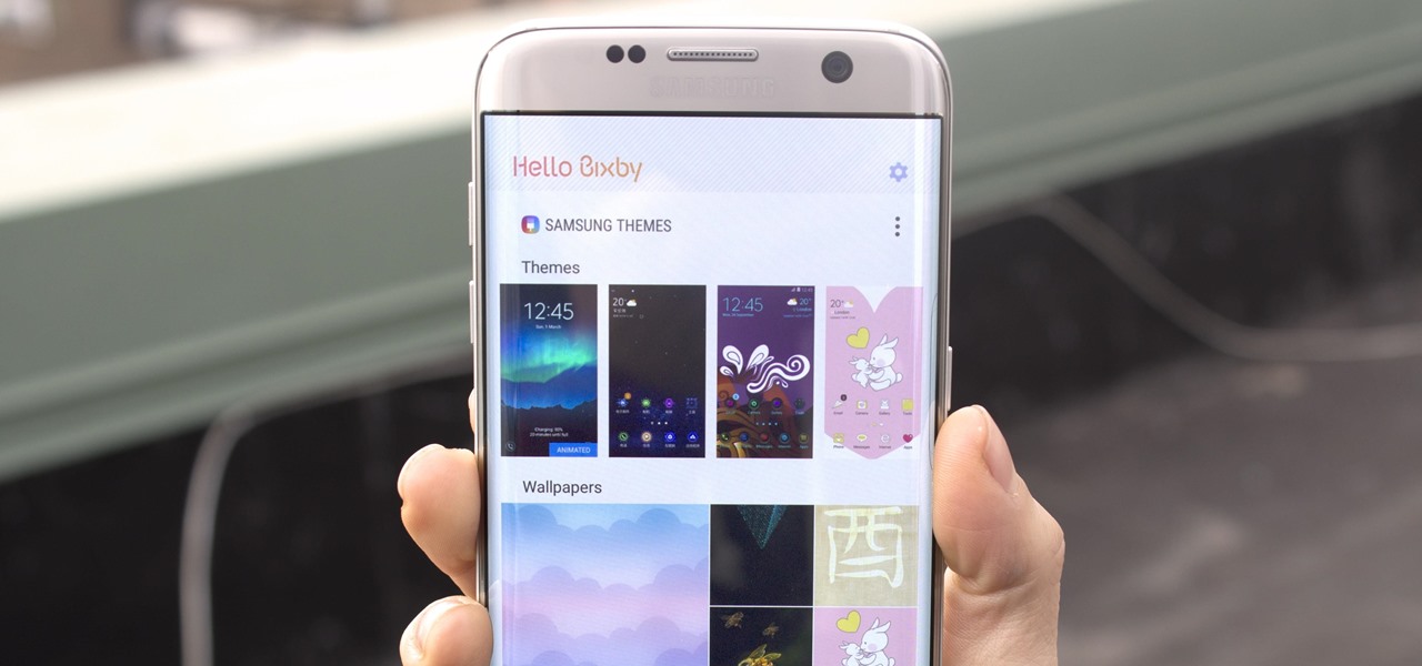
Samsung's new personal assistant, Bixby, is making its debut on the Galaxy S8 and S8+. In addition to taking voice commands and performing visual searches, a new Hello Bixby feature predicts what you might want to do next with an integrated home screen feed. All of these features look nice, but if you're not ready to shell out at least $750 for a new phone, you'll be glad to know that Hello Bixby just leaked.

If you're a parent of a toddler (or have a friend that acts like a toddler), you occasionally need to take a break just to preserve your mental health. The perfect way to buy yourself some "me time" in this scenario would be to pull up an episode of Dora the Explorer on Netflix or YouTube, then hand your phone or tablet over to your child (or child-like friend) and try your best to relax while they're occupied.

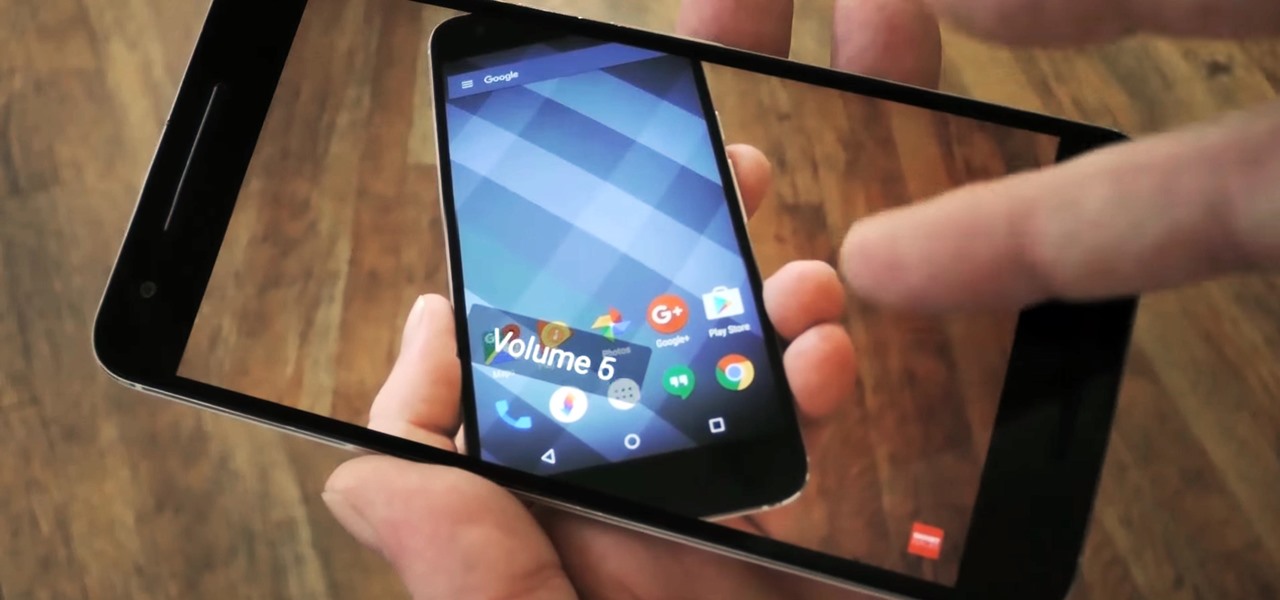
If you have stuck volume buttons, it can be a real pain to adjust sound levels since your only other option is to use the volume menu in Settings. But even if your volume rocker is working fine, it's still a little weird to have to click a mechanical button to control one of the most central aspects of an operating system that is otherwise entirely touch-based.

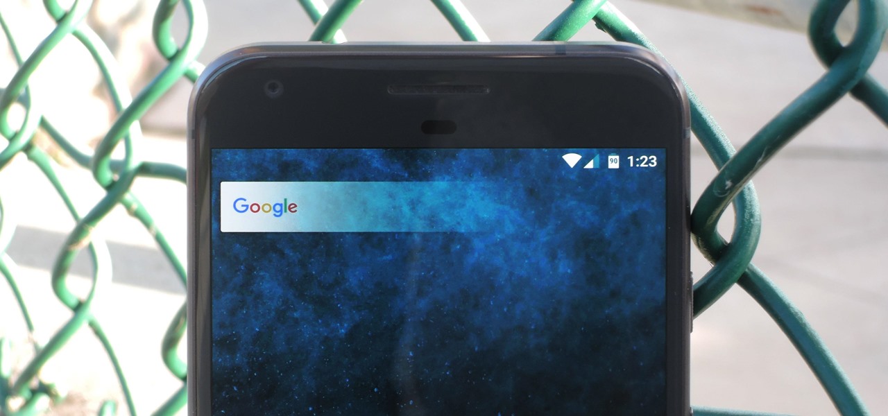
Almost every Android device comes with a Google search bar embedded directly into its stock home screen app. But Google search is available in so many different places on Android that having this bar in your launcher is almost overkill. On top of that, Google recently changed the logo overlay to a more colorful one that may clash with your home screen theme, so there's plenty of reasons to dislike this feature.

The widget system on iOS leaves a lot to be desired when compared to Android's offering, but that's not really Apple's fault. The system is there, we just need some good widgets to really get the most out of it, so it's up to developers to create some awesome apps that work with the home screen and lock screen widget panels on iPhone, iPad, and iPod touch.

Sometimes it's the smallest feature in your smartphone that makes the biggest difference in user experience. Take screen timeout, for instance. You can probably think of plenty of times when your handset's display blacked out while you were in the middle of something. You could have been cooking with a recipe on the screen or looking at chords while you learned a new riff on your guitar.

If your mechanical home button or capacitive navigation keys are on the fritz, doing something as simple as navigating your phone's interface becomes a tedious chore. In this situation, some users have turned to root mods that enable Android's software navigation bar to solve the problem, but not everyone is willing or able to root their device.

Paranoid Android has always been one of the most popular custom ROMs because of the inventive features its developers add to Android. Two of the biggest draws in particular have to be the "Halo" notification bubble, and the "Pie" navigation buttons, which can both fundamentally change the way you interact with your device.

Starting with iOS 7, the iPhone has had a cool feature that lets you see upcoming calendar events right on your lock screen, and it only got better with iOS 10. Android used to have this feature with its lock screen widget system, but that was removed back in the Lollipop days, so there's nothing quite like iOS 10's "Today View" feature anymore.

Blue light (like that from our smartphone) tricks the human brain into thinking it's still daytime, even if it's coming from something as small as a screen. So while you're playing around with your new Pixel or Pixel XL after dark, subconscious signals to be awake are preventing you from getting to sleep as early as you should.

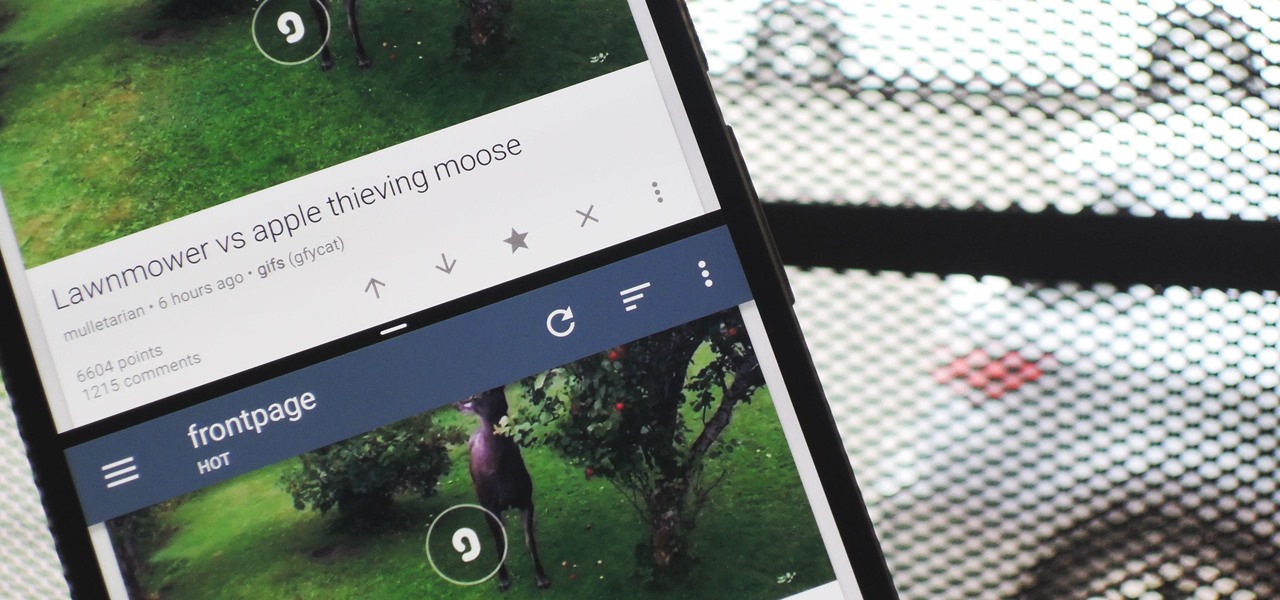
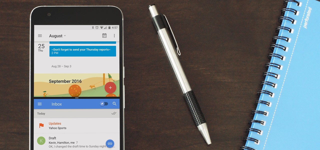
Some manufacturers, like Samsung and LG, have had split-screen multitasking on their custom versions of Android for years. But starting with Android Nougat, Google added this functionality to AOSP, which means that all phones and tablets running Android 7.0 or higher will now have a new multi-window mode.

When Google issues an Android update, the changes are usually all over the place—fixing issues, adding functionality, playing catch-up with the latest thing Apple added to iOS. It's how the smartphone wars have evolved, where the two competing operating systems continually match and one-up each other.

With every flagship device they release, Samsung makes sure to add in at least a few little software goodies. Last year's Galaxy Note5 was no exception, because among other things, Samsung included a revamped version of their useful utility called Air Command that gave users quick access to tools and common functions with a small floating bubble.

The widget selection on Android is one of the main things that set it apart from other mobile operating systems. You can get quick, at-a-glance information for topics like weather, news, music, and much more, all without ever leaving your home screen.

We recently covered a set of ported apps from the new cloud-based smartphone, the Nextbit Robin. These ported APKs brought two of the Robin's slick new stock apps—Camera and Gallery—to any other device, but the launcher was conspicuously absent.

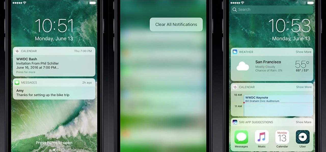
Your iPhone's lock screen is about to get a major upgrade in iOS 10, as shown off by Apple at WWDC '16, and it will make dealing with notifications and apps a breeze. The new lock screen has been fully redesigned to give users better and faster interaction with the apps they need. It's also snappier and more aesthetically pleasing with notifications no longer darkening the wallpaper.

When Android Nougat is released sometime this fall (or sooner), a new feature called "Quick Reply" will allow users to respond to incoming text messages directly from the notification. It will definitely be nice to carry on a conversation without leaving the screen you're currently viewing, but unfortunately, most of us won't get that Android Nougat update for quite some time.

The VLC Player app for Android has a really nice feature that allows you to adjust brightness and volume by sliding your finger up or down on the left or right side of your screen, respectively. It helps keep you immersed in the video while you're in full screen mode, since you don't have to mess around with any popups or overlays to perform these basic functions.

Aside from changing your wallpaper, there's not much you can do to customize the home screen on your iPhone besides nesting folders, hiding folder names, and hiding apps—and those aren't even actual features. They're simply glitches that Apple never took care of, and now there's another, even cooler one to add to that list.

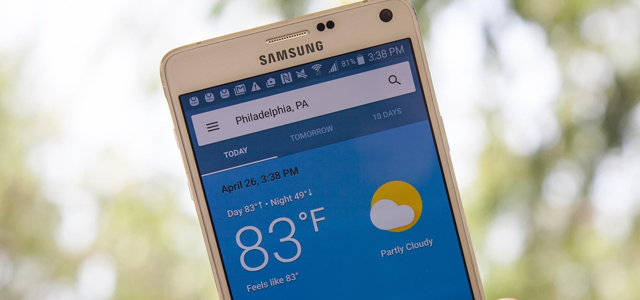
You can now access Google's slick Weather app without having to first open the Google or News & Weather apps. However, you will have to use Google to access the weather the old-fashioned way one more time, but you'll have the option to place a shortcut on your home screen to access the weather directly going forth.

Samsung's latest flagship devices—the Galaxy S7 and S7 edge—both sport an interesting new feature called Always On Display, or simply AOD. When enabled, this feature keeps the clock, date, and other bits of information visible at all times—even when the screen is off.

The only knock on Samsung's last round of flagship devices is that TouchWiz is still alive and kicking. Aside from this overbearing skin that's been applied on top of Android, the Galaxy S6, S6 edge, Note 5, and this year's Galaxy S7 models are some of the best phones money can buy.

Smartphone displays are getting bigger every year, and Samsung devices are at the forefront of that trend. But, from a software standpoint, the icons, buttons, and other on-screen elements seem to stay at the same scale. So while phones are getting bigger, their interfaces are getting bigger as well.

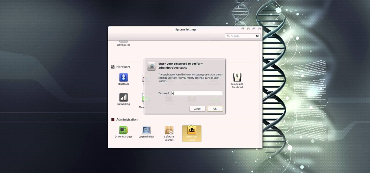
In this video tutorial, I'll show you how to remove the password from the log in screen on Linux Mint 17.2

Say what you want about Samsung's TouchWiz UI being cluttered or overbearing, but one thing you can never complain about is a lack of features. In fact, it's been almost 8 months since I first took my Galaxy S6 Edge out of its box, but I'm still discovering features to this day.

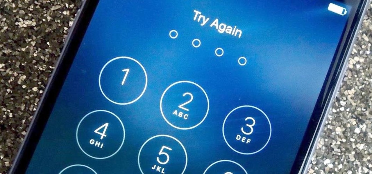
With over 10,000 possible combinations, a four-digit passcode may seem secure, but it's fairly easy for someone to crack your code—no matter how clever you think it is. Luckily, there are many other options for securing your iPhone's lock screen—especially if your running iOS 9.

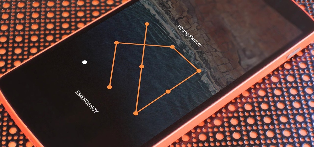
If you somehow forgot the pattern, PIN, or password that locks your Android device, you might think you're out of luck and are destined to be locked out forever. These security methods are hard to crack by design, but in many cases, it's not entirely impossible to break into a locked device.

One of the most exciting things about a major iOS update is the discovery of new glitches, or even just finding ways to replicated the old ones that we've come to love so much. One of these is the glitch that lets you nest folders within folders on the home screen, which can save some major screen real estate. While this glitch was available in both iOS 7 and iOS 8, the process is slightly different in iOS 9, but you still have a couple options to choose from.

At night, no matter how dim my Android's screen gets, it never seems to be enough—especially when I'm in bed. In fact, in pure darkness, the lowest brightness setting on my Android devices end up giving me a headache that keeps me up for hours.

It seems like whenever someone sees my phone, they ask me two questions right off the bat; "What phone is that?" and "How did you get your Android to look like that?"

Do you have a major mosquito problem? Well, here's a solution used by the military to drastically cut down their numbers.

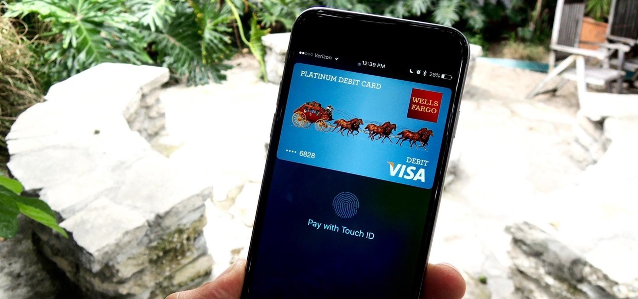
To use Apple Pay in iOS 8, you had hold your iPhone to the card reader first, and then you could either switch to a different card or pay with your default one. Now, in iOS 9, you can access your Wallet (which replaces Passbook) on the lock screen before you get to the reader.

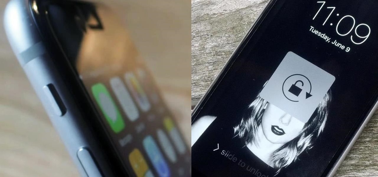
The Ring/Silent switch on the side of the iPhone has always had one purpose—to toggle ring mode/silent mode. But in iOS 9, Apple gave us another choice, and that's locking the orientation of the screen.


