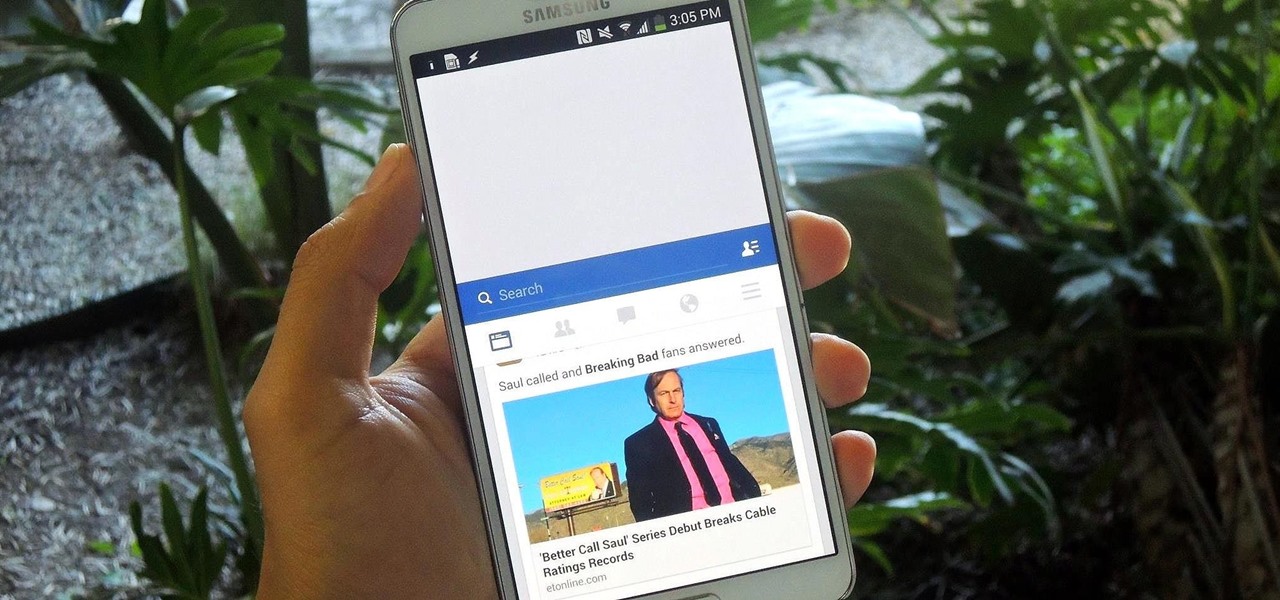
When Apple released their plus-sized iPhone 6 and 6 Plus models, it only made sense that they would include a one-handed feature to accommodate the larger displays. That particular feature is called Reachability, and with just a quick double-tap of the Home button, the screen shifts to the bottom half of the device for easier use with one hand.

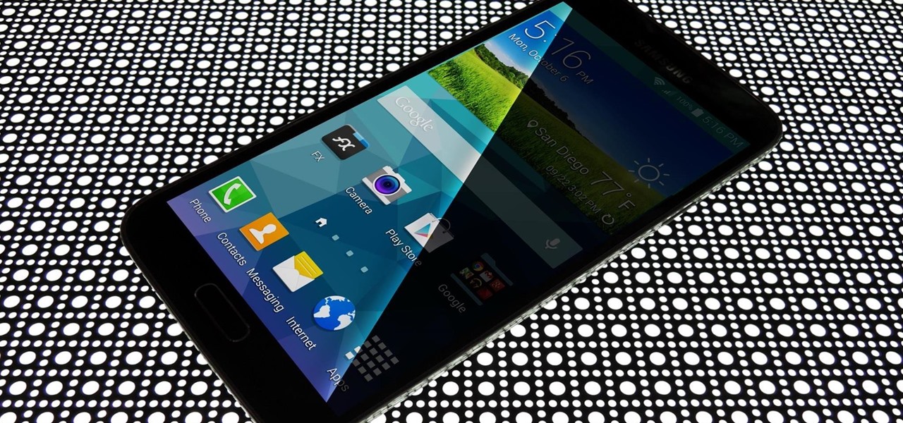
If you pay close attention, you might notice that the screen on your Android begins to flicker or pulsate when you lower the brightness past a certain point. This is a result of the AMOLED technology Samsung, among other manufacturers, use in their displays, and the way that these types of screens operate.

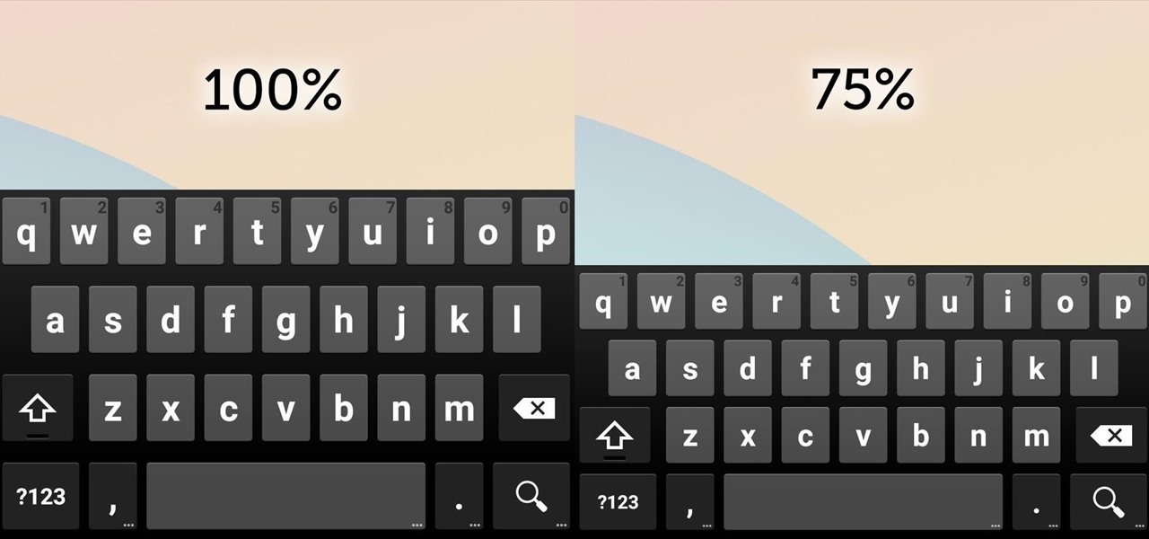
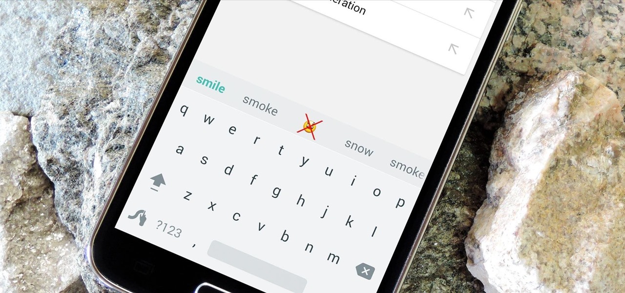
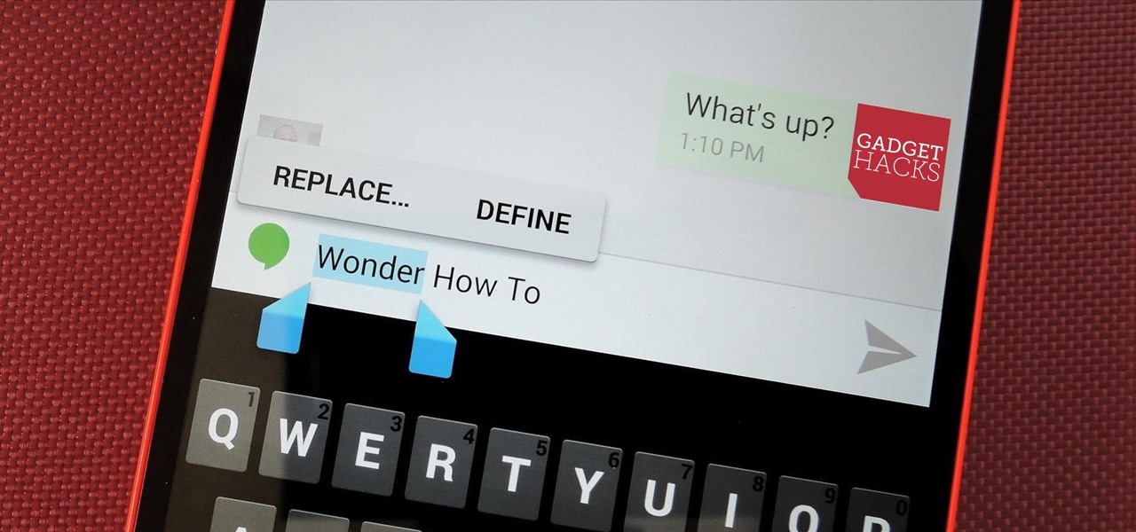
Google Keyboard, which comes pre-installed on Nexus devices (and is available for all others from the Play Store), is one of the most functional keyboards currently available for Android. With features like gesture-based typing, next-word prediction, and even text expansion macros, it's a very capable form of text input.
Yes, I know. Nexus owners aren't exactly the biggest Apple fans out there. That "Pure Android" experience was one of the main reasons we bought our Nexus devices. But give the other side some credit—the iPhone's operating system has come along way, and is still the champ when it comes to aesthetic design (at least until Material Design dethrones it this fall).

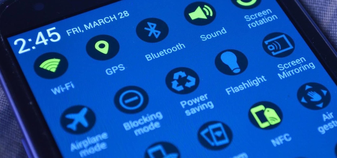
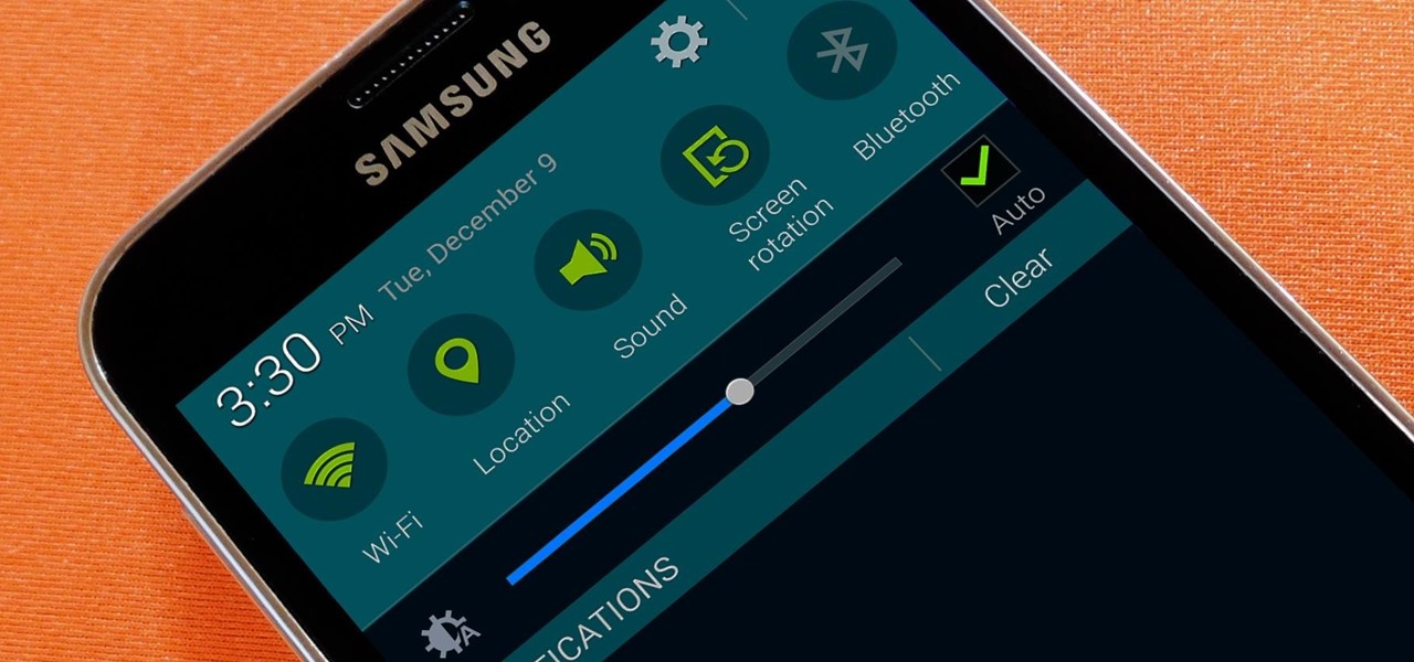
Samsung's TouchWiz skin gets a lot of flak for its appearance, namely the garish colors on the quick settings toggles. The bright green on dark blue scheme is definitely an eyesore compared to the ones in stock Android, and even other manufacturer skins like HTC's Sense.
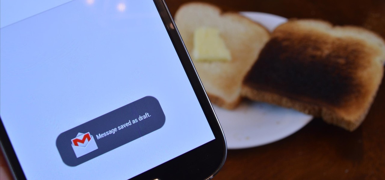
Toast notifications are a type of pop-up alert built into Android, letting us know when an app has performed a certain action. Whether it's Gmail saving a draft or Firefox opening a new tab, toasts are meant to be informational while not being totally intrusive.

Google's YouTube Red is an awesome service, particularly in the United States where it comes bundled with a subscription to Google Play Music. You don't have to worry about ever seeing ads again on any videos, you can continue playback after you exit the YouTube app or even when you turn your screen off, you can download videos for offline playback, and you'll have access to YouTube Music.

As it stands, Android's notification system is one of its biggest strengths—but that doesn't mean it couldn't use a few tweaks here and there. For one thing, when you receive multiple notifications from the same app, there is no indication as to exactly how many notifications you've received.

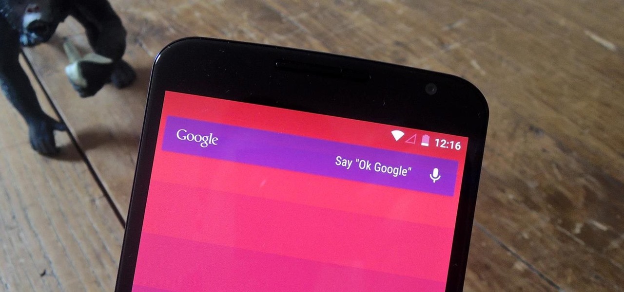
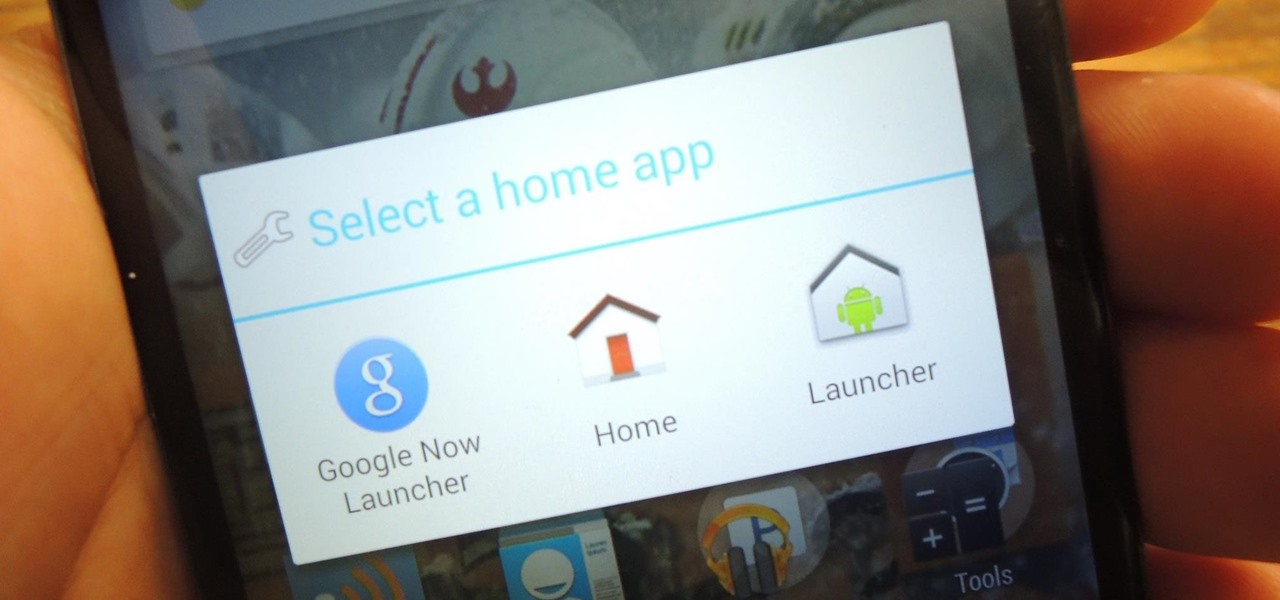
With the release of the Nexus 5 back in 2013 came the Google Now Launcher, which has become the go-to choice for many Android users, especially those who prefer the Nexus line. With its integration of the Google Now page and the always-listening hotword detection, you'd be hard-pressed to find a more complete and useful launcher.

If you're like me, you probably encounter the lock screen on your Android device more than any other screen. Every time you check for new notifications out of habit, or simply pull your phone out to see the time, the lock screen is front and center.

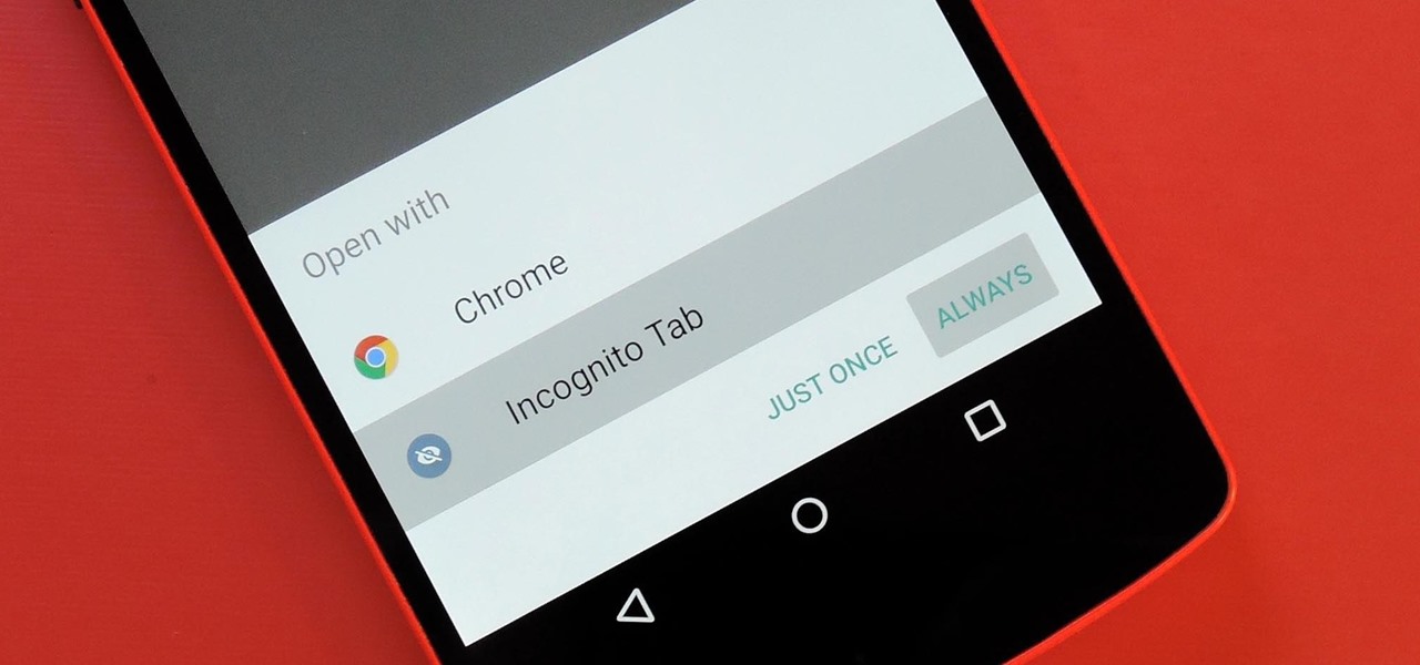
Chrome's Incognito Mode is a great feature for folks that don't want their browsing history tracked. When it's enabled, Incognito Mode makes sure that all cookies and cache that are saved while you're browsing are deleted as soon as you leave a webpage.

Since version 4.4 (KitKat), Android has taken the album artwork for any song that's currently playing, as well as videos, podcasts, and other media, then used it as the background image for your lock screen. While many users have enjoyed this little tweak, others aren't quite as fond of it.

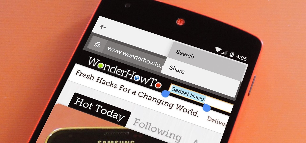
For some odd reason, the Chrome Browser on Android doesn't allow you to search selected text when you're in Incognito Mode. This must have been an oversight on Google's part, because the feature is definitely present with the browser in its normal viewing mode, allowing you to highlight text and quickly perform a Google search.

As the granddaddy of all gesture-based keyboards, Swype has seen quite a few updates in its day. A recent version bump, however, added a feature that has been universally panned by Swype users.

With Android 5.0, Google introduced a new "Heads Up" notification system for incoming calls and messages. While the new incoming call interface seems to be a rousing success, the rest of the Heads Up system has been met with much less enthusiasm from users.

There's no such thing as a perfect Android keyboard. Some, like Swype, have gesture typing down to a science, but lack in predictive technology. SwiftKey, on the other hand, boasts awesome next-word prediction, but less than stellar gesture typing. Many others are optimized for multiple languages, space saving, or emojis, but none are without their flaws.

When you search for a specific location or business with the Google app, a Knowledge Graph card is usually the top result. This card displays a handy mini-map and offers a quick link for directions to the location of your query, but it has one irksome flaw—these links can only be opened by the Google Maps app.

Android's beauty is in its customization; you can have widgets for anything, launchers that look and feel completely different from one another, and fonts you can change at any time. And it doesn't stop at aesthetics—you can go much deeper than looks.

One of the Note 3's best features is Multi Window mode, which allows users to display more than one app on the screen at the same time, taking advantage of the large and high-resolution display.

Picture this scenario—you're using your phone in a dimly-lit room, then you move to an area with a lot more ambient light, and Auto Brightness kicks in within a few seconds to ramp up the backlight. That's the way it should be, right? But then you move back to the darker area, and your phone takes 30 seconds before it decides to dim back out. Pretty annoying, isn't it?

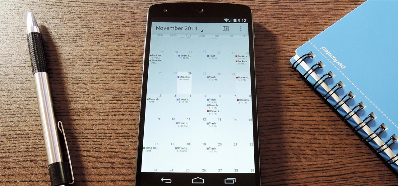
The Google Calendar app hasn't really changed much over the years. As a pre-installed staple on most Android devices, the interface is definitely lacking in some areas. Google knows this, and has plans in the pipeline to completely revamp Calendar's UI alongside Android 5.0's official release.

Whether if it's to play games or watch Netflix or YouTube, children love using our smartphones and tablets. As an uncle of many, I don't mind my nieces and nephews using my gear, but I do mind them opening apps they have no business being in, like my photo gallery or messaging app.

With recent security breaches in the news, there is no better time than the present to make sure you know exactly what's happening on your device.

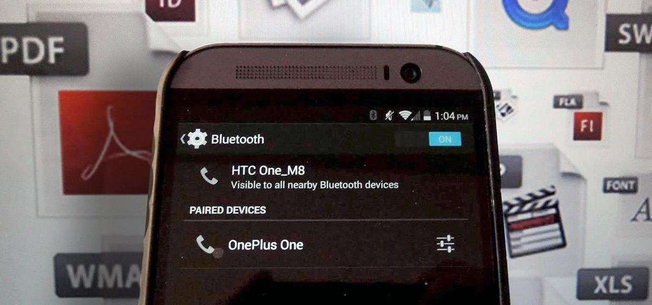
Bluetooth has been a staple on every Android smartphone ever since they began taking over our lives. Despite the fact that every device seems to have the ability to share files with one another, there is a limit to the types of files that can be shared between them.

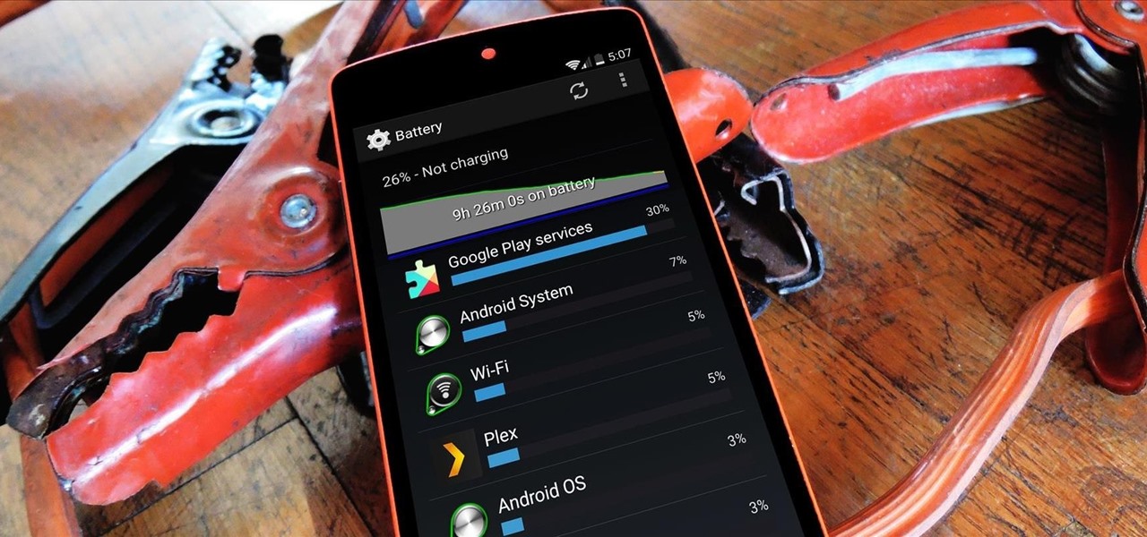
An app can request a wakelock to prevent your Android device from entering sleep mode so that it can sync data in the background. This obviously drains your battery, because instead of running in low-power sleep mode, your processor is fully activated while it performs its tasks.

In the past few weeks, the internet has been abuzz with nightmarish horror stories of Comcast's questionable decision-making and downright terrible customer service. The central theme of many of these disputes with the nation's largest cable provider is that without evidence, the conglomerate will refuse to acknowledge its mistake and place the burden of proof on the customer.

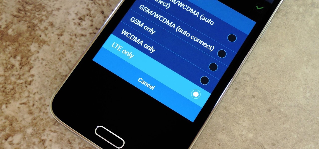
Even with the highest-tiered data plan available, there are times that your phone or your carrier might downgrade your connection to 3G or even lower. This usually occurs when you've made a phone call, or you've switched cell towers while traveling.

If you're like me, then you've got an incredibly complicated Wi-Fi password with uppercase and lowercase letters, numbers, and special characters.

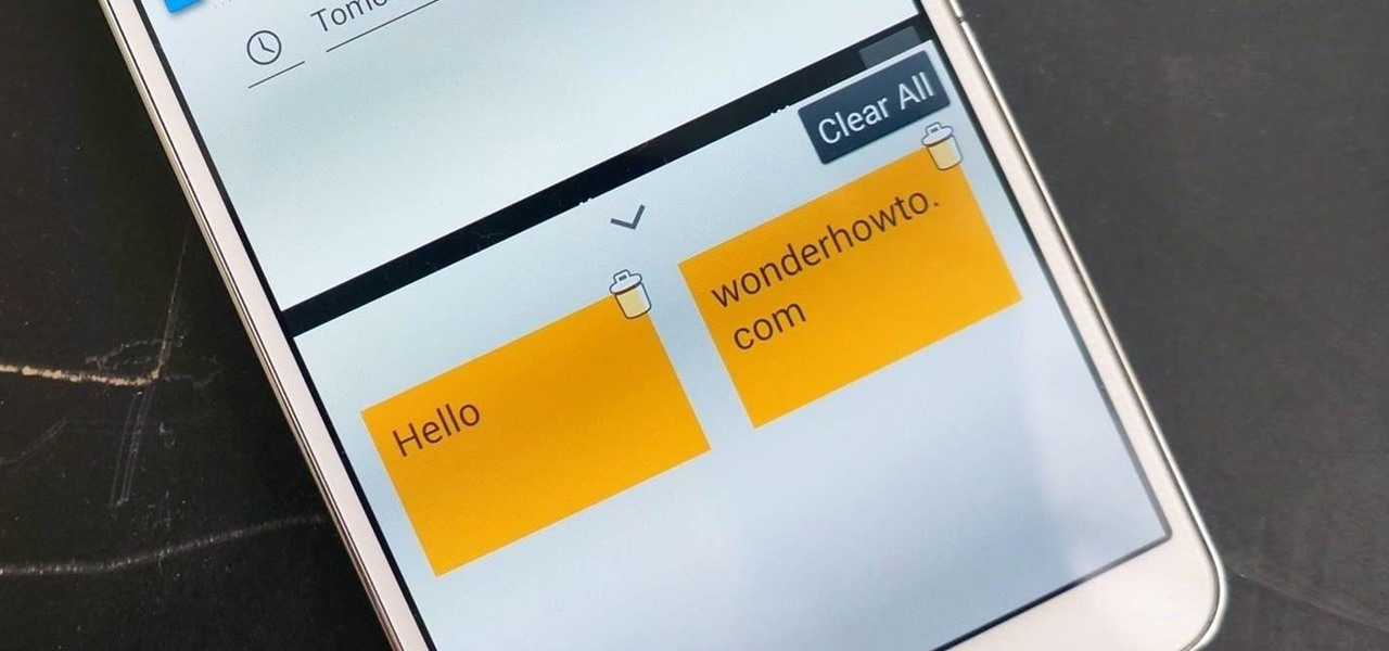
Think of all the times you've ever copied and pasted a string of text on your device. At least once, I bet you've wanted to see your copy history.

Auto-correction is a double-edged sword if I ever saw one. It's great because I'd have an abundance of typos without it, yet it's extremely frustrating (and embarrassing) when it doesn't actually work. Just take a look at the very recent example below from Breaking Bad star Aaron Paul. Funny for us, embarrassing for him. I have a particularly difficult time typing on small keyboards (i.e. fat-finger syndrome), so disabling auto-correction on my Samsung Galaxy S4 is a no-go. I'm willing to ris...

Even as a writer by trade, I'm not intimately familiar with every word in the English language. When you're typing something out on your Nexus, sometimes you think to yourself, "Is that right? Am I using the correct word here?" Then, you have no choice but to bring up Google Now and do a search for that word to make sure you're using it correctly.

When Google first introduced Android 4.4, the most glaring user-facing change was a new trend towards transparency. The stock launcher, originally exclusive to the Nexus 5, had transparent status and navigation bars and its app drawer added a touch of transparency.

You've seen it a million times. You try to do something on your Android device and a box pops up asking you which app you'd like to use. You could try Photos, Gallery, Drive, Picasa Web Albums...the list is fairly extensive sometimes. And what's worse, after that you have to select "Always" or "Just once". Add it all up, and that's three taps to do something you thought would take just one!

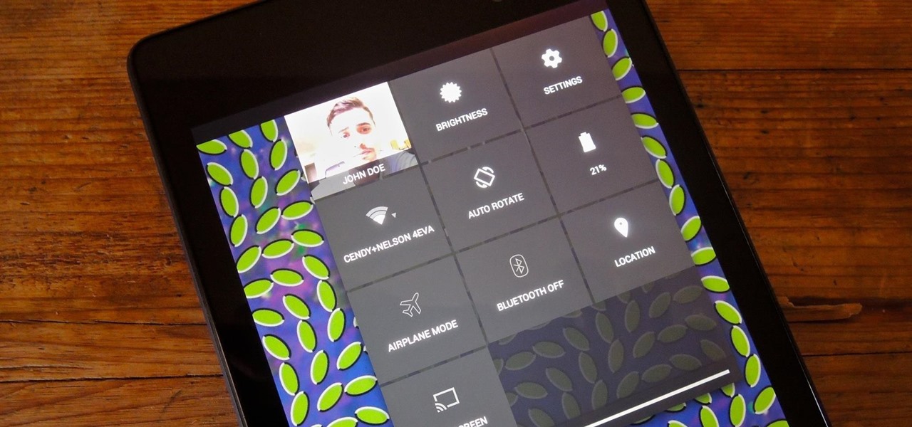
Accessing notifications and quick settings from the lock screen just makes things move quicker and more efficiently, unless of course we're using a secure lock screen. It makes sense that if we have face, pattern, or pin security enabled, we may not want notifications accessible, but really, that should be something we decide for ourselves—and now we can.

Normal wear and tear, combined with unfortunate accidents, can take a toll on any smartphone leading to scratches, cracks, and breaks that can leave physical buttons useless. One of the first buttons to usually go is the power button, since it's the main way to turn your phone (and screen) off and on.

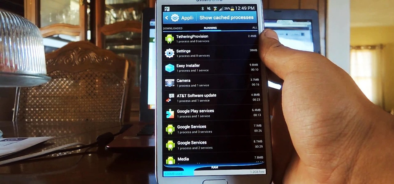
A certain selection of applications on your Android device (both system and downloaded) start running as soon as your Samsung Galaxy Note 2 turns on, laboriously hammering away at whatever tasks they have to do.

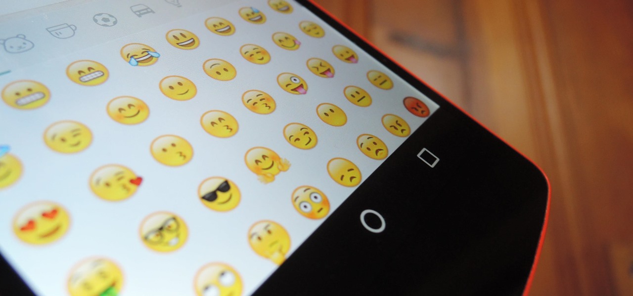
WhatsApp recently updated their emojis (or emoji, depending on your preference), but it wasn't exactly a welcome change. Many users have complained that the new smilies are just way too big, others aren't too fond of the shinier appearance, and countless folks have been venting their frustrations on Twitter.

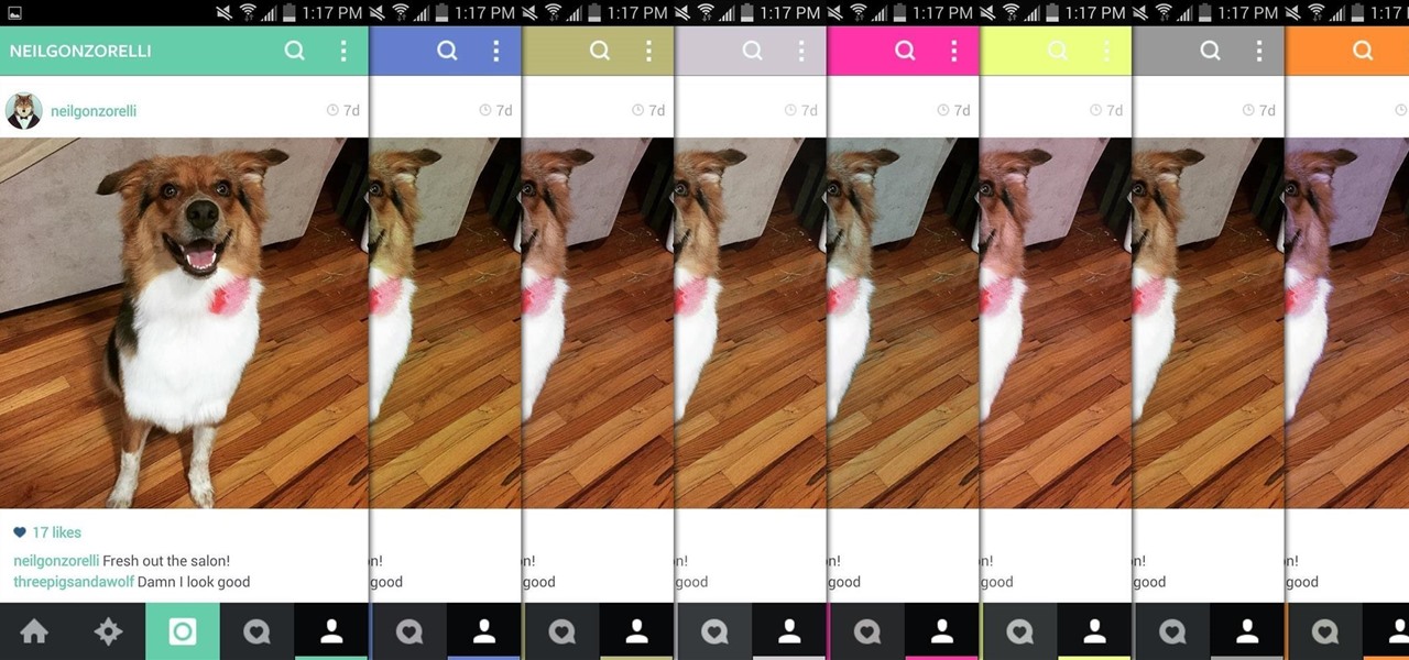
There aren't many complaints I can think of when it comes to the Instagram interface, and finding one would just be nitpicking. But like with most things in life, if given the opportunity, why not take advantage? "When in Rome," as they say.

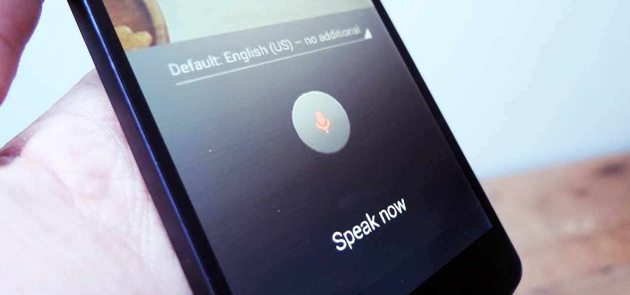
As smartphones become increasingly integral parts of our lives, so does data throttling. Personally, I try to save data any way that I can, so to stave off unnecessary usage, I use the GoogleOfflineVoice to limit the amount of data consumed by voice typing.

Whenever a picture is sent via MMS, a certain amount of compression needs to be done in order for a carrier's network to send it. That compression is meant to ease strain on the network, but in the end it leads to heavy downsizing and increased graininess in pictures.
