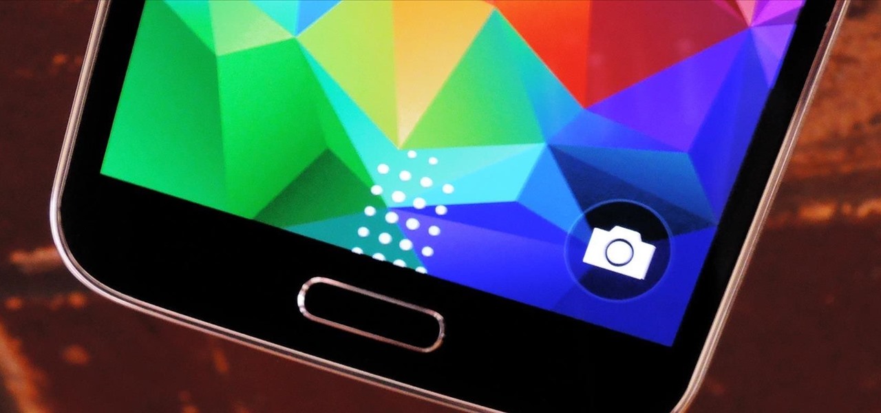
Pie controls are navigation soft keys that can be displayed by swiping up or from the side of your screen, allowing you to navigate, search, call up the power menu, take screenshots, and a lot more. Not only are pie controls functional, they make using Immersive Mode a breeze since the regular nav bar was no longer required.

Oddly enough, stock Android does not come with a "do not disturb" function out of the box. Samsung has their own version built into to TouchWiz called "Blocking Mode," and Apple has had their "Do Not Disturb" feature since iOS 6, so why is stock Android so late to the game?

While the legality of recording phone conversations varies from state to state, it's still a sought-after feature for most people. How else are we going to shame all of those bad Comcast customer service reps? Since it's a legal gray area, HTC and other smartphone manufacturers have omitted call recording capabilities from their devices.

Jotting down notes is something we all do, and with the convenience of Google Keep, it is easier than ever to have them synced across all your devices.

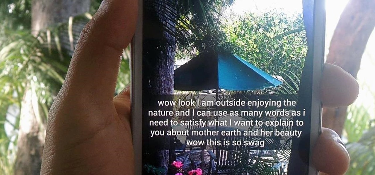
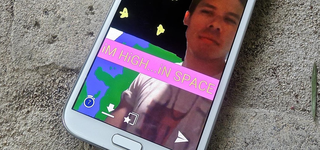
Twitter found a sweet spot with its 160-character limit, but Snapchat sports a social media low of 31 characters, forcing us to condense our ideas into a few short words when typing in picture captions because of their ephemeral nature. While this severely limited amount of words is Snapchat etiquette, I've got so much more to say than 31 characters!

In an attempt to keep things simple, Snapchat has a limited amount of editing features, made up of "smart" photo filters, drawing pens, and special text captions. If you want more editing capabilities, you'll be pleased to know there's a way, no thanks to Snapchat, but you will need to be rooted.

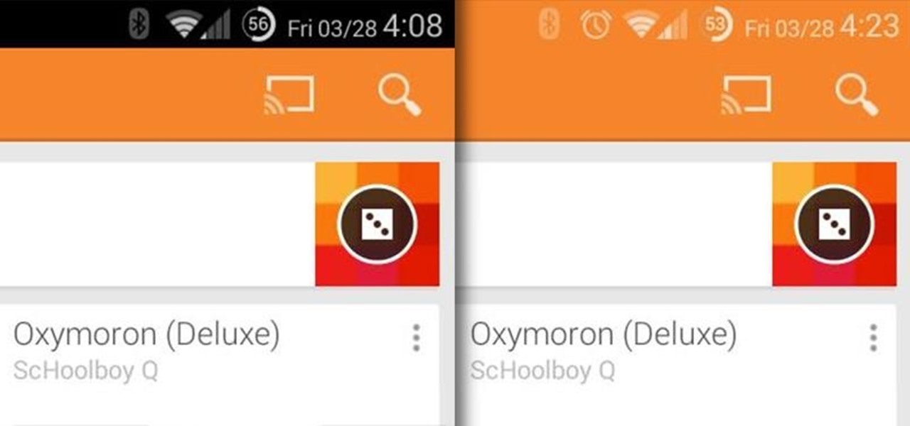
The little black status bar at the top of your screen is great for at-a-glance info, but let's face it—it's pretty ugly. If you want to hide it completely, only showing it when you need it, check out our guide on using Immersive Mode in KitKat. However, if you want to keep the at-a-glance convenience and have it blend in with your apps, try out Tinted Status Bar.

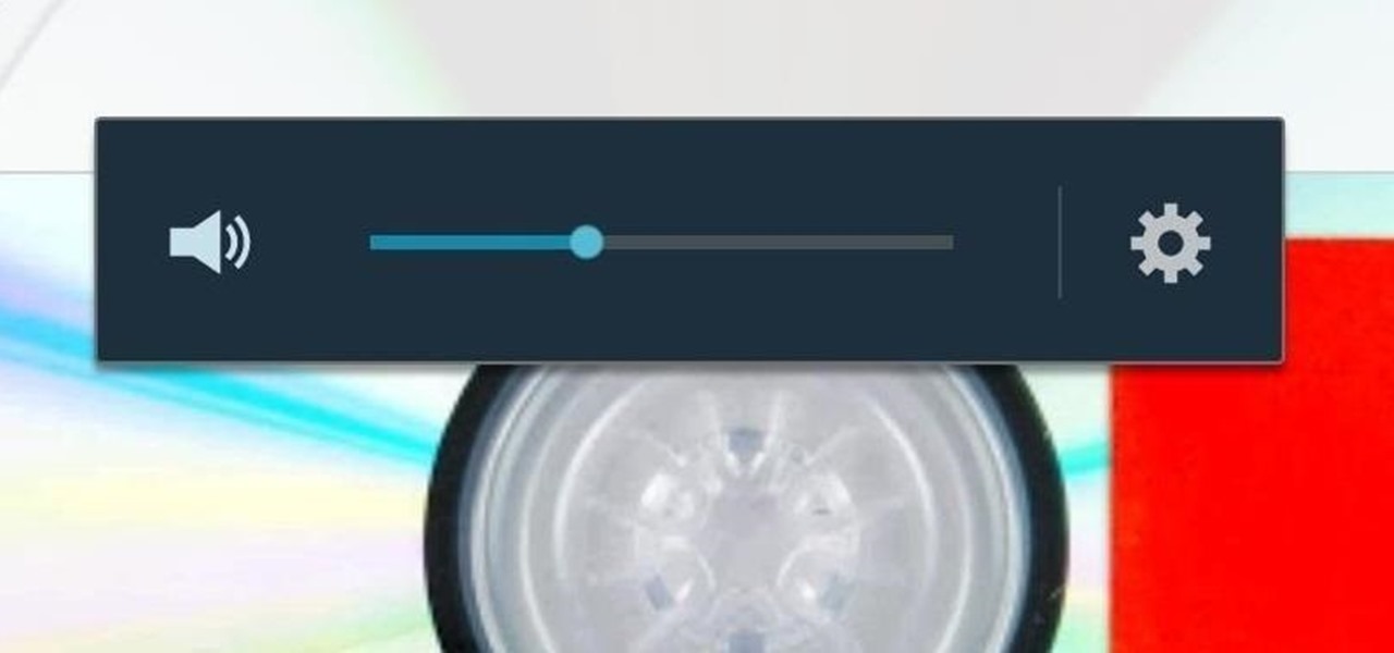
Getting the volume on our phones to be just right can be a pretty annoying task. Some people like to listen to music and videos with max volume while some like it a little lower. With the default volume control on your Samsung Galaxy S3, there are only 15 steps before you reach max volume, making it tough to find that sweet spot.

Android 4.4 KitKat has begun rolling out for the Galaxy Note 3 in India, Poland, Russia, Switzerland, and several other countries, and an unofficial build for AT&T customers has been leaked for all of us stateside.

Pinch-to-zoom has been a well-known feature in Google Maps, but one-finger zoom has always been a more practical way of navigating, especially for those of us using our phones with one hand.

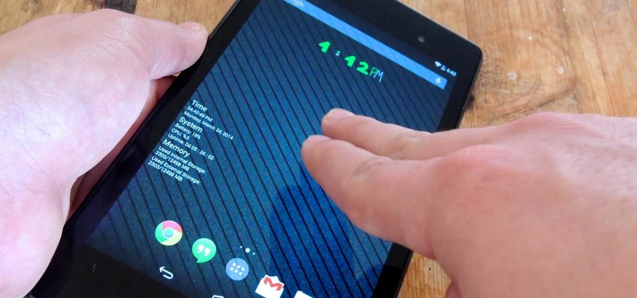
Facial, voice, and hand gestures are the way of the future for controlling our devices, and even gaming consoles like the Xbox One have incorporated them. Unfortunately, our Nexus 7 tablets have not. We're currently limited to using soft keys for most actions, but we can inch closer to the future by replacing one critical action with a simple touch gesture—going back.

While some Android applications have built-in gestures that allow you to perform certain actions, it's not a feature that's been comprehensively, let alone consistently implemented. If you're on Twitter or Facebook and you want to go back, the only global way is by tapping on the capacitive back button at the bottom of your device. Thanks to XDA dev PeterCxy, you can now enable a global swipe back gesture on your Android smartphone or tablet, making it easier than ever to backtrack within apps.

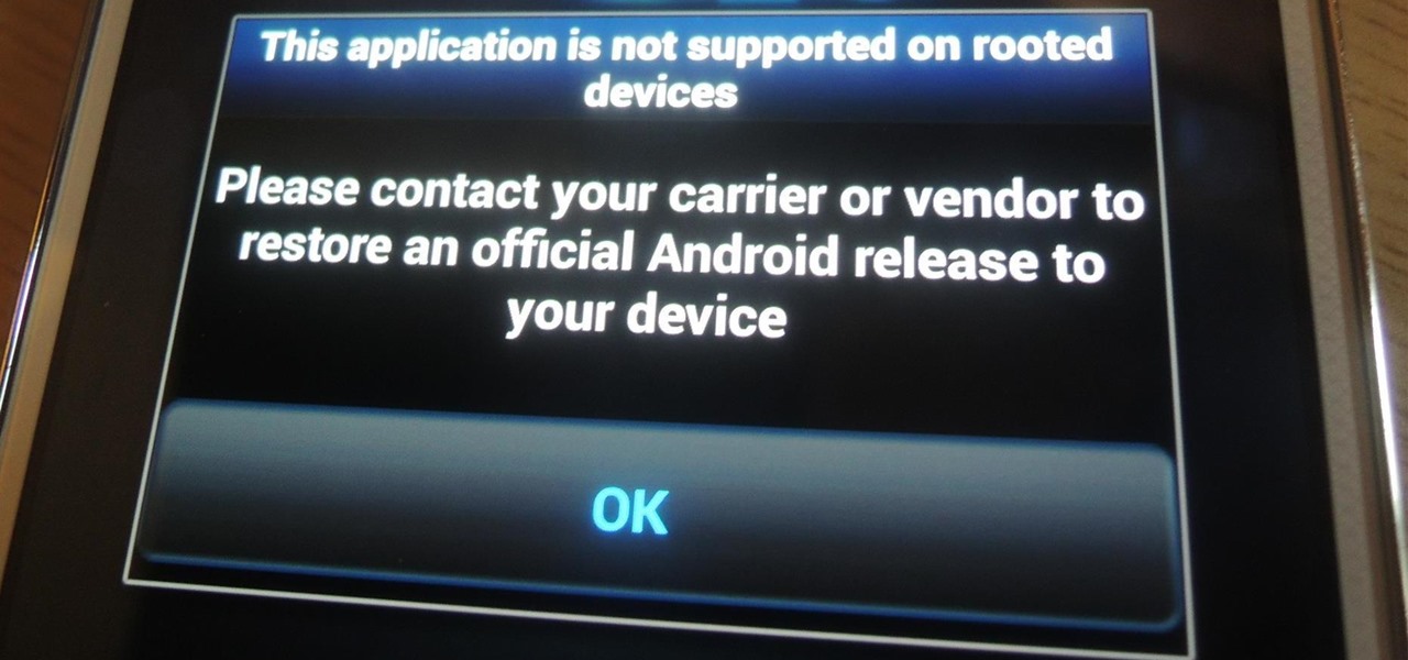
As a preventative measure against exploitation, certain Android applications won't work if your device is rooted. Opening one of these apps that detects root will typically end up with a warning and an inability to access its features, like in the picture below. AS IF!

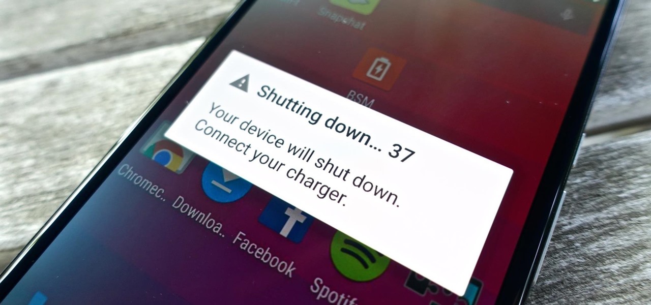
We've all been there. Rushing to find an outlet because your smartphone's battery is about to die and you're in the middle of uploading a picture on Instagram or something else of dire importance. Android's operating system shuts down automatically when ever there is 1% left in order to allow for a proper shut down, and so as not to mess with the calibration of the battery, extending its overall life.

The share menu is a vital part of Android that lets you send data between between apps. Many of your favorite apps support the feature, including the new Direct Share sub-menu, which can lead to a messy share menu. However, there are a number of tools to clean up this clutter, three of which don't require root.

Surely you've heard of the wildly-popular custom ROM CyanogenMod, right? As the longest-tenured third-party firmware for Android devices, CM has been able to maintain its popularity by supporting a wide array of devices and offering many customization options.

With all of the personal data that's stored on our smartphones, it's of vital importance that we have some sort of lock screen security enabled. One of the Galaxy S5's killer features is obviously the fingerprint scanner. It makes the process of dealing with a secure lock screen a bit easier than typing in a password or PIN.

When it comes to theming your Android device, it's the little touches that count the most. That's why developer SArnab created the Android Theme Engine, an Xposed Module to theme those hard-to-reach corners of the Android System that often go untouched with other themes.

As one of the most popular home screen apps on Android, the Google Now Launcher is used by millions of people across the world. The two main reasons behind this success are its integrated Google Now home page and an elegant, easy-to-use design.

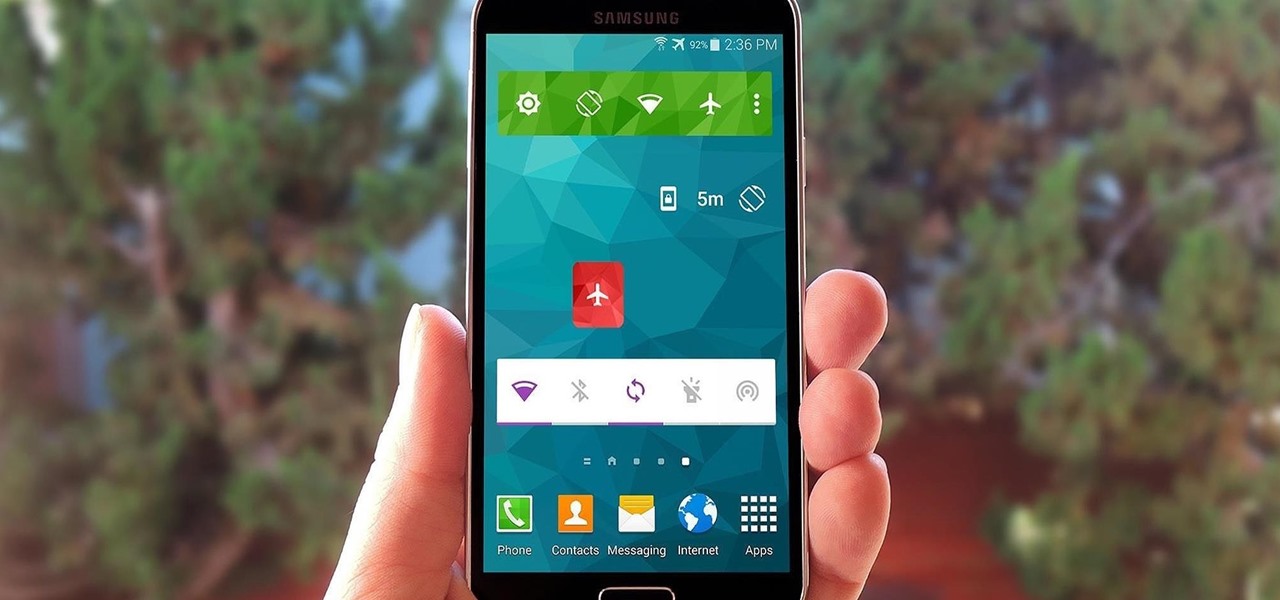
Widget toggles, or "power toggles" as they're often called, have been around for quite a while. They serve their purpose nicely as an easy way to add switches to your home screen or notification area for functions that don't come with the stock software on your device.

On most Android devices, the various volume levels are comprised of either 7 or 15 steps between minimum and maximum. For voice-call volume, alarms, and notifications alike, 7 presses of a volume button will bring you all the way from silent to full-blast. With media controls, you get 15 steps between mute and max.

The new preview build of Android is out, and it looks good. But if you're not quite ready to install Android L on your phone, there's still another way to enjoy some of these new visual elements on your Nexus device.

I am not a morning person. This is a fact that has been proven with science. I need every bit of help to get me out of bed in the morning—multiple alarms, extremely loud tones, Pandora—I've tried everything.

Multitasking has traditionally been one of Android's strengths. As the first mobile operating system to introduce true multi-process management, it even took things a step further after version 4.0 by dedicating a button to your recently-used apps.

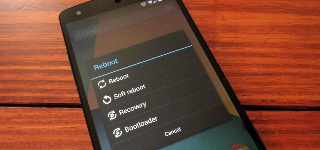
Just about every softMod requires some kind of reboot. Whether it's because something in the System UI was changed, or because a ZIP needs to be flashed in custom recovery.

You can do many things on your Nexus 7 to make life easier, like auto-categorize photos and perform on-the-fly calculations, but one thing that you should really have is more swipe gestures. By adding custom swipe gestures, you'll be able to navigate your device better, skip music tracks, and get instant access to designated apps, all with the flick of a few fingers.

Out of the box, your Android device can be customized in many different ways, and a ton more with root access, but adjusting the actual interface of the system is a little bit more challenging. Changing the status bar size, icon width/length, and positioning of toast notifications are things that require a little bit more know-how—until now.

I regularly listen to music on my Nexus 7 while working or playing my Xbox. It's light and easy to carry around, and has basically become an extension of my body. The only thing that bugs me is having to constantly turn the screen on to pause or change music tracks. Even if I can do it from my lock screen instead of the actual music player app—I don't want to.

One thing we can probably all agree on is that ads suck. In particular, ad-supported mobile apps are both a gift and a curse. Most are free, but supplement that non-existent price tag with non-stop banner or video ads. Sometimes, those ads can ruin the entire app, especially if it's a game that requires your undivided attention.

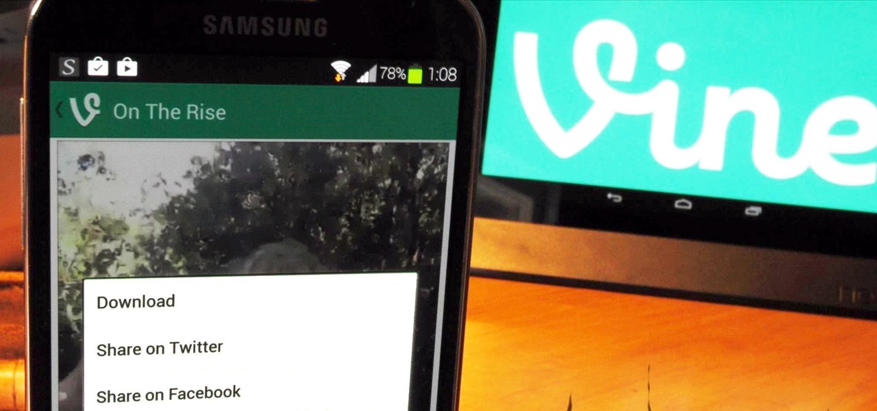
Twitter's video-sharing app, Vine, had some very stiff competition once Instagram added video sharing to its repertoire. Recent figures show Instagram at 130 million followers compared to Vine's 40 million. Many think that Vine is on its way out, but on the contrary, I think it's here to stay.

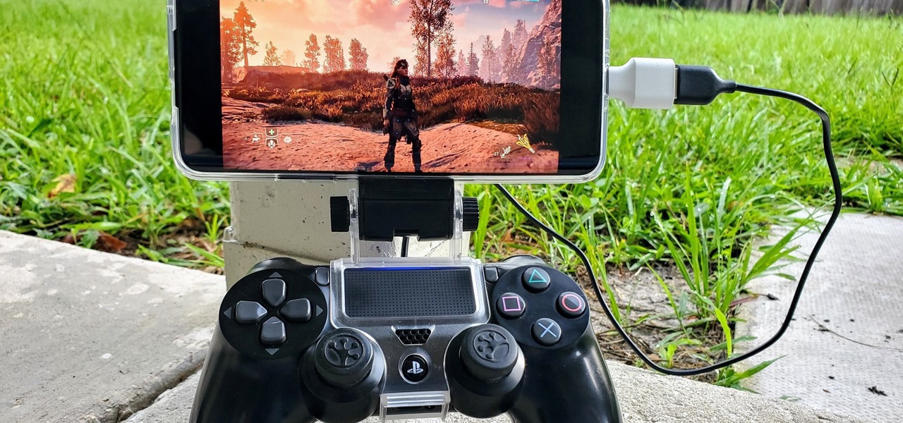
The PlayStation 4 has been around since 2013 and has brought with it countless game releases since then. One thing that hasn't changed, though, is the strict device restrictions on the PS4 Remote Play feature for streaming your games. The capability has always been there, but you still had to have an iPhone or Sony smartphone to get the best experience possible — until now.

The Galaxy S8 and S8+ are the first Samsung flagships to use virtual buttons, which means this is the first time we're seeing Samsung's design style applied to Android's software navigation bar. Even though the on-screen keys look fairly different from what other OEMs have put in place, they're not anything revolutionary. Still, different is usually good since it separates you from the herd, and like Android's slogan says, we should be together, not the same.

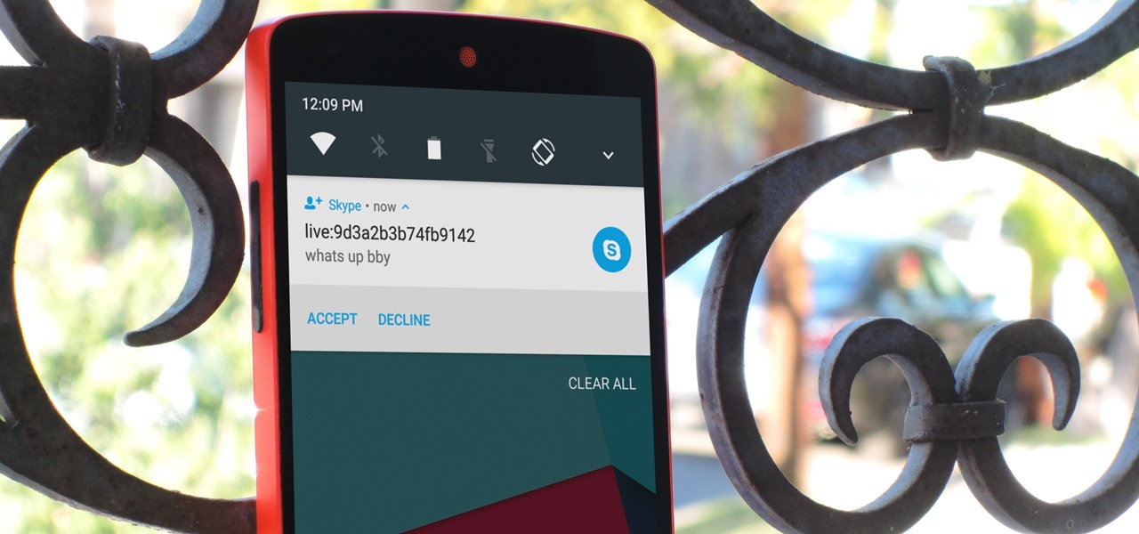
Skype is one of the most popular messaging and video chat services for a good reason—it's packed to the brim with tons of cool features. But one bit of functionality that Microsoft left out is the ability to block friend requests from people that aren't in your contacts, which can lead to a lot of unwanted notifications from spammers and bots.

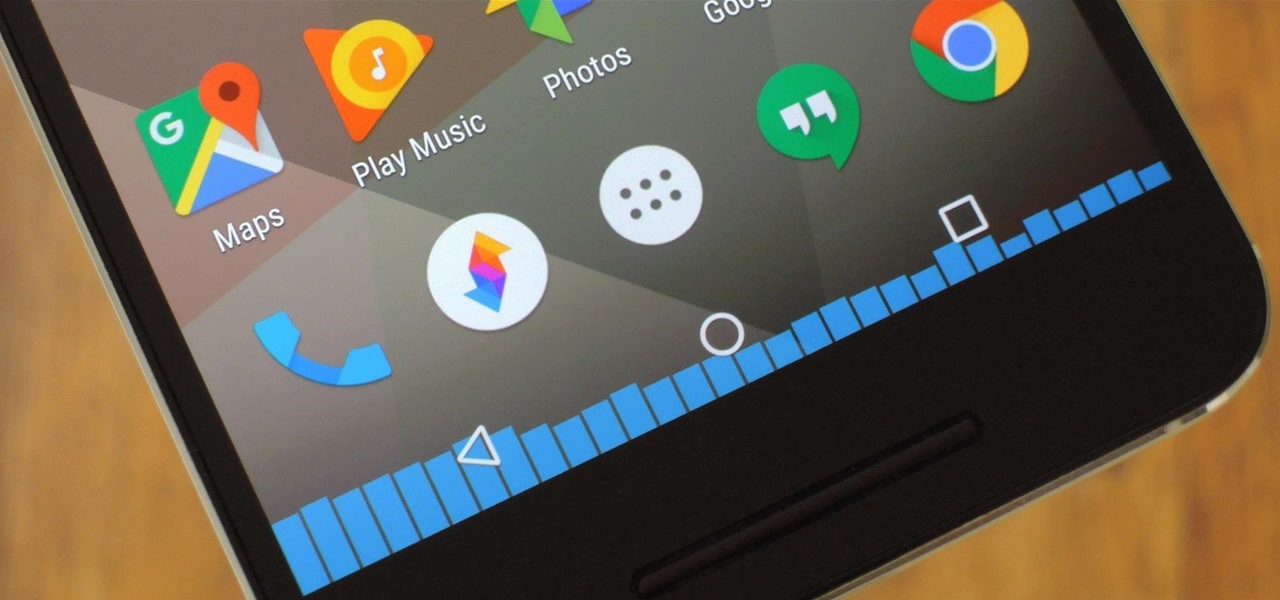
CyanogenMod, the popular custom ROM available for many Android devices, has a nice little feature that displays a music visualizer beneath your on-screen navigation keys while you're listening to your favorite songs. It's a subtle touch, but it makes for a more immersive experience when you're jamming out while using your phone or tablet.

The transition from Android KitKat to Lollipop was pretty drastic in the looks department. Google's new Material Design guidelines changed the way many parts of the UI function, like the notification drawer, status bar, and most notably, the lock screen.

Even if my phone has only 1% of battery life left, I'll keep using it until I can get to a power source somewhere. Most times I never make it to a charger, and my device eventually powers down on its own.

For every contact photo you add, Android keeps two copies. The first is stored at a 720p resolution, and this is used for high-definition imagery when you're looking at a full-sized contact card. But the second image is only 96 pixels by 96 pixels, and this is used for all thumbnails throughout the operating system.

The Gmail app recently became stock Android's central hub for all of your email accounts. Instead of being limited to just Gmail accounts, the app can now handle POP3, IMAP, and exchange service email accounts, making it a one-stop shop for all of your emailing needs.

When it comes to theming your Android device, it's the little things that matter most. Whether you're tweaking your navigation buttons or changing the color of system menus, no theme is complete until even the smallest element matches the rest of your color palette.

Android's lock screen has evolved quite a bit over the years. From the Donut days of two tabs that launched the phone app and unlocked the device, to KitKat's clean and simple approach, shortcuts have come and gone.


