We've previously covered an app called YouTube Floating Popup Player which let you watch YouTube videos anywhere on your Android device, but it has since been removed from the Google Play Store due to infringement of certain policies.

Lollipop brought a complete visual overhaul to Android, and while the vast majority of changes have been met with praise, some UI tweaks missed their mark.

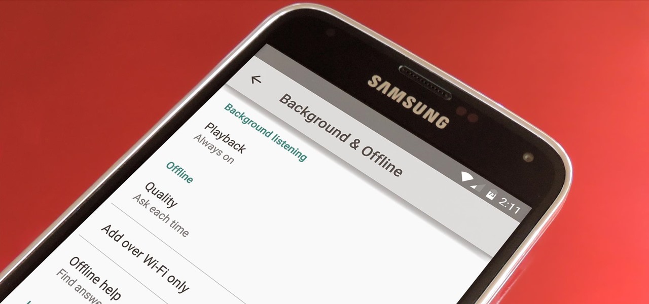
Google debuted YouTube Music Key in November, and for $10 a month, this essentially turned YouTube into a music streaming service. With ad-free music videos and background audio playback, YouTube serves as a viable alternative to Spotify or Pandora for Music Key subscribers.

Android's biggest selling point over alternatives like iOS or Windows Phone is the level of customization that it offers. If you don't like something about the UI, you can change it, whether it's as small as an icon set or as big as the entire home screen.

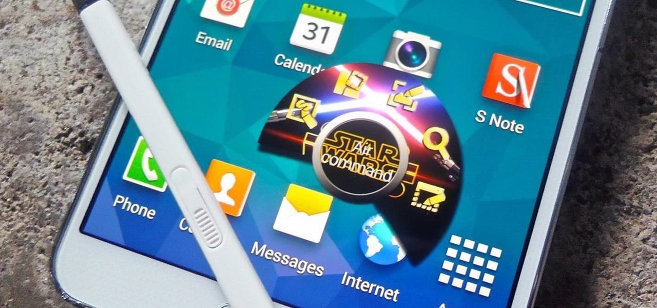
The Air Command window on Samsung Galaxy Note devices makes it easy to access all of the features that the S Pen has to offer, such as Action Memo, which turns your handwritten notes into actionable links, and Pen Window, where you can draw a square on the screen to open a certain application.

My phablet has incredible battery life, but that doesn't mean I wouldn't like it to last even longer. Unlike the Samsung Galaxy S5, the Note 3 does not come equipped with Ultra Power Saving Mode, which can keep the phone running for another 24 hours with only 10% power remaining.

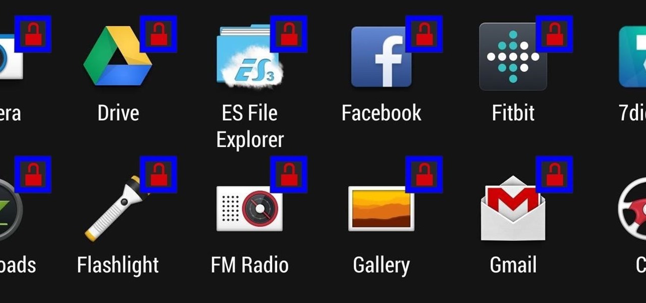
Keeping prying eyes off your device isn't always the easiest thing to do, especially once you lend somebody your phone to make a call. Seems that whenever someone is scrolling through your pictures or checking out your new phone, they always end up somewhere you don't want them be. You could always hover over their shoulder to make sure they're not getting into your texts or photos, but that isn't always possible.

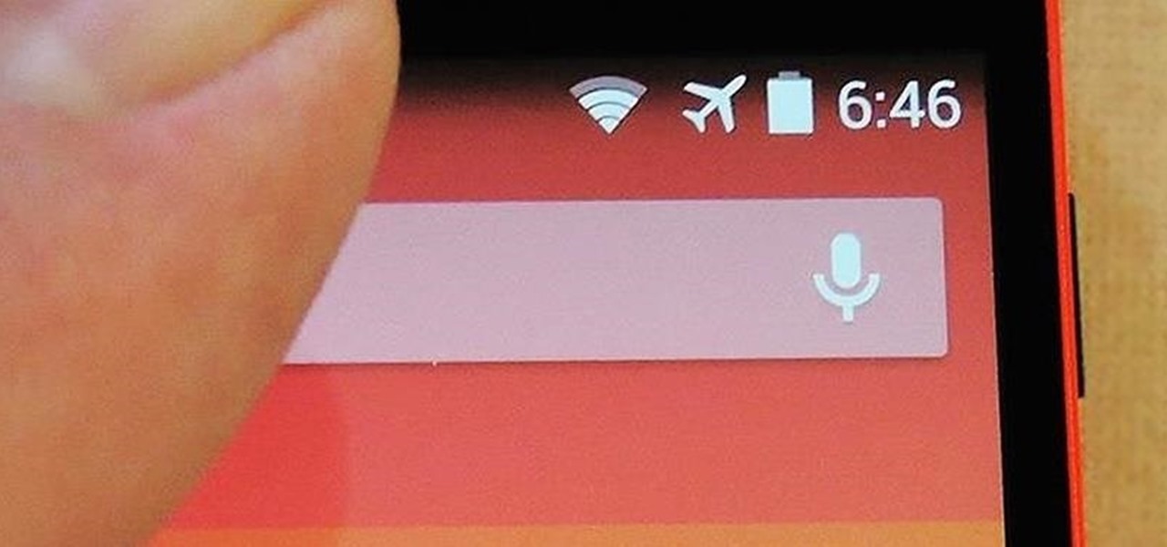
Honestly, Android's stock alarm icon is completely useless. It doesn't relay any information other than the fact that, at some point in the future, you have an alarm coming up. Considering how pointless it is, I normally install GravityBox or other similar mods just to get rid of it.

Even with display sizes increasing by the year, smartphone screen real estate is still at a premium. We want the content we're viewing to take center stage, and this leaves little room for functionality beyond the focused app.

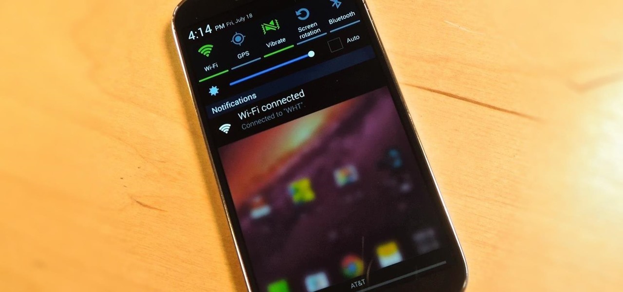
There's a lot you can access from the Notification tray on your Galaxy S4. Quick settings toggles, brightness controls, and of course, notifications. However, despite the power this simple pull-down gives you, you're still left with a boring, black background for the shade.

When theming Android, it's the little touches that complete the look, making your device yours. If you're rooted, you probably know by now that there's virtually nothing you can't change the look of on Android.

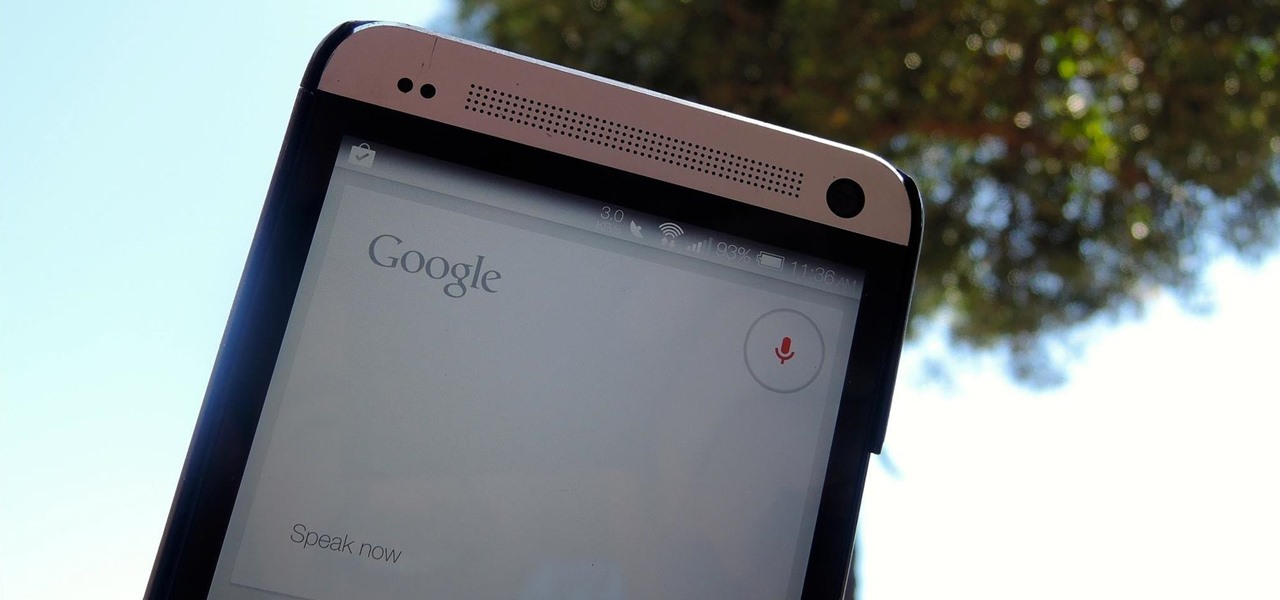
When I'm showing off my HTC One, the first thing I do is unlock my device and say, "OK Google". It may earn me a weird look or two, but in the end people are amazed by the voice recognition and automation of the Google Now Launcher.

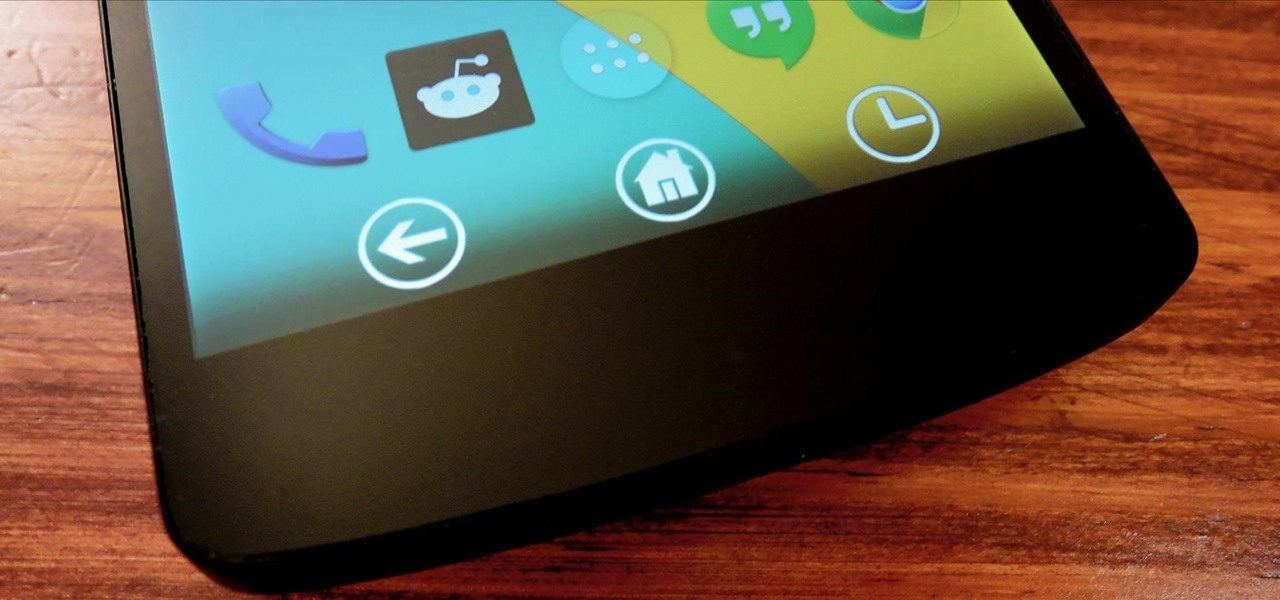
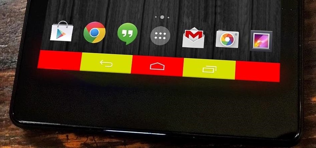
The fact that we own a Nexus means we get to experience the Android interface exactly as Google intended it. But that doesn't mean we can't make a UI tweak here and there, does it?

Ever since Android 3.0 Honeycomb, Google has been trying to push phone manufacturers to do away with physical menu buttons. Samsung has been one of the lone holdouts, retaining the menu key up until the Galaxy S5, where they finally replaced it with a "recent apps" multitasking button.

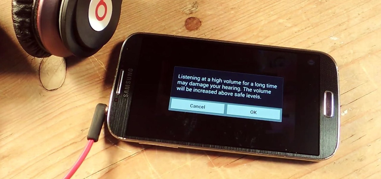
I've been told numerous times that I listen to music way too loud, to the point of potential hearing damage, especially when I have my headphones plugged in. Not only do my friends tell me this, but my Samsung Galaxy S4 likes to nag me as well. Once I pass a certain volume threshold (nine steps) with my headphones, I get that annoying high volume alert. Sorry, my hearing isn't as good as it once was, so let me jam in peace!

When the Nexus 5 was released, a new version of Android came along with it called KitKat. In the 4.4 update were some fancy new UI elements, one of the most noticeable being the translucent decor. By that, I mean the status and navigation bars being semi-transparent.

Multi Window, a feature that was greatly improved with the release of the Samsung Galaxy Note 3, is still quite limited on the older Note 2, allowing only the use of a few stock applications to multitask with.

Google released its long-awaited Google Now launcher a couple months ago, allowing users to access Google Now with the simple command of the voice. As great as the feature is, it requires that our screens be on, unlike the Moto X's "active listening" service that operates with Google Now, activating through a screen-off state.

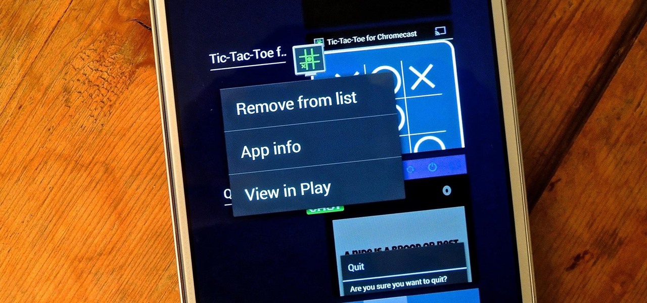
On more than one occasion, I've wanted to check out the Google Play page for an app I was currently using, whether it was to get contact information or read recent reviews to see if others were experiencing issues that I was.

Notifications, while certainly helpful, can at times be overbearing. There are banners plastered every which way on your smartphone for almost every application. While many of the notifications can simply be swept away or turned off, the same can't be said of persistent notifications.

Efficiency is one integral attribute that I need from my Android device. I want to be able to multitask like a maniac and do things on the fly. While multitasking itself is nothing new, actually being able to watch Netflix while scrolling through IMDB at the same damn time was reserved mainly for newer Samsung-ier devices.

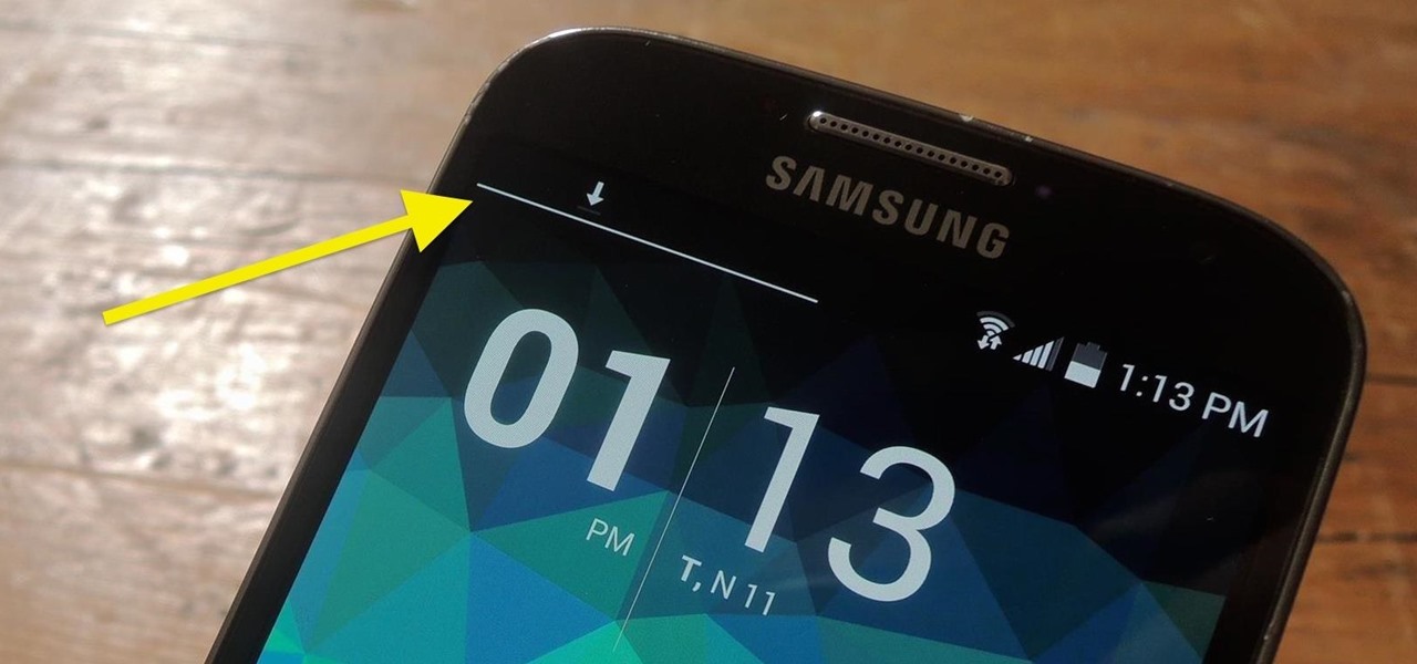
The status bar is an omnipresent force on our Samsung Galaxy S3s; always there to give us that vital information about battery life, date and time, Wi-Fi access, and much more. But there's just something about that default black bar that's so...boring.

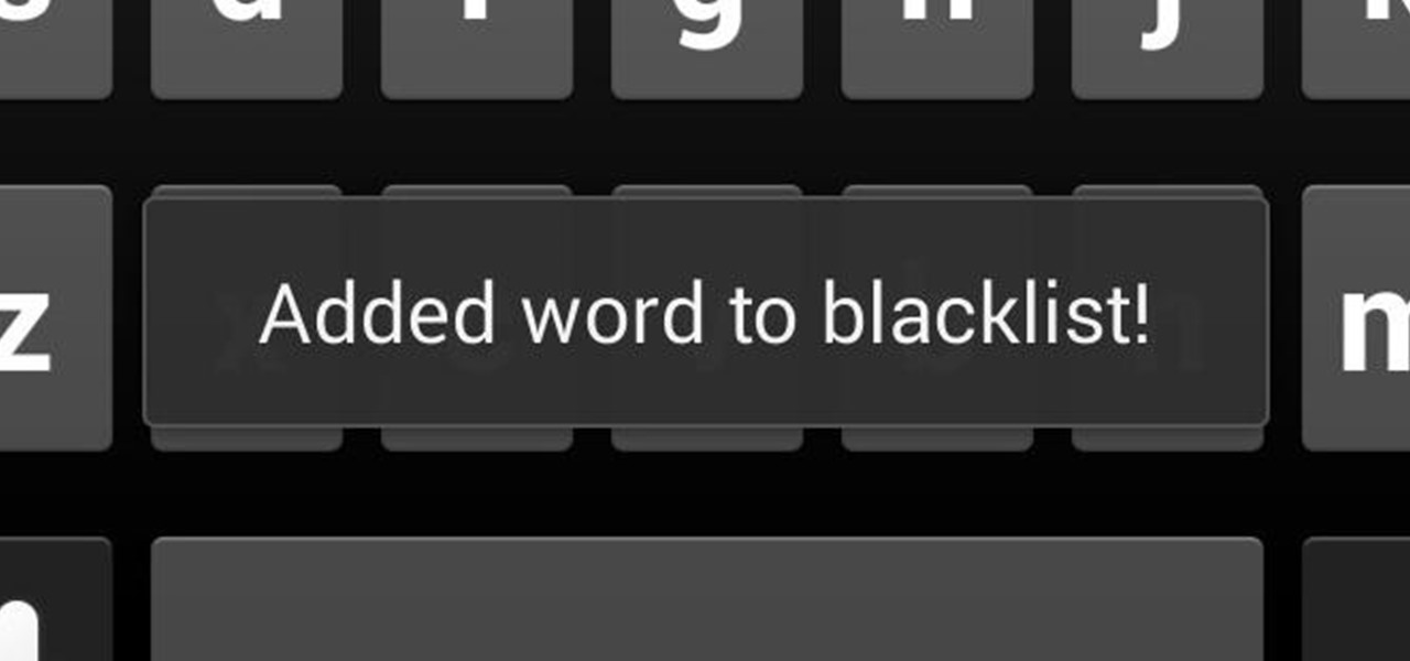
In the midst of furious finger typing on a small non-tactile screen, you're sure to make mistakes—so the majority of keyboards have autocorrect. Generally it works pretty well and is a welcomed feature.

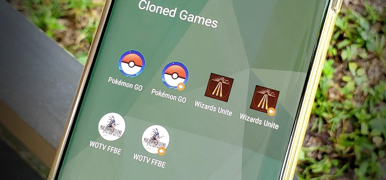
OnePlus offers a variety of features that you don't get with some other Android phones. Parallel Apps is one of those standout extras you didn't know you might enjoy until you've tried it. It allows you to clone compatible apps installed on your device, which means you can use the same app with two different accounts, for example.

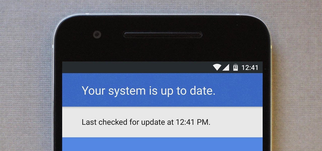
For many people, the two main advantages of buying a Nexus device are prompt updates and the ability to root without much hassle. But in a cruel twist of fate, these two features are almost mutually exclusive, since OTA updates will refuse to run on rooted devices.

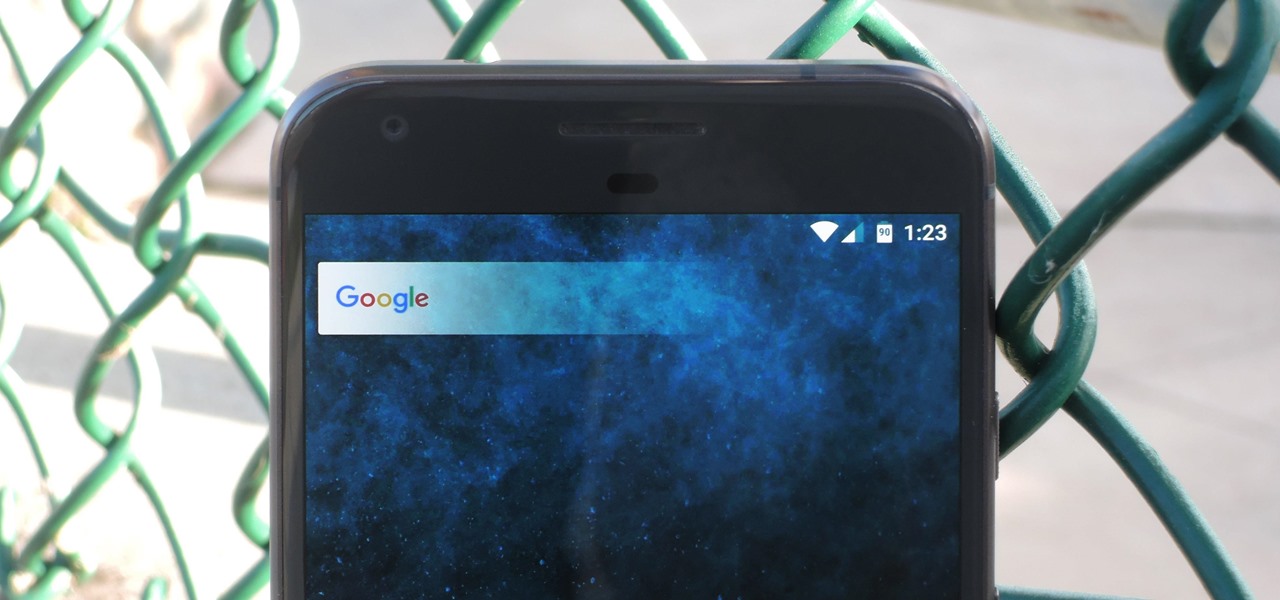
Almost every Android device comes with a Google search bar embedded directly into its stock home screen app. But Google search is available in so many different places on Android that having this bar in your launcher is almost overkill. On top of that, Google recently changed the logo overlay to a more colorful one that may clash with your home screen theme, so there's plenty of reasons to dislike this feature.

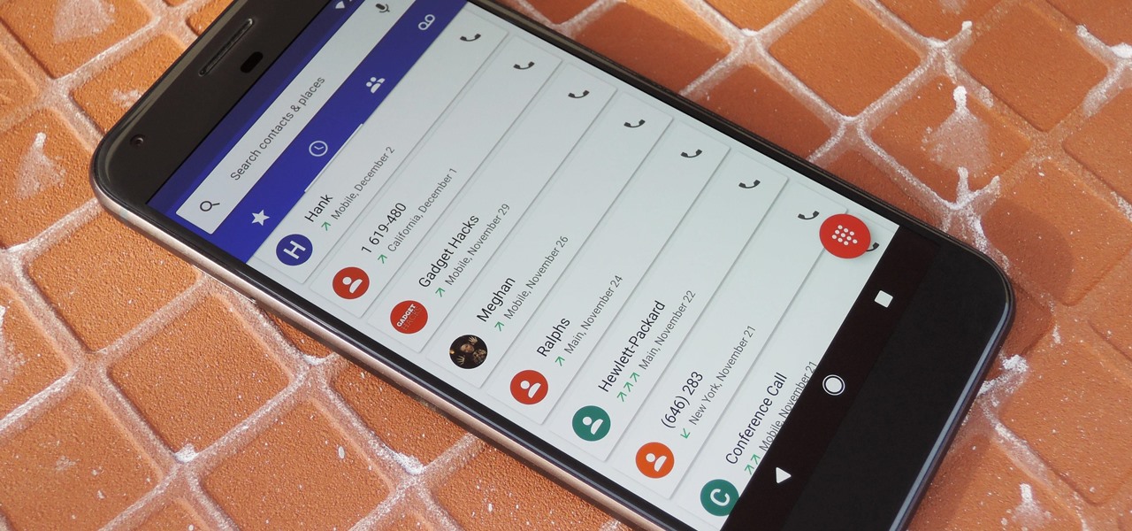
By default, Android limits your call history to the last 500 incoming, outgoing, or missed calls. When you reach this limit, older entries get trimmed off the bottom of the list and deleted forever. This isn't an issue with storage space, because even the biggest call logs only occupy mere kilobytes, so it's really just an artificial limit.

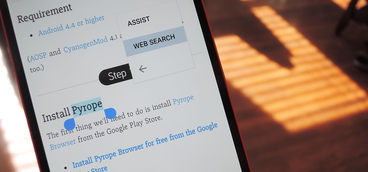
Chrome's text selection interface is pretty nice, but it could definitely use some improvements. For instance, when you're in Incognito Mode, you can't perform a web search for words you've highlighted. And when you're typing out a forum post or using any text input field, for that matter, there's no option to search or share any of the text you've written.

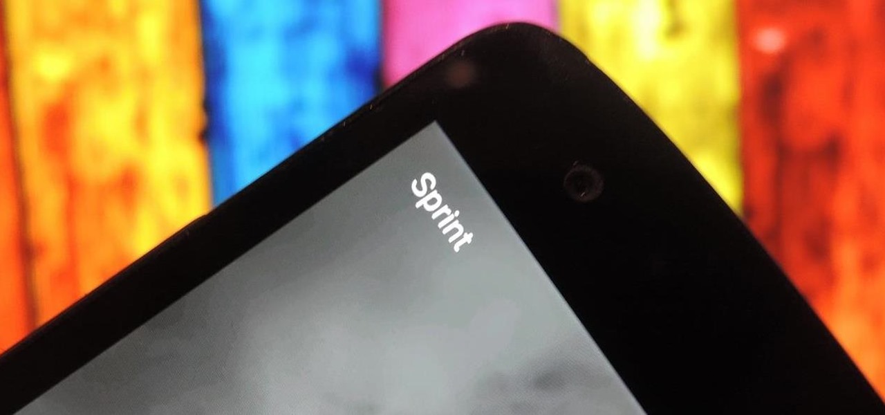
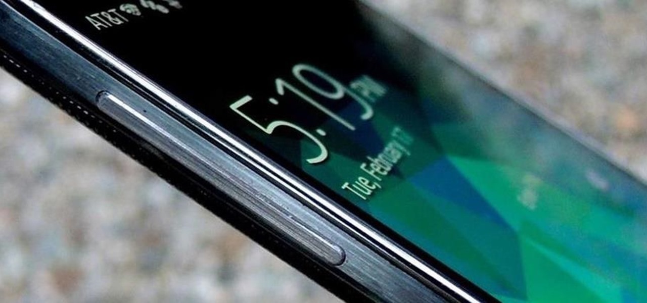
I know where I bought my phone, and I definitely know who I'm paying money to every month for cellular service, so there's absolutely no need to see my carrier's name draped all over my device. Fortunately, with Android Lollipop, the carrier label is only present on the lock screen. Nevertheless, that label can keep your phone from feeling just right, so let's go ahead and show you how to get rid of it.

Yes, they're called volume keys, but they can do much more than adjust your volume. With minimal effort, you can do some amazing things with these physical buttons, like secretly record videos, toggle on your flashlight, scroll through pages, control your music, and much more. And while using them to wake your screen is useful, let's take it a step further and show you how to use them to completely unlock your device, even if the screen is off.

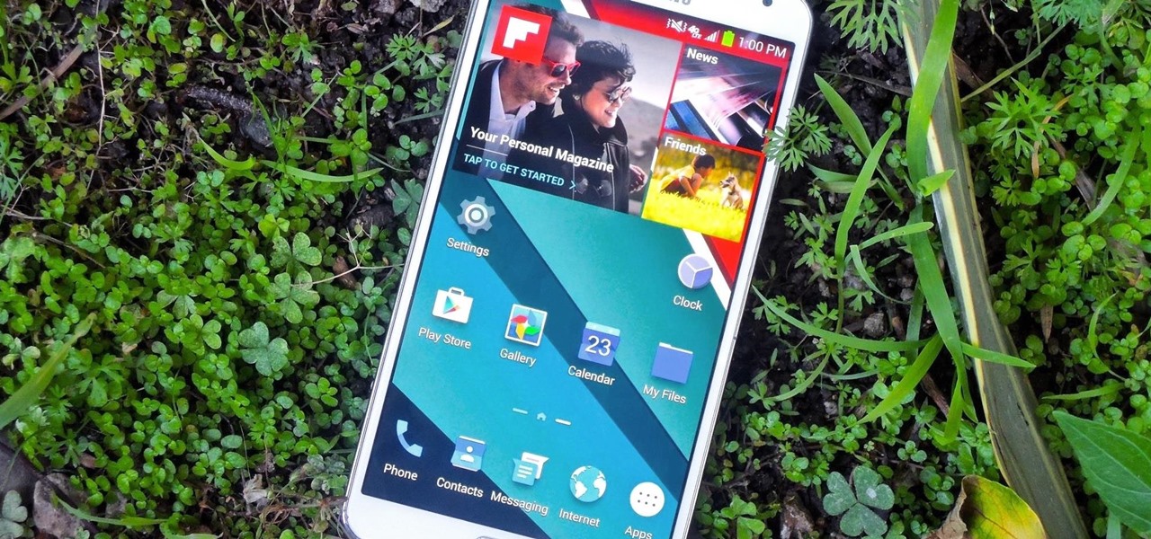
While the Samsung Galaxy Note 3 is sure to get an Android 5.0 Lollipop update, there's no official confirmation on when exactly that will happen (rumors state January). In the meantime, there are a number of ways to get some of Lollipop's features on your KitKat device right now, but today I'll be focusing on the looks with a Lollipop-themed launcher.

Not every mod you add to your Android will revolutionize the way you use it, but many of them can make things a little more simple and convenient for you on a regular basis, like sliding across the status bar to adjust brightness or swiping the screen to put your display to sleep.

Everyone has that one friend who just can't help but send multiple texts in rapid-fire succession, when they just as easily could have been consolidated into one easy-to-read message. Alert after alert, this becomes extremely annoying as your phone shoots notification sounds and vibrations at you like it was possessed.

Screen timeouts serve mostly as security measures and energy savers, but they can also interrupt you when you're reading a book or editing a document. There is no built-in way to manage screen timeouts on a per-app basis, but if you've got root access, you can do just that using Never Sleep from Android dev Hamzah Malik.

According to a recent survey conducted by Edison Research and Statista, Pandora still has a firm grasp as the most popular music streaming service in the United States. With iHeartRadio, iTunes Radio, and even Spotify trailing behind by a large margin, it doesn't look like Pandora will lose their footing in the near future.

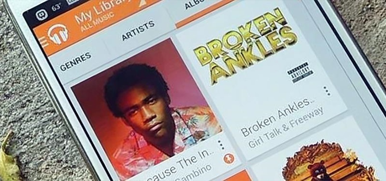
For the most part, Google Play Music makes it extremely easy to upload and organize your music library, as well as access it quickly using the default settings—but there are a few things it could do better.

When I first used the Google Now Launcher, I appreciated the transparency that came with it, and how it made the real look larger than it did before. But now that I'm used to it, that transparent navigation bar is beginning to look a little stale.

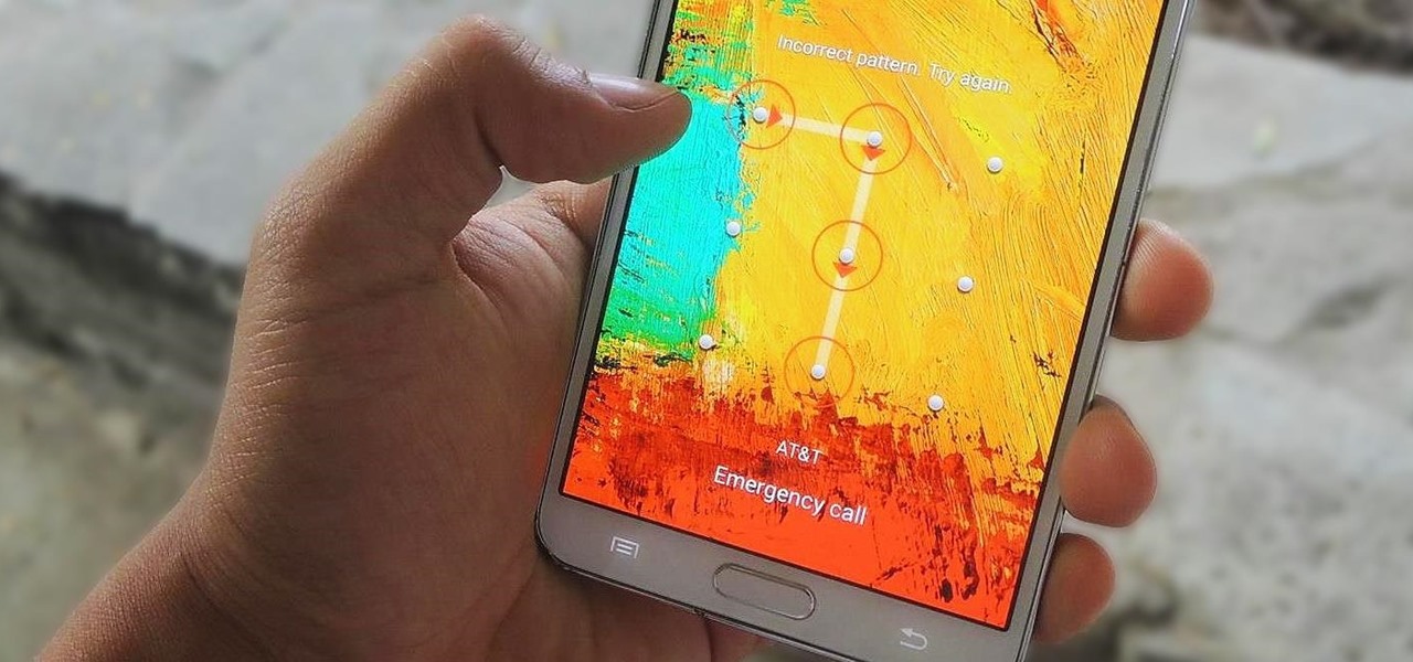
Lock screen security provides a means of safety when it comes to keeping others from breaking into our smartphones and snooping around on or stealing private information like documents, emails, photos, and videos.

Just short of a week after its release, the new HTC One has been rooted thanks to Android devs beaups and jcase, the same guys that brought us S-OFF for the original HTC One (M7).

There is only one time every year where I will willingly watch advertisements—during the Super Bowl. Maybe a Victoria's Secret commercial every now and then, too, but that's about it.
